What is Luckin Coffee?
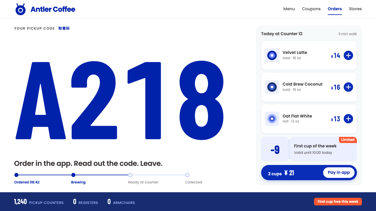
Luckin Coffee's look is white as a paper cup: a deer in a deep blue roundel, tall pickup codes, and orange kept for the moments that sell.
Luckin Coffee in brief
The Luckin Coffee style is the visual language of a coffee chain that lives inside a phone. Customers order and pay in the app, walk to a small counter, read out a pickup code and leave. There is no register to queue at and no lounge to sit in, so the brand does not live on shopfronts or interiors. It lives on white screens and white paper cups.
That setting produces a distinctive and highly disciplined look. A white deer in a deep blue roundel acts as the emblem, with its antlers reaching beyond the circle. Product photographs sit crisply on white. Prices and pickup codes are set in tall, condensed figures that can be read at a glance across a counter. A single promotional orange is reserved for coupons and limited-time tags, which means that whenever orange appears, it is a signal that something is on offer.
The result is a commercial interface style rather than a decorative one. Everything exists to make ordering faster: a single-column menu, rounded cards, a blue plus button on every item, and a rhythm that keeps the eye moving down the page. The only place where illustration is permitted to run free is on the sleeves and bags of co-branded editions, where the brand is willing to be playful.

Where does Luckin Coffee come from?
Luckin Coffee was founded in 2017 in Xiamen, in China's Fujian province. From the start it was built around the mobile phone: customers browsed a menu in an app, paid through mobile payment and collected their drinks from a pickup point. From 2018 it opened app-only pickup stores, which turned this idea into a physical format. Founders and leaders named in connection with the company include Jenny Qian Zhiya and Charles Lu Zhengyao, with Guo Jinyi also associated with the brand.
This model belongs to what is often described as app-first new retail. In that approach, the digital experience is not an add-on to a store but the primary product, and the store is reduced to a pickup point. Mobile-payment pickup stores follow naturally from it. When the counter exists only to hand over a cup, the visual identity has to work first on a phone screen and second on the cup itself, and everything extraneous gets removed.
That constraint explains the style's most important choices. White is dominant because it is the colour of the screen background and the colour of the cup, and because product photography looks sharpest against it. Deep blue provides the emblem and the primary actions. Orange is kept scarce so that it keeps its power to catch attention. Condensed numerals for prices and codes make sense because a pickup code must be readable quickly and from a distance.
From the 2020s onward, the brand has also leaned into co-branded limited editions. These collaborations bring in illustration and character art, but they are kept to the sleeves, bags and special launch visuals so that the core interface remains consistent. The combination of a strict everyday system and an expressive occasional layer is one of the cleverest parts of the approach, and it is why the style feels both efficient and fun.
What defines the Luckin Coffee look?
White as the ground
White is the dominant colour, matching the paper cup and the app screen. It gives the interface a clean, hygienic feel and makes product images pop. Panels and cards are separated by gentle spacing and subtle rounding rather than heavy lines, so the page stays airy even when it is full of products.
Deer-blue roundel
A deep blue circle holds a white deer whose antlers extend beyond the edge. The same blue appears in headers, the main action buttons and key highlights. It is a confident, trustworthy blue that signals the brand without needing a long wordmark, and the antlers breaking the circle give the emblem a lively touch.
Promo orange only for offers
Orange is limited to coupons, discount tags and limited-time labels. Because it never appears as general decoration, the eye learns to treat it as a signal. If orange creeps into headings, backgrounds or icons, the discipline of the system is broken and the promotions lose their force.
Tall condensed figures
Prices and pickup codes are set in a narrow, tall numeric style, large and tightly spaced. The proportions let long numbers fit into small spaces while staying readable at a glance. Pickup codes in particular are meant to be read across a counter, so they are given real size and strong contrast.
Single-column menu with round cards
Products are presented in one column of rounded cards, each with a photograph, a name, a price and a small blue plus button. This structure keeps the thumb path short and the choice obvious. There is no multi-column complexity, because speed of ordering is the goal.
Illustration only on co-brands
Everyday screens carry no decorative illustration at all. Character art and playful graphics are saved for the sleeves and bags of co-branded editions. This separation keeps the core experience calm and makes each collaboration feel like an event.

Who shaped Luckin Coffee?
Qian is one of the people named in connection with Luckin Coffee's founding and leadership. Her association with the brand ties the visual identity to the company's early app-first strategy, in which the phone, rather than the shopfront, was the main place where customers met the brand.
Lu is another figure named in connection with the company from its start in Xiamen in 2017. His name belongs to the story of the chain's rapid move to app-only pickup stores from 2018, the format that the white, minimal interface style was made to serve.
Guo is also named in connection with the brand. Like the others, the name marks the group of people associated with building Luckin Coffee in its early period, when mobile-payment pickup stores and a disciplined visual system were being defined together.
How do you use Luckin Coffee today?
On slides, the Luckin style is excellent for retail, consumer app and growth presentations. A cover can place the blue roundel on a clean white slide with a big, tall numeral as a headline metric. Content slides should use product-like cards, with one photograph or one number per card. For data slides, use condensed numerals as the hero and reserve orange for the single figure that represents a promotion, an uplift or a deadline.
On the web and in apps, the style fits ordering flows, menus, loyalty programmes, coupons and any service where speed is the main value. A mobile menu can follow the single-column structure with round cards and a blue plus button. A pickup screen can present the order code in very large condensed figures. A checkout page can show prices in the same narrow numerals, with orange used only for the discount line.
In editorial and marketing work, the style supports promotional posters, coupon campaigns, store-opening announcements and seasonal launches. The everyday look stays white and blue, while limited-time activity is flagged in orange. For co-branded campaigns, follow the brand's own approach: let illustration appear on the sleeve, the bag or a dedicated launch banner, and keep the underlying interface unchanged.
A helpful rule is to ask of every element whether it makes ordering faster. If it does not, remove it. Keep photographs cropped consistently on white, keep the blue for actions and identity, and keep numbers large and tight. The calm, repetitive rhythm is a feature, because it lets customers form a habit quickly.
The common mistake is to spread orange across the page, turning a signal colour into decoration and weakening every offer. Another is to add illustration or textured backgrounds to everyday screens, which clutters a system that depends on white space. A third is to use wide, loose numerals for prices and codes, which loses the compact readability that gives the style its practical edge.

Luckin Coffee — FAQ
What is the Luckin Coffee design style?
It is a white, app-first interface style built around a deer-blue roundel, crisp product photographs, tall condensed numerals for prices and pickup codes, and a single orange used only for promotions. Menus are single-column with rounded cards and a blue plus button, and the whole system is designed to make ordering as fast as possible.
Why is the interface so white?
Because the brand lives on phone screens and paper cups, both of which are white. The colour keeps the interface clean and lets product photographs stand out. It also makes the few coloured elements, the blue emblem and the orange promotions, far more noticeable.
Where did Luckin Coffee start?
The company was founded in 2017 in Xiamen, Fujian, China. It built its model on ordering and paying through an app, and from 2018 it opened app-only pickup stores. Its later co-branded limited editions, from the 2020s onward, added illustration on cup sleeves and bags.
When should I use orange?
Only for offers: coupons, discount tags and limited-time labels. The style depends on orange being rare, so that it always signals a promotion. For everything else, use white, deep blue and neutral text colours.
Can I add illustration to my screens?
Only in the places where the brand itself allows it, namely co-branded sleeves, bags and special launch visuals. Everyday screens should stay free of decorative illustration, so the core ordering experience remains fast and consistent.
Related design styles
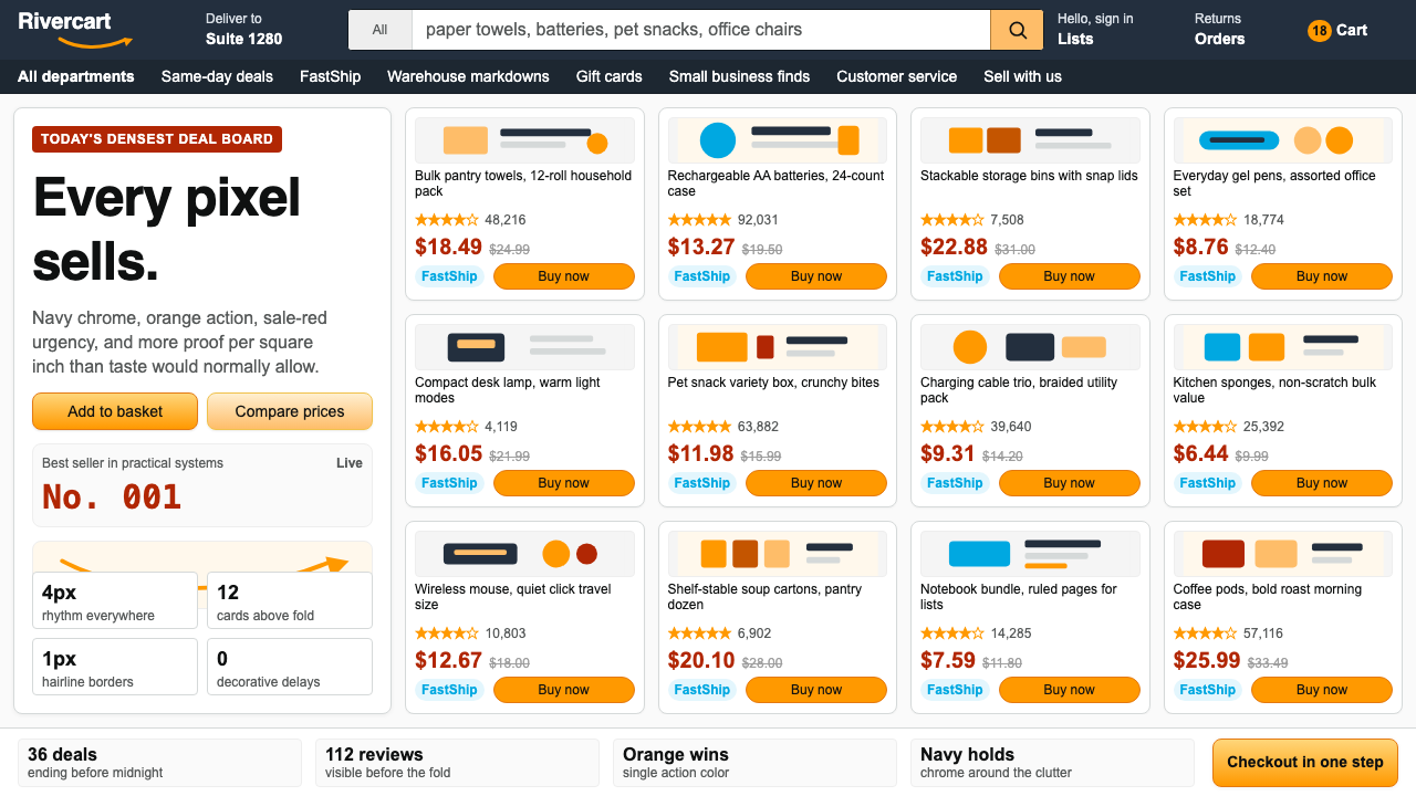 AmazonUgly sells efficiently. Navy chrome, orange buttons, red prices crowd a dense…
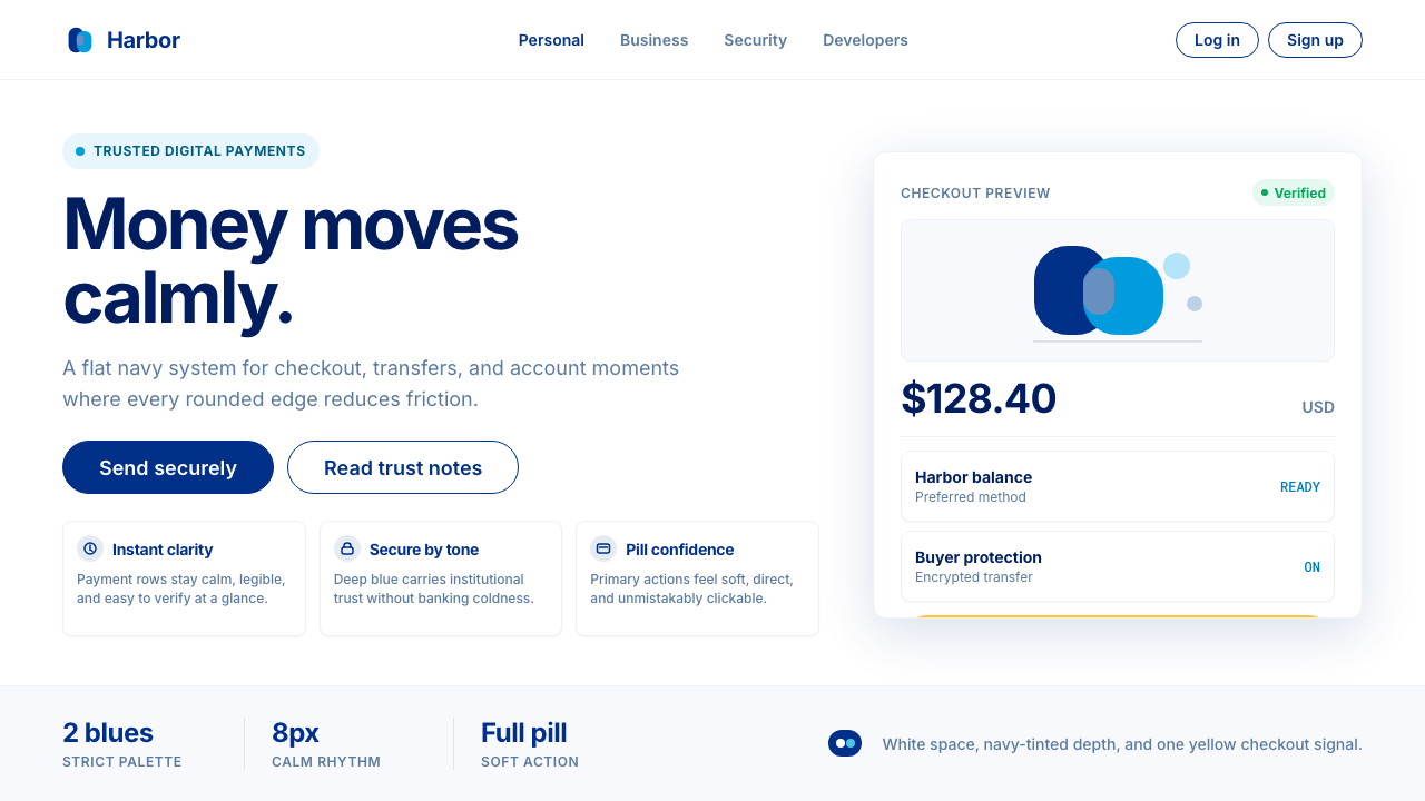 PayPalTrust without coldness. Deep navy, sky cyan, white cards, and pill checkout c…
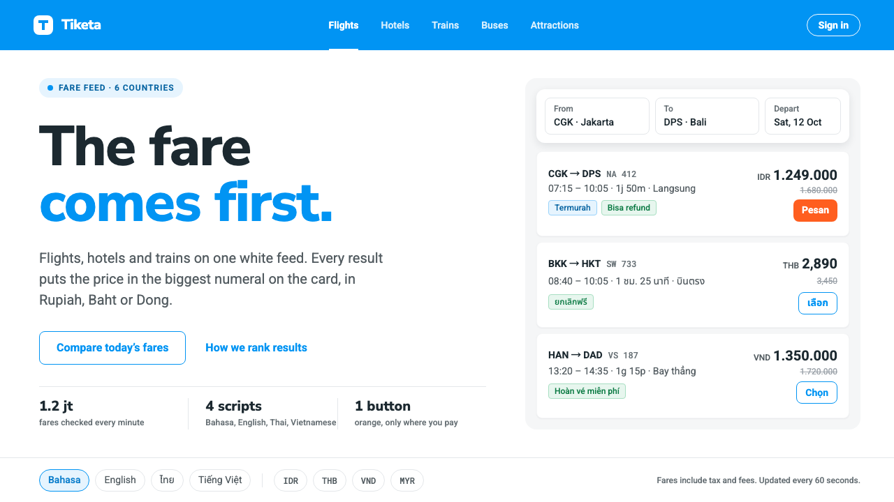 TravelokaThe fare comes first. Azure band, white cards, price as the biggest numeral,…
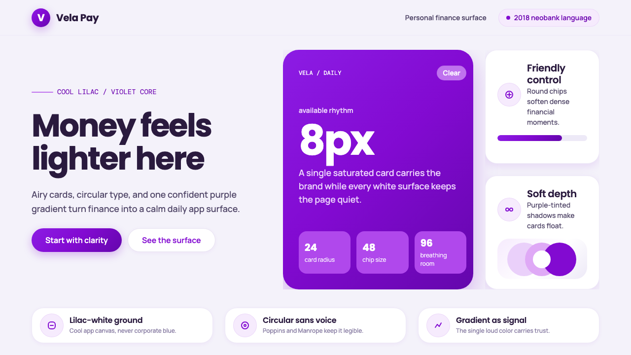 Circular FintechFinance feels light. Lilac-white space, rounded cards, and one vivid purple g…
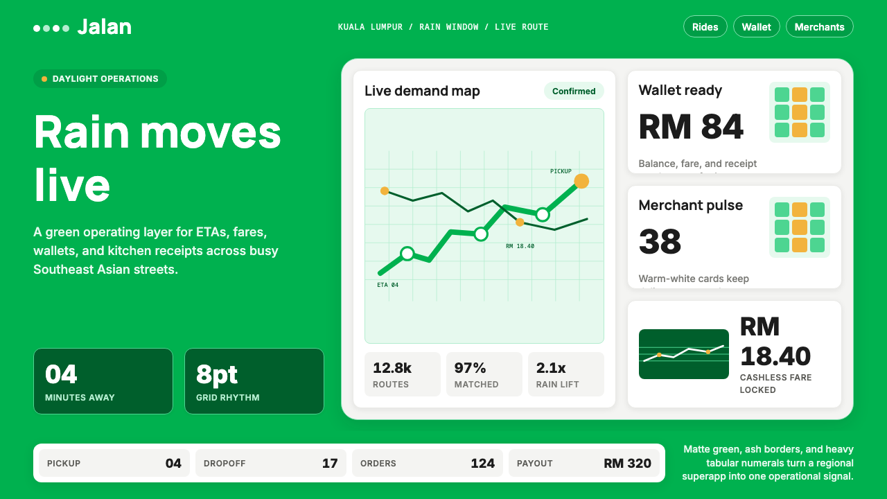 Grab SEA Superapp 2018Operational warmth. Saturated green, Inter numerals, and tight dashboard card…
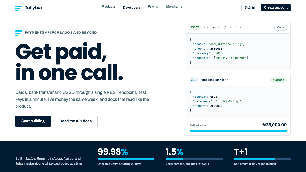 PaystackPlain-spoken payments infrastructure. White page, navy ink, four flat cyan ba…