What is Feishu?
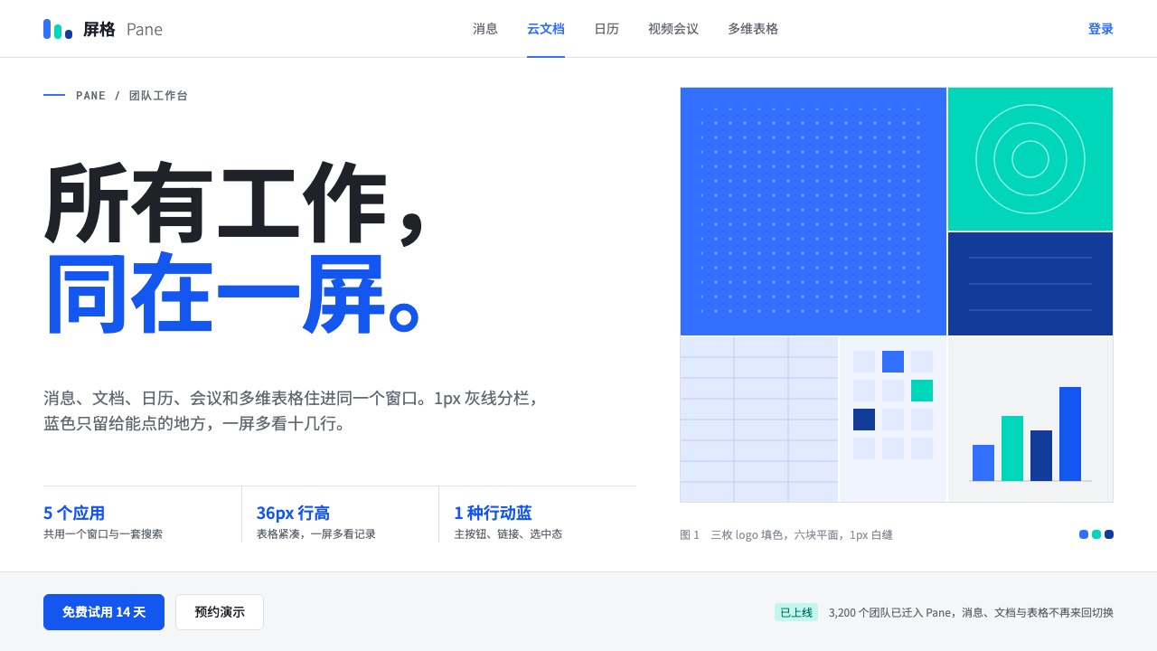
Feishu is quiet density in one blue: a white page cut into panes by hairline grey lines, where color appears only on what you can click.
Feishu in brief
Feishu, sold outside China as Lark, is the all-in-one work suite built by ByteDance. Messaging, documents, calendar, video meetings and database-style tables all live in a single window. Its interface style is the look of that suite: a white workspace divided into panes by hairline grey lines, set in a cool, near-black ink, at the density of a serious office tool.
The palette comes from the bird in the logo. Its flat blue, teal and deep navy fills define the colors of the product, with a slightly deeper blue reserved for primary actions. Everything else is deliberately quiet, so that rows, messages and documents carry the screen instead of ornament. There are no heavy shadows and no decorative illustrations; blue appears only where something can be pressed.
The style suits collaboration tools, admin back offices, knowledge products and any software whose users spend hours inside it. It is a style that earns trust by being unremarkable in the best sense: dense, predictable and calm, so that attention goes to the work.

Where does Feishu come from?
The story starts in Beijing, inside ByteDance. In 2016 the company began using an internal collaboration tool called Lark to run its own fast-growing organization. Because it was built by people who used it every day, it was shaped by real working habits rather than by a marketing brief, and its interface developed toward efficiency instead of showiness.
In 2019 the tool was released publicly as Feishu in China and as Lark abroad. It arrived in the middle of a wave of Chinese collaborative software, when many companies were moving to all-in-one work suites and adopting document-centered and objectives-driven working cultures. In that setting, a product's interface had to feel fast, dense and professional, because it would be open on a screen for most of the working day.
The visual identity most people know today belongs to roughly the period from 2021 to 2024, often described as the Feishu 5.0 era. The design settled around a white workspace, a three-column structure of app bar, list and content, and a narrow palette taken from the brand mark. The names most associated with the company in this context are Zhang Yiming, ByteDance's founder, and Xie Xin, who is associated with the product.
Taken together, the look is a product of its circumstances. It reflects the all-in-one suite model, the habits of a document-centric office culture, and the Chinese software convention of showing a lot of information on a single screen. It avoids the airy, spacious look of consumer apps and chooses the compact look of a tool meant to be used.
What defines the Feishu look?
Color
One blue does almost all the work. A bright brand blue marks links and highlights, a slightly deeper blue marks the primary action, and a teal and a navy appear as secondary notes taken from the logo. Neutral greys carry everything else. The rule is simple: if something is blue, it can be clicked, and if it cannot be clicked, it should not be blue.
Panes and lines
The screen is organized by hairline grey dividers instead of boxes or shadows. An app bar sits on the left, a list in the middle and the content on the right. Thin lines separate zones without adding visual weight, so users can see a lot of information and still tell where each region begins and ends.
Typography
Text is set in a cool, near-black ink rather than pure black, which softens long reading without losing contrast. Type sizes are compact and the hierarchy is built from weight and grey values instead of dramatic size jumps. It reads as an office tool: efficient, legible, and made to be scanned quickly down a list.
Density
Density is a feature. Rows are tight, lists are long, and a single screen shows many messages, files or events at once. The aim is to avoid wasting a row of vertical space. This is the typical standard of Chinese office software, and it asks for restraint elsewhere in the design so the page stays calm despite the volume.
Flat surfaces
Surfaces are flat and white. Shadows are used only to lift floating layers such as menus and dialogs, and they stay light. There are no gradients, textures or decorative illustrations in the working screens. The effect is a calm background against which content and the occasional blue can be seen clearly.
Restraint with emphasis
Emphasis is rationed. A single filled blue button per area, a small badge for unread items, and a colored link are usually the only loud elements. Because so little else competes, those few accents guide attention efficiently. Adding more color usually weakens the system rather than strengthening it.

Who shaped Feishu?
The founder of ByteDance, the company in which the tool was first built in 2016 for internal use. His organization's own scale and pace of growth created the need that the suite answered.
A figure associated with the Feishu product. The public launch in 2019 and the later refinement of the suite are linked to the team around the product she is known for leading.
The Beijing company that built the suite first for itself. Its habit of running the whole organization inside one tool is the reason messaging, documents, calendar and tables share a single, consistent interface language.
How do you use Feishu today?
On slides, the style fits product reviews, internal reports and team updates. Use a white slide, a title in dark cool ink, and one blue accent per slide for the thing that matters. Thin grey rules can divide a slide into two or three panes, echoing the app's structure and making dense content easy to scan.
For data slides, this is one of the most comfortable styles to work with. Tables with hairline dividers, small sparklines in the main blue, and a teal for a second series let you present a lot of numbers without clutter. Keep the colors few, label directly, and treat blue as the highlight for the number or row under discussion.
On the web, the style belongs in dashboards, admin consoles, document editors, project trackers and any product with lists, filters and long sessions. Follow the three-column logic: navigation on one side, a list in the middle, detail on the other. Use the filled blue for the primary action only, and reserve outlined or text buttons for everything secondary.
In editorial and marketing work, the look can be adapted for product pages and help documentation. White backgrounds, clean headings, a single blue call to action and screenshots with thin borders communicate reliability. It is not a style for emotional storytelling, so use it where the message is that the tool is dependable, efficient and clear.
A frequent mistake is to use blue everywhere, including on decorative elements, until nothing is clickable-looking any more. Another is to copy the density without the discipline: tightly packed rows only work when alignment, grey values and spacing are consistent. If you add shadows, gradient banners and colorful illustrations, you lose exactly the quiet that makes the style useful.

Feishu — FAQ
What is the Feishu design style?
It is the interface look of ByteDance's Feishu (Lark) work suite: a white workspace divided into panes by hairline grey lines, cool near-black text, dense lists, and one main blue used only for things you can click. It is flat, quiet and information-rich.
Where do the colors come from?
They come from the bird in the product's logo. Its three flat fills, a bright blue, a teal and a deep navy, set the palette. A slightly deeper blue is used for primary actions so the main button stands out from ordinary blue links.
Why is it so dense?
Because it is designed for people who spend hours in it. Dense lists let users see more messages, files and events at once and move quickly between them. The density follows the conventions of Chinese office software and is balanced by a restrained palette and consistent spacing.
Is it only for work tools?
It is at its best in work tools, dashboards, knowledge products and admin systems. For consumer, entertainment or brand-led products, it may feel too plain and utilitarian. It can still serve as the base for help centers and documentation, where clarity matters most.
When did the look take shape?
The tool began as an internal product in 2016 and launched publicly in 2019. The visual style most people recognize now is associated with roughly 2021 to 2024, often called the Feishu 5.0 era, when the white, three-column workspace and the narrow blue palette became settled.
Related design styles
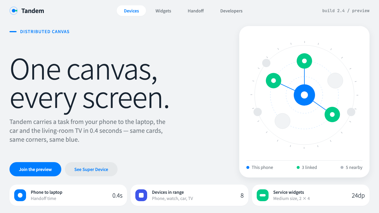 HarmonyOSOne blue for everything you can touch. White 24px cards on cool grey, navy te…
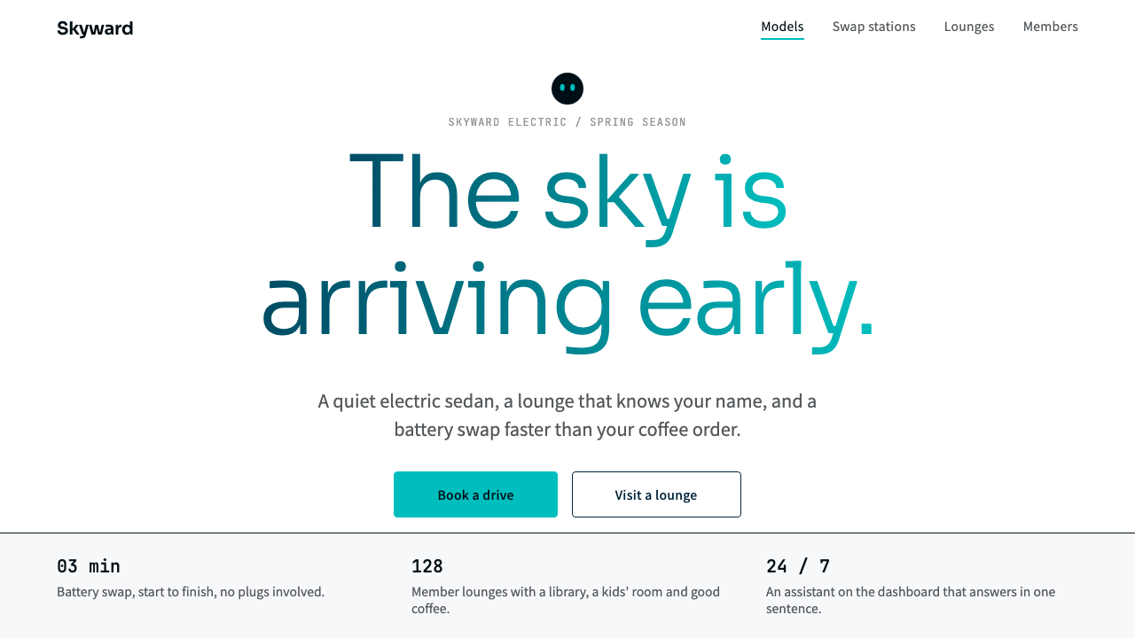 NIOQuiet premium with the sky in the headline. White pages, navy ink, one teal-t…
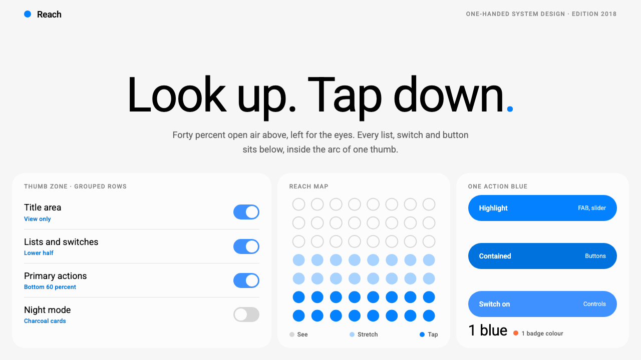 Samsung One UILook up, tap down. Giant Roboto title in open air, white 26px cards on grey,…
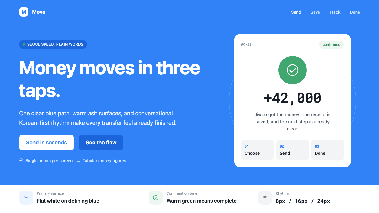 Toss Korean Fintech BlueMoney feels instant. Signature blue, Pretendard scale, and one-screen transfe…
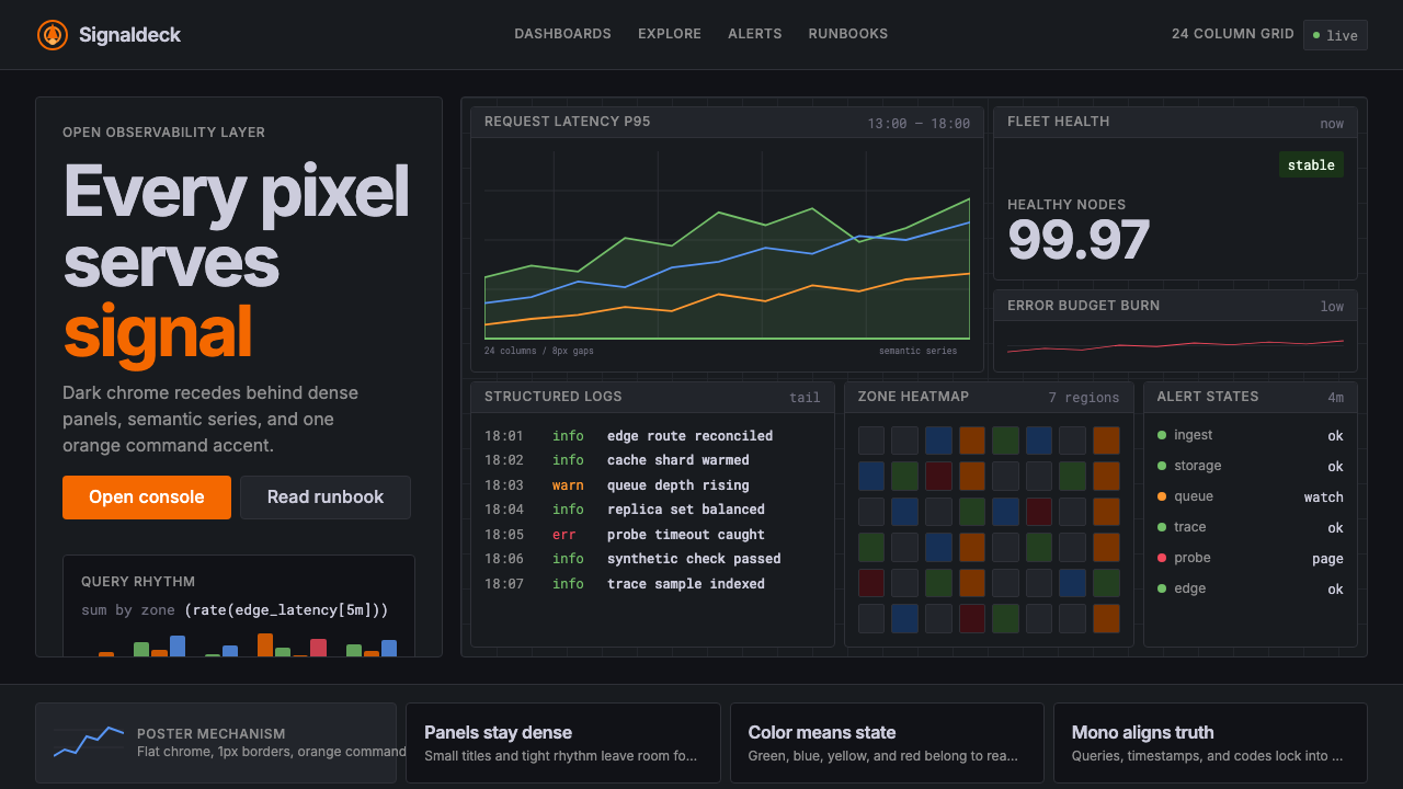 GrafanaData first, chrome last. Orange accent cuts through dense dark panels and sem…
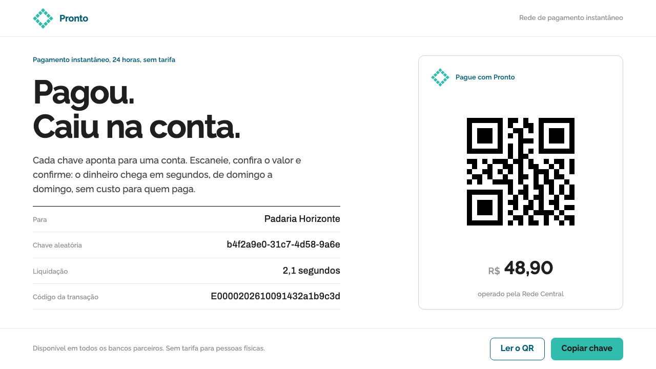 Pix Instant PaymentTrust through near-nothing. White sheets, one teal rhombus, a hard black QR a…