What is HarmonyOS?
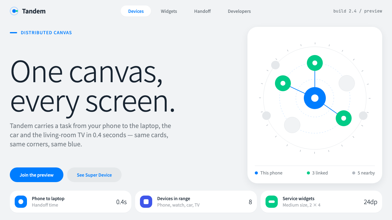
HarmonyOS is a quiet, exact interface for many screens: cool grey ground, big white cards, navy text and one system blue for everything you can touch.
HarmonyOS in brief
HarmonyOS is the visual language of Huawei's distributed operating system, designed so that one interface can run across a phone, a tablet, a watch, a car and a television. Its look is deliberately calm and precise: a cool, light grey page, white cards with generously rounded corners, navy rather than pure black text, and a single system blue reserved for anything the user can touch.
The central discipline is that color means interaction. Everything that is not interactive stays neutral, so the blue is never decoration. Buttons are capsule-shaped, settings are gathered into grouped blocks, and information is presented in cards that can be lifted out of an app and placed elsewhere. The system looks modest at first glance because its ambition lies in consistency across devices, not in surface drama.
As a design style it is easy to recognize and easy to apply. It rewards rounded geometry, soft separation between layers, and a clear hierarchy built mostly from size, weight and spacing. Two interface ideas give it a recognizable personality: service widgets that slide out of an app icon, and the Super Device view, where nearby devices appear as bubbles that can be dragged together.

Where does HarmonyOS come from?
HarmonyOS was announced by Huawei at its developer conference in Dongguan, Guangdong, on 9 August 2019. The goal was blunt: an operating system that treats a household or a workday as a set of cooperating devices, so a task can start on one screen and be finished on another. Phones got a version of it with HarmonyOS 2 in June 2021, which is when most people first saw it on real hardware. The visual identity most users know today dates from roughly 2021 to 2024.
The setting matters. Huawei works from Shenzhen and Dongguan in Guangdong, and the project is tied to names such as Richard Yu (余承东) and Wang Chenglu (王成录), who appear among the people associated with the launch. A distributed operating system makes unusual demands on interface design. If the same app has to appear on a wrist and a car dashboard, then layout must be built from small, movable pieces and from tokens that scale, not from fixed pages. That requirement explains why the style is so modular and why card-based layouts sit at its center.
The look draws on several streams. Distributed multi-device operating systems are the technical frame. Card-based mobile UI, in which information and functions are packaged into rounded, self-contained units, supplies the building blocks. System-wide design tokens, meaning a shared set of color, radius and spacing values that every product inherits, provide the discipline. The open-source side of the platform, OpenHarmony, publishes these tokens, which is why the style can be translated almost directly to the web.
That translation is what this design system does. It takes the system palette and corner parameters used by the platform and reinterprets them for websites: service widgets, grouped settings blocks, capsule buttons and the Super Device bubble map become the building blocks of web pages. The result keeps the platform's restraint, and it keeps the promise that one interface language can sit comfortably on many sizes of screen.
What defines the HarmonyOS look?
One blue for touch
The system blue is the only strong chromatic note on the page, and it marks links, primary buttons, toggles and selected states. Because nothing else competes with it, users learn quickly that blue means 'you can act here'. This is a stricter rule than most brand palettes follow: even logos and illustrations are kept away from it so that its meaning stays clean.
Cool grey ground
The page background is a light, slightly cool grey rather than white. That tint lets pure white cards stand forward without needing borders or heavy shadows, and it gives the whole interface a clean, daylight feel. Neutral surfaces carry the structure so the blue and the navy text can stay sharp.
Large rounded white cards
Content lives in white cards with big, soft corners. The radius is generous enough to read as a signature, yet consistent, so nested elements step down proportionally instead of mixing arbitrary curves. Cards are the unit of composition: a widget, a settings group and a notification are all the same family of object at different sizes.
Navy text instead of black
Primary text is a deep navy, with lighter blue-greys for secondary information. It reads as dark and authoritative, yet softer than pure black on a grey ground, and it harmonizes with the system blue instead of fighting it. Hierarchy is built from size, weight and a small number of grey steps rather than from many hues.
Capsule controls
Buttons, tags, search fields and segmented controls are pill-shaped, with ends fully rounded. This keeps the interface friendly and touch-ready, and it makes primary and secondary actions easy to tell apart: a filled blue capsule for the main action, a pale tinted capsule for the alternative. The shape also echoes the rounded cards around it.
Grouped settings blocks
Lists of options are gathered into a single rounded block with thin dividers between rows, rather than shown as separate boxes. Each row has a label on the left and a value, switch or chevron on the right. This pattern is the system's way of making dense information feel calm: related items are grouped, unrelated ones are separated by space.
Service widgets and device bubbles
Two interaction ideas shape the visual identity. Service widgets are compact cards that pull a slice of an app out of its icon, and the Super Device view arranges nearby devices as bubbles you can drag together. Both present the platform's central claim, that functions flow between devices, as something users can see and do.

Who shaped HarmonyOS?
A senior Huawei executive whose name is closely associated with the public launch and promotion of HarmonyOS. He appears among the key figures of the platform's story, tied to the moment in 2019 when Huawei announced a distributed operating system built for many device types.
Another Huawei figure associated with HarmonyOS and its software platform. His name belongs to the group of people linked to the system's early history, including the 2019 announcement and the move to phones in 2021.
The open-source side of the platform, which publishes the system color palette and corner parameters that this design style translates for the web. Its public tokens are the reason the visual language can be studied, reproduced and adapted outside Huawei's own products.
How do you use HarmonyOS today?
HarmonyOS suits products that need to feel dependable, light and cross-platform: multi-device apps, IoT control panels, service portals, smart-home dashboards and utility tools. It works best where the interface has many small functions and needs to make each one easy to find and easy to trust.
For presentation slides, use the cool grey as the page and place white rounded cards on it as content containers. A cover can be nearly empty, with a navy title, a small blue capsule label and one large rounded shape holding an image. Content slides become grids of cards, each with a short heading and one or two lines of text; blue appears only on the item you want the audience to act on or remember. Data slides use simple rounded bars and a limited blue ramp with greys for context.
For web interfaces, build the page as a stack of cards and grouped lists. A dashboard might show service widgets in a row, a settings column made of grouped blocks, and a device overview where each device is a bubble or a small card. Make all links and buttons the system blue, give primary buttons a capsule shape, and keep every non-interactive element neutral. Navigation should be minimal, with clear labels and a restrained active state.
For editorial and marketing work, the style is friendlier and cleaner than it is dramatic. Landing pages can alternate grey bands with rounded white feature cards, put a single blue call to action in each section, and use illustrations in soft, low-contrast tones. Product shots look best when floated on a card with plenty of space around them. Keep copy short and tidy, because the style is built for scanning, not for long dramatic reading.
The most common mistake is using blue as decoration. If headings, icons, borders and background tints are all blue, the rule that blue means 'touch' breaks and the interface loses its main signal. A second mistake is mixing corner sizes, which makes cards look unrelated and undermines the family resemblance. Choose one corner radius for cards, a fully round shape for capsules, and scale nested elements down consistently.

HarmonyOS — FAQ
Why is only one color used for interactive elements?
It is a usability rule more than an aesthetic one. If the system blue appears only on things the user can touch, then color becomes a reliable signal across phones, watches, cars and televisions, where users often have only a glance. Reserving it also lets everything else stay quiet. The cost is that designers must resist using the blue for emphasis or brand flavor.
Is HarmonyOS design the same as iOS or Material design?
They share ideas such as rounded cards, clear hierarchy and consistent tokens, but HarmonyOS has its own character. It is more reserved in color, using navy and a single blue on a cool grey ground, and it is organized around the idea that cards and tasks move between devices. The Super Device bubble view and the service widgets that slide out of icons are specific to its identity.
Can I build a dark mode in this style?
Yes, but treat it as a separate tuning exercise. The light version relies on white cards floating on a grey ground; a dark version needs the same stepped separation from layers of dark grey and a softened blue that stays legible. Keep the same rule that blue marks interaction, and avoid adding extra accent colors just because the ground is darker.
What is a service widget in this style?
A service widget is a compact card that exposes a slice of an app's function, such as a quick action or a live piece of information, without opening the full app. In visual terms it is a white rounded card with a short title, a few lines of content and a capsule action. On the web it translates well into a repeatable component for dashboards and landing pages.
Where does this style struggle?
It struggles where emotion, texture or strong brand personality is the point: luxury goods, cultural projects, expressive editorial work. Its calm neutrality can feel generic when the product has nothing to say beyond function. It works best for tools, services and systems whose strength is clarity and consistency across many contexts.
Related design styles
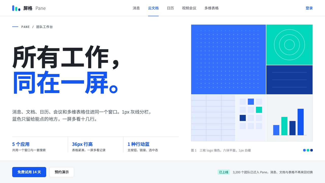 FeishuQuiet density, one blue. White panes split by 1px grey lines; blue marks only…
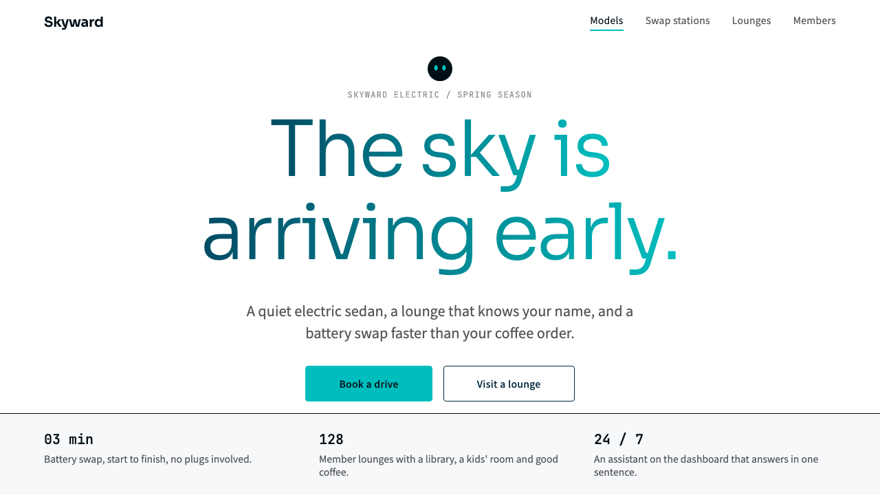 NIOQuiet premium with the sky in the headline. White pages, navy ink, one teal-t…
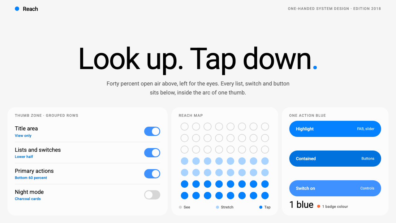 Samsung One UILook up, tap down. Giant Roboto title in open air, white 26px cards on grey,…
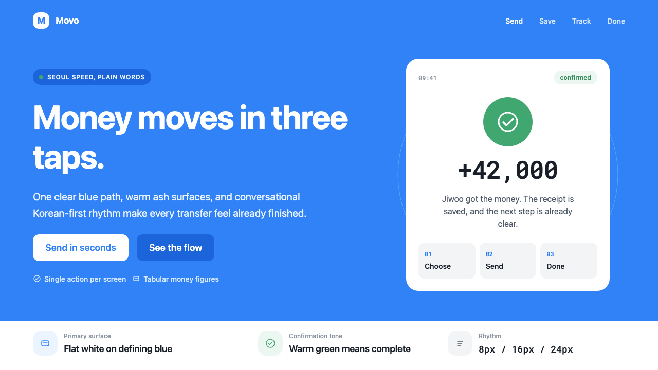 Toss Korean Fintech BlueMoney feels instant. Signature blue, Pretendard scale, and one-screen transfe…
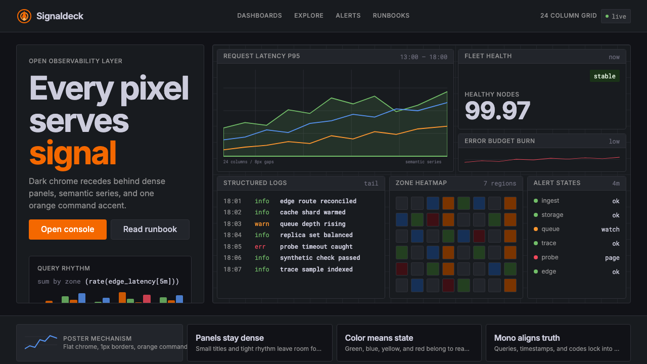 GrafanaData first, chrome last. Orange accent cuts through dense dark panels and sem…
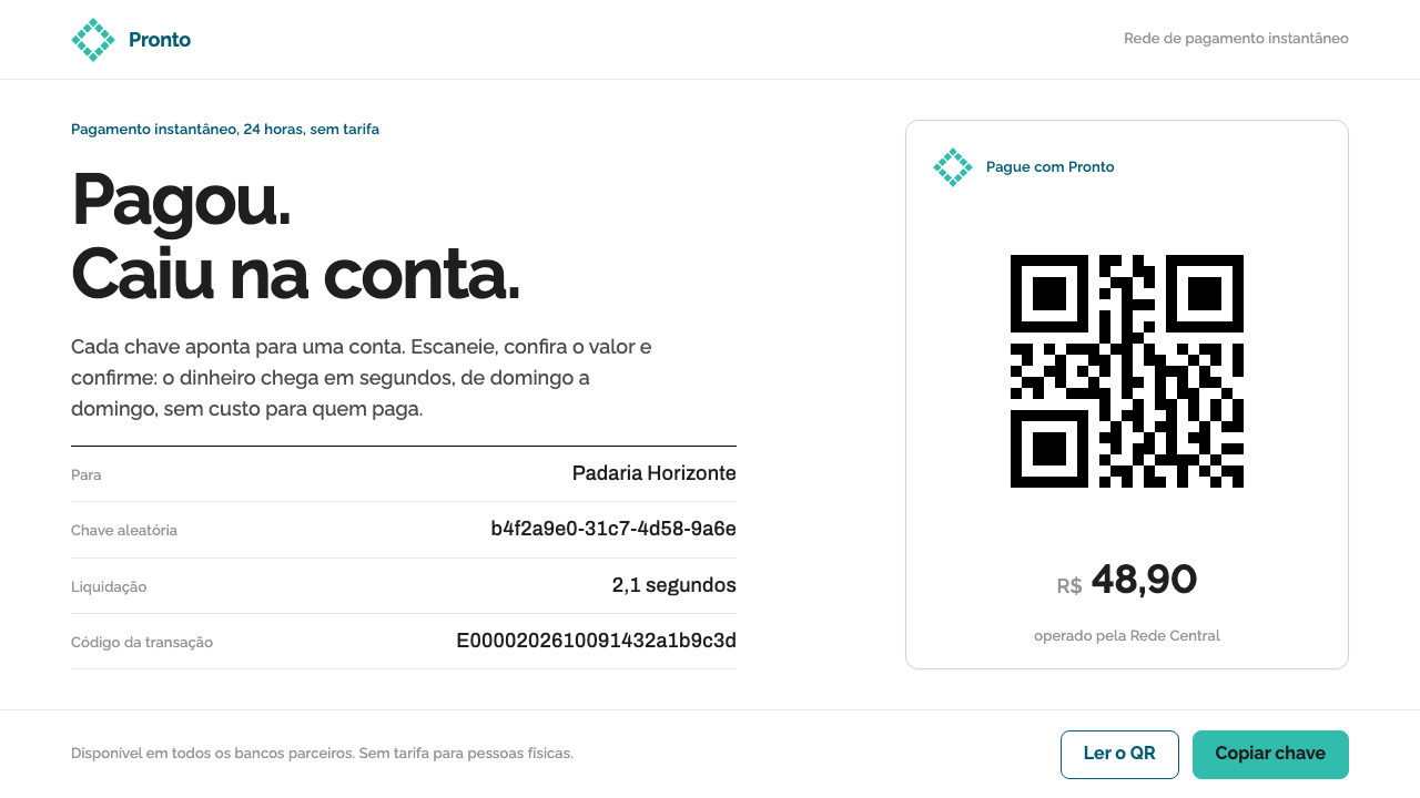 Pix Instant PaymentTrust through near-nothing. White sheets, one teal rhombus, a hard black QR a…