What is Pix Instant Payment?
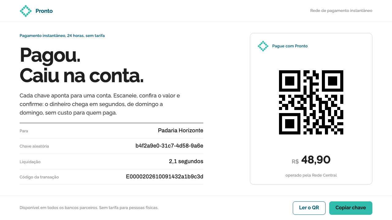
Pix earns trust through near-nothing: white sheets, one teal rhombus, institutional petrol for headings, and a hard black QR code as the hero of the screen.
Pix Instant Payment in brief
Pix Instant Payment is a payments interface style drawn from the instant-payment system that Banco Central do Brasil launched in November 2020. The identity it imitates is almost nothing, on purpose: a teal rhombus assembled from four arrows, a small grey line reading 'powered by Banco Central', and whatever white screen or laminated standee the mark happens to appear on. The style takes that restraint seriously and builds an entire visual system from it.
The ingredients are few. White sheets form the ground. One teal is used only for confirmation and success. An institutional petrol blue handles headers and links. Raleway sets payment keys and amounts, while Archivo, with its tabular figures, sets long strings such as identity numbers and transaction codes. The one thing that might look like decoration is not decoration at all: a real QR code, in black modules with the proper empty margin around it, placed as the main object on the page.
The aim is reassurance at a glance. A payment screen is a place where a person is spending money, often in a hurry and often in a shop with other people waiting, so the interface's job is to remove doubt, not to create delight. By being almost transparent, the style asks the user to trust the institution behind the system rather than the brand in front of it.

Where does Pix Instant Payment come from?
Pix was switched on by Banco Central do Brasil on 16 November 2020. The brand manual was drafted in mid-2020, and the visual system in this style has stayed current from launch to the present. The background material locates it in Brasília, with the added note that it extends to every corner shop across Brazil, an acknowledgement that the identity lives as much on a laminated sign beside a till as on a bank's app screen.
The key figures named in the background notes are Banco Central do Brasil itself, Roberto Campos Neto and the BCB Department of Banking Operations. That list is unusual for a design style: the names are not a studio or an art director but a public institution, a named official and a department. It signals that this is an identity of public infrastructure, authored by an institution and meant to be used by many others rather than owned by a single brand.
Three movements frame the style. State-built instant payment rails describes a model in which a central bank, rather than a private network, builds the infrastructure over which payments move in seconds. gov.br Padrão Digital de Governo, which translates as the Digital Government Standard, signals that the interface belongs to the world of public services and not of commercial branding. QR-first retail payment describes the everyday result: a merchant needs nothing but a printed code, and a customer needs nothing but a phone camera.
These origins explain why the style leans so hard on neutrality. A payment rail built by the state does not compete for attention with the banks that offer it; the same mark and the same QR code must sit comfortably inside many different bank apps and on countless different counters. A visual identity that works there has to be quiet, consistent and instantly legible. Within a year the system had spread across the country, with the material mentioning bakeries, nail salons and roadside stalls, so the style also had to survive printing and lamination.
What defines the Pix Instant Payment look?
White Sheets
The ground is white throughout. It behaves like a sheet of paper or a laminated sign rather than a screen with its own atmosphere, and it gives the QR code the clean, high-contrast background it needs to scan reliably. White also lets the single teal and the petrol blue each carry their meaning without competing with a tinted surface.
Teal for Confirmation
Teal is the colour of the Pix mark, and in this system it is held for one purpose: confirmation and success. A completed payment, a validated key, a check mark are teal; nothing else is. Because it appears so rarely, teal functions like a spoken 'done', and the user learns to read it that way.
Institutional Petrol Blue
Institutional petrol blue, a deep blue with a slightly green lean, handles headers and links. It is the colour of authority and wayfinding, deliberately more serious than the teal. Splitting roles between the two, petrol for structure and teal for outcome, means a user can tell navigation from confirmation without reading a word.
Raleway for Amounts
Raleway sets payment keys and amounts. Its clean, open letterforms suit large figures, so the amount of a payment is the biggest and clearest thing on a screen. Amounts and keys are the data a person must check before committing, so they get the typographic emphasis.
Archivo Tabular Strings
Archivo, with tabular numerals, sets long strings such as taxpayer numbers and transaction identifiers. Tabular figures give every digit the same width, so strings line up and can be compared character by character, which is exactly what a person does when verifying a code. This is typography as error prevention.
The QR Code as Hero
The QR code is rendered with real black modules on white, hard-edged, without rounded corners, logos or colour, and surrounded by a generous empty margin. It is placed as the main object on the page, large and central, rather than tucked beside a pay button. The principle is that the code's job is to be scanned, so it is treated as a functional object and never as an ornament.
A Nearly Empty Identity
The identity is a rhombus built from four arrows, a grey 'powered by Banco Central' line and nothing more. No gradients, textures or illustrations are added around them. Restraint is not a lack of effort here; it is the design message. A payment screen that looks like nothing in particular looks like it has nothing to hide.

Who shaped Pix Instant Payment?
Banco Central do Brasil, the central bank of Brazil, launched Pix in November 2020 and is named first among the key figures. It is the institutional author of the identity, which is why the grey 'powered by Banco Central' line is part of the mark. The style inherits an institutional tone: calm, plain and written for the public at large rather than a target segment.
Roberto Campos Neto is the one individual named in the background material, listed alongside the institution. The material does not describe what he did, so this article does not either. His inclusion shows that the project is documented as an act of public administration with a responsible name attached, which is part of why the visual system favours plainness over personality.
The BCB Department of Banking Operations is the third named entity, an internal department of the central bank. Naming a department rather than a creative team says something about how the identity was made: as part of operating a payment system, in which the brand manual drafted in mid-2020 had to produce an identity that worked for banks and shopkeepers alike.
How do you use Pix Instant Payment today?
The Pix style is built for moments of trust: paying, confirming, receiving. It fits anywhere the user must verify exact information and feel safe doing so.
For slides, covers can be almost empty: a white page, one teal mark or a short petrol-blue title, and nothing else. Content slides work as sheets of plain type, with amounts set large in the open geometric face and identifiers in the tabular face. For data, use sparse tables with aligned numerals rather than decorated charts, and use the teal only where a confirmation or success figure appears. A QR code on a slide should be large, black on white and framed by an empty margin.
In web and mobile UI, the style fits checkout flows, invoices, billing, wallet screens, public-service forms and receipts. Use petrol blue for headers and links, teal for success states, and keep everything else white and black. A payment screen should have the amount as the largest element, the key or identifier in the tabular face and the QR code as the central object. Dashboards in this idiom are quiet ledgers: tables with aligned numerals, minimal colour, and teal reserved for settled items.
For editorial and marketing work, take the retail standee as the model: a laminated white sign with a code, a short instruction and a small institutional line. Brochures, signage, merchant-onboarding guides and explainers for public services work better when they look like official documents than when they look like advertisements. Copy should be short, instructions numbered, and imagery limited to the code and the mark.
The most common mistake is to treat the QR code as a decorative element by rounding it, tinting it, putting a logo in the middle or shrinking its margin. All of these risk unreadability and erode the trust the style exists to build. Another is to spread teal into headings and buttons: once teal means everything, it no longer means confirmed. And avoid adding friendly illustration or gradient, because the style's warmth comes from reliability.

Pix Instant Payment — FAQ
Why is there so little colour?
Because the identity itself is almost nothing: a teal rhombus, a grey 'powered by Banco Central' line, and white. A payment rail built by a central bank has to look the same inside many different bank apps and on laminated signs at counters, so it avoids anything that would date or personalise it. Limiting colour to two roles, teal for confirmation and petrol blue for headers and links, also makes each use meaningful.
What are Raleway and Archivo each for?
Raleway sets payment keys and amounts, where a clean, open face makes the key figures easy to take in. Archivo, with tabular numerals, sets long strings such as identity numbers and transaction codes, because equal-width digits line up and can be checked character by character.
Why does the QR code get so much attention?
In QR-first retail payment the code is the interface: a merchant prints it, a customer scans it, and the exchange is complete. The style therefore treats it as the main object on the page, in black modules on white, with hard edges and a generous empty margin and no decoration, since anything that interferes with scanning interferes with the payment itself.
Is the style only for payments?
It is best for payments, billing and public services, but the principle extends to any interface where a person must verify exact information and feel safe: receipts, identity checks, appointment confirmations, government forms. It is a poor fit for entertainment or brand-led experiences, where the deliberate absence of personality would feel flat.
Can I use the Pix style for my own payment product?
You can use its approach, meaning white sheets, rationed colour and a code as the hero, for your own interface. The Pix name, the rhombus mark and the central bank's attribution line belong to the real system, so a product built on this style should carry its own identity and should not suggest an official connection.
Related design styles
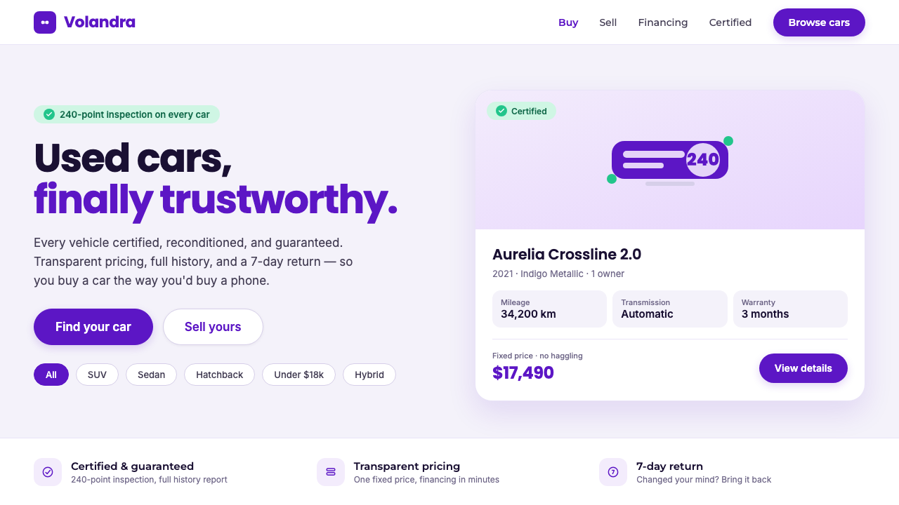 Kavak MarketplaceUsed cars, finally trustworthy. Kavak Purple on violet-tinted white, green ce…
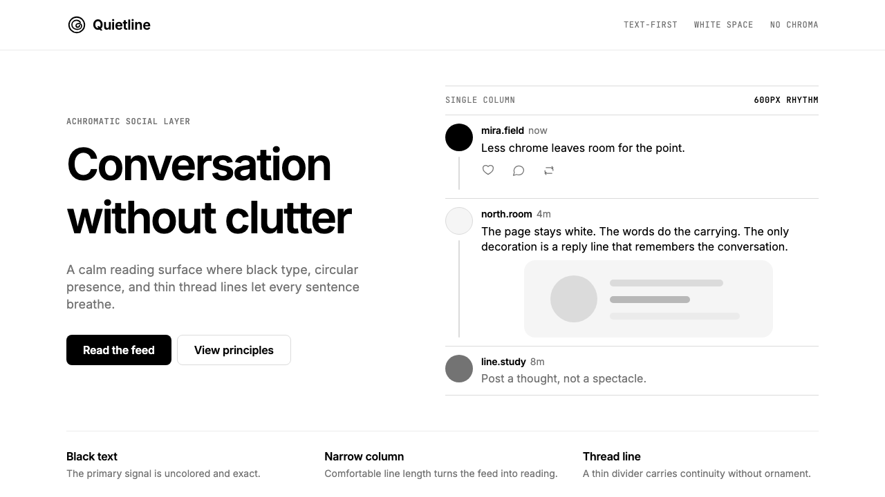 Threads (Meta)Restraint is the brand. Black Inter type, narrow feed, thin connectors, white…
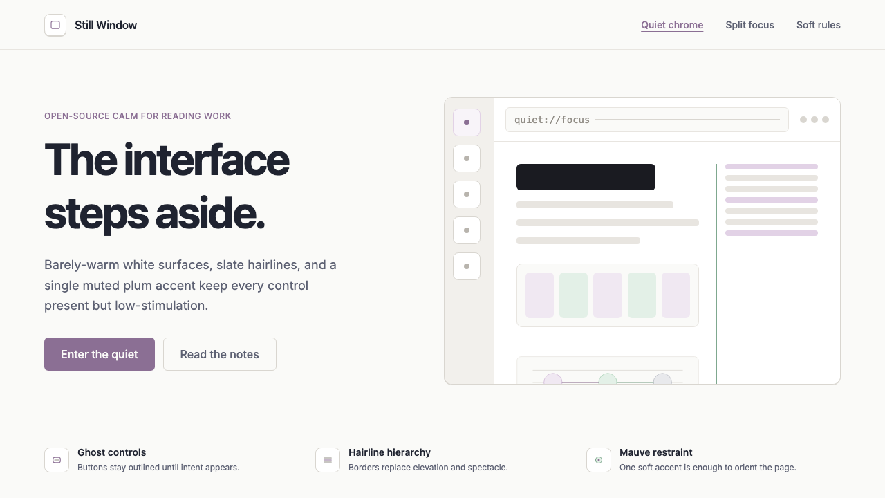 Zen BrowserSoftware steps aside. Warm white, slate hairlines, and muted plum carry the c…
 1Password Purple VaultSecurity stays quiet. Vault purple, Inter type, and crisp white cards do the…
 Android Bugdroid GreenFriendly tech, reduced to geometry. Vivid green pops from Grey 900 and rounde…
 AsanaCalm productivity breathes. Cream canvas, lavender panels, coral-blue-yellow…