What is Samsung One UI?
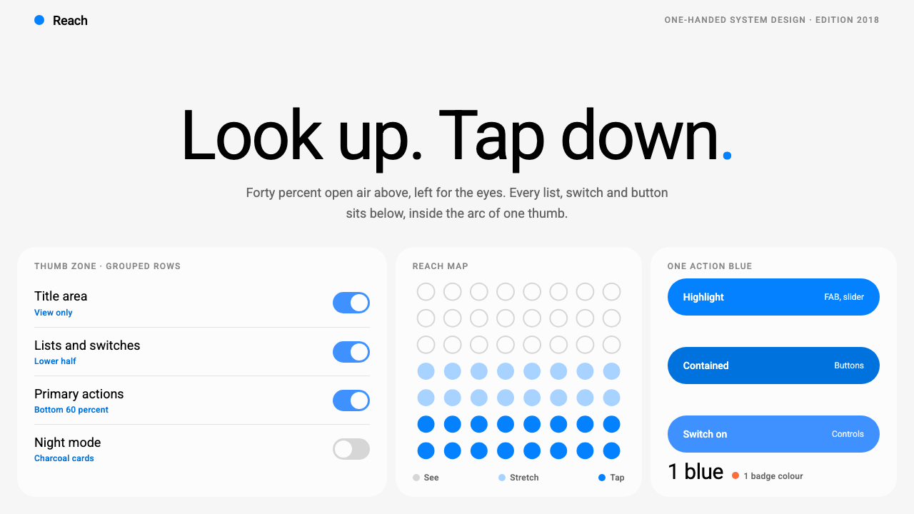
Samsung One UI cut every screen in half: the top for the eyes, the bottom for the thumb, with one quiet blue marking where to press.
Samsung One UI in brief
Samsung One UI is the interface system Samsung introduced in 2018 for its Galaxy phones, and its defining idea is reachability. As phone screens grew, the top edge moved out of range of a thumb holding the device in one hand. One UI answers by splitting every screen into two zones. The upper half is open air, holding one oversized title and a small line of supporting text, with nothing to tap. The lower half is where lists, switches and buttons live, inside the arc a thumb can actually sweep on a large phone.
Visually the style is calm and deliberately plain. Content sits in near-white rounded cards laid on a light grey window, and the cards are separated by tone rather than by shadow. A single trustworthy blue is the only action colour, used on the floating action button, sliders and highlights. Typography is a clean humanist sans-serif in a regular weight, with the large title doing the work of orientation through size alone rather than boldness.
A night mode flips the entire system to a near-black ground with charcoal cards, preserving the same layout and the same single blue. The overall impression is of a system interface that never competes for attention: spacious at the top, practical at the bottom, quiet everywhere. It suits products that people use one-handed and repeatedly, such as settings, utilities, messaging, health and productivity apps, where comfort over many months matters more than visual drama.

Where does Samsung One UI come from?
One UI was announced in November 2018 at the Samsung Developer Conference and reached consumers the following year with the Galaxy S10. It replaced an earlier skin on Samsung's Android phones, and the shift in approach was clear from the start. The company's reasoning was ergonomic before it was aesthetic: as flagship phones grew taller and wider, the most important controls had to move toward the place where the thumb naturally rests. The visual style that resulted is largely a consequence of that single physical constraint.
Two names are attached to the background of this style. DJ Koh, known in Korea as Koh Dong-jin, led Samsung's mobile business during the period when the system was announced and released. Christian Robertson is the type designer behind Roboto, the typeface that became the default voice of the interface in the version of One UI this style documents. Roboto had originally been created for Android itself, so its adoption tied Samsung's skin closely to the wider Android typographic tradition even as the layout departed from stock Android conventions.
The visual identity that this style records runs from roughly 2019 to 2023, spanning the first One UI releases through version 5.1. Within that period, the system was shaped by three movements named in its background: one-handed reachability design, large-screen Android skins and system-wide dark mode, which arrived in 2019. Each shaped a different part of the look. Reachability produced the split between upper viewing area and lower touch area. The large-screen skin context pushed toward generous scale for titles and touch targets. Dark mode demanded a palette simple enough to invert cleanly.
The place of origin is Suwon, South Korea, home of Samsung's headquarters, and the design has a certain regional restraint: no flourishes, no mascots, a preference for tidy rounded forms and clear hierarchy. Over time, One UI became less a single product than a language shared across phones, tablets and folding devices, with the same principle of calm, thumb-aware layout adapted to each screen size. What survives in this style is that principle in its clearest early form.
What defines the Samsung One UI look?
Look up, tap down
Every screen is divided into a viewing zone and an interaction zone. A large title floats in open space at the top with a small count or caption beneath it, and nothing in this area is meant to be touched. All controls are pulled toward the lower half, where a thumb can reach them without shifting the grip. This split is the foundation of the whole look and should be preserved even when the content changes.
Large, quiet titles
The headline is set very large in a regular weight, in a clean sans-serif. It announces where you are through scale alone, with no bold emphasis and no decoration. The generous empty area around it is part of the design; it creates a feeling of calm and gives the eye a place to rest before the interactive part begins.
Rounded cards on a grey window
Content groups sit inside near-white cards with generously rounded corners, placed on a light grey ground. The cards are separated from the window by tone, not by drop shadow, which keeps the surface flat and avoids visual weight. Related items share a card, and gaps between cards mark the boundaries between groups.
One trustworthy blue
There is a single accent colour, a clear mid-saturation blue. It marks the floating action button, slider tracks, selected states and highlights, and nothing else. Because there is only one, it becomes an unambiguous signal: where blue appears, something is active or actionable. The rest of the palette is neutral greys and whites.
Night mode as an inversion
The dark version swaps the grey window for a near-black ground and the white cards for charcoal ones, while keeping the same layout, spacing and single blue. Because the light theme is already built on tonal separation instead of shadow, it inverts cleanly: the card-on-ground relationship survives and the interface looks like itself in both modes.
Humanist type that stays out of the way
The typeface is Roboto, a neutral and widely familiar sans-serif. Hierarchy comes from size and spacing instead of from heavy weights or contrasting faces. The result is a voice that feels like part of the operating system rather than a brand, which is exactly what a system interface should sound like.
Large, forgiving touch targets
List rows, switches and buttons are given ample height and generous spacing so that a thumb can hit them without precision. Controls are spaced apart rather than packed, trading information density for comfort. This is consistent with the reachability goal: an interface for a large phone must forgive an imprecise press.

Who shaped Samsung One UI?
Koh led Samsung's mobile division when One UI was announced in 2018 and shipped with the Galaxy S10 the following year. He is the executive name attached to the design direction, and his tenure frames the company's decision to treat the software experience of its phones as seriously as the hardware.
Robertson is the type designer who created Roboto. Its clean, neutral shapes became the default typeface of this version of One UI, which is why the interface speaks in the same voice as the wider Android ecosystem while using a very different layout.
The annual developer event where One UI was first announced in November 2018. It is the public starting point of the system and a reminder that the design was introduced as a platform for developers to build on, not only as a skin for Samsung's own apps.
How do you use Samsung One UI today?
In slides, translate the split between viewing and interaction into a split between headline and content. A cover can be extremely simple: a large title in regular weight placed in the upper third of a light grey slide, with a small subtitle beneath and everything else left empty. Content slides should place the title high, then put the information in one or two near-white rounded cards in the lower portion. Data slides work well when each metric or chart sits in its own card, and the single blue is reserved for the one number or series the audience should notice.
On the web and in apps, the style suits utilities, settings, messaging, health, finance and productivity products, especially on mobile. Use a large, quiet page title with a small count or status line, then group controls into rounded cards on a grey background. Place primary actions in the lower half, and consider a floating action button in the single blue for the most common task. Keep list rows tall and generously spaced. On desktop, the same logic can be preserved by narrowing the content column and leaving the top of each page open.
For editorial and marketing work, the look is a good fit for explainers, product tours and onboarding sequences where clarity beats drama. A hero section can follow the same structure: a very large headline in open space, followed by a card containing the call to action. Feature lists can be presented as stacked rounded cards, each with a short heading and one line of text. The restraint of a single accent colour makes the occasional highlight feel meaningful.
The style also adapts to hardware companions, kiosks and in-car or wearable displays, wherever a person has one free hand or limited attention. The principle to carry across is not the specific shapes but the ergonomic logic: keep non-interactive information at the top, place everything that must be touched where the hand naturally rests, and make the targets large. Dark mode should be offered from the start, since the system is built to invert.
The most common mistake is to copy the rounded cards and grey background but abandon the split layout, placing controls at the top of the screen where a thumb cannot reach them. A second mistake is to add several accent colours, or to make the title bold and small, which removes the quiet openness that defines the style. Finally, avoid heavy shadows: the card separation depends on tone, and adding drop shadows turns the calm surface into a cluttered stack of floating panels.

Samsung One UI — FAQ
What problem was One UI designed to solve?
It was designed around one-handed use on large phones. As screens grew, the top edge became hard to reach with a thumb, so One UI moved everything interactive into the lower half and left the upper half for a large title and quiet supporting text. The visual style follows from that ergonomic decision rather than from a purely aesthetic one.
Why does the style use only one accent colour?
A single blue makes the meaning unambiguous: wherever it appears, an element is active, selected or actionable. With surfaces built from neutral greys and whites, that one colour carries all the signalling, and it also makes the system easy to invert for night mode without recalculating a whole palette.
How is this different from stock Material Design?
They share Roboto and the broader Android ecosystem, but One UI places much more emphasis on layout. The large title in open space, the strict split between viewing and touch zones, tonal separation instead of shadows and the generous rounded cards make it feel calmer and more spacious than a typical Android app, with reachability as the organising principle.
Can I use the style for desktop products?
Yes, though the reachability logic matters less on a large screen with a mouse. The transferable parts are the open title area, the rounded cards on a grey ground, the tonal separation and the single accent colour. Narrow the content column, keep generous spacing, and the calm character survives even without a thumb in the picture.
How should dark mode be handled?
Treat it as an inversion, not a separate design. Swap the light grey ground for a near-black one and the near-white cards for charcoal ones, keep the layout and spacing identical, and keep the same single blue. Because the light theme already relies on tone rather than shadow, the card-on-ground relationship holds in both modes.
Related design styles
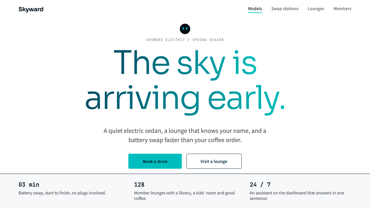 NIOQuiet premium with the sky in the headline. White pages, navy ink, one teal-t…
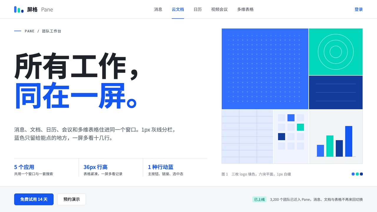 FeishuQuiet density, one blue. White panes split by 1px grey lines; blue marks only…
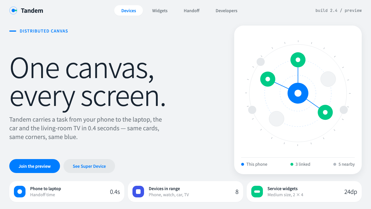 HarmonyOSOne blue for everything you can touch. White 24px cards on cool grey, navy te…
 Threads (Meta)Restraint is the brand. Black Inter type, narrow feed, thin connectors, white…
 Universal Translator EarpieceTwo languages, one white sheet. Stacked Noto cards, mono fine print, coral on…
 Zen BrowserSoftware steps aside. Warm white, slate hairlines, and muted plum carry the c…