About Samsung One UI
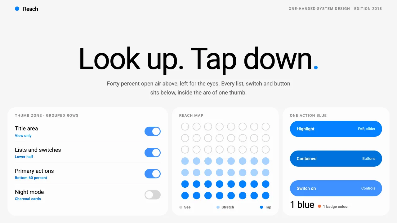
Samsung One UI split every screen in two. The top half is open air: one oversized title and a small count, nothing to tap. The bottom half is where the lists, switches and buttons live, inside the arc a thumb can actually reach on a 6-inch phone.
Content sits in near-white rounded cards on a light grey window, separated by tone rather than shadow. A single trustworthy blue, #0381FE, marks the FAB, sliders and highlights. Night mode flips the whole thing to near-black with charcoal cards.
- Origin
- Suwon, South Korea
- Era
- 2018 announced at SDC; Roboto-default visual 2019–2023 (One UI 1.0 through 5.1)
- Key figures
- DJ Koh (Koh Dong-jin) · Christian Robertson
- Movements
- one-handed reachability design · large-screen Android skins · system-wide dark mode (2019)
Samsung One UI design spec
Colors
Background
Surface
Primary
Secondary
Accent
Text
Typography
RobotoHeadings
Roboto MonoMono
Unlock for 1 credit
The other 11 sections — buttons, cards, spacing, motion, techniques and more — open once you unlock. Download the DESIGN.md or send it to your AI in one click. Unlock once, yours forever.
Sign up nowHave an account? Sign in
Styles similar to Samsung One UI
Also inspired by brands & products, with a close feel.
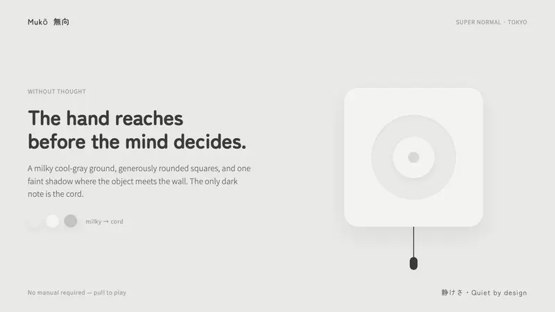 Fukasawa Without ThoughtHand reaches before mind decides. Milky cool-gray plastic, rounded squares, one faint wall shadow.
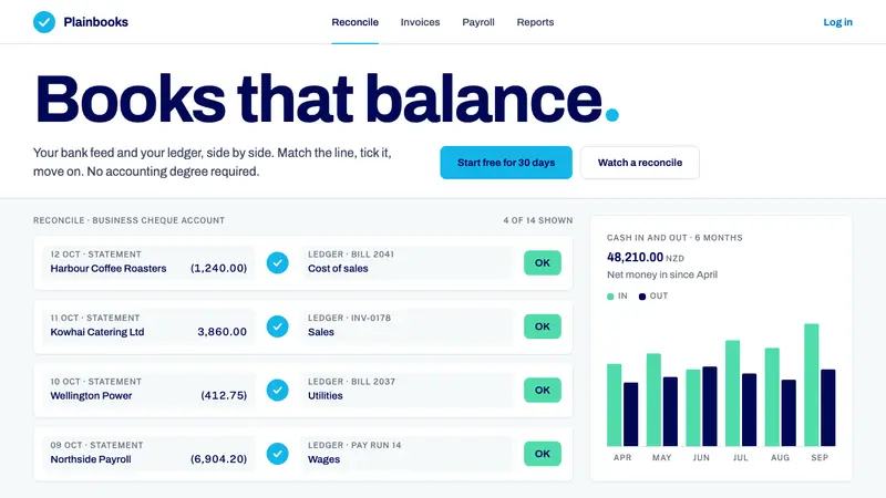 Xero AccountingCalm money, made scannable. White ledger cards, one sky-blue circle, navy only as ink.
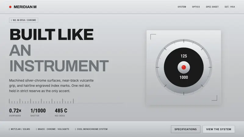 Leica M Silver ChromeBuilt like an instrument. Brushed silver-chrome on near-black vulcanite, one red dot, lone accent.
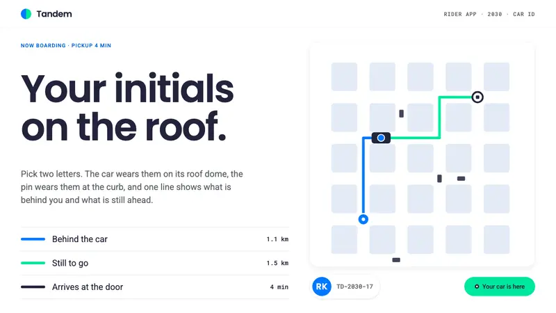 Robotaxi Rider AppYour initials, on the roof. One 6px route line flips blue to green at the car, on a white map.