What is Universal Translator Earpiece?
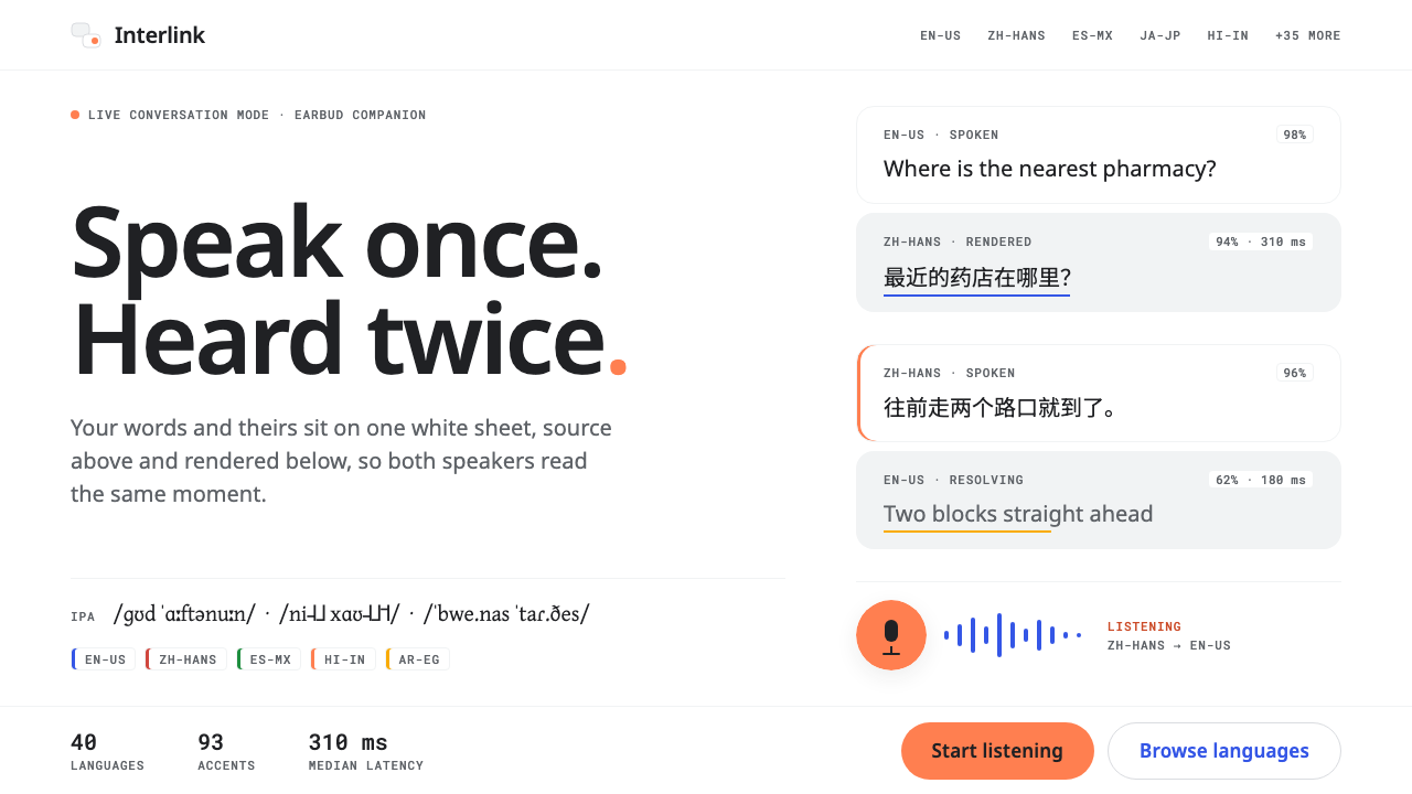
Universal Translator Earpiece puts two languages on one white sheet: stacked cards, grey mono fine print, and coral reserved for the live microphone.
Universal Translator Earpiece in brief
Universal Translator Earpiece is a design language drawn from the screens that accompany live-translation earbuds and handheld translators. Its reference points are the conversation mode of Pixel Buds, Timekettle's M2 and Pocketalk. The common interface in those products is strikingly simple: two white cards stacked vertically, the sentence that was spoken above and the sentence that was rendered below.
Everything else is pushed to the edges. Confidence scores, latency, and language codes are reduced to a single line of grey monospaced fine print, present for the curious but invisible to the person in conversation. The only warm color on screen is coral, borrowed from the coral colorway of the Pixel Buds Pro and spent entirely on the listening state, so that one glance tells you whether the device is hearing you.
The type is Noto throughout. The reasoning is practical and almost moral: when forty languages and a hundred accents may appear on the same screen, no character is allowed to turn into an empty box. The style is therefore quiet by design. It tries to disappear so that a conversation between two people who do not share a language can feel like a conversation.

Where does Universal Translator Earpiece come from?
The timeline of this style begins in 2017, when Pixel Buds first offered real-time translation, and runs to the present. Timekettle's M2 followed in 2021, and the Pixel Buds Pro arrived in its coral colorway in 2022. These dates are less important as product history than as the moment translation moved from a typed query on a phone to a continuous, hands-free activity in the ear. That shift created a new interface problem: a screen that is only glanced at, between sentences, by two people looking at each other rather than at the device.
The solution that emerged is geographically spread. The design culture comes from several places at once: Mountain View, Shenzhen and Tokyo. Google's Pixel Buds set expectations for light surfaces and clear status states. Shenzhen's hardware makers, including Timekettle, brought translation earbuds and pocket devices to a global consumer market. Japanese devices such as Pocketalk had already made the dedicated handheld translator familiar to travelers. The system synthesizes what these have in common instead of imitating any single brand.
Three traditions sit underneath. The first is Material Design's light surfaces, with white cards on a pale ground, clear elevation and a single accent for the active state. The second is the Unicode ideal of universal coverage, summed up in the phrase No Tofu: the commitment that no character should display as a blank rectangle. The third is conversational voice UI, in which speech is the primary input and the screen is secondary evidence of what the system understood.
The two typographers named in the source material anchor the typographic side. Steve Matteson, the designer behind the Droid family and the Noto Sans work that grew out of it, stands for the humanist, neutral sans-serif that covers a wide range of scripts. Victor Gaultney, known for the Gentium family and work on typefaces for many writing systems, stands for the commitment to extensive language support and careful treatment of diacritics. Together they stand for a typographic ethic rather than a look: legibility across languages comes first, and style comes second.
What defines the Universal Translator Earpiece look?
Two stacked cards
The defining layout is a pair of white cards, one above the other. The upper card holds the original speech and the lower card holds the translation, or the reverse on the other speaker's turn. The symmetry gives both languages equal status, and the vertical stack suits a device held between two people.
White sheet, no decoration
The ground is plain white or very nearly so, with only light separation between cards. There are no gradients, patterns or illustrations. The interface behaves like a sheet of paper on which the conversation is written, and any ornament would only distract from the words.
Mono fine print
Metadata such as language codes, confidence and latency appears in small grey monospaced type on a single line. It is useful to engineers and curious users, but low in contrast on purpose. Monospace signals this is system information, not part of the dialogue.
Coral for listening
Coral is the only warm color and it has a single job: to show that the microphone is live. It may appear as a ring, a dot or a thin outline, and when the device is idle it disappears. This one-color-one-meaning rule makes the state readable at a glance, even from across a table.
Noto for every script
Type is the Noto family so that Latin, Arabic, Chinese, Devanagari, Thai and many other scripts have a matching, real font rather than fallback boxes. Arabic is set right to left with its own proper face, and phonetic notation gets a font that actually contains its symbols. Scripts are never faked with Latin look-alikes.
Generous line height
Because scripts differ in vertical extent, text is given a roomy line height so accents, stacked marks and tall letterforms never collide. Cards expand to fit whatever length the translation takes, since one language is often longer than another.

Who shaped Universal Translator Earpiece?
Type designer associated with Droid and the Noto Sans effort, representing neutral, wide-coverage sans-serif type for screens.
Type designer known for Gentium and for typefaces supporting many writing systems, representing careful diacritics and broad language support.
How do you use Universal Translator Earpiece today?
For slides, this style suits product demos, localization talks and cross-cultural presentations. A cover can be a white field with a pair of stacked cards carrying a phrase in two languages. Content slides work well as pairs: the original on top, the translation below. Data slides, such as latency or accuracy figures, should be kept in the grey monospaced fine print, with coral used only to highlight a single live metric.
For web and app interfaces, it is a natural fit for translation tools, language-learning apps, messaging with auto-translate, customer support consoles, captioning, accessibility features and any product where two languages meet. Use stacked cards for conversation turns, a status ring in coral for recording or listening, and keep controls to a minimum. Settings and history screens can follow the same white sheet with small grey metadata.
For editorial and marketing work, the style suits clean explainers about language technology, travel apps and multilingual help centers. Layouts should show text in two scripts side by side or in stacked pairs, with ample space and a limited palette. Photography is optional; if used, it should be calm and human, with the interface kept in a clearly separate card.
A common mistake is using coral broadly. When it appears on buttons, icons and headings, it no longer tells the user that the microphone is live. Another is selecting a stylish display font that lacks coverage; one missing glyph can undermine the whole idea of the system. A third is overloading the cards with confidence bars and badges, which turns a conversational surface into a diagnostics panel.

Universal Translator Earpiece — FAQ
What is the Universal Translator Earpiece design style?
It is a light, minimal interface style drawn from live-translation earbud apps: two stacked white cards for original and translated speech, grey monospaced fine print for metadata, Noto type for every script, and coral used only for the listening state.
Why is Noto used for everything?
Noto is designed to cover many scripts so that no character appears as an empty box. In a translator, where unpredictable languages appear in real time, that reliability matters more than stylistic variety.
Why is coral the only warm color?
Coral is borrowed from the Pixel Buds Pro colorway and used only for the listening state. Giving the color a single meaning lets people see at a glance whether the device is hearing them.
What products inspired the style?
The reference points are Pixel Buds conversation mode, Timekettle's M2 and Pocketalk, along with the broader traditions of Material Design light surfaces and conversational voice interfaces.
Where does the style work best?
Translation tools, language-learning apps, messaging, captions, support consoles, accessibility features and any multilingual product that wants a quiet, text-first interface.
Related design styles
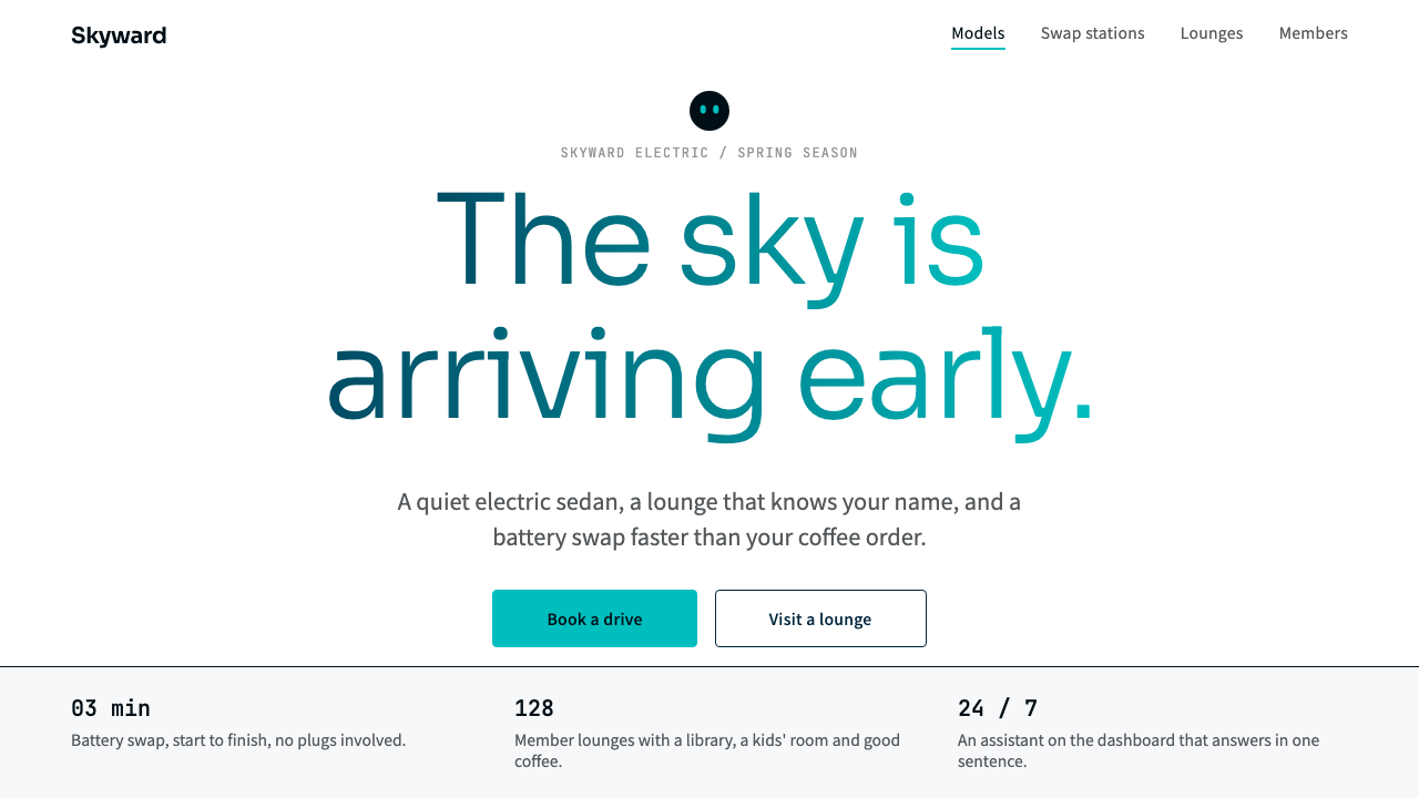 NIOQuiet premium with the sky in the headline. White pages, navy ink, one teal-t…
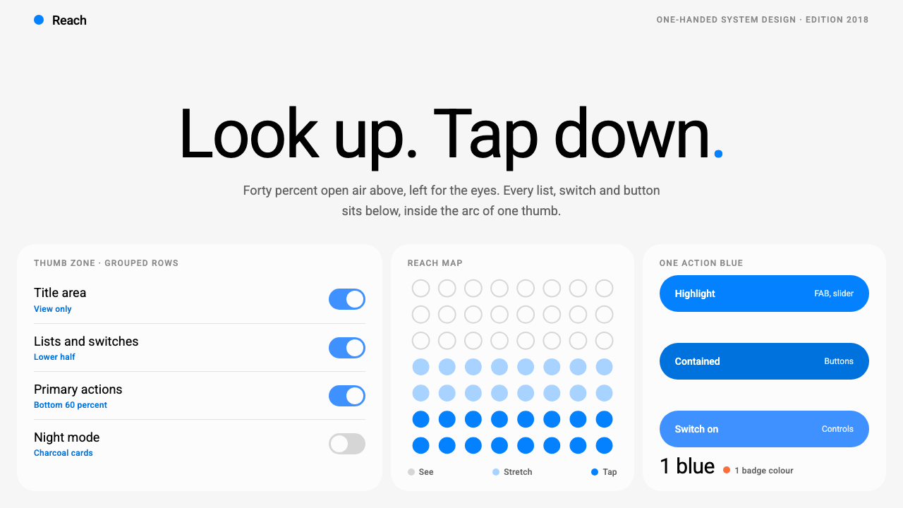 Samsung One UILook up, tap down. Giant Roboto title in open air, white 26px cards on grey,…
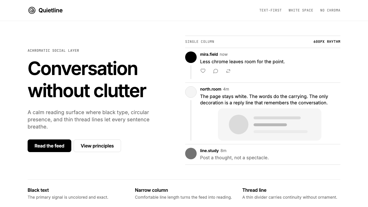 Threads (Meta)Restraint is the brand. Black Inter type, narrow feed, thin connectors, white…
 Zen BrowserSoftware steps aside. Warm white, slate hairlines, and muted plum carry the c…
 1Password Purple VaultSecurity stays quiet. Vault purple, Inter type, and crisp white cards do the…
 Android Bugdroid GreenFriendly tech, reduced to geometry. Vivid green pops from Grey 900 and rounde…