What is NIO?
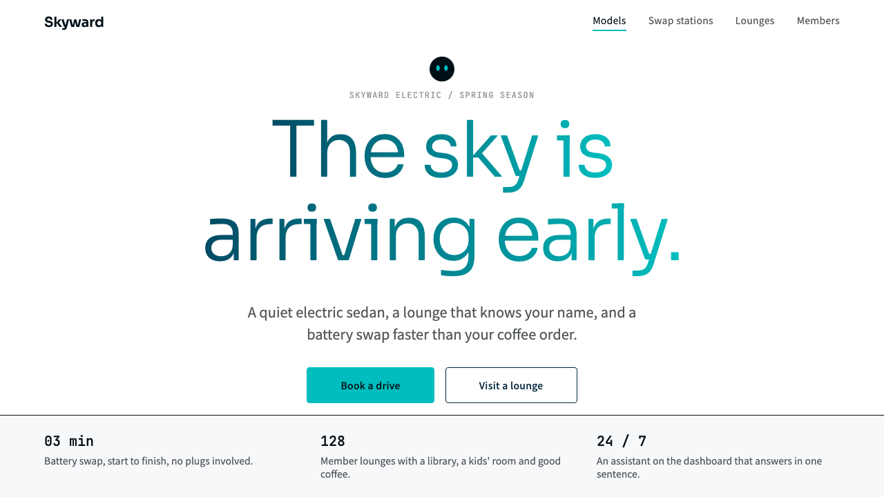
NIO's digital language is quiet premium with the sky in the headline: white pages, deep navy ink, and a single teal-to-cyan gradient poured into the type that matters most.
NIO in brief
The NIO style is the visual language of the website and app surfaces of the Shanghai electric-vehicle maker founded in 2014. Its English tagline, Blue Sky Coming, is the starting point, and the interface keeps that promise almost literally: white pages, cool off-white panels, near-black navy for text, and one deep-teal-to-cyan gradient that fills the headline type and almost nothing else.
What separates it from a generic clean tech look is restraint with a purpose. Colour is held back so that the product and the person speaking to it carry the page. Buttons are crisp, surfaces are calm, and the gradient is rationed so strictly that it reads as a signature rather than a decoration. The result is premium without being cold, which is a difficult balance for technology and service interfaces.
The warmth does not live in the page ornament at all. It comes from elsewhere in the brand: a round on-dashboard face called NOMI that blinks as a greeting, and physical NIO Houses built from terrazzo, Douglas fir and mirrored ceilings. The digital system pairs that calm product frame with a friendly, member-first voice, so the screen stays quiet while the language speaks to the owner as a member of a community.

Where does NIO come from?
NIO launched in Shanghai in 2014, and its English line, Blue Sky Coming, made the name itself a promise. The source material places the company within a group it calls Chinese premium EV brands, a wave of makers that tried to meet global luxury expectations in a new category rather than copy the established grammar of petrol-car marketing. For such a brand the website is the first showroom, and a visual language that feels composed and unhurried was a natural way to signal premium intent.
The brand's public history is marked by a short list of vehicles. The EP9 appeared in 2016, the ES8 in 2017, and the ET7 in 2021. The web visual that this style describes is dated to roughly 2021 through 2024, which means it belongs to the period when the company was already established and could afford to say less. Earlier stages of a young carmaker often shout; this later surface speaks in a lower voice, and the white ground with navy type shows the confidence of a company that no longer needs to explain itself loudly.
A second strand in the origin is what the source calls the user-enterprise community model. NIO treats owners as members of a relationship rather than one-time buyers, and the physical NIO Houses, with terrazzo floors, Douglas fir and mirrored ceilings, act as living rooms for that community. The digital style borrows this logic. Its voice is friendly and member-first, and its restraint leaves room for the human elements, the round NOMI face on the dashboard blinking hello, to supply the warmth.
The third strand is a Scandinavian-led brand identity. The people and studios named among the key figures include William Li, the founder known as Li Bin, along with Kris Tomasson, Stockholm Design Lab and Schmidt Hammer Lassen. The last two are Nordic names, and the movement tag in the source says plainly that the identity has a Scandinavian lead. That lineage explains much of what the screens look like: pale surfaces, disciplined colour, natural materials echoed in the physical spaces, and a calm that reads as design confidence rather than minimalism for its own sake.
What defines the NIO look?
Colour
The palette is white and cool off-white for surfaces, with near-black navy for text. There is exactly one expressive colour move, a gradient running from deep teal to a sky-like cyan. It is reserved for headline type, so the eye learns that the gradient means something. Everything else stays neutral, and functional colour is kept quiet.
Gradient discipline
The sky gradient is applied to the type itself rather than to backgrounds, buttons or cards. Used once per view at most, it behaves like a signature. Spreading it across panels would turn a promise into wallpaper, so the rule is simple: one gradient, one headline, nothing competing with it.
Typography
Type is clean and modern, set in navy rather than pure black so that long reading stays soft against the white. Headlines are large and confident because they carry the gradient; supporting text is plain and generously spaced. Hierarchy comes from size and placement, not from decorative faces or heavy effects.
Surfaces and space
Pages are white and panels are slightly cooler off-white, so layers are distinguished by a barely visible tonal shift rather than by heavy borders or shadows. Space is generous. The calm of the layout is part of the message: a premium product does not need to crowd the screen to prove itself.
Buttons and controls
Buttons are described as crisp: clearly shaped, clearly labelled and quiet in colour. They do not compete with the headline gradient. The interaction vocabulary is plain and dependable, which suits an owner who comes to check a service, book a visit or read about a car and wants the interface to get out of the way.
Voice
The tone is friendly and member-first. Copy addresses the person as part of a community, in line with the brand's user-enterprise model. This warm voice is what keeps the very restrained visual frame from feeling cold, and it should be kept together with the visuals rather than replaced by generic marketing language.

Who shaped NIO?
Named in the source as a key figure; the founder of NIO, which launched in Shanghai in 2014 under the line Blue Sky Coming.
Listed among the key figures of the style, associated with the brand identity and design direction behind the Scandinavian-led look.
A Nordic studio named among the key figures, part of the Scandinavian-led brand identity lineage that shapes the calm, composed visuals.
A Nordic architecture practice listed among the key figures, connected to the physical NIO House spaces whose terrazzo, Douglas fir and mirrored ceilings the digital style echoes.
How do you use NIO today?
For slides, use the NIO style for a cover where the title carries the only gradient and everything else is white and navy. A single large headline on an empty white field is enough. Content slides work best with generous margins, a short navy heading and two or three lines of body copy, and a data slide should use neutral grey-blue chart marks with the gradient left out entirely, since the gradient belongs to titles.
For web and app interfaces, the style suits service-oriented products: an owner dashboard, a booking flow, a membership page, a support centre. Keep panels in the cool off-white, keep buttons crisp and few, and let status information be calm rather than alarming. A pricing or plan page should present options as quiet cards with clear comparison, using the gradient only on the single headline that frames the choice.
For editorial and marketing pages, the style gives a campaign page an unhurried, premium feel. Pair a big gradient headline with a clean photograph or product render and plenty of white. Long-form stories about a community, a service or a technology release read well in navy on white, and the friendly member-first voice can carry the personality that the restrained visuals deliberately do not.
It also fits technology and service products outside the automotive field, anywhere the brief is premium but not cold: a fintech onboarding, a health service, a membership club. The source frames it as suitable for interfaces that need that premium-but-warm balance, so the question to ask is whether the product wants to speak calmly to a person rather than shout at a crowd.
The most common mistake is spreading the gradient. Once it appears on buttons, cards, icons and backgrounds, the one signature moment is lost and the page becomes generic cyan branding. A second mistake is replacing the navy ink with pure black or the cool off-white with warm beige, which breaks the sky-like temperature of the system. Finally, do not add heavy shadows or decorative illustrations; the warmth is supposed to come from voice and from human touches, not from visual noise.

NIO — FAQ
What is the NIO design style?
It is the visual language of NIO's digital surfaces: white pages, cool off-white panels, near-black navy text, and one teal-to-cyan sky gradient reserved for headlines. It aims to feel premium without being cold, and it pairs a calm product frame with a friendly, member-first voice.
Why does the gradient appear only on headlines?
The gradient stands for the Blue Sky Coming idea, and rationing it makes it a signature. Applied to type once per view, it directs attention to the key message. Used on buttons or backgrounds, it would turn the promise into decoration and lose its meaning.
Where does the warmth of the NIO style come from?
Not from ornament on the page. The source points to the round NOMI face that blinks on the dashboard and to NIO Houses built from terrazzo, Douglas fir and mirrored ceilings. The digital system keeps the screen quiet and lets a friendly voice and human details supply the warmth.
What kinds of products suit this style?
Technology and service interfaces that need a premium but approachable feel, such as owner dashboards, booking and membership flows, support centres and calm campaign pages. It is less suited to playful, high-energy or heavily decorated products that depend on loud colour.
Where does the style come from historically?
It comes from NIO, launched in Shanghai in 2014, and its current web visual, dated to roughly 2021 to 2024. Its lineage includes Chinese premium EV brands, the user-enterprise community model and a Scandinavian-led brand identity, with Stockholm Design Lab and Schmidt Hammer Lassen among the named figures.
Related design styles
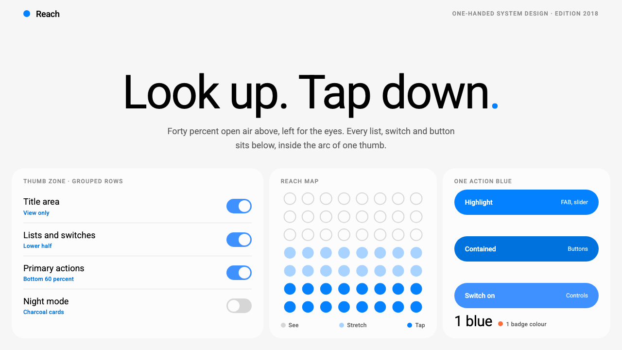 Samsung One UILook up, tap down. Giant Roboto title in open air, white 26px cards on grey,…
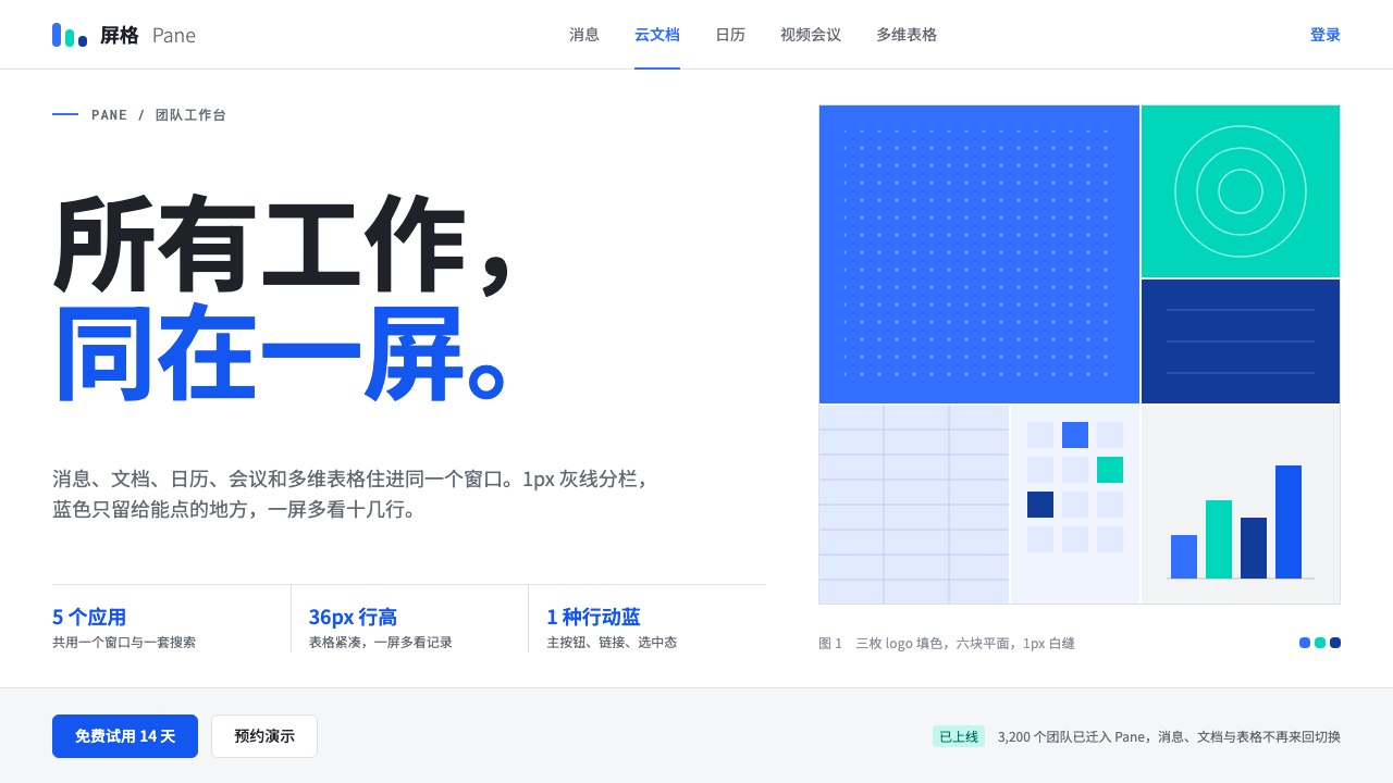 FeishuQuiet density, one blue. White panes split by 1px grey lines; blue marks only…
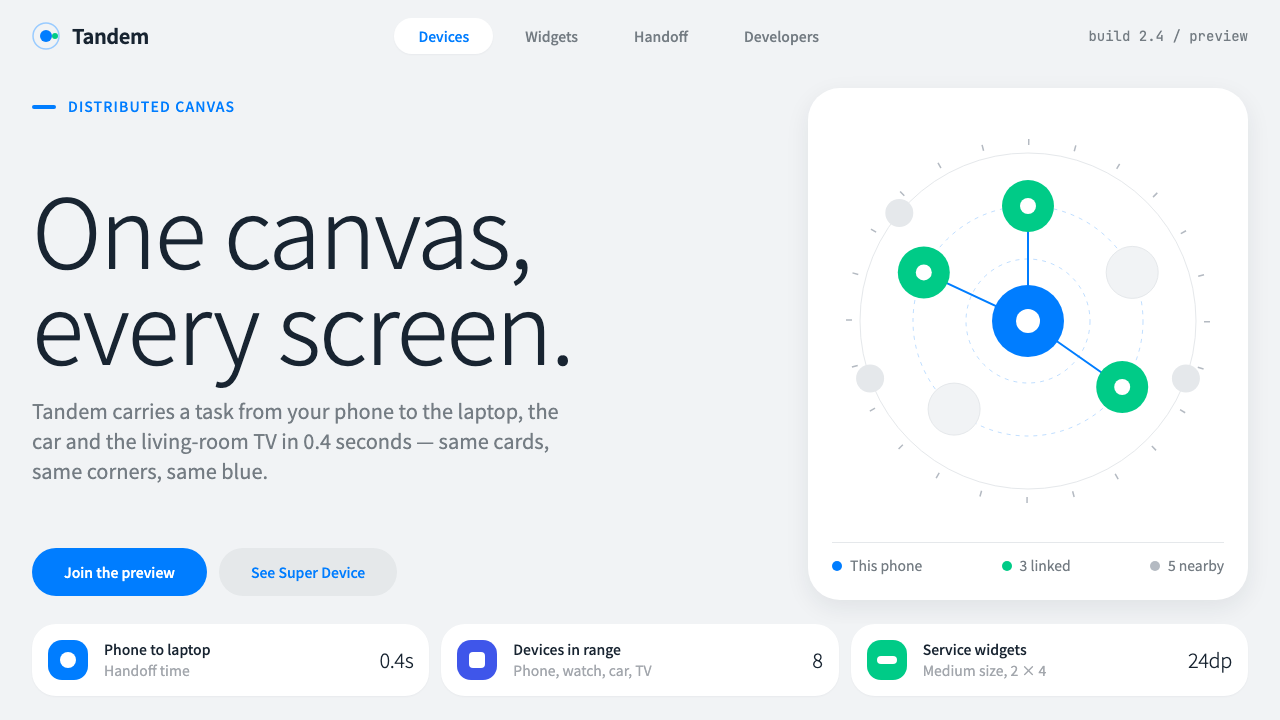 HarmonyOSOne blue for everything you can touch. White 24px cards on cool grey, navy te…
 Threads (Meta)Restraint is the brand. Black Inter type, narrow feed, thin connectors, white…
 Universal Translator EarpieceTwo languages, one white sheet. Stacked Noto cards, mono fine print, coral on…
 Zen BrowserSoftware steps aside. Warm white, slate hairlines, and muted plum carry the c…