What is Pebble?
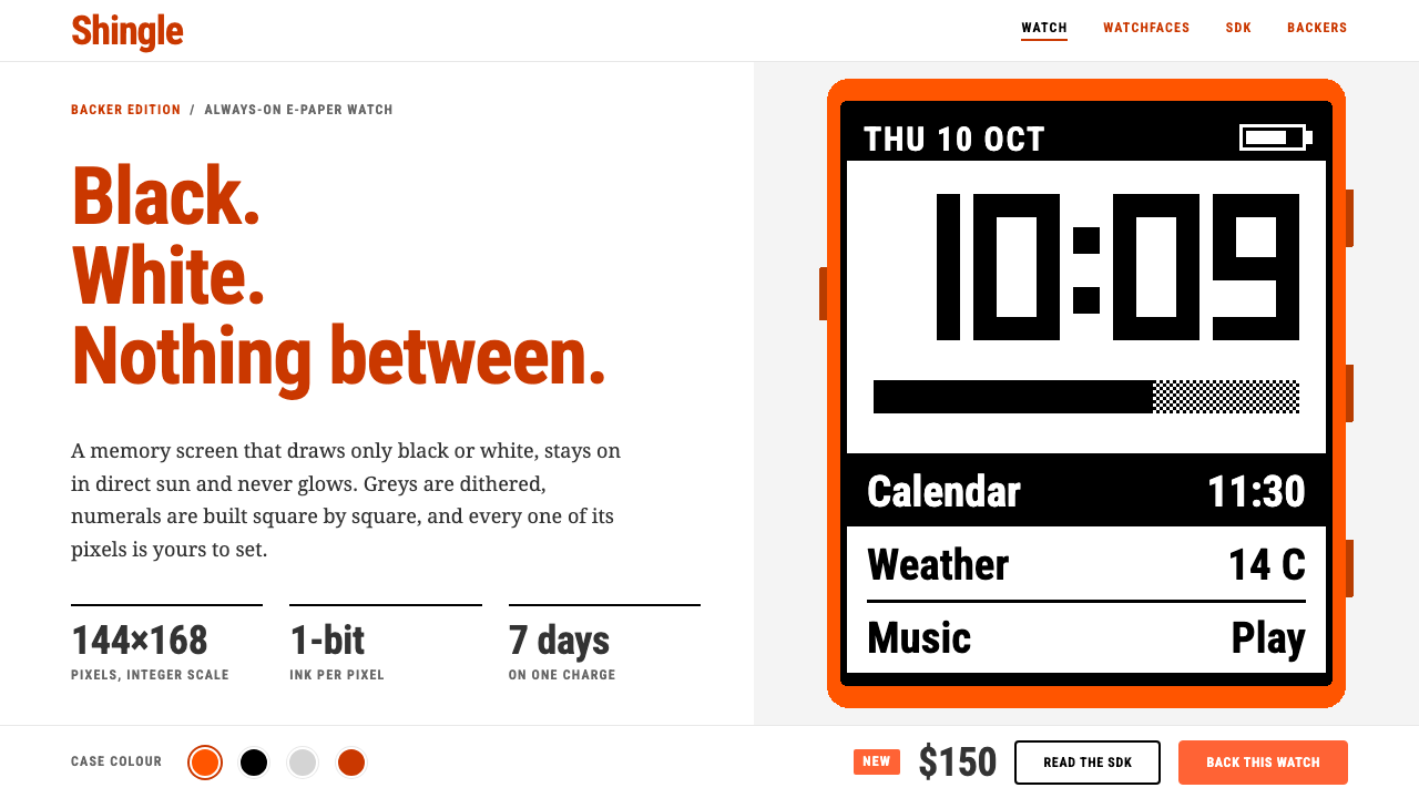
Pebble turned a tiny black-and-white screen into a design philosophy: with no greys to hide behind, every pixel had to be a decision.
Pebble in brief
Pebble is the visual language of the smartwatch that began life on Kickstarter in 2012 and shipped to its first backers in 2013. Its screen was a reflective memory display that could show only two states, ink and paper, so everything on the wrist, and later on the company's website, inherited a hard-edged, one-bit sensibility: no anti-aliasing, no gradients, no soft glows, just squared-off shapes that either exist or do not.
The style Curio captures is the getpebble.com of 2013 and 2014. It is a plain white page with dark grey body copy and headings in a burnt orange, and set into that calm frame is a small, crisp black-and-white screen, shown as a product photograph or an illustrated watchface. A brighter case orange is held back for colour swatches and the purchase button, so that the one place the eye is invited to act is also the one place the palette raises its voice.
What makes the look memorable is the contrast between two worlds. Around the watch is ordinary, friendly web design for a consumer gadget; inside the watch is a deliberately primitive pixel world, built from chunky numerals, dithered tones that simulate grey from black and white dots, and icons drawn square by square. The style is at its best when it lets those two worlds sit side by side without apology.

Where does Pebble come from?
Pebble was founded around Eric Migicovsky, a Canadian engineer who had been building watches that talked to phones before anyone had a market for them. When traditional venture funding proved hard to find, the project went to Kickstarter in 2012 and became one of the most famous crowdfunding campaigns of its era, raising a sum in the millions of dollars from a very large crowd of backers. That origin shaped the brand: it spoke like a team of enthusiasts talking to other enthusiasts, not like a corporation addressing a market.
The hardware constraints did most of the design work. A low-power memory display with no backlight in the ordinary sense meant the watch could run for days on a charge and remain readable in direct sunlight, but it could draw only black and white. Designers and the community that gathered around the platform turned that limit into a craft. Greys were faked with patterns of dots, numerals were built from thick blocks so they could be read at a glance, and every icon, from a Bluetooth symbol to a battery gauge, was drawn on a grid with the discipline of a type designer working on a tiny bitmap font.
The watchface hacking scene is as important to the style as the company itself. Because the platform was open to developers, thousands of amateur and professional designers published their own faces, and the best of them treated the small screen like a poster: bold numerals, a few lines, a joke or a reference, nothing wasted. This community is the reason the aesthetic belongs to a wider tradition of one-bit pixel art that stretches back through early handheld games and monochrome computers.
The marketing site of 2013 and 2014 translated that culture to the web. Rather than imitate the watch's pixels everywhere, it used them sparingly as a centrepiece, and surrounded them with restrained, readable page design. The company later went through a difficult commercial period and its assets were eventually acquired by a larger firm, but a community called the Rebble Alliance kept the services and the watchfaces alive, which is a large part of why the look still carries real affection and a small measure of nostalgia.
What defines the Pebble look?
Color
The page palette is deliberately small: white ground, dark grey body text, burnt-orange headings. Inside the watch image the world is strictly black and white with no true greys. A brighter case orange appears only on colour swatches and purchase buttons, so colour works as a signal for choice and action rather than as decoration.
Typography
Page copy is set in a friendly, neutral sans serif at comfortable reading sizes, while on-screen content uses chunky, blocky numerals and pixel lettering built from squares. The contrast between smooth web type and bitmap type is part of the charm; the two should be kept visibly separate rather than blended into one hybrid face.
One-bit imagery
Illustrations and watchfaces use only ink and paper. Tone is created by dithering, meaning patterns of dots that suggest grey from a distance, and edges are never smoothed. Icons are drawn on a visible grid so that diagonals stair-step honestly instead of being softened.
Layout
Pages are plain and generous: a centred column of white space, a single hero screen, then simple rows of features and colour options. Nothing competes with the product image. The device is treated like an exhibit in a gallery, and the page is the quiet wall behind it.
Edges and shape
Corners are square or only barely softened, borders are crisp, and there are no glossy highlights. The screen is a hard-edged rectangle with a thin dark bezel. Shadows, when they exist at all, are minimal and flat, in keeping with a device whose own display cannot render a soft shadow.
Tone of voice
Copy is warm, direct and a little geeky. It talks about days of battery life, readability in sunlight and apps made by the community, and it assumes the reader enjoys small clever details. The voice of a hobbyist workshop, not of a luxury watchmaker.

Who shaped Pebble?
Founder of Pebble and the driving force behind its Kickstarter campaign. His belief that a watch should be a glanceable, long-lasting companion to a phone, rather than a miniature computer, set the product's priorities and explains why the display and the visual identity stayed so simple.
A community of former users and developers who preserved Pebble's online services, app store and watchfaces after the company's commercial wind-down. Their work is the reason the style remains a living, usable thing rather than a museum piece.
Thousands of independent designers who treated the small screen as a poster format. Their dithered illustrations, oversized numerals and playful references defined what a Pebble look means in practice, often more than the official designs did.
The crowd that funded the first run turned a product launch into a shared project. The brand's open, enthusiast tone is a direct reflection of speaking to people who had literally paid in advance to see the idea exist.
How do you use Pebble today?
For slides, the cover is the place to be bold. Use a white ground, a heading in burnt orange and a single crisp black-and-white image or pixel illustration centred in the frame, then leave generous empty space around it. Content slides should keep to dark grey text on white, with short bulleted lines and one idea per slide. Keep the brighter orange for the single call-to-action or the one item you want the audience to remember.
For data slides, resist the temptation to introduce a rainbow. Charts work best in strict black and white, using dither-style hatching and solid fills to separate series, with orange used for only the one series that matters. Labels should be large and blocky, in the spirit of a watchface, so that a chart can be read across a room in a single glance.
For web interfaces such as dashboards and pricing pages, the style suits hardware product pages, developer documentation and any tool aimed at enthusiasts. A pricing page can present each tier as a plain white card with an orange heading and a hard-edged border, with the purchase button in the brighter orange. Dashboards benefit from large numerals, square status indicators and a refusal to use soft shadows, which makes them feel fast and reliable.
For editorial and marketing work, let the one-bit pixel image carry the story. A launch announcement, a retro-themed newsletter or a documentation landing page can use a single pixel illustration as its hero, surrounded by calm, readable text. The tone of the writing should match: specific, friendly, a little nerdy, and quick to mention the clever details.
The most common mistake is to apply the pixel look everywhere, so that body copy, buttons and backgrounds all become bitmap. The style works because the pixel world is contained inside a calm, ordinary page. A second mistake is to add greys, gradients or soft shadows to the watch image, which destroys the one-bit logic that gives the look its identity. Keep the pixels in the screen, the clarity on the page, and the bright orange for the moment of choice.

Pebble — FAQ
What is the Pebble design style?
It is the visual language of the 2013 and 2014 Pebble smartwatch website and its one-bit display: a white page, dark grey text, burnt-orange headings and a crisp black-and-white pixel screen as the centrepiece, with a brighter orange reserved for swatches and the buy button. It combines friendly consumer web design with the deliberate primitiveness of bitmap art.
Why does the style avoid greys inside the watch image?
Because the original screen could only display black and white. Any apparent grey is made by dithering, which is a pattern of dots that the eye blends at a distance. Using true grey tones in a watch illustration would break the honesty of the medium and make the image look like a mock-up rather than the real device.
Is Pebble the same as general pixel art or retro gaming style?
They are related but not identical. Pixel art and retro games often celebrate colour palettes and playful sprites, while Pebble is stricter: it has only ink and paper, and it frames the pixel world inside a calm, professional product page. Think of it as one-bit pixel craft presented with the restraint of consumer hardware marketing.
When should I choose this style for a project?
It suits hardware product pages, developer tools, technical documentation, retro-flavoured launches and anything addressed to enthusiasts who appreciate small clever details. It is a poor fit for luxury, medical or highly emotional brands, where the geeky friendliness and hard pixel edges would feel out of place.
How do I keep the orange from overwhelming the page?
Treat the two oranges as different roles. The darker, burnt orange belongs to headings and gives the page its identity, while the brighter case orange is reserved for choosing a colour or buying. If the bright orange appears in more than a couple of places at once, it has stopped being a signal and become decoration.
Related design styles
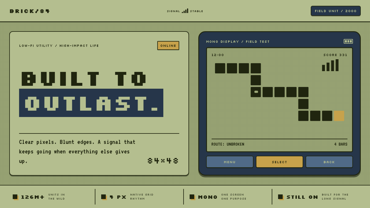 Nokia 3310 (2000)Built to outlast. Dark pixels march across olive glass inside a matte navy fr…
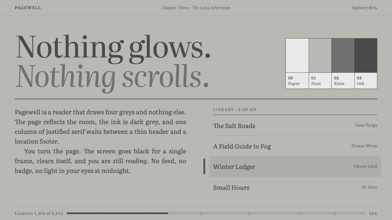 KindleNothing glows. Green-grey paper, grey Literata ink, one justified column, a b…
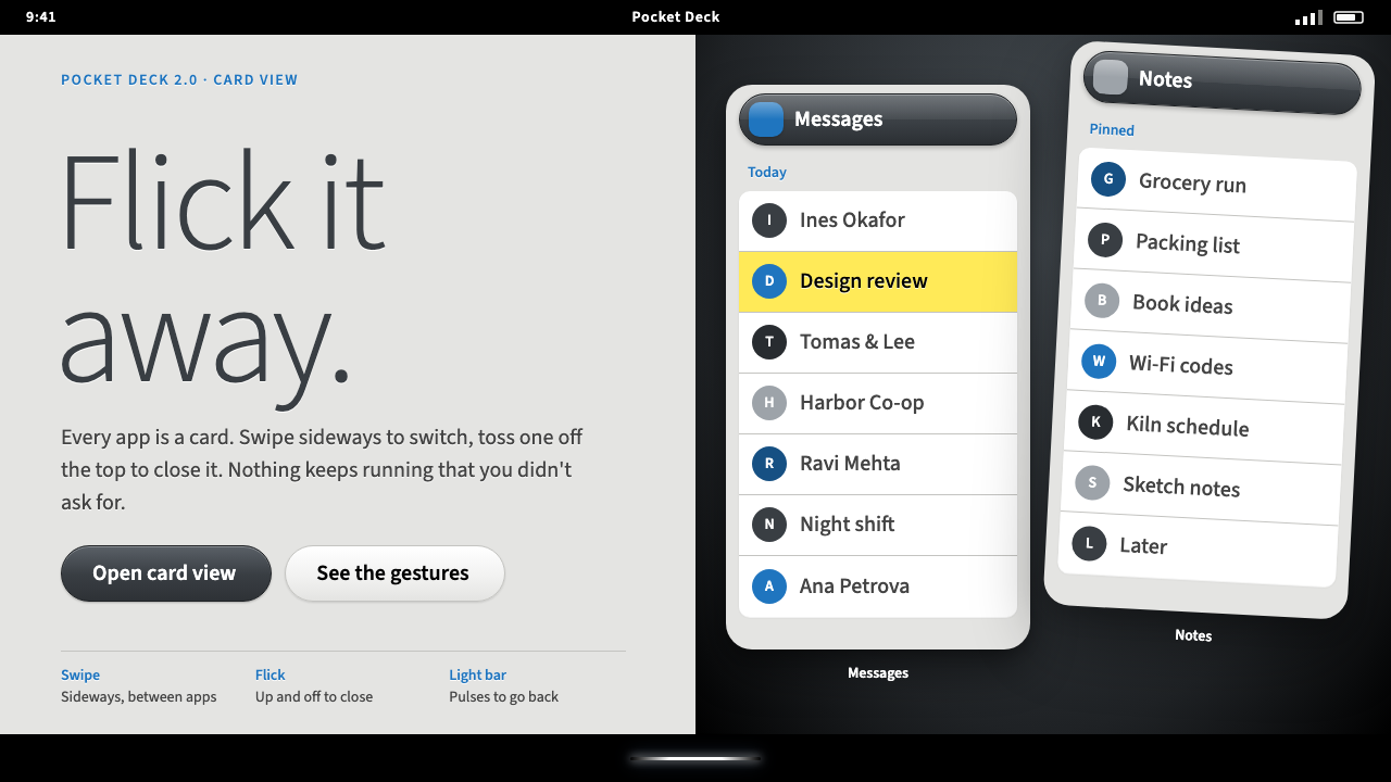 Palm webOSEvery app is a card you flick away. Charcoal gloss pills and blue labels on g…
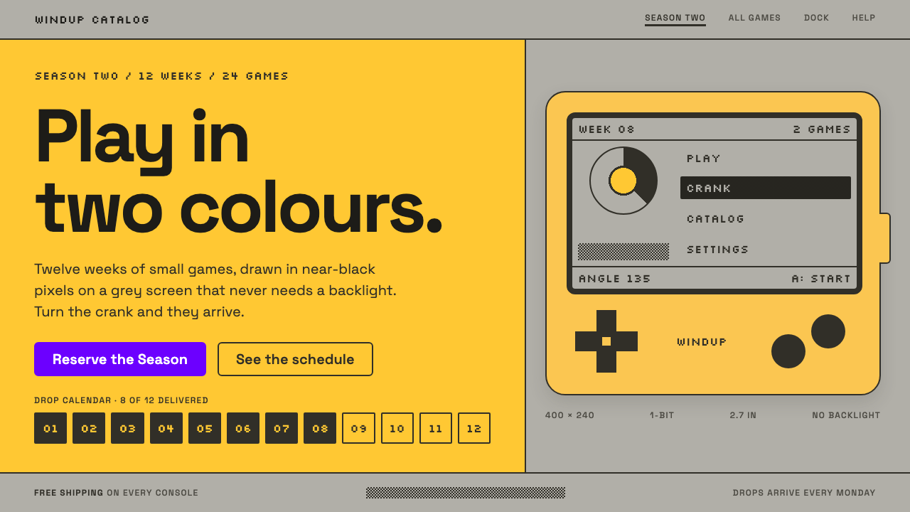 PlaydateTwo colours, all the play. Ink pixels dithered on screen grey, framed by flat…
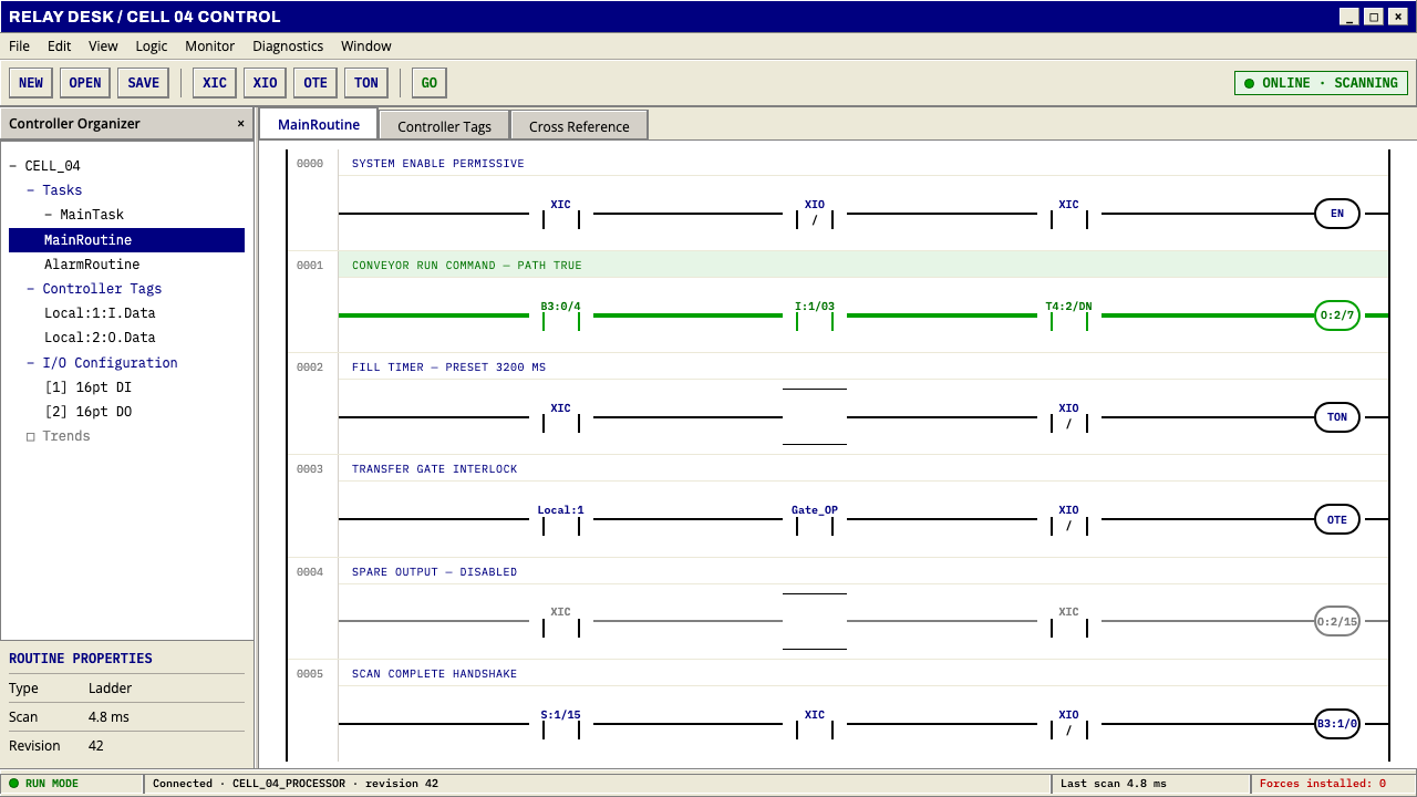 PLC Ladder LogicLogic made visible. Black rails and navy mnemonics turn green wherever the ci…
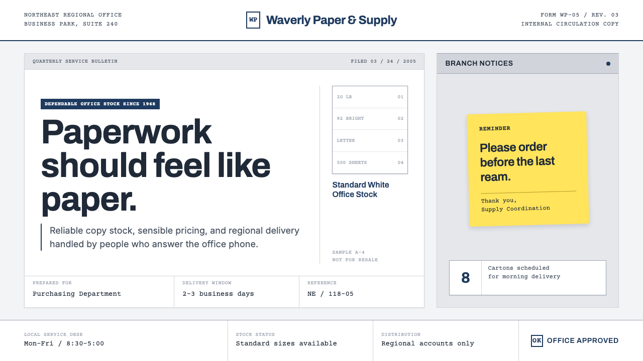 The Office (Dunder Mifflin, 2005)Mundanity is the punchline. Copier white, cubicle gray, memo grids, and one y…