What is Nokia 3310 (2000)?
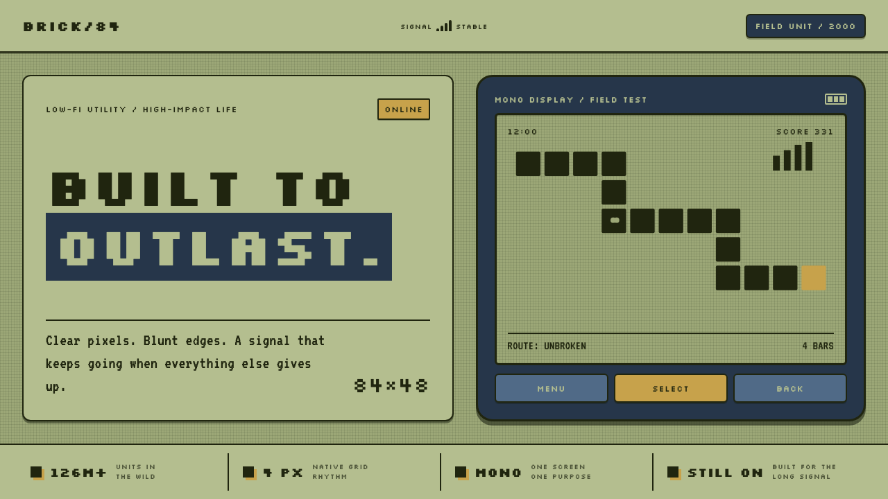
Nokia 3310 turns durability into a visual language: dark pixels, olive glass, and a matte navy shell made to survive ordinary life.
Nokia 3310 (2000) in brief
The Nokia 3310 is an early mobile-phone design language shaped by constraint, legibility, and physical resilience. Launched in September 2000, it combines a pale olive-green monochrome LCD with a rounded navy polycarbonate body. Its screen does not imitate paper, glass, or a miniature computer desktop. It presents information as dark rectangular pixels on a restrained field, making every word, icon, and game object feel deliberately constructed.
The visual system rests on two linked surfaces. The display is a small field of dark dot-matrix marks separated by a fine lattice; the body is thick, matte, rounded, and tactile. One surface handles information with compression and clarity, while the other makes the object feel secure in the hand. The design does not conceal the device’s limits. It makes limited resolution, compact controls, and a sturdy enclosure into its character.
Nothing in the 3310 language depends on gloss, decorative depth, or visual excess. Type is snapped to the screen grid, signal and battery indicators read as stacked bars, and Snake advances as a chain of block-like segments. The result is austere Finnish utility: an interface and object that look robust because their visual decisions are direct, repeatable, and hard to misread.
Where does Nokia 3310 (2000) come from?
The Nokia 3310 belongs to the period from 2000 to 2005, an era in which mobile phones were primarily communication objects rather than continuous media surfaces. Its September 2000 launch places it in the early mobile UI moment, when small monochrome displays had to make calls, messages, menus, status, and games understandable through a tightly bounded visual vocabulary.
Its context is Finland: Nokia’s Espoo headquarters and Salo factory. The source material connects the phone to Scandinavian industrial design, a tradition expressed here through restrained form, rounded enclosure, practical material, and a refusal to add visual richness that does not improve use. The navy shell and olive display are not separate styling gestures; together they create a tool-like identity.
Dot-matrix LCD interfaces supplied the screen’s governing logic. Every visible element is assembled from dark blocks rather than drawn with continuous curves or soft tonal transitions. This gives type, meters, and game graphics a common material language. A menu label and a Snake segment belong to the same system because both are built from the same disciplined marks.
Frank Nuovo, Jorma Ollila, and Taneli Armanto are identified in the source material as key figures associated with this context. Their presence situates the 3310 within Nokia’s design and mobile-interface culture rather than treating it as an isolated object. The phone’s enduring recognition comes from that union of industrial form, simple visual rules, and a screen language designed for immediate comprehension.
What defines the Nokia 3310 (2000) look?
Olive Monochrome Display
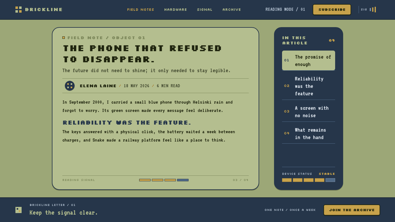
The pale olive-green LCD is the visual field from which the style begins. Dark pixels sit sharply on its reflective surface, creating contrast without theatrical brightness. The green cast gives the interface a physical, instrument-like quality: information appears on glass rather than floating in an abstract digital space.
Dot-Matrix Type
Letterforms are clusters of rectangular marks aligned to a strict grid. Their low-resolution character is not softened or disguised; it is the basis of their authority. Words feel compact, mechanical, and immediately readable because every glyph obeys the same visible construction rule.
Chunky Controls
The rounded polycarbonate shell and substantial keys make interaction visibly physical. Controls do not disappear into a seamless face; they declare where pressing happens. Their chunky form matches the display’s block structure, linking tactile input and pixel output into one durable system.
Matte Navy Shell
The navy enclosure is rounded and matte rather than glossy or precious. It communicates resilience through surface character: the phone reads as something meant to be held, carried, dropped, and used repeatedly. The color grounds the pale display and keeps the overall object calm and utilitarian.
Status as Geometry
Signal and battery indicators are not decorative symbols placed beside information; they are information. Stacked bars make capacity and connection visible through accumulation. This turns status UI into a small diagram, where meaning comes from the number and arrangement of dark blocks rather than from illustrative detail.
No Fragile Effects
There are no glossy highlights, soft gradients, or ornamental transitions competing with content. The screen remains flat, the contrast remains direct, and the body remains materially honest. This restraint makes the language feel durable even before the device is touched: it does not promise delicacy, polish, or illusion.
Who shaped Nokia 3310 (2000)?
Frank Nuovo is named in the source material as a key figure in the Nokia 3310 context. His inclusion places the device within Nokia’s design culture and reinforces that its rounded body, restrained surface, and durable visual identity belong to a considered product language.
Jorma Ollila is identified as a key figure associated with the 3310’s source context. The association locates the phone within Nokia’s broader mobile era, when clear communication, compact interfaces, and robust everyday objects defined the product’s public character.
Taneli Armanto is listed among the key figures for the Nokia 3310. His presence is especially fitting for a design language in which Snake is not an ornamental extra but a direct demonstration of the display’s logic: movement, form, and play all emerge from the same dark pixel grid.
How do you use Nokia 3310 (2000) today?
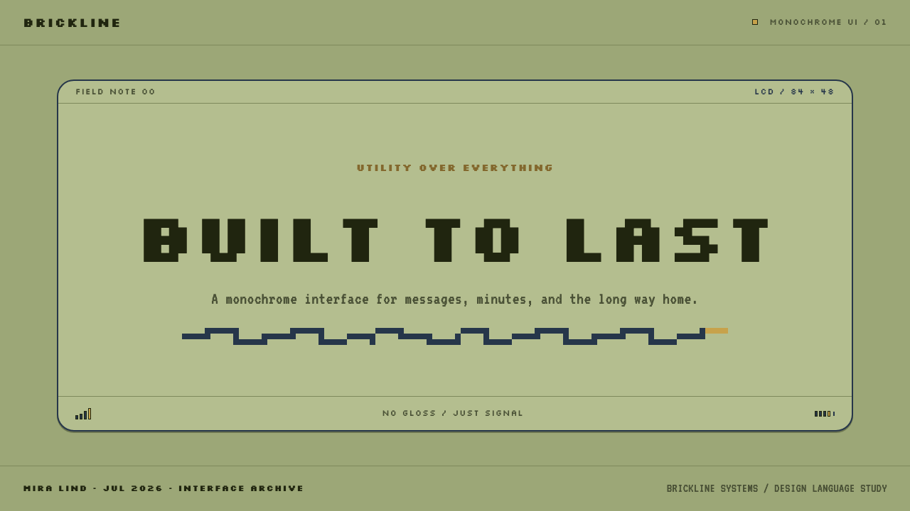
For presentation covers, use the 3310 language as an exercise in concentrated contrast. Set a short title in a visibly grid-based, dark display treatment on an olive-toned field, then frame it with a rounded navy container or control-like shape. The composition should feel like a useful screen captured inside a durable object, not like a retro collage. Keep supporting text sparse and let the display field carry the visual identity.
For presentation content and data slides, treat every status marker as a compact diagram. Headings can resemble menu labels, section dividers can use bar-like accumulations, and charts can adopt dark block segments rather than polished decorative forms. The goal is not to mimic an old handset literally. It is to inherit its hierarchy: primary information should be unmistakable, secondary information should remain compact, and every mark should earn its place.
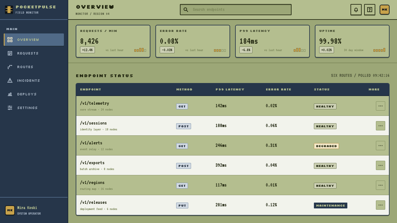
For web interfaces, this style suits dashboards, settings panels, compact utilities, and pricing experiences that benefit from a strong sense of state and control. Build a pale greenish display area inside a rounded dark housing, use dark pixel-like marks for active information, and make buttons look pressable rather than invisible. Navigation works best when it resembles a clear menu system with obvious selection, status, and progression.
For editorial and marketing work, use the style to tell stories about resilience, limited attention, practical tools, or the early mobile era. A headline may sit like a display message while supporting facts appear as concise status entries. Product callouts can borrow the logic of signal bars and battery indicators, but should communicate real hierarchy rather than becoming nostalgic decoration. The matte, rounded object language is especially effective where reliability is central to the message.
The common mistake is to treat Nokia 3310 as a generic retro filter: neon color, glossy plastic, random pixel fonts, and decorative game references. That misses its discipline. The authentic lesson is reduction: one calm display field, dark readable marks, tactile controls, and status information expressed as geometry. If an effect makes the interface feel more precious, more theatrical, or harder to read, it moves away from the source language.
Nokia 3310 (2000) — FAQ
Is the Nokia 3310 style simply retro design?
No. Nostalgia may be part of its contemporary appeal, but the style is built on practical rules: monochrome contrast, grid-based glyphs, visible status indicators, rounded physical controls, and a durable matte enclosure. Applying it well means using those rules to improve clarity and tactility, not merely adding old-looking pixels to a modern layout.
Why does the monochrome screen feel so readable?
Because the system reduces visual competition. Dark pixel clusters are clearly separated from the olive field, and every type label, icon, meter, and game form follows the same dot-matrix logic. There is little ambiguity about what is active, what is text, and what represents a changing status. The interface gains clarity by limiting the number of visual languages in use.
Can this language work for a contemporary dashboard?
Yes, particularly when the product needs clear status, compact scanning, and a practical tone. Use the display concept to organize information, with dark marks, bar-like meters, obvious selected states, and a restrained field around them. Avoid making every element pixelated; ordinary explanatory text can remain comfortably readable while status and key controls carry the stronger dot-matrix character.
What makes the physical form important to the visual style?
The 3310 is not only a screen aesthetic. Its rounded navy polycarbonate body and chunky keys give the dark-pixel interface a believable physical home. The shell suggests repeated use and impact tolerance, while the keys make interaction visible and tactile. Removing that object logic can leave a digital imitation that has pixels but lacks the original sense of sturdy utility.
Related design styles
 Financial Terminal MonoMaximum signal per pixel. Pure black, IBM Plex Mono, green-red ticks, amber-b…
 Game Boy DMG Green ScreenOnly the grid remains. Olive LCD tones, pixel type, and hard black borders.
 Handheld LCD GameConstraint is the charm. Olive LCD grid, black segment ink, tight molded beze…
 Nintendo Game BoyConstraint becomes play. Four swamp greens, pixel type, and an 8×8 grid do th…
 EVE OnlineCold cockpit luxury. Cyan glass panels float over a black nebula void.
 Minecraft CreeperBuild it blocky. Mottled lime texels on cave-stone gray, hard voxel edges, pe…