About Nokia 3310 (2000)
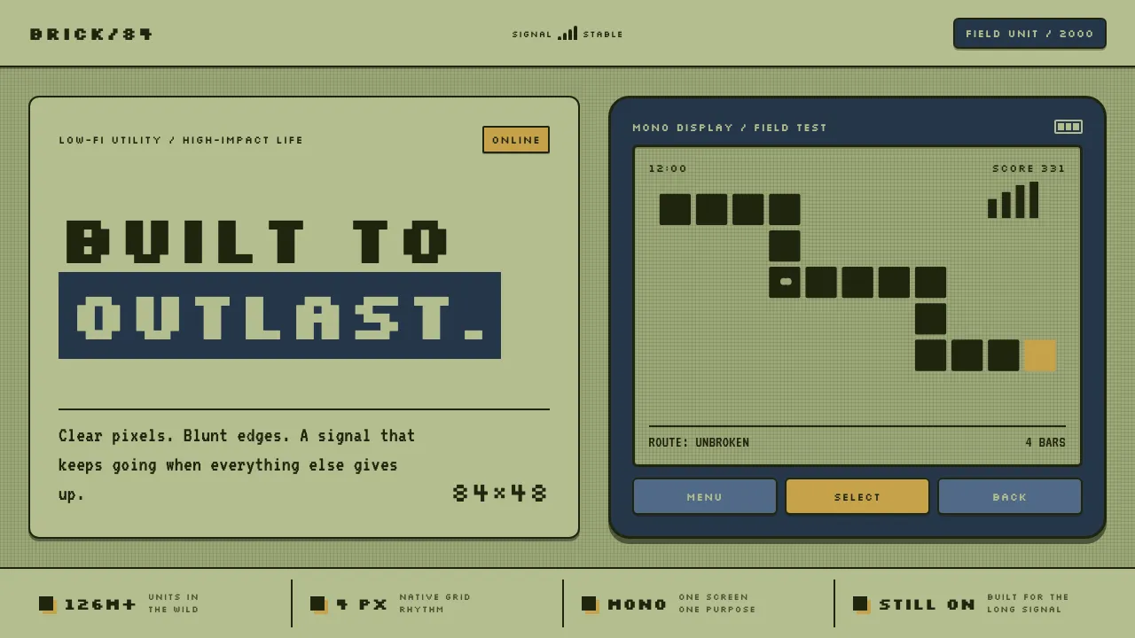
The Nokia 3310 is the phone that outlived its owners' patience — dropped, sat on, run through washing machines, and still asking for a T9 word. Its design language runs on two truths: a pale olive-green monochrome LCD where every glyph is a cluster of dark rectangular pixels split by a hairline lattice, and a rounded navy polycarbonate shell with chunky, satisfying keys.
Nothing here glosses, gradients, or breaks. Type is grid-snapped and low-resolution, Snake winds one blocky segment at a time, and meters read as stacked signal bars. It is austere Finnish utility rendered at 84×48 dots: legible pixels on green glass inside a shell you cannot destroy.
- Origin
- Finland (Nokia — Espoo HQ / Salo factory)
- Era
- 2000–2005 (launched September 2000; 126M+ units sold)
- Key figures
- Frank Nuovo · Jorma Ollila · Taneli Armanto
- Movements
- Scandinavian industrial design · Early mobile UI · Dot-matrix LCD interfaces
Nokia 3310 (2000) design spec
Colors
Typography
The other 11 sections — buttons, cards, spacing, motion, techniques and more — open once you unlock. Download the DESIGN.md or send it to your AI in one click. Unlock once, yours forever.
Sign up nowStyles similar to Nokia 3310 (2000)
Also inspired by brands & products, with a close feel.
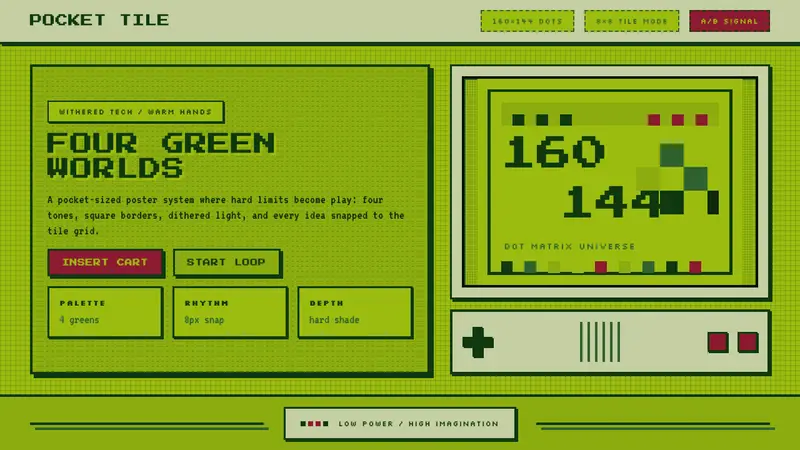 Nintendo Game BoyConstraint becomes play. Four swamp greens, pixel type, and an 8×8 grid do the work.
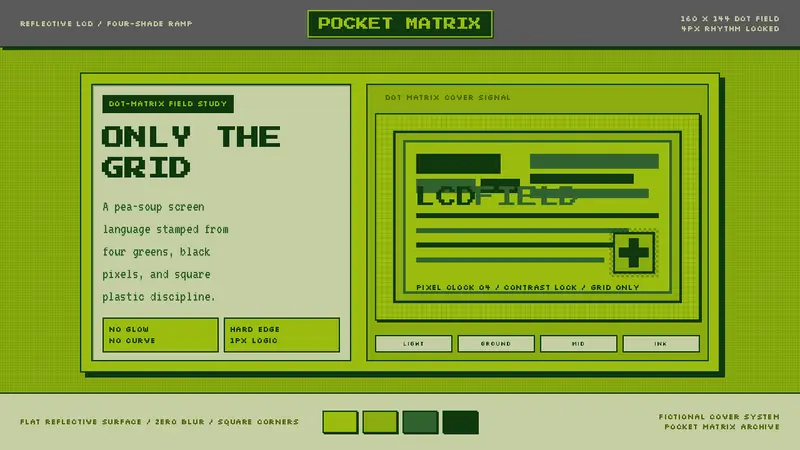 Game Boy DMG Green ScreenOnly the grid remains. Olive LCD tones, pixel type, and hard black borders.
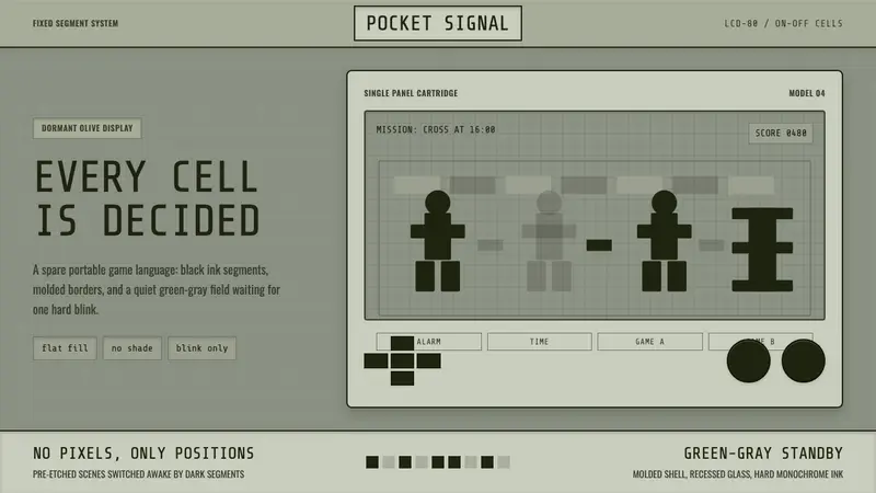 Handheld LCD GameConstraint is the charm. Olive LCD grid, black segment ink, tight molded bezels.
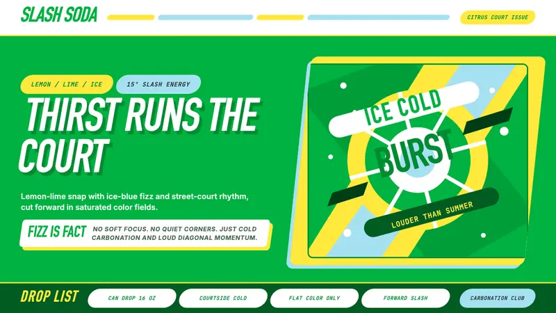 Sprite — Obey Your ThirstCitrus hits like asphalt heat. Saturated green, lemon yellow, and 15° slashes drive the poster.