What is Playdate?
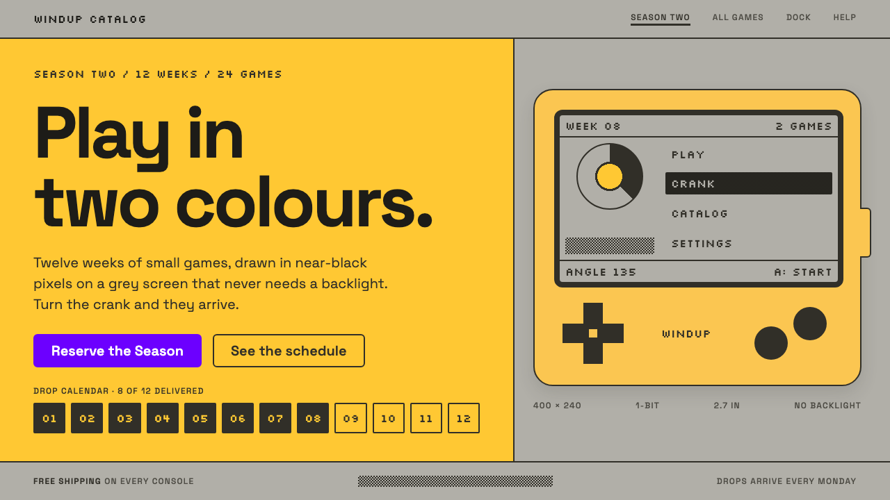
Playdate turned a two-colour reflective screen into a charm offensive: ink pixels on silver-grey, a flat yellow frame, and exactly one purple button.
Playdate in brief
Playdate is the visual language of a small yellow handheld game console with a crank on its side, released in 2022 after being announced in 2019. Its screen knows only two colours, near-black pixels on a reflective silver-grey, so every game, menu and score is drawn in one bit and shaded with dither patterns. The style that Curio captures puts that grey screen at the centre of the page and lets the yellow body work as its frame.
The page is built from flat bands of yellow, chunky ink outlines and generous silver-grey areas that behave like the screen itself. Text inside the screen is set in Silkscreen, a pixel typeface made for small, crisp lettering, while the copy around it is set in Space Grotesk, a geometric sans serif with a slightly quirky character. A single purple accent is reserved for the buy button, so the one thing you are meant to do is also the one saturated surprise on the page.
There are no gradients and no glossy highlights. The result feels like a quiet, well-made little machine: playful, but never loud, and more interested in craft than in spectacle.

Where does Playdate come from?
Playdate was created by Panic, the independent software company from Portland, Oregon, best known for Mac applications and, in more recent years, for publishing games. Its co-founders Cabel Sasser and Steven Frank have long run the company with a reputation for taste, humour and a willingness to make unusual things. A handheld with a crank was exactly the kind of idea that a larger company would have shelved, and the founders have described it as a project driven by curiosity and affection.
The hardware was designed with Teenage Engineering of Stockholm, whose co-founder Jesper Kouthoofd is known for compact, colourful and playful electronic instruments. The partnership shows in the console's appearance: a bright, flat yellow body, simple geometric forms and a small number of clearly labelled controls. The reflective Sharp memory display, which uses ambient light rather than a backlight, gives the screen a paper-like quality and is the technical reason for the grey ground that dominates the visual style.
Three traditions meet in the style. Indie games supply the sense that small teams make personal, idiosyncratic work and that a console can exist to host such work, which is why the console was launched with a season of games delivered weekly. One-bit pixel art supplies the craft: with only two colours available, artists create tone with dither patterns and clever outlines, a discipline with roots in early monochrome computers and handheld devices. Boutique hardware design supplies the finish, the idea that a gadget can be treated like an object of affection rather than a commodity.
The visual identity extended naturally from the product to its website and packaging. The yellow frame and the grey screen became the basic grid of the page, and the typography followed the same logic: a pixel face for things that belong to the screen and a more conventional face for everything outside it. Since its release, the look has been admired for the way it communicates a complete personality with an extremely small set of ingredients.
What defines the Playdate look?
Color
Three roles, kept strictly apart. A flat, warm yellow is the body of the machine and the frame of the page. A reflective silver-grey is the screen, the place where content lives. Near-black ink draws every pixel and outline. One purple accent appears only on the buy button, so it is the page's single moment of saturation.
Typography
A deliberate pairing. Silkscreen, a small pixel typeface, sets anything that belongs inside the screen, such as scores, menu items and game labels. Space Grotesk, a geometric sans serif, sets headings and explanatory copy around it. The two should never be swapped, because the difference between them tells the reader which world they are looking at.
Dither and one-bit imagery
All screen imagery is ink on grey with no intermediate tones. Shading is achieved by patterns of dots, checkerboards and lines, and edges are crisp. Illustrations often look like screenshots of an imaginary game, with chunky characters and simple scenery.
Bands and outlines
The page is organised into broad flat bands of yellow, separated by thick ink outlines. Containers have square or only slightly softened corners and no soft shadows. The weight of the outline is what gives the page its toy-like, handmade feeling.
The crank
The crank is the product's most distinctive feature, and the style reflects it through rotation and mechanical motifs: dials, circular indicators and playful interactions that respond to turning. It is a reminder that this is a physical object, not a flat slab of glass.
Tone of voice
Warm, witty and slightly self-aware. The copy talks about small joys, quirky games and the pleasure of a well-made object. It does not shout about specifications, and it is happy to be charming at the expense of sounding corporate.

Who shaped Playdate?
Co-founder of Panic and a prominent voice behind the Playdate project. Known for his enthusiasm for design, games and the history of computing, he helped shape the console's playful public personality.
Co-founder of Panic and one of the people behind its long tradition of well-crafted software. His involvement connects Playdate to the company's reputation for polish and taste.
Co-founder of Teenage Engineering in Stockholm, the design partner for the hardware. His studio's playful, compact and distinctly coloured devices provided the template for the console's friendly, toy-like industrial design.
The Portland software and publishing company behind the console. Its history of making Mac tools with unusual care, and later of publishing independent games, explains why Playdate treats games as small, personal works rather than blockbusters.
How do you use Playdate today?
For slides, the cover should look like the console itself. Use a flat yellow background, a grey rounded-square panel in the centre as the screen, and a title set in a pixel face inside it, with an outline in near-black ink. Content slides can keep the grey panel as the main area and the yellow as a frame at the edges. Use the purple accent once per deck, for the call to action.
For data slides, treat the grey panel as the plotting area. Draw charts in one-bit style, using solid ink and dither patterns to distinguish series, and set labels in the pixel typeface. Limit each slide to one chart so that the panel keeps its toy-screen simplicity, and use the sans serif for any explanatory sentence placed outside the panel.
For web interfaces such as dashboards and pricing pages, the style suits indie games, hardware, creative tools and playful consumer products. A pricing page can lay out each plan as a grey screen panel inside a yellow band, with the purple button as the only strongly saturated element. Keep forms and long text in the sans serif on calm grey, and reserve the pixel face for short labels and headings.
For editorial and marketing work, the style is excellent for game announcements, community newsletters, developer diaries and product launches that want to feel handmade. Illustrations in one-bit pixel art with a few dithered tones carry a strong identity at very small sizes. Write in a warm, funny and specific voice, and let small details do the persuading.
The most common mistake is to add colour. As soon as a second accent appears, or a gradient is introduced, the idea of a screen that knows only two colours is lost. Another mistake is to use the pixel typeface for everything; long passages in a bitmap face are tiring to read, and the pairing with the sans serif is what keeps the style legible. Finally, avoid glossy effects, since the whole look depends on being flat.

Playdate — FAQ
What is the Playdate design style?
It is the visual language of the Playdate handheld and its website: near-black one-bit pixels and dither patterns on a reflective silver-grey screen area, framed by flat yellow bands and chunky ink outlines. It pairs a pixel typeface for on-screen text with a geometric sans serif for surrounding copy, and uses a single purple accent for the buy button.
Why does the screen look grey rather than white?
The console uses a reflective memory display that works with ambient light instead of a backlight, so its lightest state is a silver-grey, like paper in a room. The design style reproduces that grey as the content area because it is the most distinctive thing about how the device looks in real life.
How is it different from general retro pixel art?
Retro pixel art often explores rich colour palettes and sprites from eight-bit and sixteen-bit consoles. The Playdate look is stricter, limited to ink on grey, and it is framed by a calm, modern page with flat yellow bands and clean type. It feels contemporary and boutique rather than nostalgic.
Can I use it for something other than games?
Yes. It suits creative tools, hardware products, indie software, newsletters and any brand that wants to feel playful and crafted. The key is to keep the structure: a screen-like content area, a flat frame, a pixel face for short labels and a single saturated accent.
How should I use the purple accent?
Sparingly. It is reserved for the single most important action, such as buying, and should appear once per screen. If purple is used for links, tags or decoration, it stops being a signal and the page loses the quiet confidence that makes the style work.
Related design styles
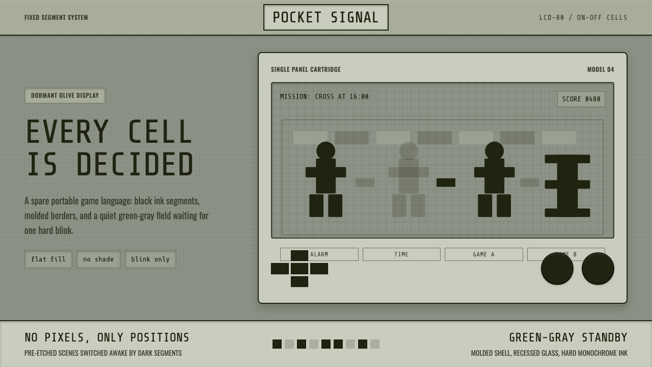 Handheld LCD GameConstraint is the charm. Olive LCD grid, black segment ink, tight molded beze…
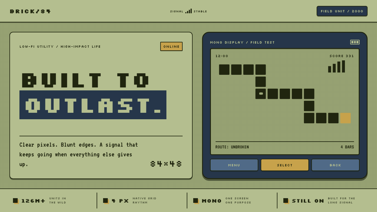 Nokia 3310 (2000)Built to outlast. Dark pixels march across olive glass inside a matte navy fr…
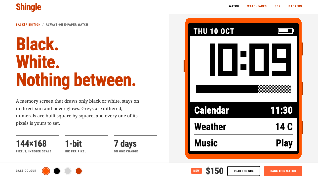 PebbleTwo colours, no greys. Burnt-orange headings on white frame a 144×168 one-bit…
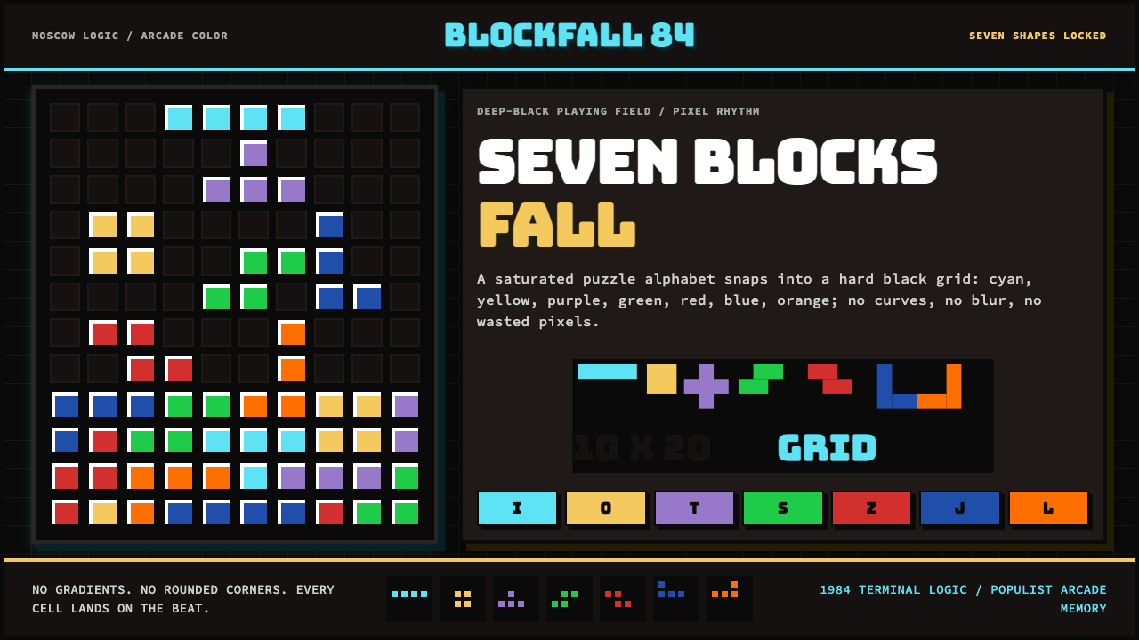 Tetris (1984)Arcade gravity, pixel exact. Black grid, Bungee type, seven saturated blocks.
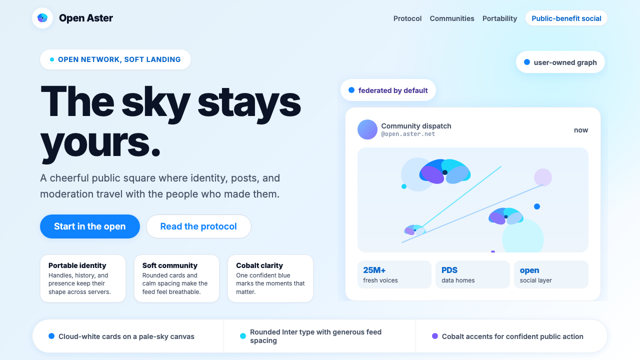 Bluesky AT Protocol 2024Open tech feels warm. Pale sky, cloud cards, Inter, and one cobalt accent car…
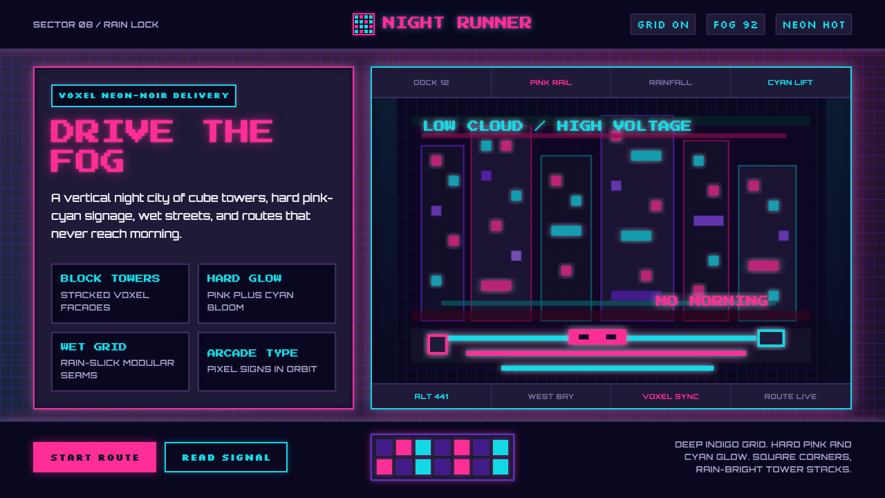 CloudpunkNeon-noir goes voxel. Pink-cyan glow cuts deep-indigo grids and blocky tower…