What is Journey?
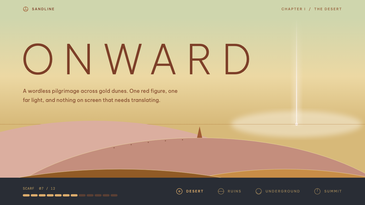
Journey tells its story without words: a dune-gold ground, one robe-red mark, a mountain beam on a low horizon, and light capital letters tracked wide like titles fading in over sand.
Journey in brief
This design system is drawn from Journey, the 2012 game by thatgamecompany. A traveller in a long robe crosses a vast desert toward a distant mountain, meeting other anonymous travellers on the way. There are no spoken words and no text dialogue; meaning is carried by landscape, light, music and symbol. The design language that comes from it is quiet, golden and unhurried.
Visually, a few elements do almost all the work. The ground is the gold of sand dunes. The traveller’s red-brown robe is the only strong mark, so wherever red appears the eye knows it is looking at something that matters. The horizon sits low, and a beam of light on the far mountain pulls the eye forward, creating a sense of direction even on a still page.
Type is light and widely tracked, like a title card that fades in over sand. Surfaces glow like sun haze, borders step inward like mural frames, and progress is shown as a scarf of rune segments. The style suits slow, story-led pages that let landscape and symbol carry the meaning instead of paragraphs of explanation.

Where does Journey come from?
thatgamecompany was founded in 2006 in Santa Monica, California, and Journey was released on 13 March 2012 for the PlayStation 3. It was one of a small number of independently minded games funded through a publishing deal with Sony, and it became a landmark for what an interactive work could say without language. The look is tied to that single, tightly focused release.
The game’s design decisions come from a commitment to wordless communication. Because players cannot speak to each other, every shape, colour and sound has to be readable at a glance. Colour is therefore used sparingly and symbolically: gold for the world, one strong red for the traveller, cool blue for distance and sky. Typography, when it appears, is minimal and is treated as part of the scenery.
Several names are tied to the work. Jenova Chen and Kellee Santiago are associated with the founding of the studio, Matt Nava with the art direction that gave the dunes and the robe their look, and Austin Wintory with the score that set the pacing of the whole experience. Their combined work made a world where the interface barely needs to exist, and that is what this design system tries to preserve.
Three currents meet in the result. The first is the idea of art games, interactive works that value mood and meaning over challenge. The second is wordless online cooperative play, in which strangers help each other without a chat window. The third is the Sony-funded independent game, a model that gave small studios room to take aesthetic risks, and which produced a visual voice that is serene rather than competitive.
What defines the Journey look?
Color
The palette is dominated by a warm dune gold in many tints, from pale sun haze to deeper amber. A single robe-red, a warm reddish brown, is reserved for the one thing that matters on the page: a primary action, a marker or a character. Cool tones appear only at the distance, in the sky and far mountain. Because red is rare, it carries narrative weight.
Typography
Headings are set in light capital letters with very generous tracking, so each word spreads out like the opening titles of a film. Weight is thin rather than bold, and sizes change gently. Body text is minimal and given a lot of surrounding space; the aim is for words to feel like part of the landscape rather than a block of information.
Surfaces and glow
Panels do not use hard edges or deep shadows. They glow softly, like warm haze lit from behind, and their tone is only slightly different from the ground. This gives a layered, atmospheric depth in which cards seem to float in the light rather than sit on top of it.
Borders and symbols
Borders step inward in layers, like the frame of a mural or the recesses of an ancient doorway. Icons are drawn as simple glyphs and runes instead of detailed pictograms, and meaning comes from repeated use of the same few symbols. Progress is shown as a scarf made of glowing rune segments that fills as the journey continues.
Composition
The horizon sits low, which leaves a large sky-like area for headlines and breathing room. A beam of light on a distant mountain acts as a focal point and a direction of travel, and layouts tend to lead the eye from the lower left toward a far point in the upper area. Compositions are sparse, with large areas of unbroken colour.
Tone and motion
The mood is serene, contemplative and slightly sacred. Movement is slow: elements fade in over sand-like backgrounds, drift gently, and settle without bouncing. There is no urgency in the system, which is why it works as an antidote to dense and noisy interfaces.

Who shaped Journey?
Chen is associated with the founding of thatgamecompany and with the vision behind Journey, a game meant to evoke emotion and connection without any spoken language. His ideas about wordless communication are the root of the system’s reliance on symbol and colour.
Nava is tied to the game’s art direction. The sweep of the dunes, the silhouette of the robe and the treatment of light across the sand all belong to the visual world that this design system translates into surfaces, colour and type.
Wintory composed the score that sets the pace of the experience. His music is part of why the design language feels slow and unhurried: the visual rhythm of fades and glides is meant to match a score that builds rather than shouts.
Santiago is associated with the founding of the studio. She belongs to the team that took a small independent project through Sony’s support and into a wide audience, which helped establish art games as a respected strand of the medium.
How do you use Journey today?
On slides, use the style for covers and chapter openers that want to feel cinematic: a warm gold gradient-free field, a wide-tracked light capital title placed high or low rather than centred, and a single red element such as a thin line or a small mark. Content slides should be sparse, with one idea and a lot of empty space. It suits brand stories, travel, wellness, film and long-form presentations.
For web interfaces, it works best on narrative and brand pages: storytelling scroll sites, portfolio introductions, meditation and sleep apps, and documentary or museum experiences. Cards glow softly, borders step inward, and the only red on the page is the primary action. Navigation should be minimal and icon-led so the page remains quiet.
On pricing and sign-up pages, the style can lend an air of calm trust. A pale gold ground, a single red button and plan cards that glow rather than outline create a slow, deliberate choice experience. Use the rune scarf for multi-step onboarding progress so the user feels they are travelling somewhere.
In editorial and marketing work, use it for essays, long-form features and event invitations. Let a large landscape image fill the width, set the title in widely tracked capitals over the sky area, and keep body text narrow and light. Where possible, let symbols stand in for explanation.
The most common mistake is adding too much red or too much text. If several elements use the robe colour, the single focal point disappears and the page loses its story. Another mistake is tightening the tracking or switching to a heavy weight, which breaks the title-card quality. Keep the gold wide, the red rare and the type thin.

Journey — FAQ
What is the Journey game style?
It is a design language drawn from thatgamecompany’s 2012 game Journey. It uses a golden dune ground, a single robe-red accent, a low horizon with a beam of light, widely tracked light capital type, glowing surfaces, stepped mural-like borders and a rune-scarf progress bar.
Why is there only one strong color?
Because the game tells its story without words, so colour has to do the talking. By keeping red rare, the design makes sure that wherever it appears, the eye knows it matters. If you add more strong colours, the focal point and the narrative both weaken.
What kinds of products suit it?
It suits slow, story-led products: brand narratives, meditation and sleep apps, travel and film pages, museum and documentary experiences, and long-form editorial. It is a poor match for dense dashboards or fast, transactional tools.
How do I show progress in this style?
Use a scarf of rune segments that glow as they fill, rather than a plain bar. Each segment is a simple glyph, and the scarf grows as the user moves through the steps, matching the idea of a journey instead of a task checklist.
What are the main mistakes to avoid?
Avoid overusing the red, packing in explanatory text, tightening the letter spacing, or using bold weights. Each of these breaks the quiet, title-card character that makes the style recognisable.
Related design styles
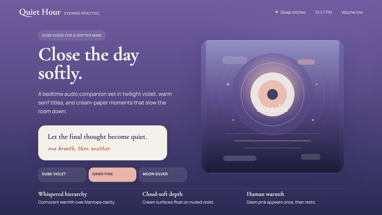 Calm App Purple MeditationWhispers at bedtime. Dusk-purple gradients, cream serif type, and dawn-pink w…
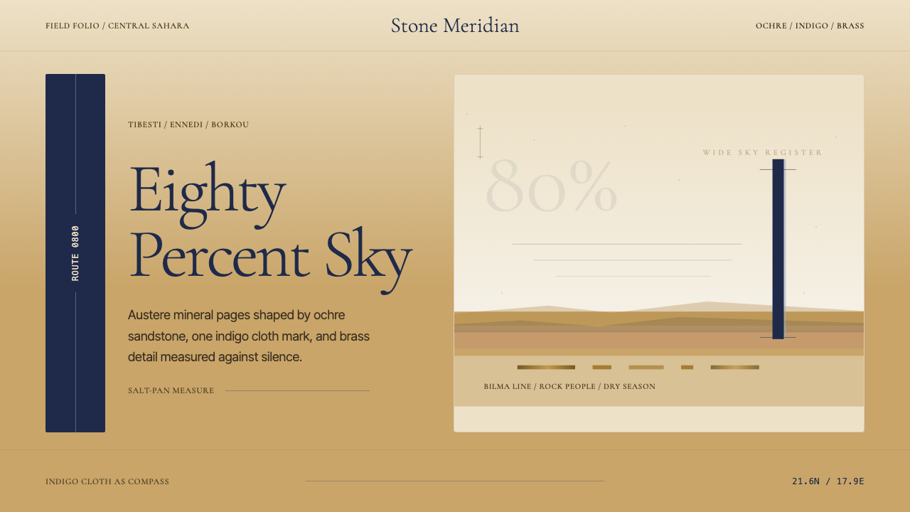 Chadian Toubou Saharan RouteRadical emptiness holds. Sandstone ochre, indigo serif, and one vertical mark…
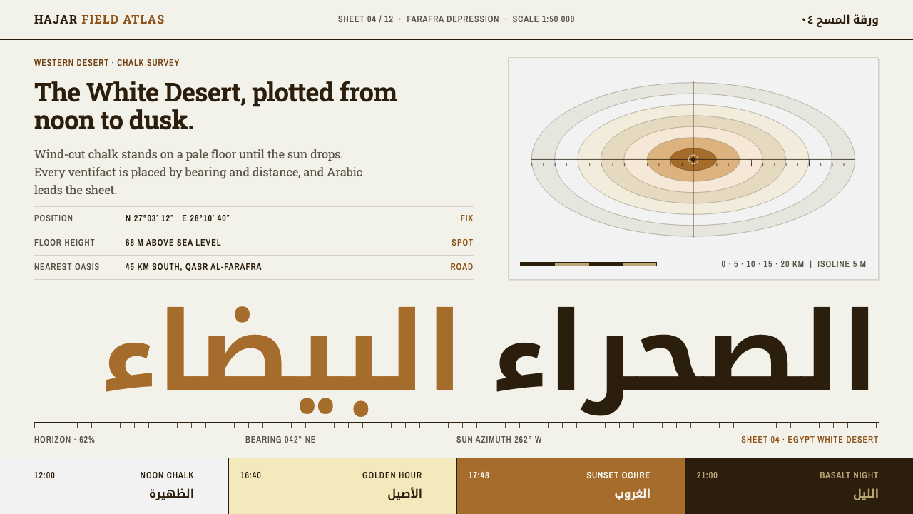 Egypt White DesertChalk at noon, ochre at dusk. Kufi Arabic leads a survey sheet of condensed l…
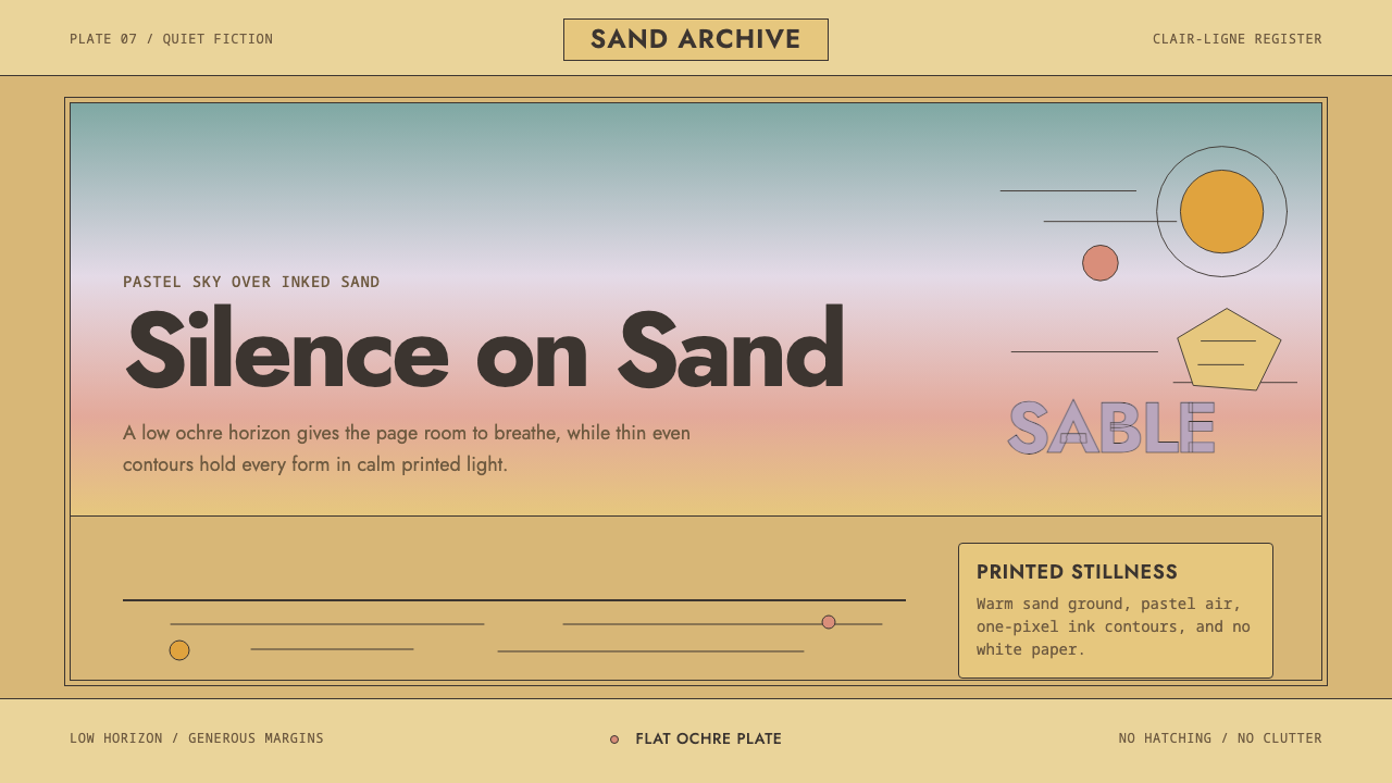 Sable (Mœbius)Still desert science fiction. Ochre ground, pastel sky, and thin ink contours…
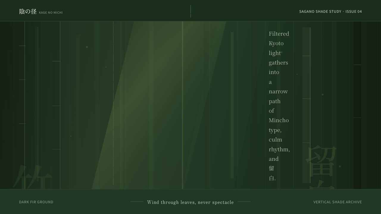 Bamboo GroveQuiet goes vertical. Fir green, Mincho type, and dappled culm rules create de…
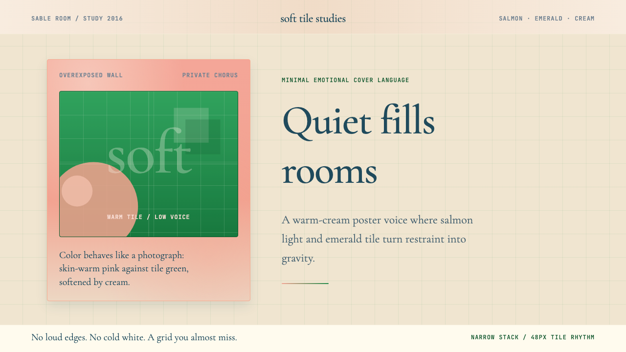 Frank Ocean — BlondeQuiet carries weight. Salmon pink and emerald tile sit on warm cream with air…