What is Egypt White Desert?
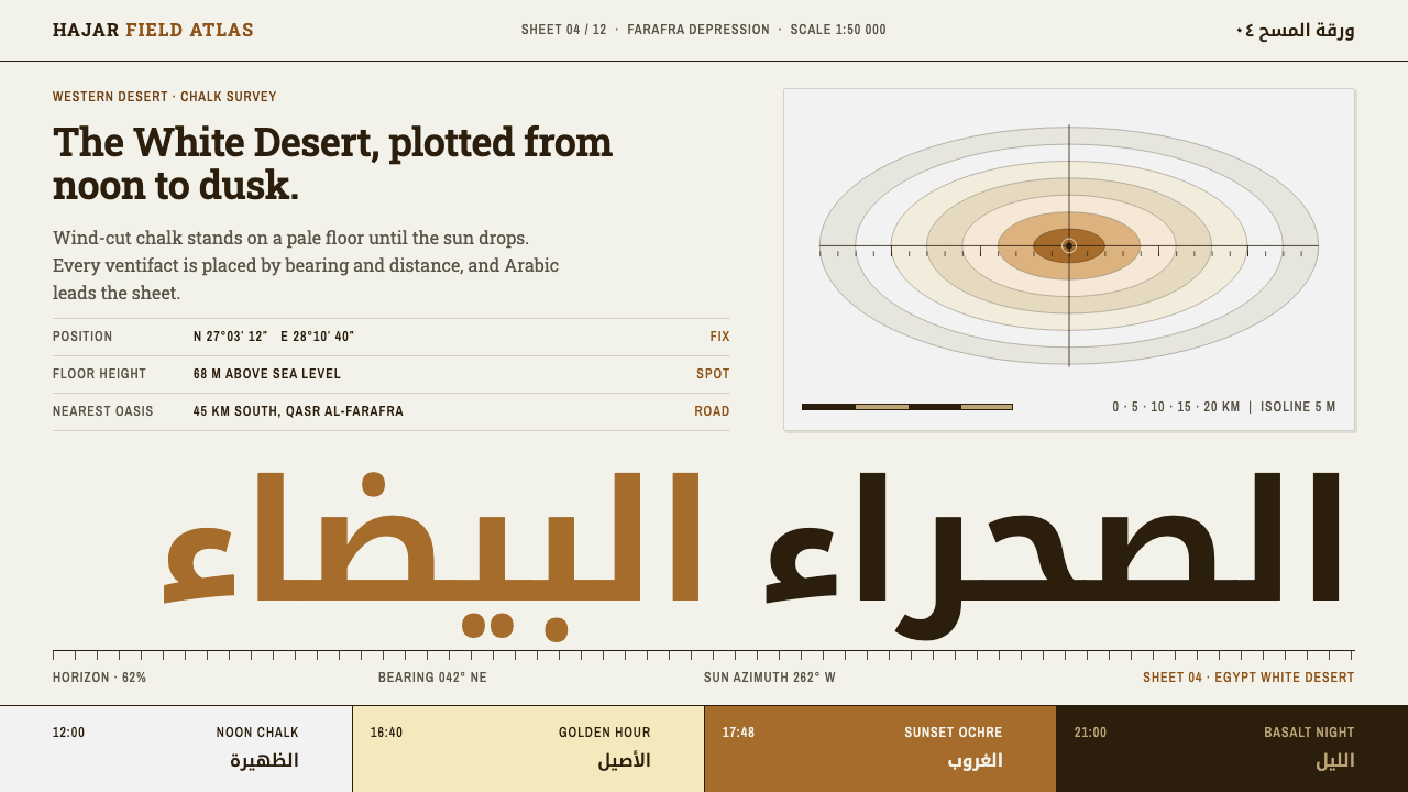
Egypt White Desert turns the chalk landscape of Farafra into a survey sheet: a near-white page, one ochre that arrives with the low sun, and Arabic type leading a field of fine coordinates.
Egypt White Desert in brief
Egypt White Desert is a design system drawn from the chalk landscape of the Farafra depression, in Egypt's Western Desert. Its visual language is easy to name: a near-white page the colour of wind-polished rock at noon, a single ochre accent that appears only the way evening sun does, Arabic Kufi headlines, Naskh for reading text, a sturdy Clarendon-style slab for Latin, and small condensed labels that carry coordinates, distances and bearings.
The source of the style is a place, not a school. The White Desert is a field of pale chalk formations that wind and sand have carved, over geological time, into mushroom rocks, ice-cream-cone rocks and chicken-leg rocks. They stand on grey-white ground in front of golden dunes, and further north the colour flips to the basalt of the Black Desert. At noon the stones are almost pure white; when the sun drops, the same stones and sand burn to a deep ochre. The design system is organised around that one day of light rather than around a colour chart.
The result feels like a survey sheet rather than a brochure. It reports a place instead of selling it: information is measured, labelled and located. Edges are hard, and where a shape is cut it is undercut on the windward side, the way eroded chalk is. Shadows, where they exist, are hard, offset and entirely without blur, because the glare of an open-desert noon gives a shadow a clean edge, not a soft one.

Where does Egypt White Desert come from?
Unlike most styles in a design library, this one has no founder, manifesto or school. Its origin is geological. The rock of the White Desert is Cretaceous chalk, a soft, pale limestone laid down long before any human culture, and the shapes people photograph today are what wind and blown sand have left after an immense span of time. Because moving sand does most of its abrasion close to the ground, the base of a pillar is cut back faster than its crown, which is why so many formations balance a broad cap on a narrow stem. Rocks shaped this way are called ventifacts, and the design system treats that process, subtraction by wind, as its working method: nothing is added for decoration, everything is removed until the form is honest.
The place became a formal conservation subject in 2002, when the area was declared a national park, and the style's visual reference runs from that date to the present. That sets the register of the system. It speaks in the voice of geological heritage and protected-area conservation, where the job is to describe a fragile landscape accurately and to invite visitors to move through it with care. The Egyptian Environmental Affairs Agency, the national body concerned with environmental protection, belongs to this story as the institution associated with the area's protected status.
Travel through the region has long depended on people more than on maps. The Bedouin guides of the Farafra and Bahariya oases know the routes between the oases, the chalk fields, the dunes and the basalt country, and overland desert travel and star camping are among the activities that draw visitors today. That practical, route-minded knowledge shows up in the system as an emphasis on direction and distance. Every page behaves a little like a guide's briefing: it tells you where something is and how far away it lies.
The graphic vocabulary comes from a third tradition, exploration-era survey publishing. Reports and map sheets of the Western Desert described remote ground to readers who would never see it, using fine coordinates, measured distances and compass bearings set in compact condensed type. The cartographers of those sheets are the system's typographic ancestors. Over this survey layer the system places a distinctly regional voice. Arabic Kufi, an angular, geometric script suited to monumental headings, takes the lead; Naskh, the calm cursive built for continuous reading, carries the text; and a slab-serif Latin sits alongside as a sturdy, sign-like second language.
What defines the Egypt White Desert look?
Chalk and Ochre
The page is a near-white, the colour of a chalk ventifact at noon, and the palette is deliberately starved. One ochre does all the accenting, and it behaves like evening light: it arrives late, it is warm and low, and it never shares the stage with a second hue. The supporting greys are pale and faintly warm, never cool or bluish, so the whole surface reads as sun-bleached stone rather than as a clinical white.
Arabic-Led Typography
Headlines are set in Kufi Arabic, an angular and geometric script that has the weight of carved inscription. Naskh carries the reading text because it was shaped for long, continuous passages. Latin text uses a Clarendon-style slab, whose heavy, bracketed serifs echo the solidity of a signpost. The three voices are not blended; each has a job, and the hierarchy between them is clear at a glance.
Survey Labels
Coordinates, distances and bearings are lettered in condensed small type, set tight and placed at the margins and corners of a composition as annotation. They do the work that captions, tags and metadata do in other systems, but with the precision of a plate in a survey atlas. The condensed form lets a lot of measured information sit in a small footprint without competing with the headline.
Hard Edges, Undercut Windward
Corners are hard. Where a panel or card has been shaped, the cut is made on the windward side, as if sand had worn away the base of a pillar of chalk. This undercut gives rectangles a sense of weathering without any texture, noise or simulated erosion; the shape alone carries the story. Nothing is rounded to feel friendly.
The Dune Arc
The one curving gesture in an otherwise angular system is the top edge of a card, which follows the line of a dune. It is a single, shallow arc rather than a set of soft corners, so it reads as landform, not as friendliness. Because it is used only there, it works like a horizon line: a quiet reminder of the dunes behind the chalk.
Hard Shadow, Zero Blur
Shadows are solid, offset and sharp-edged, the way a rock casts its shadow under a high desert sun. They are used to separate layers, not to suggest a glow, and they never spread into a haze. The effect is graphic and almost diagrammatic: elements look cut from card and placed on the ground, which suits a style that wants to read as a measured document.

Who shaped Egypt White Desert?
The Bedouin guides of the two oases are the human intelligence of the landscape. They know where the chalk fields, the dunes and the basalt country begin and end, and they are the people who make overland desert travel and star camping possible. Their way of describing place, by route, direction and distance, is the practical root of the system's emphasis on bearings and measured labels.
As the national body concerned with environmental protection, the agency is the institution associated with the White Desert's protected status. Its presence in the style's story explains the system's conservation register: a tone of careful description, measured information and respect for fragile ground, rather than the promotional enthusiasm of a typical travel brand.
The cartographers who produced the survey sheets and expedition reports of the Western Desert gave the system its graphic grammar: fine coordinates, distances, bearings, and condensed lettering that can hold a great deal of information in a small space. Their sheets describe remote ground for readers who will never visit, which is precisely what a well-built information page also does.
How do you use Egypt White Desert today?
Egypt White Desert suits work that has to describe a real place, a measured quantity or a journey, and it asks for a certain discipline: keep the page quiet, let one colour mean 'look here', and let small, precise labels do the explaining. It is closer to cartography than to decoration, so it works best where the content has coordinates, distances, dates or sequences to show.
For presentation slides, a cover can work like a plate from a survey atlas: a large near-white field, a headline set in Kufi or in the slab, and a single ochre mark, such as a rule, a dune-arc shape or a small marker, anchoring one corner. Content slides lean on the condensed labels for captions, sources and figures, with generous chalk-white space around one idea at a time. Data slides should read as survey diagrams: thin rules, direct labels instead of legends, and ochre reserved for the one series or value the audience must notice.
For web interfaces, the system suits dashboards, itinerary tools, environmental monitoring, and any pricing or booking page where visitors compare measured options. Cards carry the dune-arc top edge and hard shadows, primary buttons are flat ochre with plain text, and navigation can be purely typographic, with condensed labels acting like bearings on a compass. Because shadows are hard and offset, stacked panels stay legible without blur or gradients. For right-to-left audiences, set Arabic headlines and body text in their proper directions instead of approximating them.
For editorial and marketing work, whether an expedition feature, a travel guide, a conservation report or a park brochure, the survey-sheet logic supplies a ready structure: a wide column for narrative, a narrow margin of coordinates and bearings, and captions set like plate notes. Photography of the chalk formations needs little adjustment because the page already shares its colours; full-bleed images can sit directly on the near-white ground and meet hard, undercut crops rather than rounded frames.
The most common mistake is to treat 'desert' as permission for a generic sand-and-gold look: warm gradients, soft glows, pyramid clip art and ornamental scripts. This system argues the opposite. The page is white, ochre is rationed, edges are cut rather than rounded, and Arabic is typeset as a working language rather than as a decorative flourish. A second error is spending the ochre everywhere; once it appears on every button, badge and heading, the effect of dusk, the one thing the colour is for, disappears.

Egypt White Desert — FAQ
Does Egypt White Desert only work for Arabic content?
No. Latin text is built into the system through the Clarendon-style slab, and condensed labels do the same survey job in any language. Arabic is meant to lead where the content is Arabic or bilingual, which is what gives the style its regional voice. On an all-Latin page the slab takes over the headline role. If you add an Arabic word to an English page, set it with care and for a real reason, not as decoration.
Why is there only one accent colour?
Because the colour is modelled on a single event: the low, late sun that turns white chalk to ochre. One accent keeps the page legible as a map, where a reader can find the thing that matters at a glance. A second accent would turn the system into a generic two-colour palette and weaken the idea that the page is white until the light changes.
Can the style be used in a dark theme?
The system is built on a light ground, because the white page is the noon chalk. The basalt of the Black Desert to the north shows that the landscape has a dark side, but a dark version is a different design problem rather than a simple inversion. If you must go dark, keep the hard edges, the dune arc, the survey labels and the single ochre, and accept that you are adapting the style, not reproducing it.
What kinds of products and content suit it best?
Anything that describes a place or a measurement: travel and expedition planning, geology and natural-heritage education, conservation reports, mapping and field-data tools, outdoor equipment and tour operators. It is a weaker fit for playful consumer apps, children's products or luxury brands that rely on soft gloss, since the system's honesty comes from hard edges and restraint.
Why are the shadows hard, with no blur at all?
Because the style imitates the light of an open desert at noon, where shadows are crisp, and because a hard shadow is a geometric decision rather than a lighting simulation. Hard, offset shadows also reproduce cleanly in print, on small screens and in single-colour output, which suits a style meant to behave like a survey sheet.
Related design styles
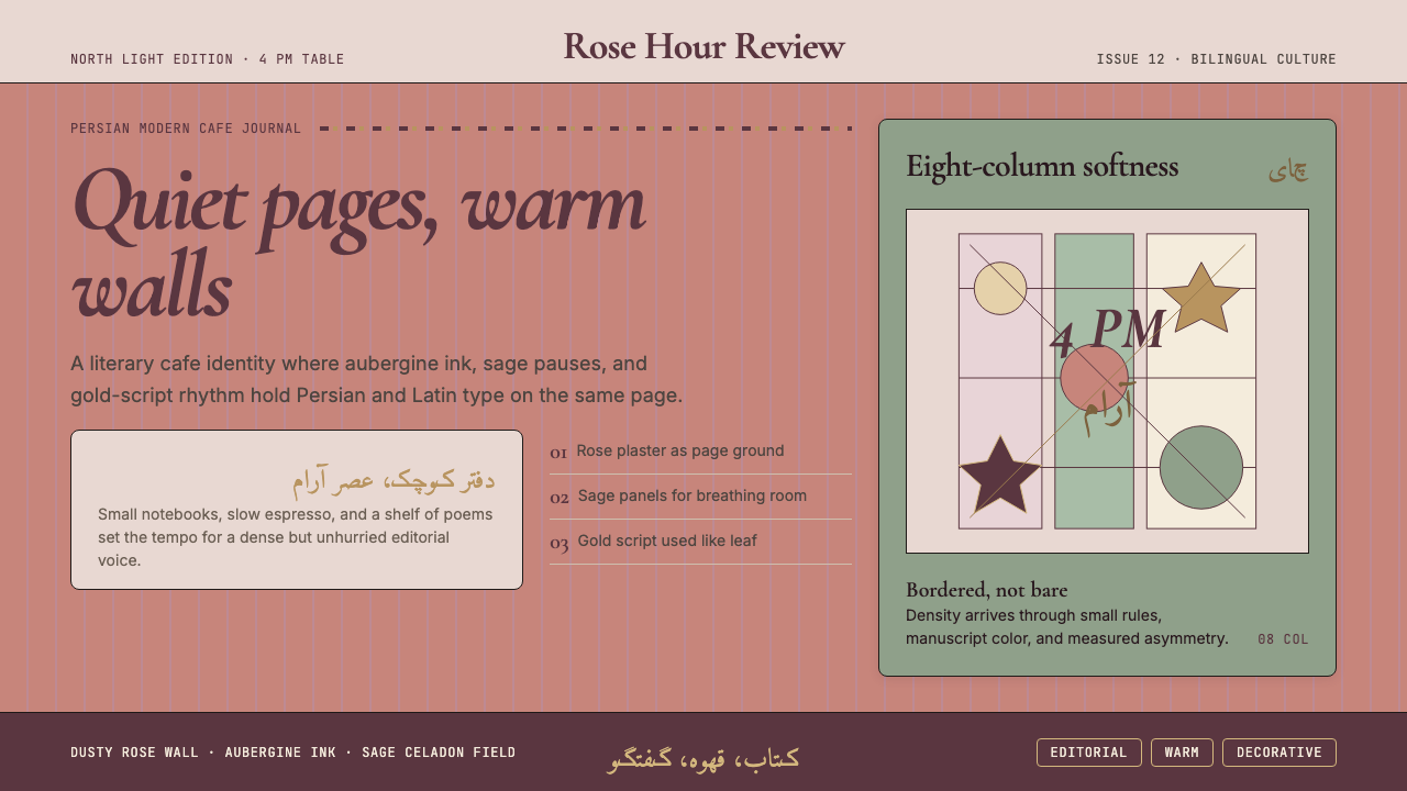 Tehran Cafe ModernismQuietly dense, warmly literary. Dusty rose, sage panels, and italic serif gri…
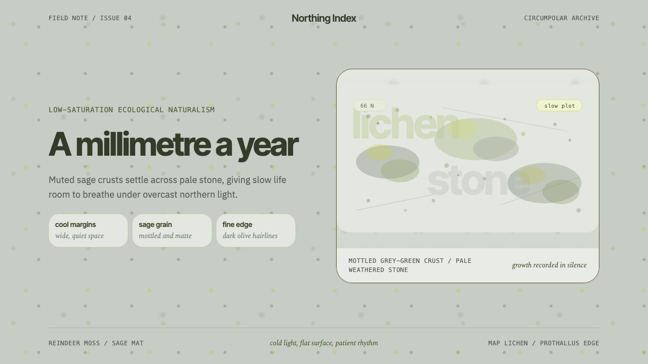 Arctic Tundra LichenPatience made visible. Sage speckles drift over cold stone with narrow, quiet…
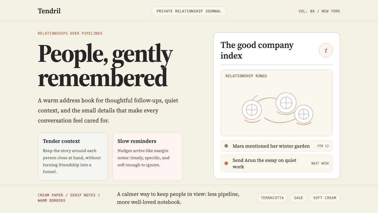 Clay 2024CRM as a sketchbook, not a sales pipeline. Cream backgrounds, terracotta, han…
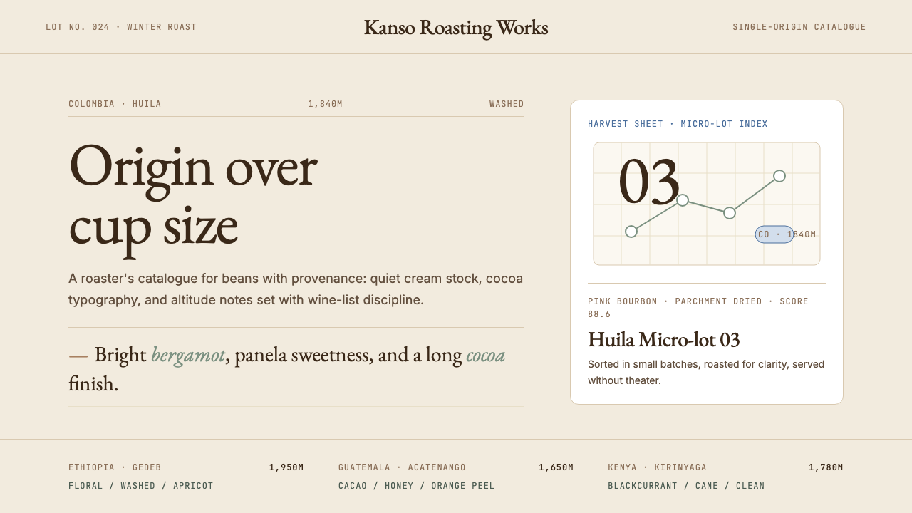 Third Wave CoffeeCoffee as catalogue. Cream paper, cocoa serif, mono origin specs, one sage no…
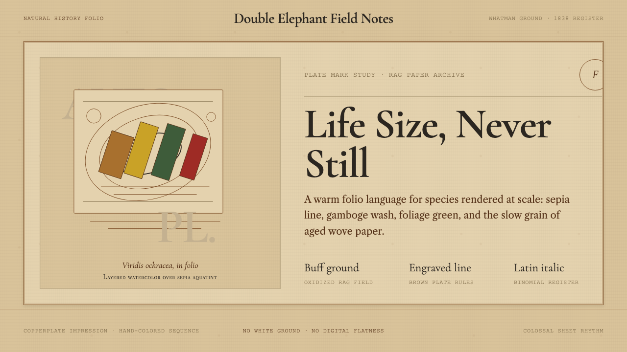 Audubon Birds of AmericaAged natural history breathes. Buff rag paper, sepia rules, and italic binomi…
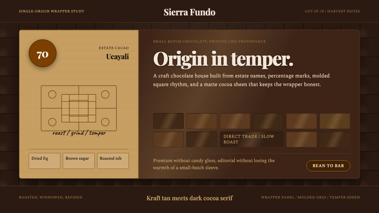 Bean-to-Bar ChocolateOrigin tastes tactile. Cocoa serif, kraft panel, and molded squares carry the…