What is Arctic Tundra Lichen?
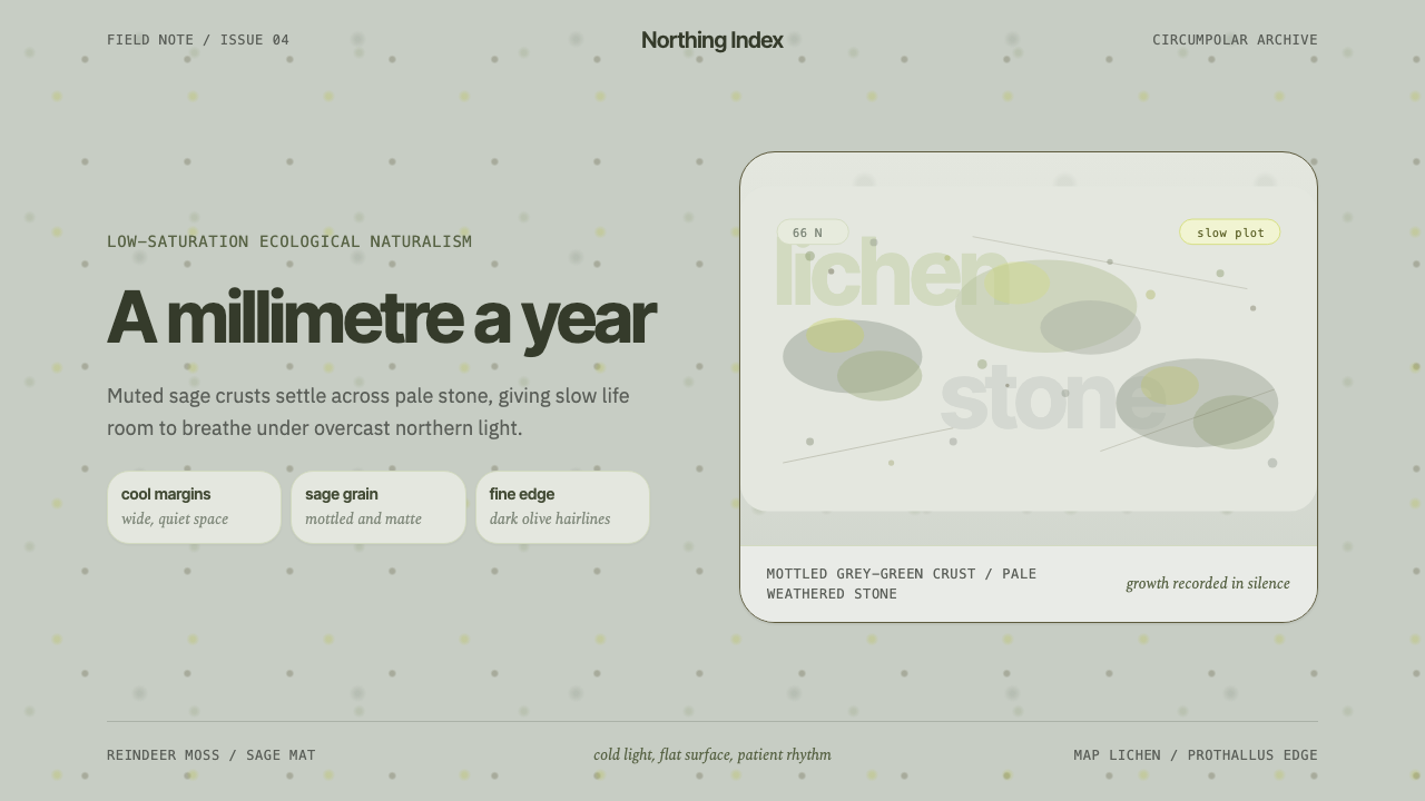
Arctic Tundra Lichen makes patience visible — muted sage speckles drifting over cold stone, with narrow, quiet type that never raises its voice.
Arctic Tundra Lichen in brief
Arctic Tundra Lichen style draws from the speckled grey-green crusts of lichen that cling to weathered rock across the treeless circumpolar north — the vast, low-growing ecosystems of the Arctic tundra found across Scandinavia, Siberia, Canada, and Alaska. Rather than illustrating a landscape, the style abstracts a single close-up phenomenon: the mottled, organic texture of lichen growth spreading, almost imperceptibly, across stone.
This is a system built around patience rather than energy. Muted sage tones dominate, applied as mottled, organic grain rather than flat fields or gradients, and generous cool margins give every element room to breathe. Nothing in the composition shouts for attention; instead everything settles into place the way lichen settles onto rock, a process measured in years rather than moments.
The palette stays deliberately cool and low-saturation throughout, refusing warmth or vividness in favor of the muted, overcast quality of light typical of high-latitude tundra environments. The overall effect is quiet, slow, and contemplative — a visual pace explicitly opposed to urgency.

Where does Arctic Tundra Lichen come from?
Lichen is not a single organism but a symbiotic partnership between a fungus and an alga or cyanobacterium, and it is among the slowest-growing life forms on the planet — some crustose species advance across rock at a rate measured in fractions of a millimeter per year. Reindeer moss, or Cladonia rangiferina, and map lichen, or Rhizocarpon geographicum, are two of the most visually distinctive species found across the circumpolar Arctic, the latter so slow and consistent in its growth rate that lichenometry — dating rock surfaces by measuring lichen colony size — is used as a scientific technique in geology and glaciology.
The circumpolar Arctic tundra itself spans Scandinavia, Siberia, Canada, and Alaska, a treeless biome defined by permafrost, short growing seasons, and a muted, frequently overcast quality of light. Lichenologists such as Trevor Goward and Irwin M. Brodo have documented this ecosystem's visual and ecological character in detail, cataloguing the specific mottled textures and cool color ranges that these organisms produce across weathered stone.
This aesthetic entered contemporary visual culture as part of a broader, present-day turn toward ecological naturalism — a design and photography sensibility, gaining momentum roughly since the 2010s, that draws directly on low-saturation landscape photography and biophilic minimalism rather than on decorative botanical illustration. Rather than romanticizing the Arctic through icy blues or aurora-inspired color, this specific strand of the movement looks at the ground itself: the patient, grey-green crust that quietly colonizes stone across an otherwise stark and treeless landscape.
What distinguishes this style from other nature-derived design systems is its refusal of drama. Where much Arctic and polar visual culture reaches for the sublime — vast ice fields, dramatic light, aurora color — this style instead centers on the smallest, slowest, least spectacular element of the ecosystem, treating patience and restraint themselves as the aesthetic subject.
What defines the Arctic Tundra Lichen look?
Muted Sage Tones
The dominant color family sits within a narrow, muted sage-green range — never bright, never fully saturated. This restraint is deliberate: a vivid green would read as spring growth or houseplant vitality, while the muted, slightly grey sage tone this style uses reads specifically as slow, cold-climate lichen.
Mottled Organic Grain
Texture is applied as an irregular, mottled speckle rather than a flat fill or a repeating pattern. Each patch of color should feel organically distributed, as though grown rather than printed, echoing the way lichen colonizes a stone surface unevenly over time.
Cold Stone Ground
The base surface is a cool, weathered stone gray, functioning as the neutral ground upon which the muted lichen texture sits. It should read as worn and natural rather than polished, giving the sage speckle something authentically rough to cling to.
Wide Cool Margins
Generous negative space, kept within the same cool color family as the rest of the system, surrounds every element. This spaciousness is what lets the composition feel patient rather than crowded, echoing the low-density, wide-open character of tundra terrain itself.
Narrow Quiet Typography
Type is set narrow, restrained, and quiet in tone — never bold or attention-seeking. The typography should feel like it is settling into the page rather than announcing itself, matching the unhurried pace of the rest of the system.
Overcast Light Quality
Lighting throughout the system is soft, diffuse, and slightly overexposed rather than dramatic or directional, echoing the flat, even light typical of tundra skies. No hard shadows or high-contrast lighting effects should appear; the mood is consistently even and muted.
Slow Compositional Rhythm
Elements are spaced and paced deliberately, avoiding density or clutter, so that the eye moves across the composition unhurried. This rhythm is the direct visual translation of a lichen colony's growth rate — nothing appears rushed, and every element earns its place through patience rather than urgency.

Who shaped Arctic Tundra Lichen?
One of the most visually recognizable circumpolar lichen species, reindeer moss forms pale, branching, sponge-like colonies across tundra ground. Its distinctive mottled texture and muted tone are a direct visual reference point for this style's speckled grain.
Known for growing at an exceptionally slow and consistent rate, map lichen forms flat, mottled patches directly on rock surfaces. Its growth rate is precise enough to be used scientifically for dating exposed stone, making it a fitting emblem for a style built entirely around patience.
A lichenologist whose detailed documentation of circumpolar lichen ecosystems has contributed to the broader public and scientific understanding of these organisms' visual and ecological character, informing the specific textures and color ranges this style draws from.
A lichenologist known for cataloguing North American lichen species in detail, Brodo's work provides much of the descriptive vocabulary — mottled crusts, muted grey-green tone — that underlies how this style translates a biological phenomenon into a visual system.
How do you use Arctic Tundra Lichen today?
Arctic Tundra Lichen style suits any product or communication that wants to feel calm, patient, and quietly ecological rather than urgent or energetic. Applying it well means resisting the urge to brighten or saturate the palette for visual punch, since the entire system depends on restraint.
For presentation slides, a cover slide can use the cold stone ground with a drift of mottled sage texture across one corner, title set in narrow, quiet type with generous surrounding space. Content slides should keep density low, favoring wide margins over tightly packed information, while data slides can use the mottled grain idea sparingly — perhaps as a background texture behind a chart rather than as a decorative overlay on the data itself.
For web interfaces, the style is well-suited to wellness, nature, sustainability, and slow-living brands that want to signal patience and environmental groundedness rather than speed. Dashboards should use the sage tone sparingly for active states, keeping most of the interface in cool stone gray, and cards should carry soft, mottled texture rather than sharp borders to preserve the organic quality.
For editorial and marketing work, the register suits nature writing, environmental storytelling, and any brand built around slowness and care. Full-bleed cold-stone sections with drifting sage texture work well as chapter breaks; marketing hero sections should avoid crowding the composition, letting wide cool margins do as much communicative work as the text itself.
The most common mistake is brightening the sage tone into a vivid, spring-green color, which immediately shifts the mood from patient tundra lichen to generic houseplant freshness. A second frequent error is over-densifying the layout with information, which contradicts the slow, spacious rhythm the style depends on to communicate patience rather than urgency.

Arctic Tundra Lichen — FAQ
Why is the palette so consistently cool and muted rather than including any warm tones?
Because the style references the specific, overcast light quality of high-latitude tundra environments, where warm, saturated light is rare. Introducing warm tones would contradict the environmental accuracy the style depends on and would shift the mood from patient, cold-climate stillness toward something more seasonal or cheerful, undermining the quiet character that is the whole point of the system.
Is this the same as a generic "nature" or "green sustainability" visual style?
No. Generic sustainability branding typically uses bright, optimistic greens and leaf iconography to signal freshness and growth. Arctic Tundra Lichen style instead references a specific, slow-growing, cold-climate organism and deliberately avoids vividness or optimism in favor of patience, restraint, and a muted, overcast color quality.
Can this style work with a denser, more information-heavy layout?
It resists density by design. The wide cool margins and slow compositional rhythm are not incidental decoration — they are the visual mechanism that communicates patience. Compressing the layout to fit more information tends to collapse that mechanism, making the result read as generic muted-green design rather than a genuine expression of the style's core idea.
How should texture be applied so it reads as organic lichen rather than a generic speckle filter?
The mottling should be irregular and unevenly distributed, denser in some areas and sparse in others, the way a real lichen colony grows outward from multiple starting points rather than in a uniform grid. A perfectly even, regularly repeating speckle pattern reads as a generic texture filter rather than an organism that has patiently colonized a surface over time.
Where does this style struggle or feel out of place?
It struggles in contexts that demand urgency, excitement, or high energy — flash sales, entertainment platforms, or any brand built on speed and immediacy. Its deliberate slowness and muted tone can read as flat or lifeless in settings where users expect vibrancy. It performs best when the product's actual values align with patience, wellness, environmental care, or unhurried craftsmanship.
Related design styles
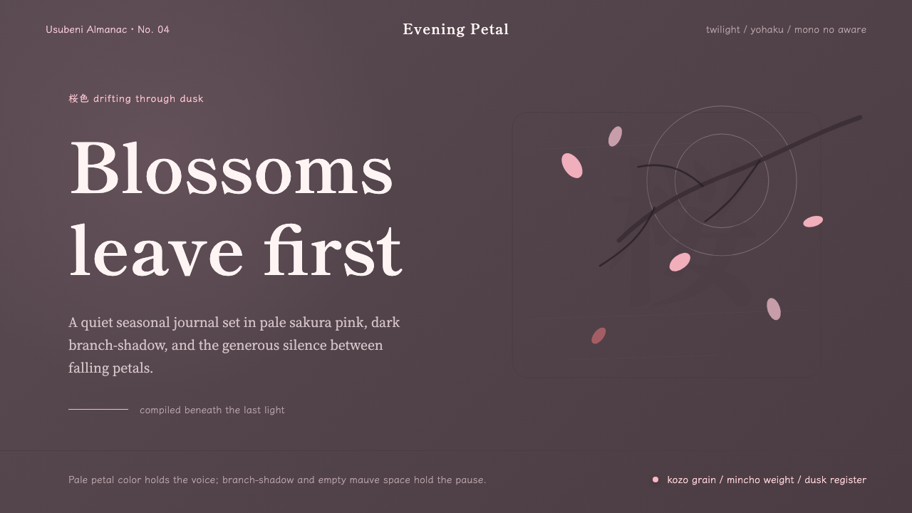 Cherry Blossom HanamiTenderness arrives in dusk. Sakura pink, branch-shadow, and Mincho type leave…
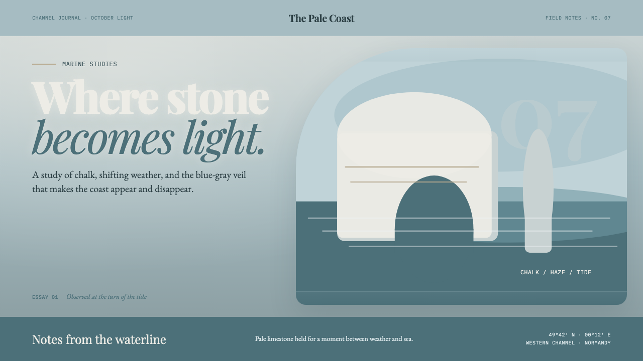 Étretat Chalk CliffsStone becomes light. Chalk-white forms dissolve through blue-gray mist and li…
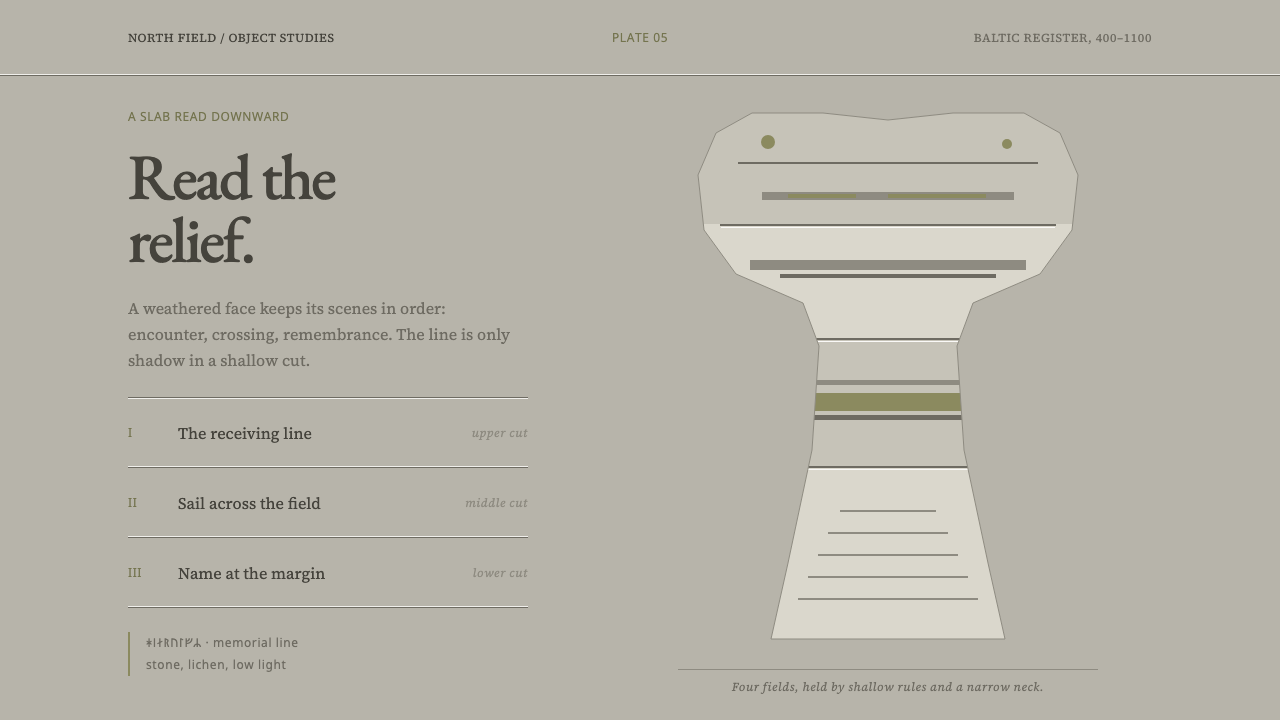 Gotland Picture StoneMeaning emerges slowly. Weathered limestone greys divide a story into shallow…
 Grant Wood American Gothic (1930)Plainness stands firm. Dusty denim and ochre align on a strict central axis.
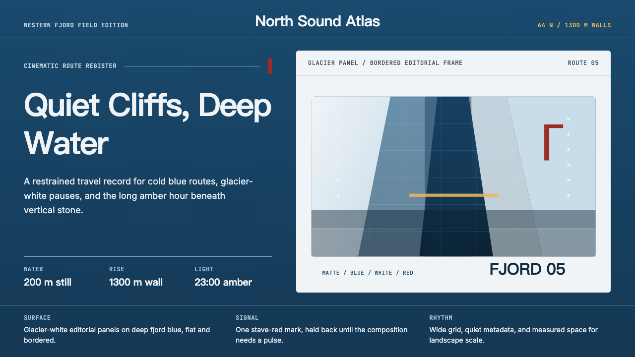 Norwegian Fjord TourismMonumental, not loud. Fjord blue, glacier-white panels, and one stave-red acc…
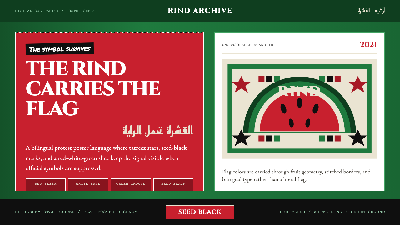 Palestinian Watermelon (2021)Defiant shorthand. Rind green, watermelon red, seed black, and tatreez stars…