What is Palestinian Watermelon (2021)?
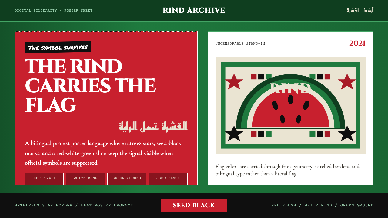
When algorithms silenced the flag, the watermelon spoke — four colors, two traditions, and a visual language that no filter could scrub.
Palestinian Watermelon (2021) in brief
The Palestinian Watermelon (2021) design system takes its name from the moment when social media platforms began algorithmically suppressing images of the Palestinian flag during the escalations of May 2021. Activists, artists, and everyday users discovered that the watermelon — red flesh, white rind interior, green outer skin, black seeds — mirrored the four colors of the flag with uncanny precision. What began as protest shorthand became a fully articulated visual language, recognized globally within weeks.
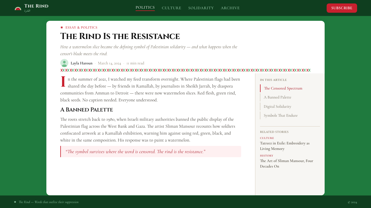
The aesthetic fuses two distinct visual traditions. The first is tatreez, the cross-stitch embroidery practiced for generations by women in Bethlehem, Hebron, Ramallah, and villages across historic Palestine. Tatreez patterns — particularly the eight-pointed star, diamond lattices, and interlocking geometric motifs — carry encoded regional identity: a trained eye can read a woman's home village from the specific arrangement of her stitches. The second tradition is the flat, high-contrast graphic urgency of Palestinian protest posters, with roots in the silkscreen and lithograph poster movements of the 1960s and 1970s, and in the iconic cartoons of Naji al-Ali, whose Handala figure became the symbol of the Palestinian refugee.
Together, these two streams produce a style that is simultaneously intimate and confrontational. The embroidery tradition contributes intricacy, craft memory, and geometric structure; the poster tradition contributes bold outline, stark contrast, and communicative directness. The watermelon motif holds both: it is decorative enough to pass through content filters yet blunt enough to be immediately legible as solidarity.
Where does Palestinian Watermelon (2021) come from?
The watermelon as political symbol has roots going back decades in Palestinian visual culture. The painter Sliman Mansour created a series of watermelon canvases in the early 1980s — a period when Israeli military orders prohibited public display of the Palestinian flag in the Occupied Territories. The four colors of the flag (black, white, green, red) appeared in the fruit's cross-section, giving artists a coded vehicle for national expression that authorities could not easily suppress without banning the fruit itself. Mansour's work established the visual grammar that later generations would inherit.
In 2007, artist and curator Khaled Hourani produced what became the most discussed single intervention in this lineage: he arranged for a single Picasso painting to be transported from Paris to Ramallah for exhibition — a logistical and political feat that drew worldwide attention to the restrictions on movement of objects (and people) in and out of the Palestinian territories. That same year, Hourani also published a book documenting the watermelon's artistic history, cementing the symbol's status as an art-historical subject rather than merely a folk protest gesture.
The 2021 digital resurgence transformed the symbol's scale and speed of circulation entirely. During the May 2021 conflict, users across Instagram, Twitter, and TikTok discovered that posts featuring the Palestinian flag were being down-ranked or removed, while posts featuring watermelons were not. The watermelon became the preferred visual for solidarity content practically overnight. Artists began producing work in real time — digital illustrations, animated GIFs, embroidery pattern templates — explicitly in this four-color vocabulary. The tatreez eight-pointed star, already widely recognized in diaspora communities, appeared alongside the fruit motif as a paired symbol.
What distinguishes the 2021 iteration from earlier uses of the watermelon symbol is the conscious codification into a design system. Rather than isolated protest images, artists and designers began articulating consistent visual rules: the rind-green as a dominant ground color, the flesh-red as the primary accent, the seed-black for line work and typography, and the white interior band as the neutral separator. Tatreez geometric borders were standardized into repeatable modules. The result was not just a symbol but a coherent visual language capable of spanning posters, clothing, digital interfaces, and editorial illustration simultaneously.
What defines the Palestinian Watermelon (2021) look?
Color Structure
The palette is organized around the four colors of the Palestinian flag: a deep, saturated green derived from the watermelon rind anchors the ground; a vivid, warm red from the flesh functions as the primary accent; black drawn from the seeds handles linework and type; and an off-white borrowed from the interior pith serves as the neutral separator. These four colors carry the communicative load of the entire system — no additional hues are needed or appropriate. Their combination is immediately legible as both fruit and flag, which is the essential compression the system performs.
Tatreez Geometric Patterning
Tatreez embroidery motifs — most centrally the eight-pointed star, but also diamond lattices, stepped zigzag borders, and interlocking cruciform shapes — function as the ornamental layer of the system. In digital and printed applications, these patterns are typically rendered as flat, solid-filled geometric shapes rather than simulating the texture of actual thread. They appear as borders, background textures, and decorative dividers, and they carry regional and cultural specificity: the embroidery patterns historically encoded a woman's village of origin, giving the decorative layer a depth of meaning that generic pattern work cannot replicate.
Flat Graphic Boldness
Inherited from the Palestinian protest poster tradition, the style favors strong, unmodulated outlines, solid color fills, and high contrast between figure and ground. Gradients, soft shadows, and atmospheric depth are absent. This flatness is not minimalism — it is the visual register of urgency, of images designed to be reproduced quickly, cheaply, and at any scale from a screen to a street banner. The poster lineage also means that figurative imagery, when it appears, tends toward silhouette and iconic reduction rather than detailed naturalistic rendering.
Bilingual Typography
The style pairs Arabic script — typically Naskh (the rounded, legible script used in print and media) or Kufi (the angular, geometric historical form) — with Latin serif or humanist typefaces for solidarity messaging in English, French, or other languages. The combination is deliberate: Arabic is not subordinated as a decorative element but treated as typographically co-equal with the Latin text. Naskh's rounded forms sit comfortably against the curved lines of the watermelon motif; Kufi's angular geometry echoes the geometric regularity of tatreez borders. The bilingual pairing signals that the message is addressed simultaneously to internal and diaspora audiences and to international solidarity networks.
Symbolic Density
Every visual choice in this system is also a political statement, which gives even simple compositions a layered meaning that outsiders may miss and insiders immediately read. The rind-green ground is simultaneously a design decision and an assertion of presence. The tatreez border is simultaneously a decorative element and a declaration of cultural continuity. The watermelon itself is simultaneously a food, a flag substitute, and a record of censorship. This compression — where aesthetic and political meaning are inseparable — is the defining characteristic of the style and the source of its emotional resonance.
Handmade and Digital Coexistence
Unlike many historical-revival design styles, the Palestinian Watermelon aesthetic comfortably bridges handmade and digital production. Tatreez embroidery is a craft requiring months of labor; its patterns, transposed into flat digital geometry, reproduce instantly. Hand-painted protest banners share visual grammar with algorithmically distributed social media graphics. This coexistence is not a contradiction but a feature: the style's adaptability across media is precisely what allowed it to propagate at the speed of the 2021 digital moment while remaining rooted in a material tradition centuries old.
Dark Ground Preference
Unlike many historical movements whose canonical form uses a light or neutral ground, the Palestinian Watermelon system most commonly deploys a dark, rind-green ground with light or vivid elements above it. This inversion reads as nocturnal, urgent, and weighted — qualities appropriate to the political context from which the style emerged. The deep green ground has the visual effect of making the red flesh-tones and white separator elements appear almost luminous by contrast, a dynamic that intensifies the flag-color reading.
Who shaped Palestinian Watermelon (2021)?
Mansour is among the most significant Palestinian painters of the twentieth century, and his early 1980s watermelon series represents the origin point of the symbol's art-historical lineage. Working during a period when the flag itself was prohibited in public display under Israeli military orders, he used the fruit's four-color cross-section to create paintings that could circulate under the radar of censorship while remaining legible to Palestinian audiences as unmistakable assertions of national identity. His practice spans painting, illustration, and cultural activism; he is closely associated with the Jerusalem Fund for Education and Community Development and with efforts to document and preserve Palestinian visual and material heritage.
Hourani is a Palestinian artist, curator, and educator who has done more than perhaps any other single figure to secure the watermelon symbol's place within art-historical discourse. His 2007 book on the watermelon's artistic history documented the symbol's uses from Mansour's canvases forward. His most discussed project remains the Picasso in Palestine initiative, in which he arranged for Vincent van Gogh's painting to travel from the Netherlands to Ramallah — drawing international attention to both the restrictions on cultural exchange in Palestinian territories and to the Palestinian contemporary art scene. He has taught at and directed institutions including the International Academy of Art Palestine.
Al-Ali was a Palestinian political cartoonist whose work, produced from the 1960s until his assassination in London in 1987, defined the visual register of Palestinian resistance imagery for an entire generation. His most famous creation, Handala — a small, barefoot child seen always from behind, arms clasped behind his back — became the symbol of the Palestinian refugee and has been reproduced on murals, T-shirts, and protest banners from the occupied territories to diaspora communities worldwide. Al-Ali's flat, high-contrast line style, his use of stark silhouette, and his commitment to producing work that circulated through cheap reproduction established a visual language that directly informs the protest-poster dimension of the Palestinian Watermelon aesthetic.
The tatreez tradition that supplies the geometric layer of the Palestinian Watermelon aesthetic was developed not by named individual artists but by generations of women across villages in the West Bank, Gaza, and what is now Israel. Each regional embroidery tradition — Bethlehem, Hebron, Ramallah, the villages of the Galilee — developed distinct pattern vocabularies that encoded local identity. The 2021 digital resurgence drew on this collective inheritance and, in doing so, brought renewed attention to tatreez as a living practice, with diaspora communities and younger Palestinian women reconnecting with the craft as a form of cultural continuity and political affirmation.
The codification of the Palestinian Watermelon into a coherent design system during May 2021 was a collective, largely anonymous act of distributed creativity. Thousands of digital artists, graphic designers, illustrators, and embroiderers across the Palestinian diaspora and in solidarity communities around the world produced and circulated work simultaneously. The resulting body of work achieved a surprising visual consistency — the four-color palette, the tatreez star, the flat graphic clarity — not through top-down design direction but through the rapid convergence of shared references. This mode of authorship, distributed and collective, is itself part of what the style represents.
How do you use Palestinian Watermelon (2021) today?
The Palestinian Watermelon aesthetic is a politically charged style, and choosing to apply it carries inherent meaning. For solidarity campaigns, human rights organizations, cultural institutions, and editorial contexts engaging with questions of censorship, resistance, and cultural preservation, the style is extraordinarily legible and emotionally resonant. Its four-color vocabulary and tatreez geometry are understood globally since 2021, which gives work produced in this register immediate recognizability within international discourse.
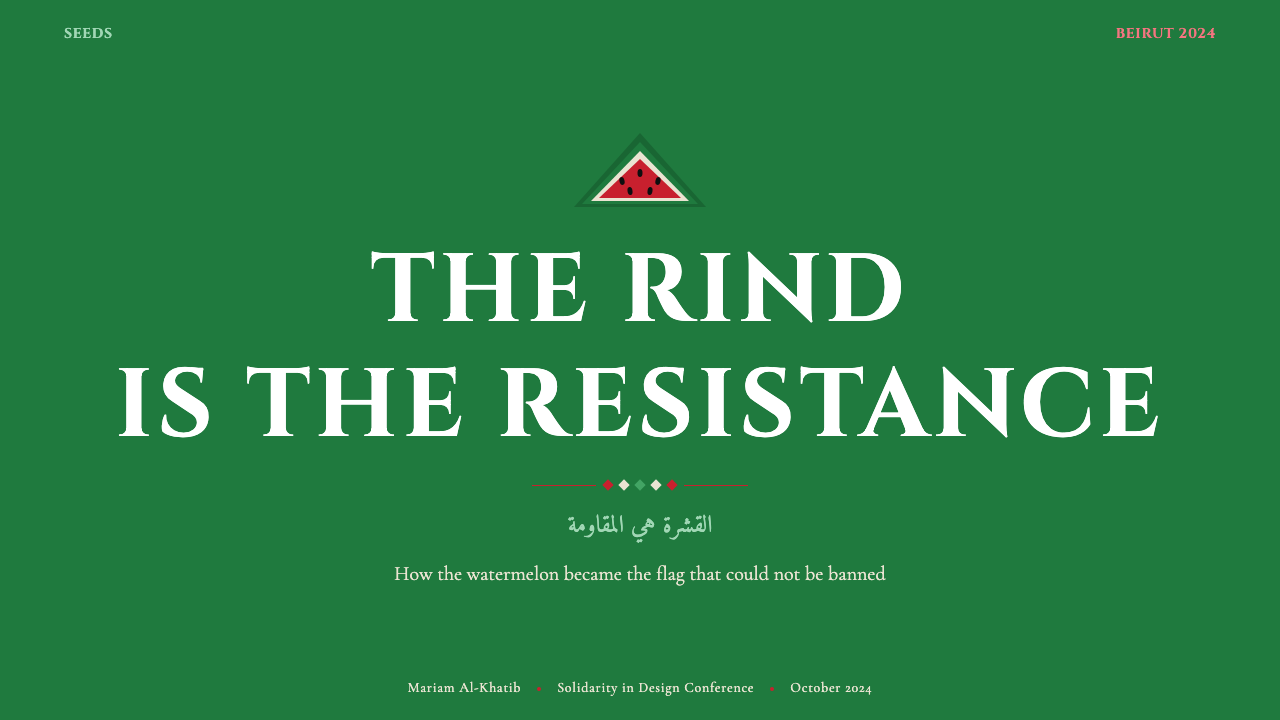
For presentation slides, the deep rind-green ground works well as a cover page. A single watermelon motif — either the full fruit in cross-section or a fragment showing the four-color transition — can anchor a hero image without requiring any typography at all. Content slides benefit from the tatreez star or diamond lattice as a subtle background pattern at reduced opacity, keeping the geometric richness of the tradition present without competing with text legibility. Data slides should use the flesh-red for active or highlighted data series, reserving seed-black for reference lines and off-white for axis labels. The style handles bold, unequivocal data presentations well; it does not suit tentative or hedged information design.
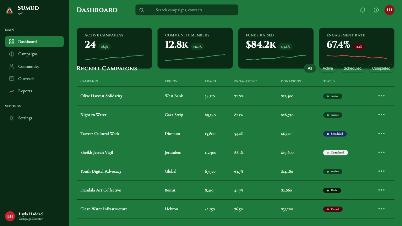
For web and digital interfaces, the style is well-suited to advocacy landing pages, cultural organization websites, and editorial publications addressing related themes. The approach: establish the rind-green as the dominant background, use the flesh-red only for the most critical interactive elements and calls to action, and use seed-black for all body type. Tatreez borders can frame section headers or navigation elements at a consistent weight. The style does not adapt well to utility-focused interfaces where users require neutral visual environments for extended task completion — the weight of the palette and the symbolic density of the motifs make it a foreground style, not a workhorse interface.
For editorial illustration and marketing materials, the style's poster lineage makes it particularly effective at single-image impact. A full-bleed rind-green background with a central watermelon cross-section and bold type in off-white or flesh-red produces a cover that reads immediately from a distance. The style handles bilingual layout naturally — Arabic text set in Naskh or Kufi, paired with Latin type in a weight that matches the visual weight of the Arabic letterforms, creates a compositional balance that honors both typographic traditions.
The most common mistake when applying this style is treating it as a purely aesthetic choice divorced from its political meaning. Unlike Bauhaus or Memphis, which have been thoroughly absorbed into neutral design vocabulary, the Palestinian Watermelon remains a live symbol with active political associations. Using it for contexts unrelated to solidarity, cultural engagement, or the political themes it encodes risks both visual incoherence (the symbolic density reads as noise if stripped of context) and reputational problems for the deploying organization. The second most common mistake is over-complexity: adding additional colors, gradients, or photographic elements to the four-color system dilutes the compressive force that gives the style its power. Restraint is not a limitation but the mechanism.
Palestinian Watermelon (2021) — FAQ
Why specifically 2021? Hasn't the watermelon been a Palestinian symbol for decades?
The watermelon has been used as a Palestinian political symbol since at least the early 1980s, when Sliman Mansour and other painters adopted it as a coded substitute for the prohibited flag. What changed in 2021 was the scale, speed, and systematization of its use. Social media platforms algorithmically suppressing the flag pushed users globally toward the watermelon in a matter of days, producing an enormous volume of visual work that, through rapid shared reference, coalesced into a recognizable design system. The 2021 moment also introduced the explicit pairing with tatreez geometric motifs at digital scale — a combination that predates 2021 in physical craft but achieved global circulation only then. The year designates a crystallization, not an origin.
Is it appropriate for non-Palestinian designers to use this visual language?
The question is worth taking seriously. The style emerged from a specific political context, and its symbols carry meaning that extends well beyond aesthetic preference. International solidarity organizations, human rights institutions, and media covering Palestinian issues have used this visual register appropriately and effectively. For commercial contexts unrelated to these themes, use is harder to justify — the symbolic density of the motifs reads as incongruous when stripped of political context, and the deployment risks being perceived as appropriation. The test is whether the context has genuine engagement with the themes the style encodes, not whether the visual outcome is attractive.
How does this style relate to other Palestinian visual art traditions?
Palestinian visual art is not a monolith; it encompasses contemporary fine art, traditional crafts, photography, film, and a rich tradition of political graphic design. The Palestinian Watermelon system draws most directly from two strands: tatreez embroidery (material, craft-based, regional in specificity) and protest poster graphics (print-based, flat, politically explicit). It does not represent Palestinian visual culture as a whole — many Palestinian artists work in idioms that have no relationship to this vocabulary. The watermelon system is better understood as a specific branch of Palestinian resistance visual culture, one that became globally visible through the particular conditions of the 2021 digital moment.
What makes tatreez patterns different from generic geometric ornament?
At a superficial visual level, tatreez eight-pointed stars and diamond lattices can resemble geometric patterns found in many other textile traditions — Islamic geometric art, Central Asian suzani embroidery, North African Berber weaving. What distinguishes tatreez is the specificity of regional coding: each village in historic Palestine developed distinct pattern vocabularies, color combinations, and compositional arrangements that functioned as identity markers. A Bethlehem piece looks different from a Hebron piece to someone trained in the tradition. In the digital context of the Palestinian Watermelon system, this regional specificity is often compressed into a generalized tatreez vocabulary, but the underlying tradition remains one in which pattern carries encoded cultural information at a level of precision that generic geometric ornament does not.
Can this style work without the explicitly political watermelon motif?
The tatreez geometric vocabulary — the eight-pointed star, diamond lattices, stepped borders — can function as a design element in contexts that are culturally engaged without being explicitly political, particularly in Palestinian cultural institutions, diaspora community contexts, or editorial work about Palestinian heritage and craft. In these cases, the four-color palette derived from the flag still carries meaning, though with the primary symbol absent, the reading becomes more ambient. What does not work is applying only the aesthetic surface — the colors, the geometry — while stripping out all acknowledgment of the cultural tradition those elements represent. The visual grammar without the cultural context is not a neutral design choice; it is a form of erasure in its own right.
Related design styles
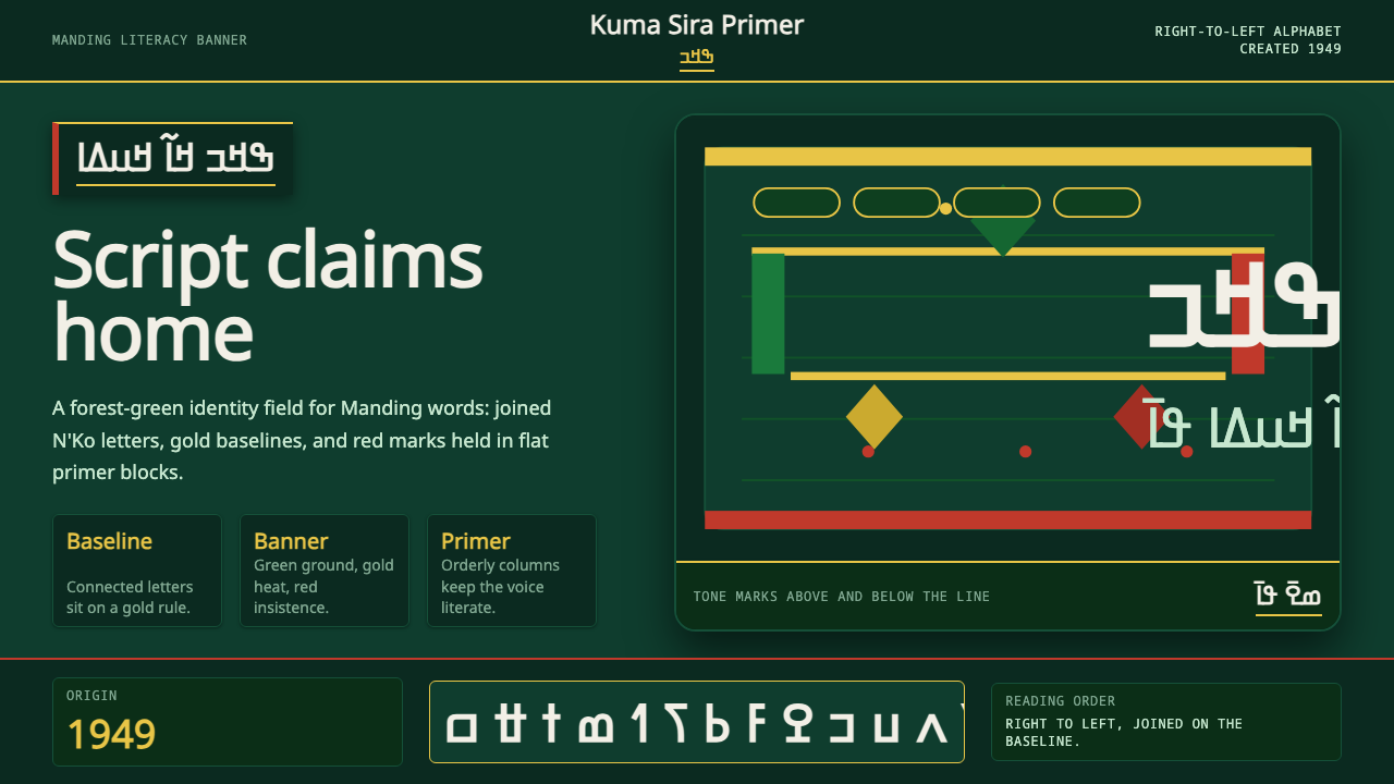 N'Ko ScriptIdentity writes itself. Forest green and gold baselines anchor joined N'Ko le…
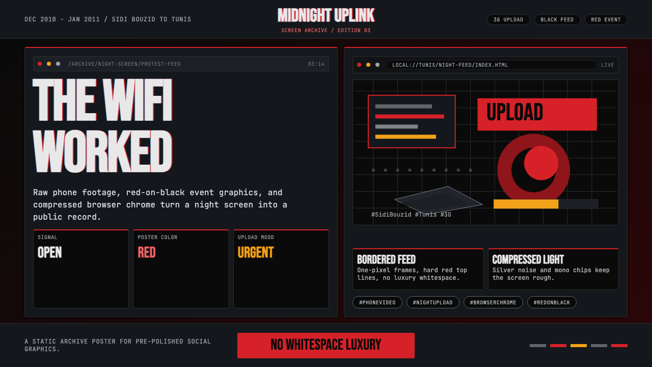 Tunisian Jasmine Revolution (2010)Raw urgency wins. Red browser grids and mono hashtags compress 3am protest in…
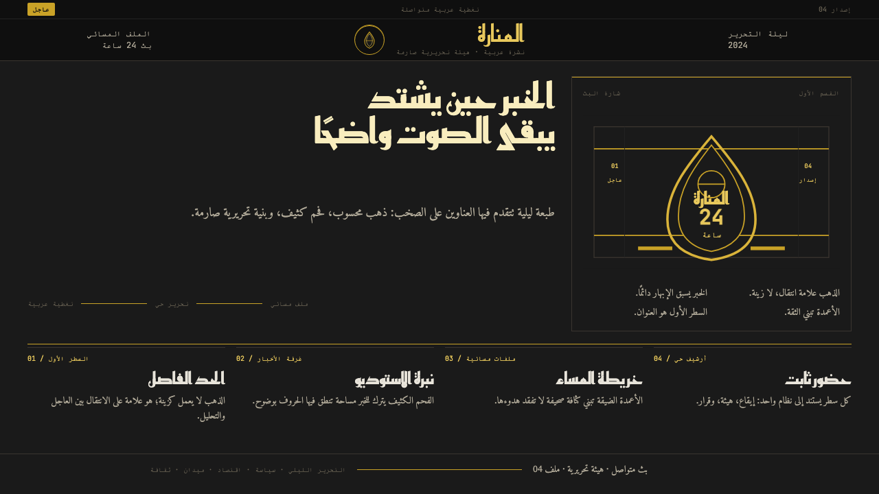 Al Jazeera Arabic NewsAuthority, stripped bare. Gold seal, dense Arabic type, matte charcoal.
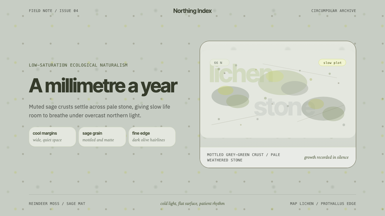 Arctic Tundra LichenPatience made visible. Sage speckles drift over cold stone with narrow, quiet…
 Capoeira RodaJoy as resistance. Roda green and flag gold orbit on dusk-clay terracotta.
 Chilean BRP Ramona Parra 1971Resistance stays alive. Blood red panels, black outlines, and stencil type re…