What is Hollow Knight?
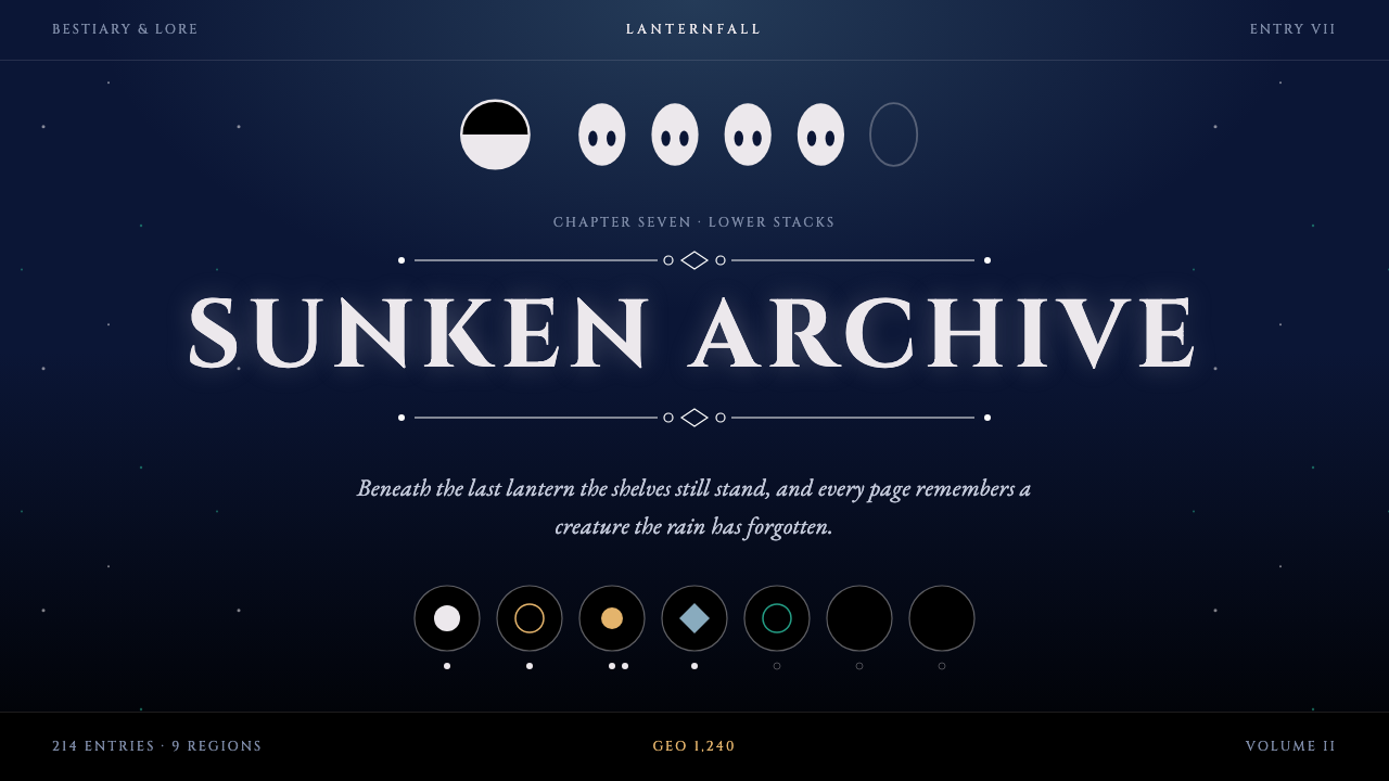
Hollow Knight's visual language is a study in subtraction: a vast ink-navy dark, a few bone-white things, and hairline filigree that makes every menu feel like an inscription found underground.
Hollow Knight in brief
The Hollow Knight style is the interface and art language of Hallownest, the ruined underground kingdom of Team Cherry's 2017 action-adventure game. It is a dark system built on ink-navy caverns, a pale bone-white mask and menus that sit on pure black beneath thin white filigree. The overall impression is of a few pale things floating in a great deal of darkness.
Typography does half the work. Titles are set in carved, Roman-style capitals that look chiselled into stone, while lore text and body copy use a classic old-style book serif. Together they make every screen read like a found inscription or a page from a forgotten manuscript. Nothing is glossy or neon; the tone is hushed, melancholic and a little cold.
Colour arrives sparingly and by region, just as it does in the game. Rain-blue belongs to the weeping City of Tears and is used for panels, a living teal marks the overgrown Greenpath, honey-gold belongs to the Hive and to the currency and highlights, and a deep crimson is reserved for danger and for the names of fearsome opponents. Because there is so little colour, each appearance of it carries real weight.

Where does Hollow Knight come from?
Hollow Knight began as a small independent project in Adelaide, South Australia. It was funded through a Kickstarter campaign in 2014 and released on 24 February 2017 for PC, followed by a Nintendo Switch version in 2018 and a series of free content packs across 2017 and 2018. The studio, Team Cherry, was famously tiny: the Chinese source material describes it as three people, with the look of the game owing almost everything to hand-painted artwork rather than a large art department.
The art direction is associated with Ari Gibson, whose drawings give the game its distinctive silhouettes: round-headed insect knights, thin spindly limbs and architecture that fades into fog. According to the source material, the artwork was painted stroke by stroke in image-editing software, which explains the soft, charcoal-like grain on everything from caverns to creatures. Other key figures named in the material are William Pellen, who is associated with the design side of the project, David Kazi, associated with production and business, and the composer Christopher Larkin, whose quiet piano and strings fix the emotional register that the visuals share.
Hollow Knight belongs to the Metroidvania tradition, in which a large interconnected map is gradually opened up by new abilities, and its look draws on two other currents: hand-drawn 2D animation, with its fluid, painterly motion, and the broader wave of crowdfunded independent games that let small teams pursue strange, personal visions. The deliberate restriction of the palette is partly an aesthetic decision and partly a practical one, since darkness forgives a lot and focuses the eye on whatever little is lit.
The interface is a natural extension of the world. Menus and the charm screen are laid on pure black rather than on a framed panel, with only slender white ornament to hint at structure. The world is the interface: there is no cheerful UI chrome to remind the player they are looking at a game. Curio's design system distils this logic into a coherent palette and typographic pairing so that anything built with it, from a story page to a quiet product site, can inherit the same hush.
What defines the Hollow Knight look?
Ink-navy and pure black grounds
The ground is either a deep ink navy, like cave air with rain in it, or pure black for menus. The darkness is not a theme layered over a light design; it is the substance of the layout. Elements are arranged so that large areas of dark are left alone, and the eye is invited to find the few pale things in it rather than being handed a full page of content.
Bone-white as the main accent
The primary light is a soft, slightly warm bone white, the colour of the knight's mask. It is used for text, borders, ornaments and focal icons. Because it is not a clinical pure white, it feels aged and organic against the navy, a little like old ivory or carved shell.
Hairline filigree
Ornament is thin, curling and symmetrical: small flourishes at the ends of dividers, delicate frames around titles and thin rules between sections. The lines are kept so fine that they feel etched rather than drawn, and they never compete with the text. They hint at Gothic ironwork and illuminated manuscripts without becoming heavy.
Carved capitals paired with a book serif
Titles use inscriptional capitals with sharp, classical proportions. Lore and body text use a gentle old-style serif with the warmth of a printed book. The pairing sets up a clear hierarchy: monumental for names and headings, intimate for reading. Spacing around titles is generous so that each word looks placed rather than typeset.
Regional colour as signal
Colour is information. A rain-blue panel signals the City of Tears, teal evokes the overgrown Greenpath, honey-gold marks currency and highlights, and crimson means danger. Using these hues one at a time, and sparingly, turns them into a quiet vocabulary instead of a rainbow, and it keeps the overall mood restrained.
Quiet motion and stillness
Where movement appears, it is slow and soft: fades, gentle drifts, a faint glow. Nothing snaps or bounces. Stillness is part of the design, and a page that does nothing for a moment still looks intentional because the composition holds its own weight in the dark.

Who shaped Hollow Knight?
Gibson is the artist most closely tied to Hollow Knight's look. His hand-painted characters, with their rounded insect heads, thin limbs and expressive silhouettes, and his foggy, layered environments define the entire visual identity from which this design system is drawn.
Pellen is one of the two founding figures of Team Cherry and is associated with the game's design and programming side. His work shapes the way the world is structured and played, which in turn determines how its menus, maps and charm screens are organised.
Kazi is the other founding figure of the studio and is associated with production and business. His role helped a very small team carry a crowdfunded project from its 2014 campaign through to release in 2017 and the free content updates that followed.
Larkin is the composer of the game's score. His restrained piano and string themes are inseparable from the visuals, and the mood they create, mournful but tender, is exactly what a design built on darkness and a few pale things is trying to reflect.
How do you use Hollow Knight today?
Slides: A cover slide works best with a single bone-white title in carved capitals on deep navy or black, with a thin ornamental rule beneath it and nothing else. Content slides can take one idea each, set in the book serif with plenty of dark around it. For data slides, keep charts monochrome in pale tones, and reserve the honey-gold or crimson for the one number or series you really want remembered.
Web and UI: This system suits storytelling sites, game and fan pages, album or film microsites, long-form essays and quiet product pages. Use a pure black ground for navigation and detail panels, a navy ground for larger sections, and hairline borders instead of boxes with shadows. Keep buttons minimal, outlined in bone white, and avoid saturated fills. Dashboards are possible if the data is sparse, but dense tables lose the sense of atmosphere.
Editorial and marketing: Posters, trailers, title cards, lore-style articles and invitations take well to this look. A lone mask-like emblem, a single line of carved capitals and a thin ornamental frame are enough to establish tone. In print, think of a black cover with a pale foil title. In email, a short dark panel with one line of serif text can feel more memorable than a full template.
A common mistake is to treat darkness as just a dark mode toggle. If you simply invert a bright layout, the filigree, the spacing and the restraint disappear, and the result looks like a generic dark theme. The other mistake is to light up too many elements; once everything glows, nothing stands out. Keep most of the page empty and let the few pale things matter.
Remember also that the colour system is regional. If you use the rain-blue, teal, honey-gold and crimson, give each one a job and keep to it, rather than scattering them as decoration. Used in this way, the palette gives a story page a sense of geography without a single illustration.

Hollow Knight — FAQ
What is the Hollow Knight design style?
It is a dark, hushed visual language taken from Team Cherry's 2017 game Hollow Knight and its kingdom of Hallownest. It uses ink-navy and pure black grounds, a bone-white accent, hairline filigree, carved capitals for titles and an old-style serif for lore text. Colour appears sparingly, by region.
Who made Hollow Knight?
It was made by Team Cherry, a very small independent studio in Adelaide, South Australia. The project was crowdfunded on Kickstarter in 2014 and released on 24 February 2017 on PC, with a Switch version in 2018. Ari Gibson is the artist associated with its look, while William Pellen and David Kazi are the studio's founding figures and Christopher Larkin composed the music.
What kinds of projects suit this style?
It suits storytelling pages, game and fan sites, music or film microsites, long essays, invitations and quiet product pages. It works well wherever atmosphere and a sense of solitude matter more than density. It is a poor choice for bright, busy retail or data-heavy dashboards.
Why is the palette so limited?
The restriction is the point. In Hollow Knight, large areas of darkness focus the eye on the few lit things, and each region has one signature colour that tells you where you are. Applying colour sparingly makes each appearance meaningful and keeps the mood of the whole design consistent.
How is it different from a normal dark mode?
A dark mode is usually a light layout with its colours inverted. This style is designed in the dark from the start: it relies on empty space, thin ornament, inscriptional type and a handful of pale accents. Take away the filigree, the restraint and the typographic pairing, and what remains is only a generic dark theme.
Related design styles
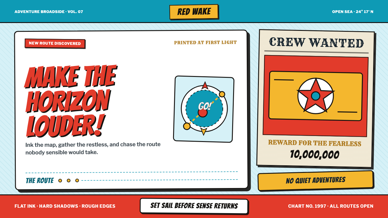 One Piece (Grand Line Adventure)Adventure shouts first. Vermilion splash type and cyan charts collide in hard…
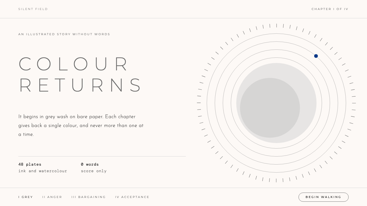 GRISColour is earned back slowly. Grey wash on bare paper, tracked Light capitals…
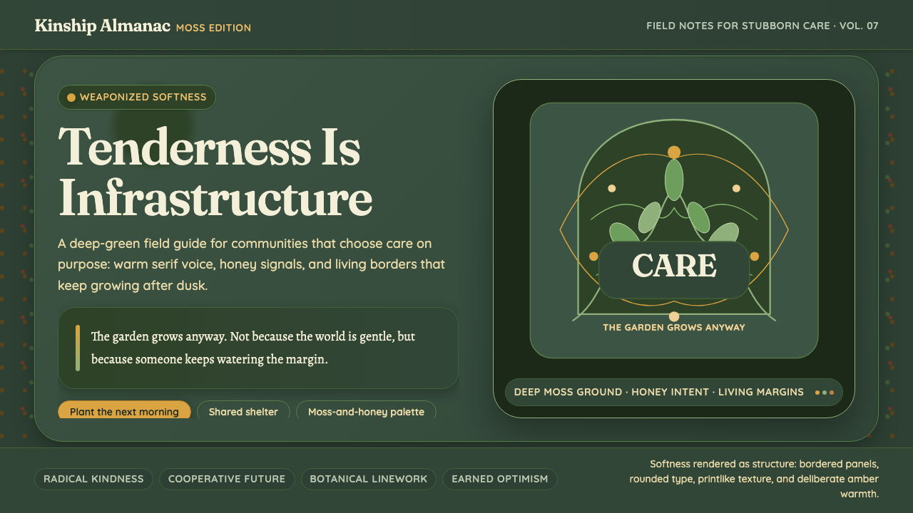 HopepunkSoftness becomes defiance. Deep moss, honey amber, and vine borders make care…
 Jujutsu KaisenCrimson only at impact. Ink-black night, purple cursed glow, brush kanji and…
 Polish Cyrk Circus PosterPainterly state-circus maximalism. Vermilion and circus yellow blaze from nea…
 Solomon Islands NguzunguzuBlack swallows light; nacre gives it back. Rose and green-blue flashes hold a…