What is GRIS?
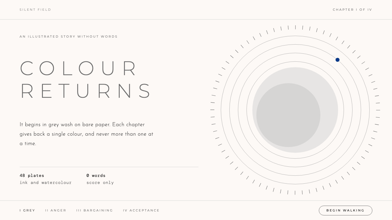
GRIS treats color as something earned: grey wash on near-white paper, thin widely spaced capitals, and one hue at a time allowed back into the world.
GRIS in brief
The GRIS style is a design language based on the 2018 video game of the same name, the debut of Nomada Studio in Barcelona. The game is a wordless platformer in which a girl moves through a world that begins as black ink lines and grey wash on bare paper. As she works through grief, color returns to the world chapter by chapter.
The design system keeps that restraint. It uses a near-white paper ground, a single grey that gives structure, thin capital letters with generous spacing, and four chapter colors that arrive one at a time and never all at once. There is almost no text in the game itself, and the system follows suit: it prefers a few words, large silences and a feeling of watercolor soaking into paper.
It suits storytelling, emotional or reflective content, and any page that needs room to breathe. It is a style about patience, and about the idea that a single color means more when it has been absent.

Where does GRIS come from?
The style comes from Barcelona, Spain. Nomada Studio developed GRIS between 2016 and 2018, and the game was released on 13 December 2018, published by Devolver Digital. It appeared first on Nintendo Switch and PC, with versions for PlayStation 4 and iOS following in 2019. The studio's founders included Adrián Cuevas and Roger Mendoza, and the project grew from a small team's wish to make something quiet and personal.
The art direction is by Conrad Roset, an illustrator known for contemporary watercolor work. His fluid, translucent painting is the source of the game's look: soft edges, pigment that bleeds into wet paper, bodies and landscapes suggested in a few strokes rather than detailed. That sensibility places the game in the world of contemporary watercolor illustration as much as in the world of games.
GRIS belongs to the movement sometimes called art games, in which a game is made to provoke feeling and reflection rather than to test skill or deliver a challenge. It is also part of a group of wordless emotional platformers, in which story is carried by movement, music and image. The music is associated with the band Berlinist, and its piano and strings accompany the arrival of each color.
The structure of the game is the key to the design system. The world begins in grey and a small amount of black, then recovers color in stages, with each chapter given its own hue. Because color arrives one chapter at a time, it carries narrative meaning: it marks progress through grief, not decoration. The design system turns that logic into a rule for pages, where a color should enter only when it has something to say.
What defines the GRIS look?
Paper ground
The page is a near-white paper, not a pure digital white. It feels slightly warm and absorbent, as though pigment could soak into it. Large areas are left bare, and the paper itself is treated as a visual element. Anything placed on it should look as if it has been painted or inked there, not stuck on top.
Grey wash
A single grey does the structural work, appearing as soft washes, lines and shadows. It is not a flat fill but a stain, with uneven density and gently blurred edges. Because grey is the default, any color that appears stands out naturally, which is the whole point of the system.
Chapter colors
Four colors, red, green, blue and gold, follow one another as chapters. Each one is given room on its own, then handed over to the next. They are never mixed into a rainbow. A page should pick one chapter color and let it carry the accent, perhaps returning to grey elsewhere, so the color keeps its meaning.
Typography
Type is set in thin capital letters, widely tracked, in a light weight. It reads as quiet and slightly formal, like a caption in an art book. Lines are short and sentences few. Heavy or bold weights would clash with the watercolor softness, so emphasis comes from space and color rather than from thickness.
Single accent
A single dot or small mark of color, often a blue, can serve as the only accent on an otherwise grey page. It might mark a link, a current position or a call to action. This minimal gesture reflects the moment in the game when color first begins to come back, and it is more effective than any large splash of color.
Pace and silence
The style relies on pauses. Content appears slowly, with soft fades and soft-edged transitions, and there are long stretches of nothing. A page may be one image, one phrase and a lot of paper. This pace gives the viewer time to feel before reading, which suits stories about loss, recovery and quiet change.

Who shaped GRIS?
The art director of the game and a watercolor illustrator. His translucent, fluid painting defines the look of the world and is the reason the design system treats ink, wash and paper as its main materials.
A founding member of Nomada Studio in Barcelona. The studio's small size and personal approach are part of why the game feels intimate and unhurried.
The other founding figure of Nomada Studio. Together with Cuevas, he helped bring the project from a small idea to a published game in 2018.
The band associated with the game's music. Its piano and strings accompany the return of color, so the sound of the game and the look of the design system share the same gentle, emotional pace.
How do you use GRIS today?
On slides, the style works for talks that tell a story of change: a personal narrative, a year in review, a research arc. Use a near-white slide, a thin capital title and a grey wash shape at the edge. Introduce one chapter color per section, so the audience feels progression as color enters, and keep earlier sections in grey when you refer back to them.
For data slides, restraint is the whole method. Draw charts in grey and let one series, or one single point, take the chapter color of that section. Gridlines should be faint, labels thin and capitalized, and the number that matters should be the only colored thing on the slide. This makes a simple chart feel like a moment.
On the web, it suits portfolios, personal essays, mental-health and wellness products, game and art sites, and long-form storytelling pages. A hero with bare paper, a few spaced capitals and a tiny blue dot can be enough. For forms and tools, keep the paper, the grey and the type, and use the accent color only for the primary action, so the calm tone survives the task.
In editorial and marketing work, give each chapter of a piece its own color and let it return to grey at the end of the section. Watercolor illustrations, soft-edged photographs and generous margins fit naturally. Keep headlines short and avoid exclamation or urgency; a campaign in this style speaks quietly and trusts the reader to lean in.
The most common mistake is to use all four colors together because they are available. The system only works when color is scarce, so a page full of red, green, blue and gold becomes a children's palette and loses its meaning. Another mistake is using sharp, perfectly clean shapes: the grey should look stained and the edges soft. One chapter color, one grey and plenty of paper is usually enough.

GRIS — FAQ
What is the GRIS design style?
It is a design language based on Nomada Studio's 2018 game GRIS. It uses a near-white paper ground, a single grey wash for structure, thin tracked capitals and a small number of chapter colors that arrive one at a time. Its mood is quiet, emotional and watercolor-soft.
Why does color appear one hue at a time?
In the game, color returns chapter by chapter as the main character recovers from grief, so each hue carries narrative meaning. The design system borrows that logic: a color should enter only when it has something to say, which keeps pages calm and makes each accent count.
Which colors belong to the style?
Grey is the base, on near-white paper. Four chapter colors, red, green, blue and gold, are available as accents. A single blue dot is a typical minimal accent. They are best used one per page or section, never combined into a full spectrum.
Is the style suitable for business products?
It works for products where tone matters more than density, such as wellness, creative portfolios, publishing and brand storytelling. For data-heavy business tools it is less suitable, though the paper, grey and thin type can still form a calm base with one accent color for actions.
How do I get the watercolor feeling without images?
Use soft-edged grey shapes with uneven density, a slightly warm near-white ground, light capital type with wide spacing and slow fade-in motion. Avoid hard borders and perfectly flat fills. The effect should be of pigment resting on paper, not of interface blocks placed on a screen.
Related design styles
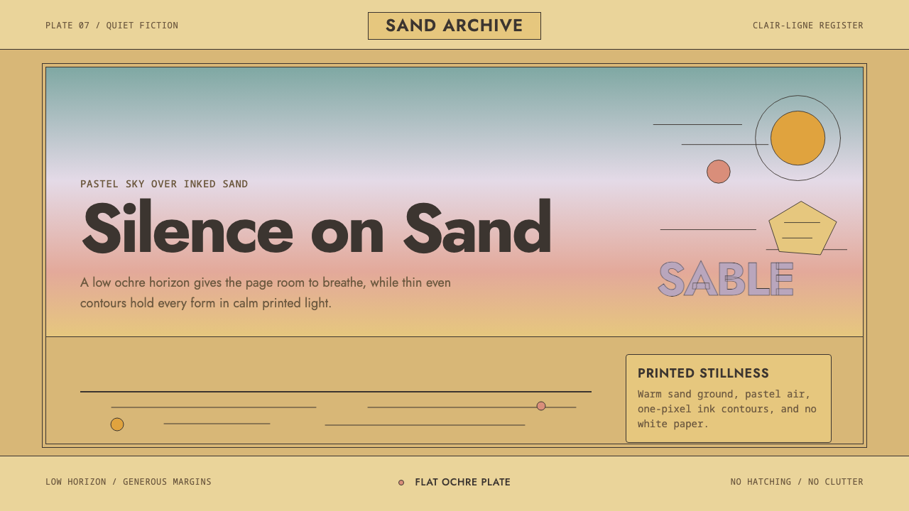 Sable (Mœbius)Still desert science fiction. Ochre ground, pastel sky, and thin ink contours…
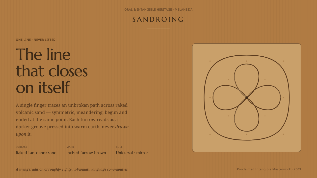 Vanuatu Sand DrawingOne finger-line, never lifted. Furrow-brown grooves a symmetric lattice into…
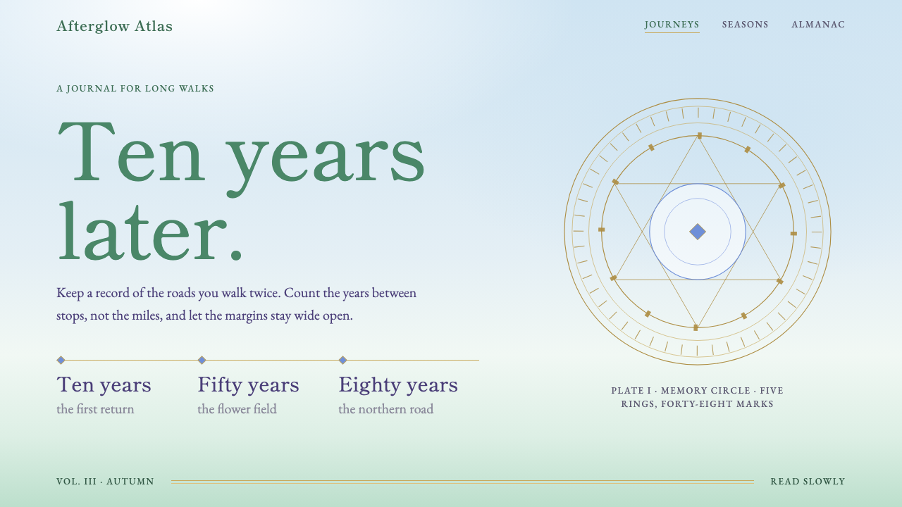 FrierenTime is the subject. Pale painted sky, meadow green, gold hairlines, Mincho t…
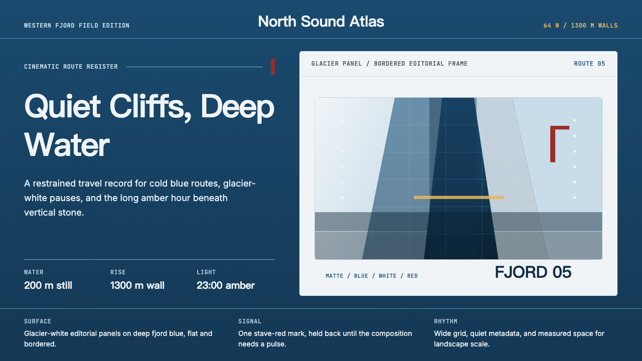 Norwegian Fjord TourismMonumental, not loud. Fjord blue, glacier-white panels, and one stave-red acc…
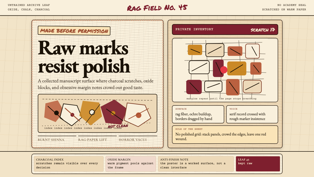 Art Brut (Dubuffet)Polish is refused. Bone-cream paper, earth pigments, scratched borders, dense…
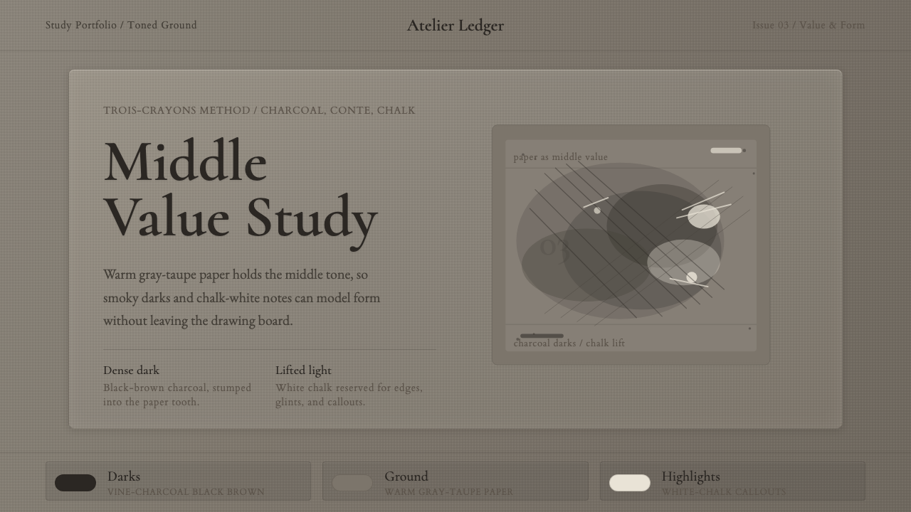 Charcoal & Conté DrawingAtelier calm, in middle value. Gray-taupe tooth, smoky charcoal, and chalk-wh…