What is Frieren?
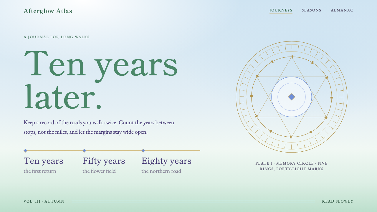
Frieren makes time the subject of the page: a pale painted sky, meadow green, thin gold rules and a single line of serif type in a great deal of open space.
Frieren in brief
The Frieren style is a design language drawn from Madhouse's anime Frieren: Beyond Journey's End, which began airing in September 2023. The story follows an elf mage who outlives the hero's party that once defeated the demon king, and who sets out again along the old roads to understand the people she traveled with. The show is quiet and reflective, and its visuals are built from daylight rather than spectacle.
The palette is the show's daylight: a white with a faint green tint, meadow-grass green as the main color, a gold that echoes the trim on the heroine's white robe, and a soft blue taken from a flower she remembers someone by. Layouts stay wide and mostly empty. A single figure, a single line of Mincho-style serif type, a thin gold rule and a pale wash of sky are often all a page needs.
Time is the real subject, and the style says so in its choices. It prefers slow fades, generous margins and wording that counts years instead of statistics. It suits stories, memorials, travel, seasonal and reflective content, and any product that wants to feel unhurried.

Where does Frieren come from?
The style begins with a manga. Frieren was serialised starting in 2020, and its premise, a story that begins after the adventure is over, set it apart from the usual fantasy structure. Rather than following a quest toward a final battle, it follows the long aftermath, in which a character who lives for a very long time slowly learns what short lives meant.
The anime adaptation was produced by Madhouse in Tokyo and ran from September 2023 to March 2024 in its first season. Its look is closely tied to the tradition of hand-painted Japanese anime background art. The backgrounds are soft, almost impressionist landscape paintings, with a low horizon, a pale blue sky pressed down on it, and fields of grass and flowers spreading across the lower half of the frame.
Names connected with the production include Keiichirō Saitō, Reiko Nagasawa, Harue Ono and Sawako Takagi. In an adaptation like this, the backgrounds and color are as much a part of the storytelling as the script. By keeping figures small, spaces large and colors pale, the visuals suggest that the world is older than the people crossing it and will remain after they have gone.
The design system translates that restraint into an interface. It belongs to the broader post-adventure fantasy mood, where tenderness and memory matter more than power. Instead of health bars, level numbers and trophies, the interface marks time with phrases such as ten years later or eighty years later, and it treats whitespace as a narrative device rather than a leftover.
What defines the Frieren look?
Color
The ground is a white with a barely noticeable green tint, like paper in daylight. Meadow green is the main color, gold is used for fine lines and small decorations, and a soft flower blue is saved for hover states and highlights. Colors are pale and washed, never saturated, so the page looks painted rather than printed.
Typography
Type is set in a Mincho-style serif, with fine strokes and a calm, literary voice. Headlines are often a single line, spaced generously, and body text is relaxed in size and line spacing. The serif gives the page a book-like gravity, which fits the show's sense of long memory.
Open space
Emptiness is the main compositional tool. A figure is small, and surrounded by sky or grass. A page may hold one image and one sentence. Margins are generous and elements are separated by wide gaps, so the eye travels slowly. The space is not wasted; it is how the style expresses distance and time.
Gold lines
Thin gold rules and small ornaments echo the trim on the heroine's robe. They divide sections, underline headings and frame quotes without adding weight. Because they are fine and sparse, they feel like a detail on a garment rather than a decoration on a page. Thick or glowing gold would feel like a fantasy game instead.
Painted backgrounds
Imagery favors soft, hand-painted landscapes: pale skies, low horizons, meadows and flower fields, with edges that are gently blended. A sky wash behind a headline can act as a backdrop. Photographic clutter and hard-edged graphics break the effect; the image should look like it was painted by a patient hand.
Slow motion
Movement is slow and quiet. Elements fade in rather than slide or bounce, transitions take their time, and nothing demands to be noticed. Time is shown in the content too, with phrases that count years. The pace of the interface should feel like a long walk, not a race.

Who shaped Frieren?
Named among the key figures of the anime adaptation. The calm pacing and the trust in quiet scenes that define the show are central to the mood the design system borrows.
Another name connected with the production. The color and atmosphere of the series, soft and daylit, are part of what this style turns into a palette.
Listed among the figures connected with the anime. The painted look of the world, and its hand-made quality, are what the interface tries to preserve in its imagery.
Also associated with the production. The attention to quiet detail in backgrounds and light is the quality that makes a restrained, nearly empty layout feel full rather than blank.
How do you use Frieren today?
On slides, use the style for storytelling decks, retrospectives, annual reviews and talks about long-term change. A cover can be a pale sky wash with a single serif title and a thin gold rule beneath it. Content slides should hold one image or one sentence, with plenty of margin, and use phrases like five years on to mark progression instead of heavy headings.
For data slides, keep charts light and few. A single line in meadow green on a faintly green white ground, with a thin gold marker for the key moment, tells a story of change over time well. Avoid dense tables; if numbers are needed, present them as a short list with generous spacing, and use time labels as the main structure.
On the web, the style suits journals, memorial pages, travel diaries, slow-reading sites, seasonal campaigns and wellness or reflective products. A hero with a painted sky, a lone line of serif text and a quiet button is enough. For functional screens such as forms and settings, keep the same palette and type but reduce decoration, so the calm mood does not get in the way of the task.
In editorial and marketing work, let a single image and a single line carry each section. Long-form essays, interviews and anniversary features work well, because the generous margins and serif type invite slow reading. Replace conventional counters and badges with time language, such as years since launch, to stay consistent with the theme.
A common mistake is making the page merely empty. Whitespace needs a subject: a figure, a horizon, a sentence worth reading. Without it the layout feels unfinished. Another mistake is brightening the colors or making the gold shine, which turns the gentle mood into a fantasy game interface. Keep colors pale, gold thin, motion slow, and let one thing at a time carry the page.

Frieren — FAQ
What is the Frieren design style?
It is a design language drawn from the anime Frieren: Beyond Journey's End. It uses a faintly green white ground, meadow green as the main color, thin gold lines, a soft flower blue for highlights and Mincho-style serif type, all set in wide, mostly empty layouts. Its subject is the passing of time.
Why does the style use so much empty space?
Because the show's pictures are mostly sky, field and distance, with a small figure in the middle. Empty space expresses solitude, age and the length of time. In the interface it gives a single subject room to be noticed and slows the reader down.
How is the style different from other soft, pastel designs?
Many pastel styles are cheerful and cute. This one is reflective and slightly melancholic. Its colors are pale because they come from daylight and paint, not from sweetness, and it uses a serif, thin gold and slow motion to sound literary and calm rather than playful.
Can it be used for data-heavy products?
Not as a default. The style relies on openness and slow reading, which conflicts with dense tables and dashboards. It is better used for storytelling, reports with a narrative, or the brand layer of a product, with a plainer working interface behind it.
What does counting years instead of stats mean in practice?
It means choosing time-based wording and structure. Instead of badges, scores or progress bars, a page might say ten years later, or organize a timeline by decades. It makes the interface feel like a story about duration, which is the central idea of the source work.
Related design styles
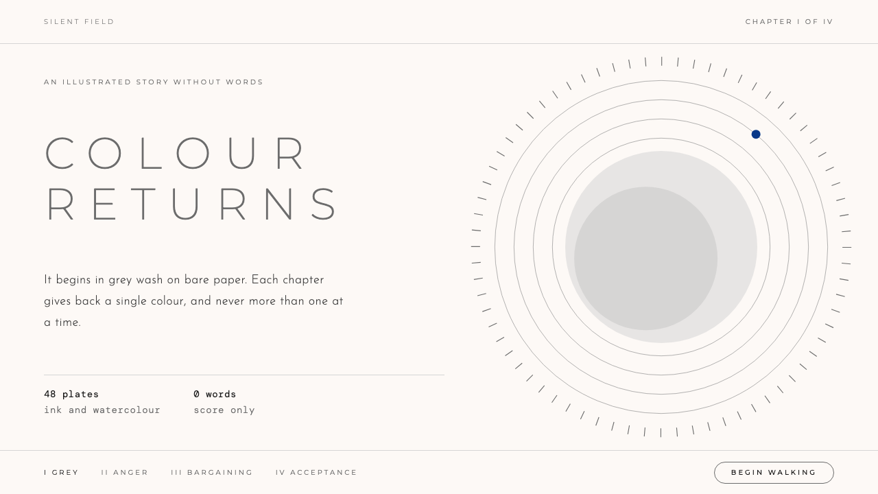 GRISColour is earned back slowly. Grey wash on bare paper, tracked Light capitals…
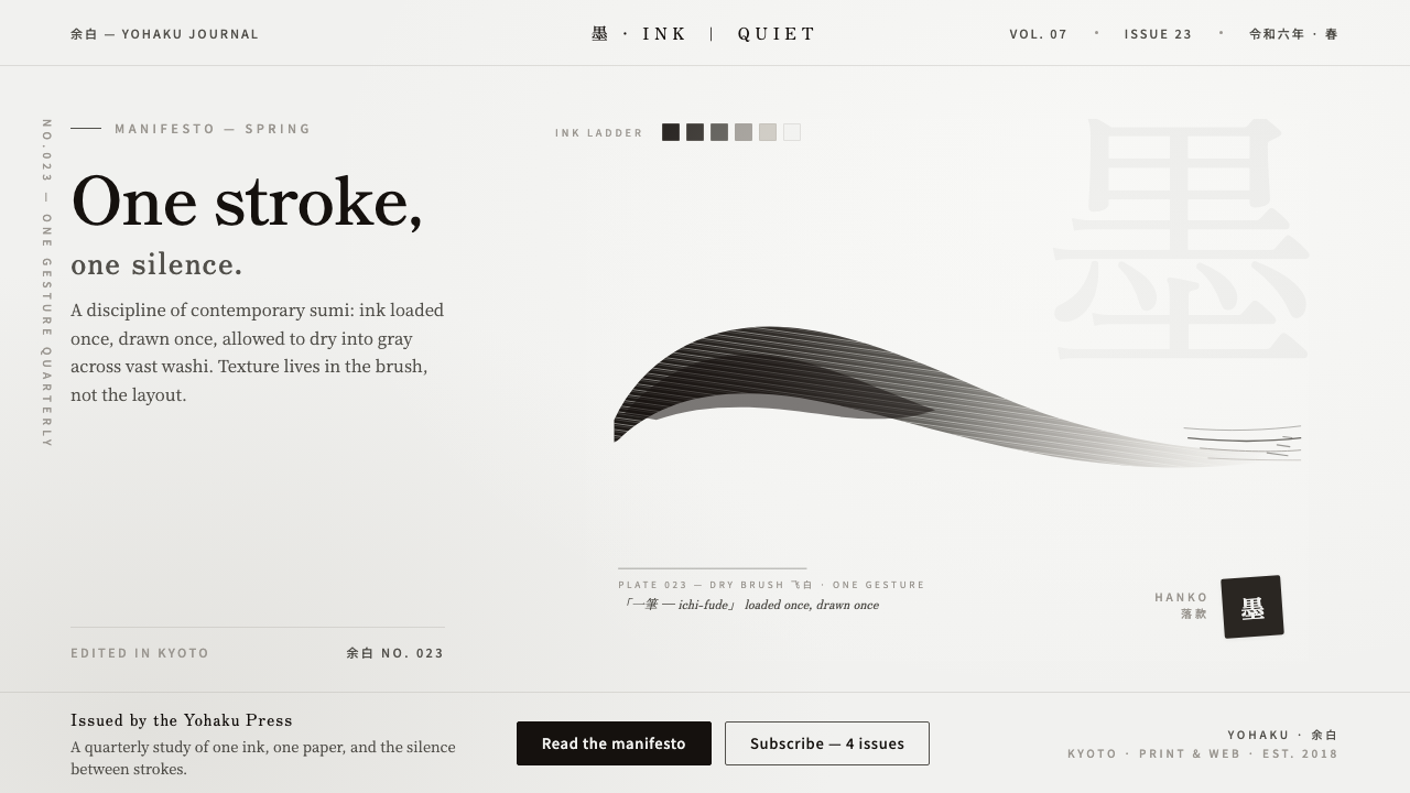 Modern Sumi BrushOne stroke, one silence. Warm sumi ink graduating through dry-brush gray acro…
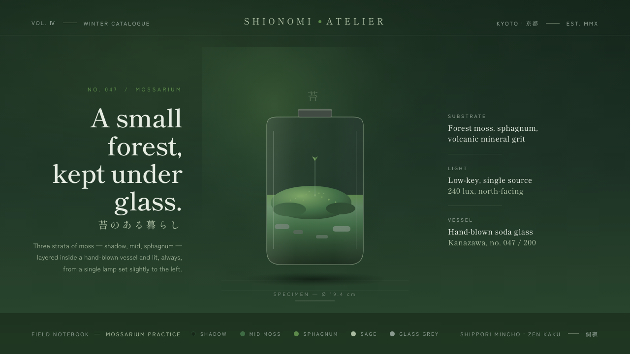 Moss TerrariumWabi-sabi, kept under glass. Layered moss greens on shadow ground, mincho ser…
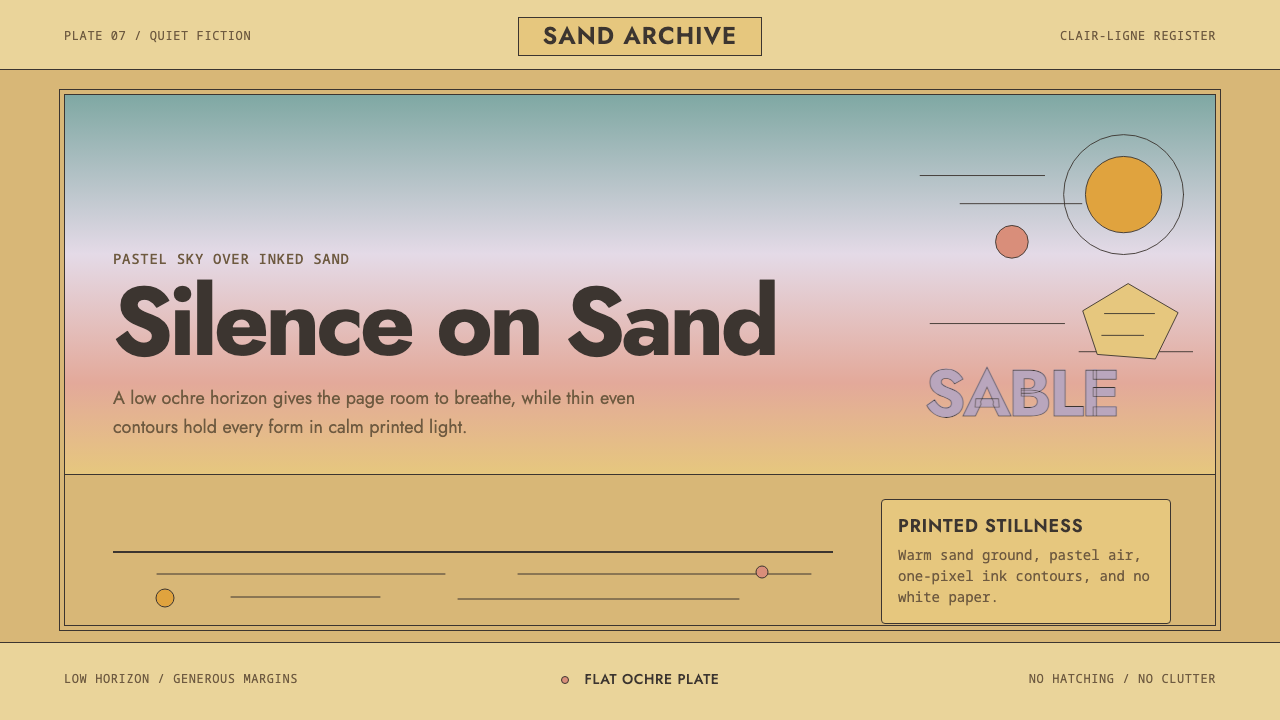 Sable (Mœbius)Still desert science fiction. Ochre ground, pastel sky, and thin ink contours…
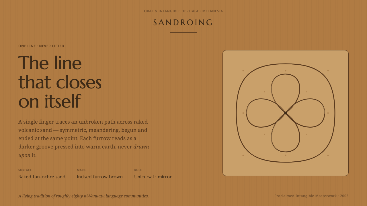 Vanuatu Sand DrawingOne finger-line, never lifted. Furrow-brown grooves a symmetric lattice into…
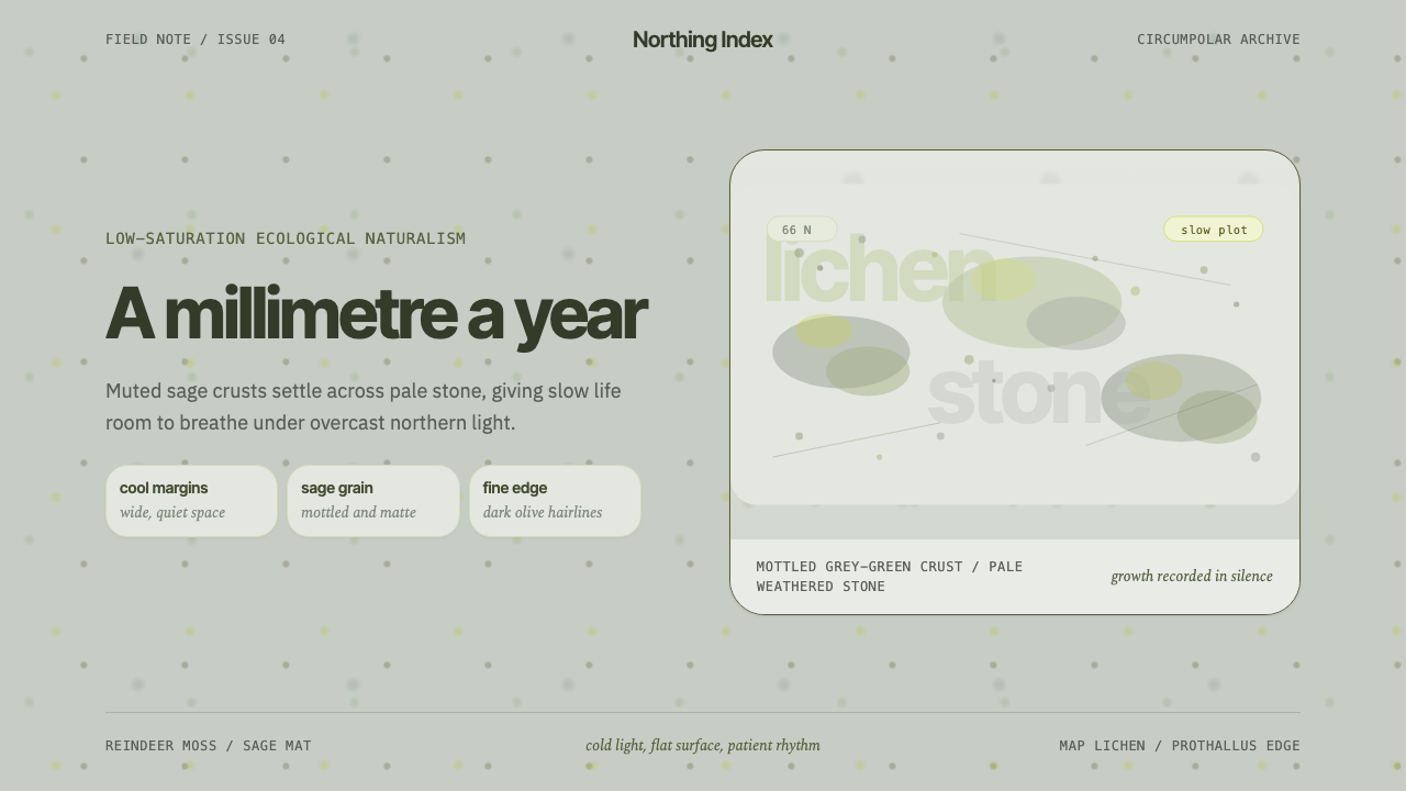 Arctic Tundra LichenPatience made visible. Sage speckles drift over cold stone with narrow, quiet…