What is Moss Terrarium?
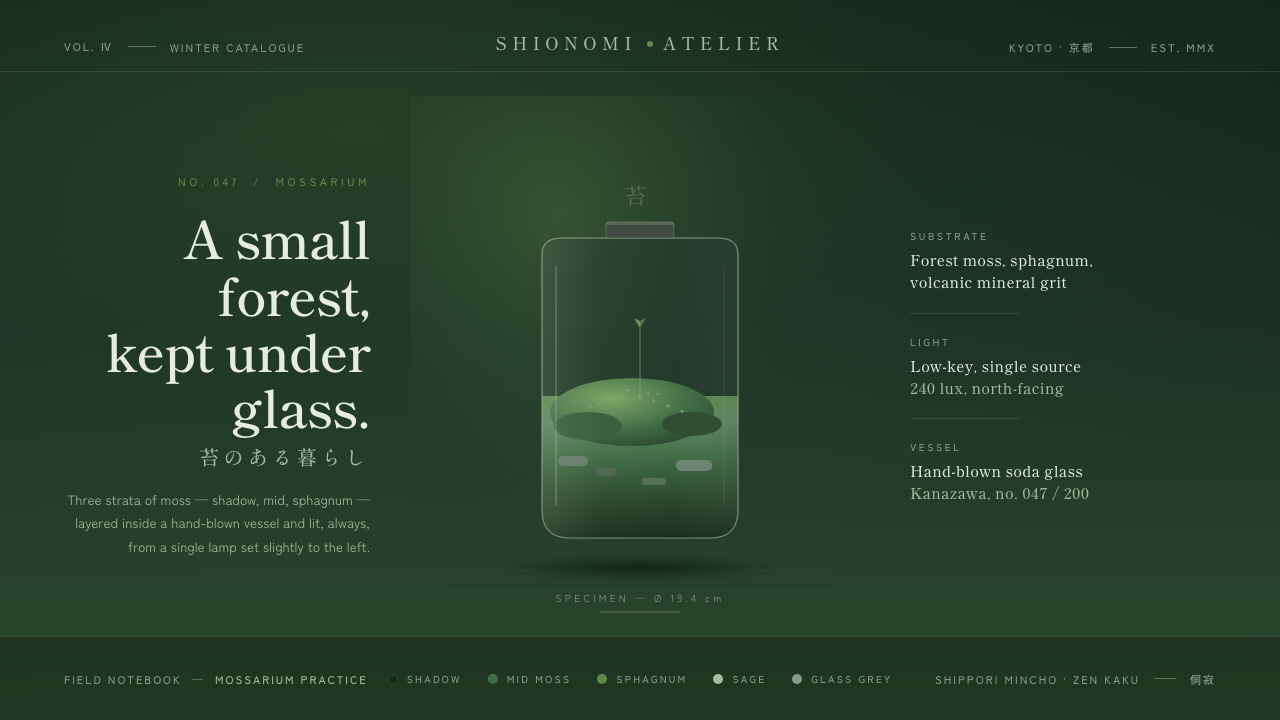
Moss Terrarium holds wabi-sabi under glass: layered moss greens, Mincho serifs, and one quiet pool of light in a deliberately shadowed world.
Moss Terrarium in brief
Moss Terrarium translates the contemporary Japanese mossarium into a design system. Its central image is a clear glass vessel resting on a deep moss-shadow ground, lit as though it belongs to a small still-life rather than a bright interface. Shadow green, middle moss, and fresh sphagnum-like highlights build depth without spectacle, while muted sage and glass-grey neutrals keep the scene restrained.
The mood comes from wabi-sabi: minimal, quiet, velvety, and intentionally incomplete in the polished digital sense. It values atmosphere over display. Generous empty space lets the few visible elements settle; the result should feel like a microlandscape viewed in silence, not a crowded product surface competing for attention.
This is a dark style by nature, not simply a light design inverted. Cream and pure white do not belong here. Darkness is the ground that makes the greens, glass, serif forms, and single soft directional shadow perceptible. Every brighter note should read as moss catching light, condensation on glass, or a small point of life within shade.
Where does Moss Terrarium come from?
Moss Terrarium belongs to the contemporary indoor-gardening revival that has developed from 2010 to the present, with Japan as its central regional reference. Its source image is not an abstract nature theme but the mossarium: a contained miniature garden in which moss, moisture, vessel, shadow, and observation are inseparable. The glass enclosure gives the aesthetic both its frame and its sense of concentration.
Its craft vocabulary draws from Japanese kokedama makers and the wider practice of miniature gardening. Kokedama moss-ball craft foregrounds moss as a material with presence rather than as background foliage. In Moss Terrarium, that lesson becomes a visual hierarchy: greens are layered like living surfaces, and the surrounding darkness is allowed to support rather than erase their texture.
Wabi-sabi provides the governing aesthetic attitude. Instead of treating a vessel as a pristine object for display, the style asks for quiet irregularity, reserve, and the dignity of subdued conditions. Low-key still-life styling contributes the compositional method: one soft lamp-like light, a restrained direction of shadow, and enough surrounding darkness for the glass vessel to appear discovered rather than presented.
Terrarium still-life stylists complete the contemporary translation. Their concern is not maximal botanical abundance but the relationship between a small living arrangement and the conditions in which it is seen. As a design language, Moss Terrarium preserves that relationship: content should appear held, observed, and lightly illuminated, with the interface receding into the role of a dark display case.
What defines the Moss Terrarium look?
Shadow-Green Depth
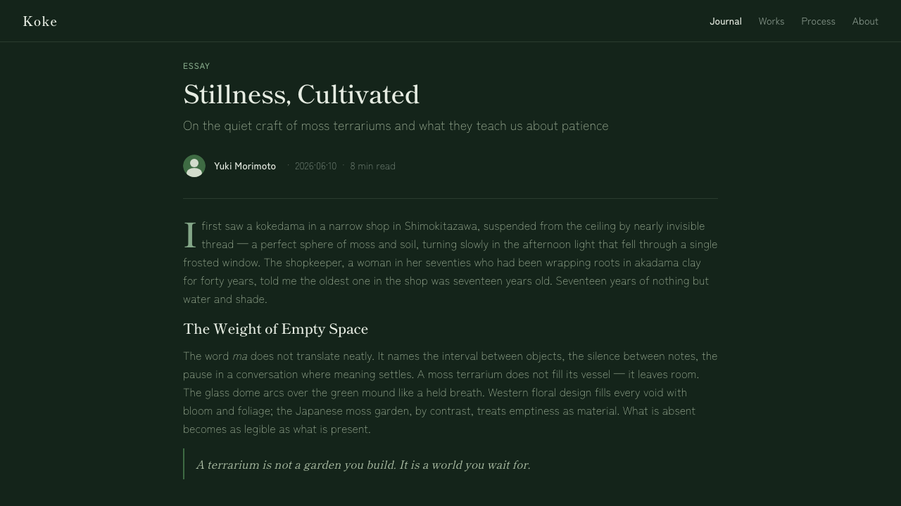
The palette begins in deep moss shadow, then rises through middle greens toward sparse fresh highlights. These greens should feel layered rather than coded as interchangeable accents. Dark ground carries most of the visual mass; the brighter moss notes indicate moisture, surface variation, or the limited reach of light. Sage and glass-grey neutrals soften transitions without breaking the nocturnal restraint.
Glass and Containment
A clear vessel is the style’s defining structural metaphor. It creates a boundary without turning into a loud frame: content appears held within an environment, not boxed into a card. Glass-grey neutrals can suggest transparency, reflection, or condensation, but they must remain quiet. The vessel should feel delicate against the shadow ground and never become glossy decorative spectacle.
Mincho Typography
Refined Mincho serifs give language the poise of a still-life label or botanical note. Their contrast and delicacy suit the glass-and-moss setting because they introduce precision without mechanical harshness. Type should be allowed to breathe in generous space. Hierarchy comes from calm changes in scale, placement, and tone, not from dense badges, emphatic decoration, or relentless visual weight.
Single Soft Light
One soft lamp-like light arrives from a consistent direction, conventionally felt from the upper left. Its purpose is compositional, not theatrical: it reveals a rim of glass, a moss highlight, or the edge of a surface before fading back into shade. Multiple competing light sources would dissolve the still-life logic and make the terrarium feel staged rather than quietly observed.
Velvety Negative Space
Empty space here is not blankness awaiting content. It is the dark air around the vessel, the pause between labels, and the field that lets a small green surface matter. The spacing should feel unhurried and absorbent, as though the design has room for humidity and silence. Filling every region with controls, captions, or ornamental texture breaks the style immediately.
Low-Key Surface
Moss Terrarium favors subdued surfaces over polished digital shine. Form should emerge gradually from shadow, with tonal shifts that feel like moss layers, glass haze, and soft illumination rather than synthetic gloss. The visual finish is minimal but not sterile: it should retain a tactile, almost humid sense of material presence while keeping the overall composition dark and composed.
Who shaped Moss Terrarium?
Japanese kokedama makers provide the craft reference behind the style’s attention to moss as a living material. Their moss-ball practice makes containment, surface texture, and small-scale gardening central concerns. Moss Terrarium adapts that sensibility into visual structure: green is layered with care, and the surrounding field is allowed to remain quiet enough for the material to register.
Mossarium artisans establish the direct subject matter: miniature moss environments arranged inside transparent vessels. Their work joins living greenery to glass, moisture, and concentrated viewing. In the design system, that relationship becomes a rule of emphasis: the content is treated as a small ecosystem, while surfaces and framing stay secondary to its atmosphere.
Terrarium still-life stylists contribute the language of low-key presentation. Their influence appears in the use of one restrained light, a dark supporting ground, and compositional patience around a small object. Rather than making the vessel perform as a luxury accessory, this approach lets it sit in shadow and gain significance through careful observation.
How do you use Moss Terrarium today?
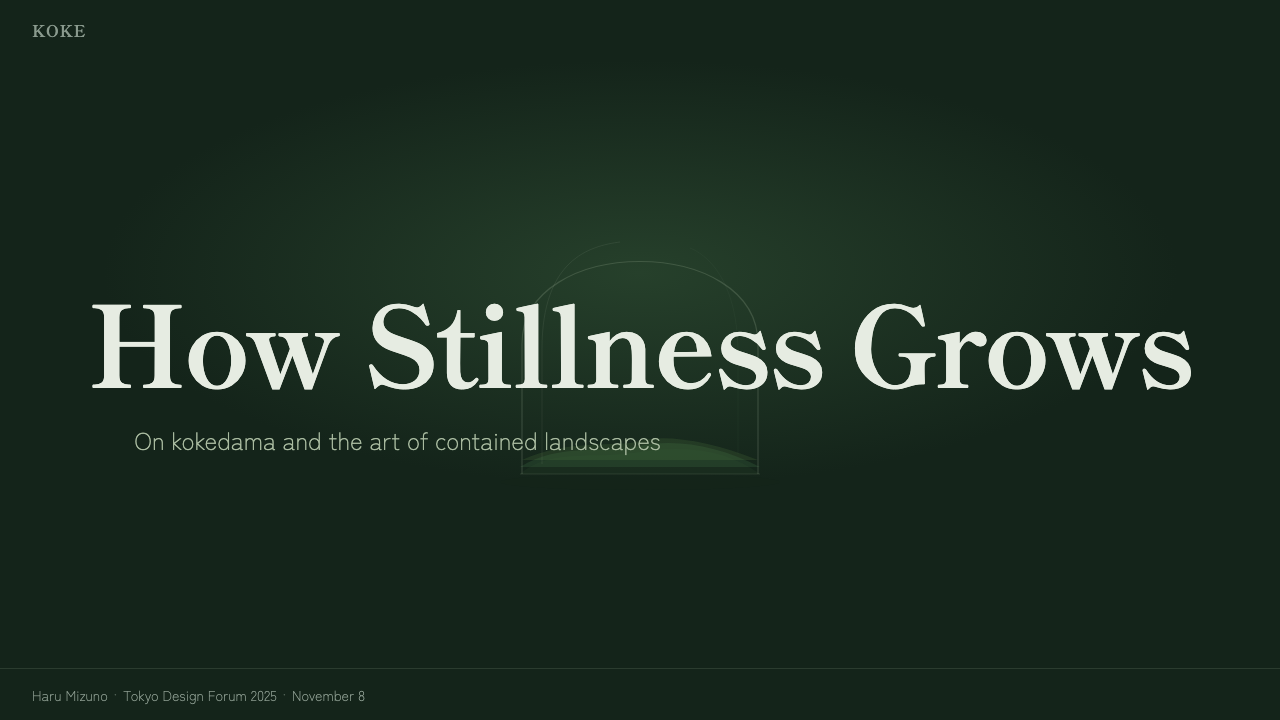
For presentation covers, treat the slide as a dark still-life field. Let a vessel-like form, a moss image, or a small luminous green area occupy one quiet zone while the title rests in composed Mincho serif type. The cover should establish containment and silence before it communicates detail. Avoid bright framing, broad light fields, or a collage of botanical imagery; one observed object is stronger than a collection of nature signals.
For content slides, use generous negative space to separate ideas as if each were an entry beside a specimen. Mincho headings can introduce sections with restraint, while supporting text remains calm and legible against the shadow ground. On data slides, let charts behave like the terrarium’s internal layers: use the moss-green range to clarify relationships, keep grid treatment subdued, and reserve brighter green for the insight that deserves attention rather than applying it to every value.
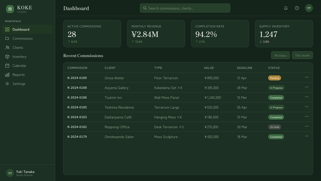
For web interfaces, Moss Terrarium suits reflective dashboards, collection views, knowledge spaces, and pricing pages that benefit from a sense of considered value. A dashboard can use dark panels as quiet chambers for focused information, glass-grey dividers as subtle boundaries, and moss highlights for status or progress. A pricing page can present each offering as a contained environment, with hierarchy expressed through space and a selective pool of light rather than urgent contrast everywhere.
For editorial and marketing work, the style is strongest when content can be framed as observation, cultivation, or curation. Long-form pages can pair Mincho-led titles with restrained captions and generous dark intervals between sections. Marketing should favor one hero vessel, one considered message, and tactile moss-like depth over a crowded catalogue of claims. The visual language gives a product a contemplative presence, but only if copy and imagery allow that pace.
The common mistake is treating Moss Terrarium as a generic dark green theme. Adding many bright green accents, glossy glass effects, several shadow directions, or dense card collections loses the atmosphere that makes the style distinct. Do not rescue the darkness with cream or pure white. Keep the palette layered, the light singular, the typography refined, and the empty space active; the design should feel like a living micro-world, not a dark dashboard decorated with plants.
Moss Terrarium — FAQ
Is Moss Terrarium simply a dark-mode nature style?
No. Dark mode alone changes contrast; Moss Terrarium changes the visual premise. It is built around a contained micro-landscape, layered moss greens, a glass-like boundary, and one restrained direction of light. Its darkness is not an empty backdrop for bright controls. It is the environmental condition that makes the vessel and moss feel present.
Why are cream and pure white excluded?
The style depends on low-key atmosphere. Cream and pure white introduce a bright-paper or gallery-wall association that competes with the shadowed glass-vessel image. Muted sage and glass-grey neutrals can provide relief where needed, but they remain part of the enclosed, dusk-like environment rather than opening it into a light-ground composition.
How should green be used without making the interface feel loud?
Use green as a layered material, not as a repeated signal color. Shadow green should establish the ground, middle moss should carry surfaces and grouping, and fresh highlights should appear sparingly where light or attention arrives. If every control, icon, chart, and label uses the brightest green, the design loses depth and starts reading as a generic status interface.
Does the style require literal terrarium photography?
No. The essential requirement is the terrarium logic of containment, layered organic depth, and quiet observation. Literal mossarium imagery can establish that connection directly, but abstracted glass forms, moss-like tonal fields, and carefully isolated content can carry the same atmosphere. What matters is that imagery remains singular and contemplative rather than becoming a decorative botanical pattern.
Where does Moss Terrarium work best?
It works best where focus, curation, and atmosphere are valuable: reflective dashboards, knowledge collections, editorial stories, considered product pages, and presentations that benefit from a quiet visual opening. It is less suitable for interfaces that need constant urgency, dense operational scanning, or highly varied competing states. The style asks the viewer to pause, so it should support a product or message that can reward that pause.
Related design styles
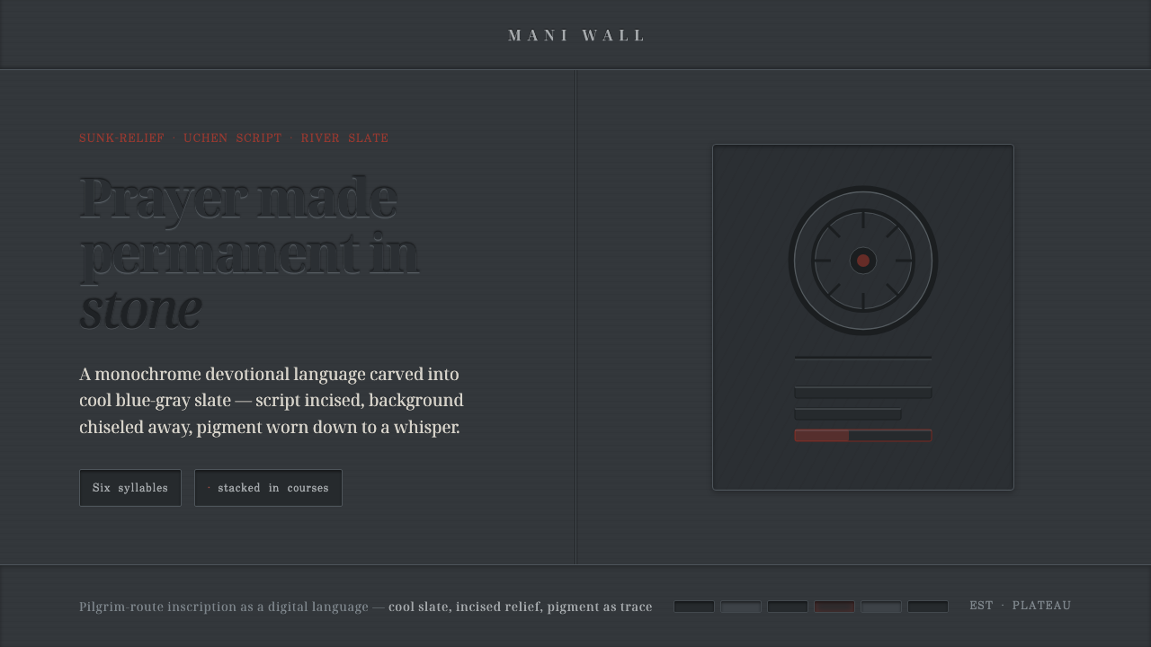 Tibetan Mani StonePrayer made permanent in stone. Sunk-relief glyphs incised into cool slate, p…
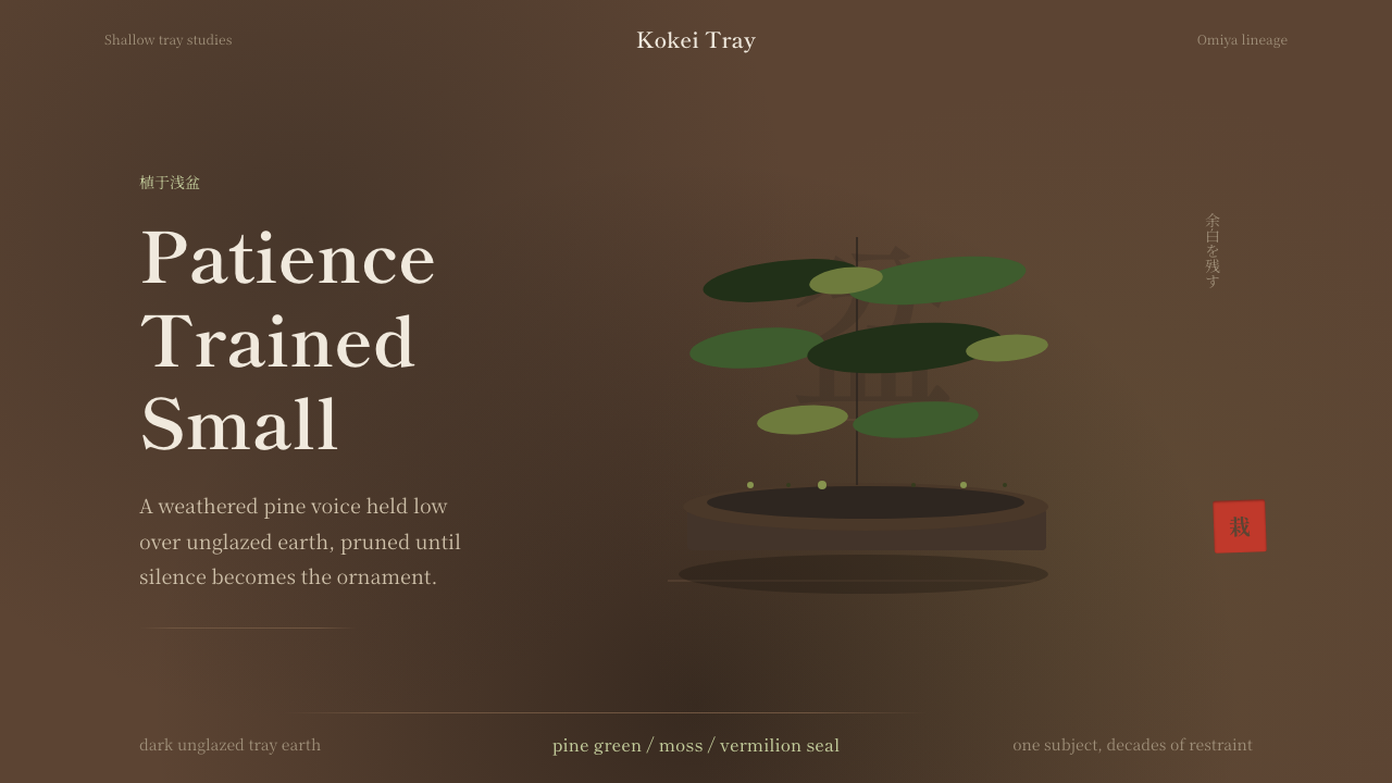 Bonsai CultivationQuiet asymmetry. Pine green rests on dark tray earth, sealed by one vermilion…
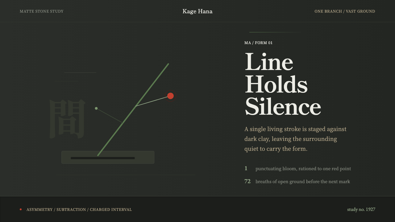 Ikebana SōgetsuQuiet becomes form. Dark stone, Mincho type, one green line and a single red…
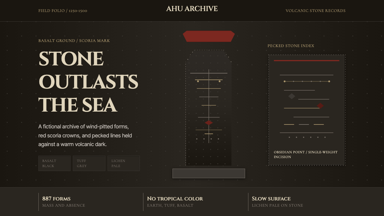 Rapa Nui Moai PetroglyphMonumental sparseness. Basalt black, scoria red, and pecked-dot borders hold…
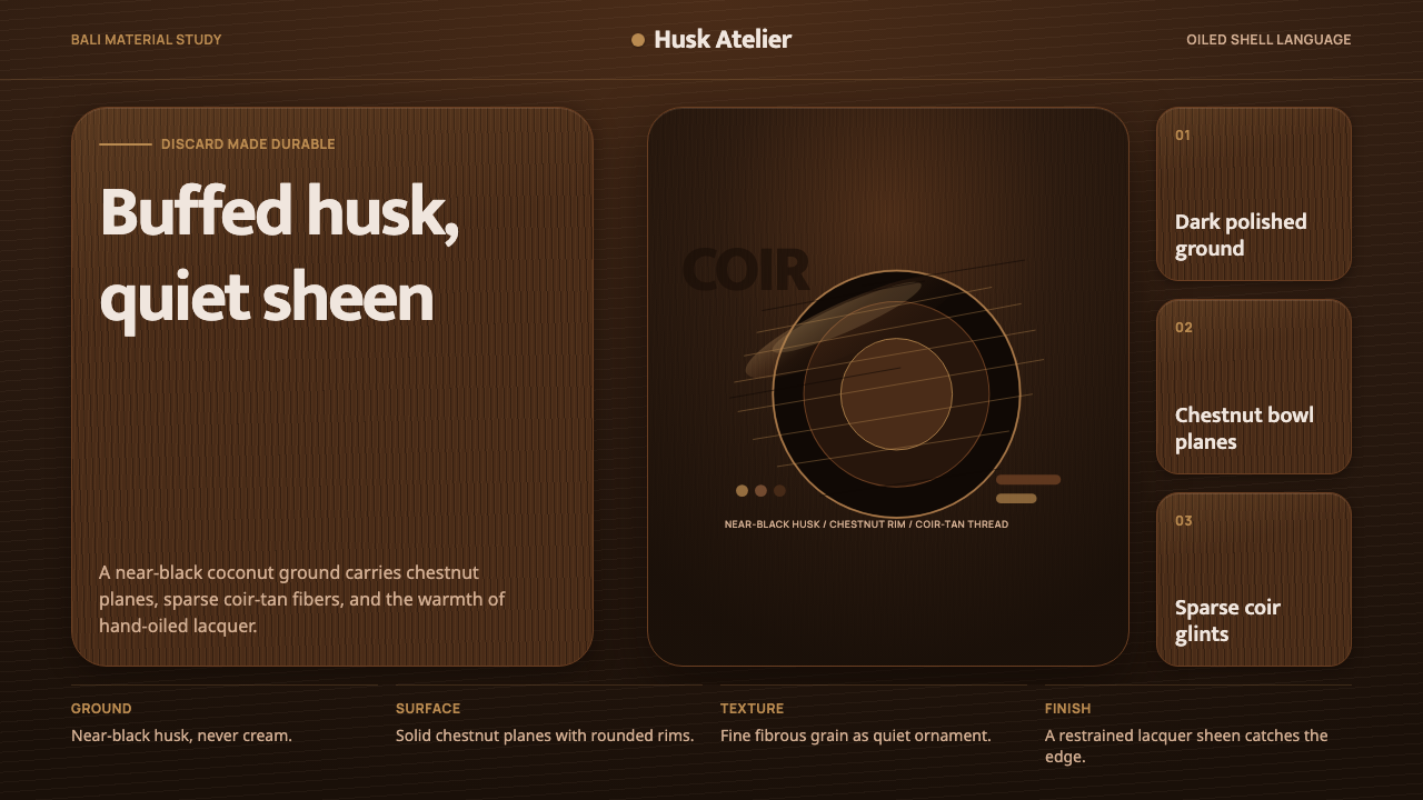 Balinese Coconut ShellQuietly hand-oiled. Near-black husk, chestnut planes, and sparse coir-tan gra…
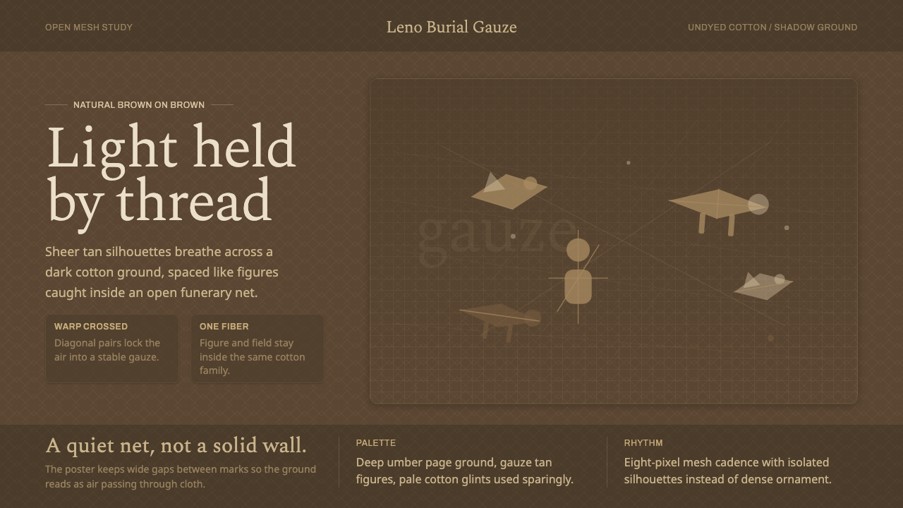 Chancay Gauze TextileQuiet woven dignity. Tan silhouettes float through a dark open cotton mesh.