What is Tibetan Mani Stone?
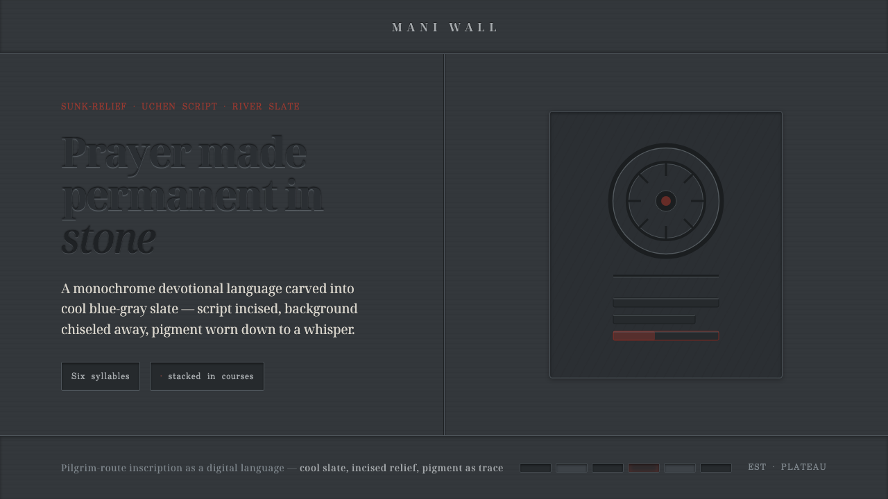
Tibetan Mani Stone turns prayer into durable surface: cool slate, carved script, and pigment reduced to the faint trace left by weather.
Tibetan Mani Stone in brief
Tibetan mani stones are flat pieces of river slate carved with the mantra Om mani padme hum in Uchen script and arranged into low walls along pilgrimage routes. Their visual force begins with material rather than decoration. The stone is cool blue-gray, matte, dense, and visibly weighty; the lettering is not printed onto it but made integral to its face through carving. A mani-stone-inspired design therefore should feel less like a graphic composition applied to a surface than an inscription patiently released from within it.
The defining technique is sunk relief. The ground around each glyph is chiseled away, allowing the letters to remain at the original surface while the surrounding field falls back. This reverses the ordinary expectation of type sitting on a page. The script has presence because the background recedes, and the eye reads both the elevated letterforms and the shadowed channels around them. In digital work, the effect should remain restrained: quiet depth, believable cut edges, and a sense that the mark belongs to the ground rather than floating above it.
The design system distilled from this craft is dark, monochrome, and devotional without becoming theatrical. A slate-like field carries nearly all of the visual atmosphere. White, red, and gold may appear only as weathered symbolic residues inside carved grooves or at carefully chosen points of attention. They are never used as bright decorative signals. The resulting language favors silence, touch, permanence, and concentration over spectacle, saturation, or visual abundance.
Where does Tibetan Mani Stone come from?
The source of this style is an enduring Tibetan Buddhist devotional practice on the Tibetan Plateau, dating from before 1900 and continuing in renewed form today. Mani stones are not isolated art objects in this context. They are carved for a devotional landscape and stacked into mani walls along routes of pilgrimage. Their setting matters to the visual language: the stone is encountered outdoors, accumulated over time, and read as part of a collective field rather than as a singular display piece.
The central written form is Uchen script, used to carve the six-syllable mantra Om mani padme hum. In this tradition, writing is inseparable from making. The glyphs have calligraphic identity, but their form is also governed by the resistance of slate and the labor of cutting away a surrounding field. The resulting letters retain a bodily relation to the stone: their contours are edged by excavation, their grooves can hold pigment, and their legibility depends on surface, shadow, and angle as much as on contrast.
Tibetan Buddhist pilgrims, itinerant mani stone carvers, and monastery lha rtse stonecutters are the named human figures within this tradition. They describe a practice sustained through movement, handwork, and religious continuity rather than through a single author or a fixed design school. That distinction is important when borrowing the aesthetic. It should not be treated as anonymous exotic texture or as a generic dark spiritual mood; its visual restraint comes from devotional stone carving, Uchen calligraphy, and the accumulated presence of mani walls.
The contemporary revival is ongoing, but the essential material logic remains stable: cool slate, relief-cut script, and only faint remnants of symbolic pigment. A digital interpretation should preserve this hierarchy. It may translate carved depth into interface depth and stone weathering into subtle tonal variation, yet it should not claim to reproduce a ritual object. Its task is to carry forward an atmosphere of carved attention, where the surface appears shaped by patience and every colored trace has a reason to remain.
What defines the Tibetan Mani Stone look?
Slate Ground
The dominant field should resemble cool blue-gray slate: dark, low-luster, mineral, and slightly varied rather than perfectly uniform. It is a ground with mass, not a decorative backdrop. Tonal shifts should suggest weathered stone and changing grain without becoming photographic texture or visual noise. Large areas of calm darkness give the carved forms their authority.
Sunk Relief
Depth is created by recessing the field around the lettering, not by making type appear inflated or glossy. The visible form should feel left behind after material has been removed. Edges are firm but softened by the suggestion of hand-cut stone, while shadow remains narrow, cool, and subordinate. Relief should reward close looking rather than announce itself from across the page.
Inscribed Typography
Typography is treated as inscription. It should feel measured, deliberate, and materially anchored, with generous space around major words or glyphs. Uchen script is the direct source of the tradition, while supporting digital text should avoid competing ornamental gestures. The goal is not to imitate sacred calligraphy casually, but to give written information the same seriousness of placement, contour, and pause.
Weathered Pigment
White, red, and gold appear as faint traces held in incised channels, never as broad bright fills. Their role is symbolic and residual: evidence of attention surviving in the stone rather than a palette competing for notice. Pigment works best when it seems partially absorbed, worn, or interrupted by the surrounding slate. The darker ground must remain visually primary.
Monochrome Restraint
Most of the composition lives within closely related dark slate tones. This narrow range makes surface, relief, and spacing more important than decorative contrast. Warmth should not be introduced to make the result friendlier or more luxurious. The style gains emotional force from coolness and reserve, allowing the rare pigment trace to feel meaningful rather than merely attractive.
Accumulated Quiet
Mani walls suggest repetition without sameness: many stones, related inscriptions, and a shared route. Layouts can echo this through stacked panels, repeated marks, or grouped information, but should avoid busy pattern-making. Repetition is a sign of continuity and collective presence. Blank space is equally important, preserving the sense that each carved element has room to settle into the ground.

Who shaped Tibetan Mani Stone?
Pilgrims are central to the devotional setting of mani stones, encountered and stacked along pilgrimage routes. Their presence situates the style within lived religious movement rather than detached ornament. For contemporary designers, this means the visual language should retain humility and purpose: it can draw from stone, inscription, and restraint, but should not turn devotion into a theatrical graphic effect.
Itinerant carvers embody the handwork behind the visual system. Their practice joins Uchen script, flat river slate, and sunk-relief cutting into a single act of making. The carved result is not simply an image of a mantra; it is a surface transformed through labor. That material discipline is the most useful lesson for digital adaptation: make depth, texture, and pigment serve the written form rather than decorate around it.
Monastery lha rtse stonecutters represent the institutional and devotional continuity of stone inscription. Their inclusion underscores that mani-stone aesthetics belong to a living practice of carving and placement, not to an abstract visual trend. A respectful design treatment should therefore emphasize slow-looking qualities—surface, contour, and residual color—while keeping sacred references precise and free of decorative excess.
How do you use Tibetan Mani Stone today?
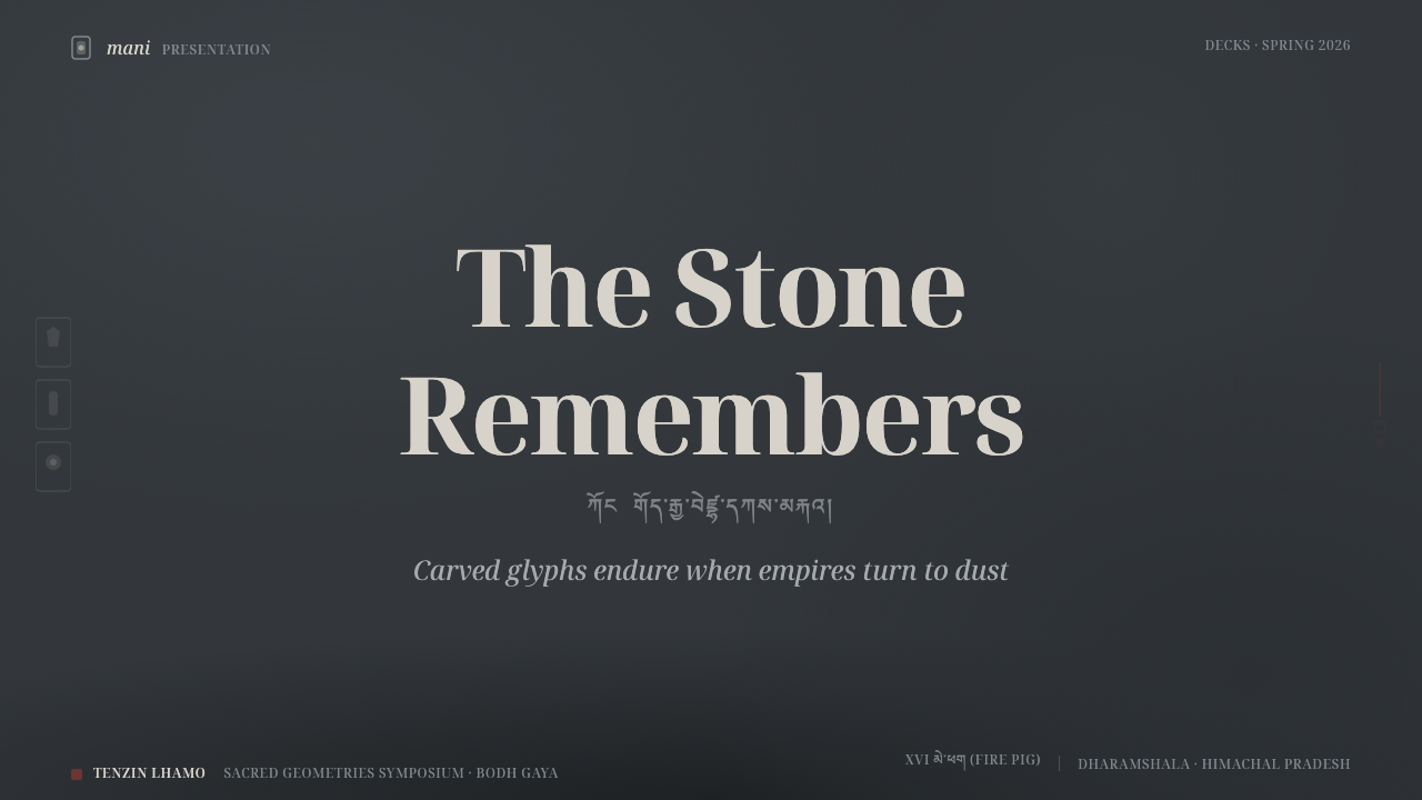
For presentation covers, begin with a nearly uninterrupted slate field and allow one carved inscription or title to carry the page. The strongest composition is often sparse: a large central or off-center textual form, a quiet recessed surround, and perhaps one weathered pigment trace within a groove. Avoid framing the title with ornamental borders or filling the cover with symbolic motifs. The cover should feel encountered, like a carved surface, rather than designed to demand attention instantly.
Content slides benefit from the style's hierarchy of ground, inscription, and pause. Treat section headings as relief-cut markers, then place supporting text in calm, highly readable blocks with ample breathing room. Data slides should remain sober: lines, labels, and simple plotted forms can emerge from the slate ground as if incised into it. Use pigment only to identify a key comparison, selected path, or important value; do not distribute accents evenly across every data point.
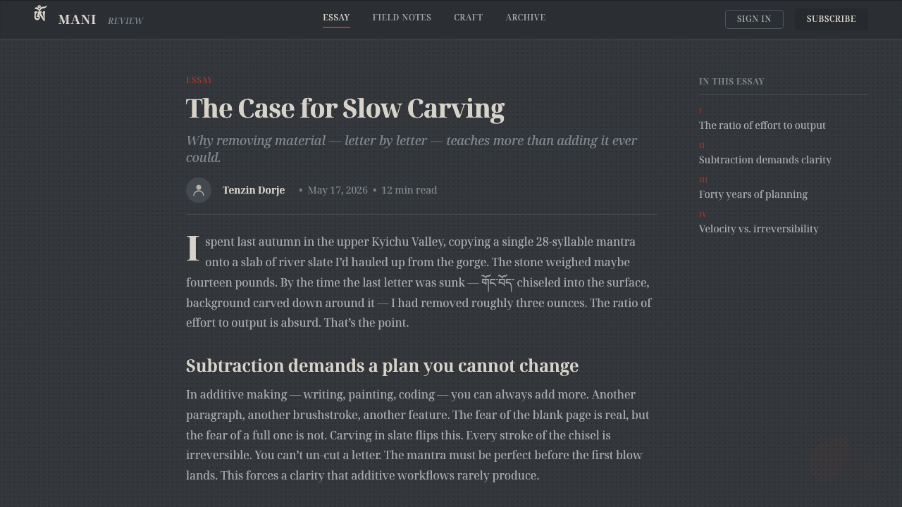
In web interfaces, Tibetan Mani Stone is most suitable for focused dashboards, reflective tools, archives, and premium information spaces where concentration matters more than speed-driven visual excitement. Panels should feel embedded in a shared mineral ground rather than floating as a collection of glossy cards. Controls, labels, and navigation can use shallow relief and carefully separated tonal layers to establish hierarchy. For pricing or membership pages, reserve the faint symbolic pigment for the recommended path or a single decisive action, keeping the rest of the journey calm and legible.
For editorial and marketing work, this language supports long-form stories, cultural context, and messages that benefit from gravity. Use an expansive dark field, restrained image treatment, and inscription-like section breaks. Marketing should foreground the product’s quiet confidence or enduring craft rather than promise urgency through loud banners. If photography is used, it should preserve cool material atmosphere and avoid warming the composition into lifestyle luxury. The result works best when each element appears placed with the patience of carving.
The common mistake is turning the style into generic dark mysticism: adding bright gold, ornate decorative type, glowing effects, or many competing symbols until the stone disappears. Another mistake is making every element deeply embossed, which flattens the hierarchy by giving everything the same importance. Authentic use depends on subtraction. Keep the slate ground dominant, reserve relief for meaningful text and structure, and let white, red, or gold remain what the source describes: faint weathered evidence held in the carved grooves.
Tibetan Mani Stone — FAQ
Is Tibetan Mani Stone simply a dark, embossed visual style?
No. Its defining logic comes from flat river slate carved with Uchen-script mantra text in sunk relief, then placed within the devotional landscape of mani walls and pilgrimage routes. Darkness and relief are only the visible consequences of that material process. A faithful digital interpretation emphasizes carved inscription, cool stone, restraint, and faint residual pigment rather than using embossing as a generic luxury effect.
How should white, red, and gold be used?
Use them as traces, not as a complete decorative palette. The source describes symbolic pigment remaining faintly in carved grooves against cool slate. In a digital composition, this suggests a small, weathered accent within an inscription or a rare point of emphasis. Broad saturated fields, warm metallic shine, or multiple bright accents at once weaken the essential contrast between durable stone and fragile pigment.
Can this style be used with ordinary Latin text?
Yes, provided Latin text is treated as inscription rather than as decorative imitation of Uchen calligraphy. Keep the writing clear, spacious, and materially grounded, with relief reserved for meaningful titles, navigation, or section markers. Uchen script is the specific source tradition and should not be casually imitated or used as ornamental filler. The transferable principle is the seriousness of carved writing, not the indiscriminate borrowing of sacred forms.
Where does Tibetan Mani Stone work poorly?
It is poorly suited to products that depend on playful abundance, cheerful warmth, rapid promotional intensity, or dense visual choice. A crowded shopping surface, a children’s interface, or an energetic entertainment campaign can easily turn its restraint into heaviness or misuse its devotional associations as atmosphere. The style works best where stillness, continuity, focused reading, and material seriousness genuinely align with the product’s purpose.
Related design styles
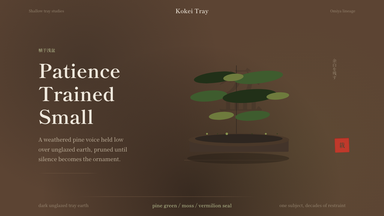 Bonsai CultivationQuiet asymmetry. Pine green rests on dark tray earth, sealed by one vermilion…
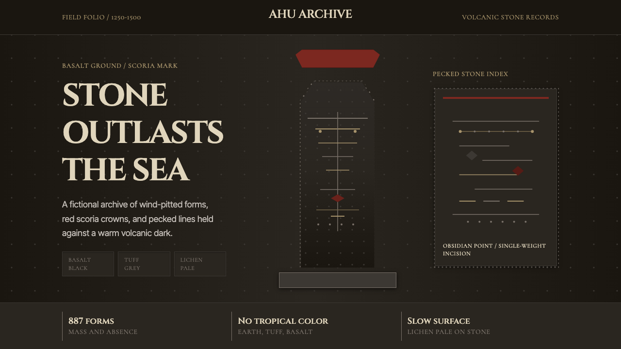 Rapa Nui Moai PetroglyphMonumental sparseness. Basalt black, scoria red, and pecked-dot borders hold…
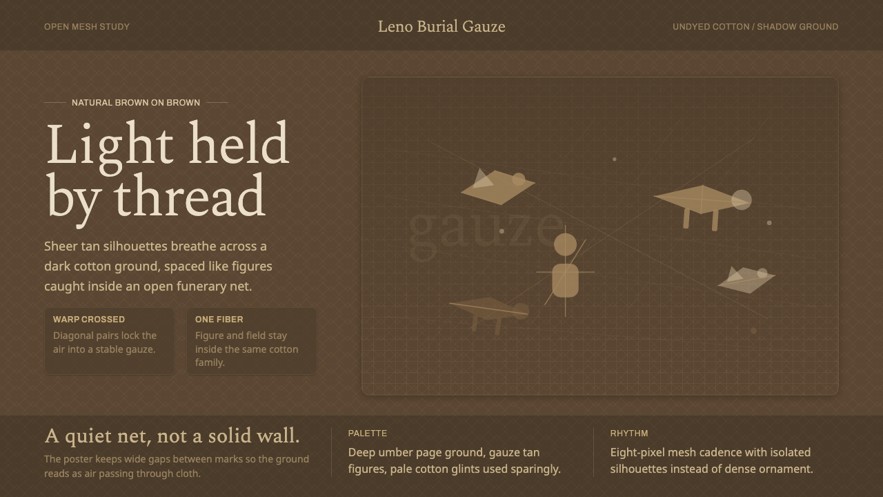 Chancay Gauze TextileQuiet woven dignity. Tan silhouettes float through a dark open cotton mesh.
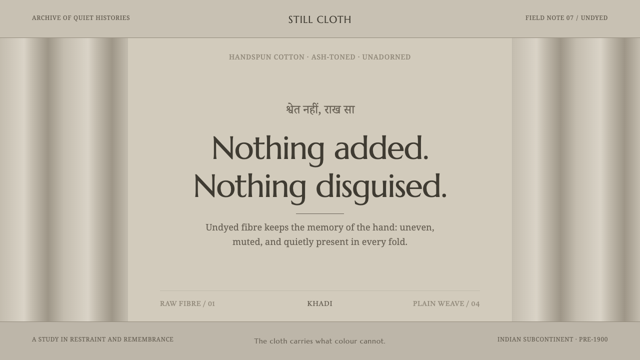 Hindu Widow White SariRestraint carries the weight. Ash-toned khadi, quiet serif type, and vertical…
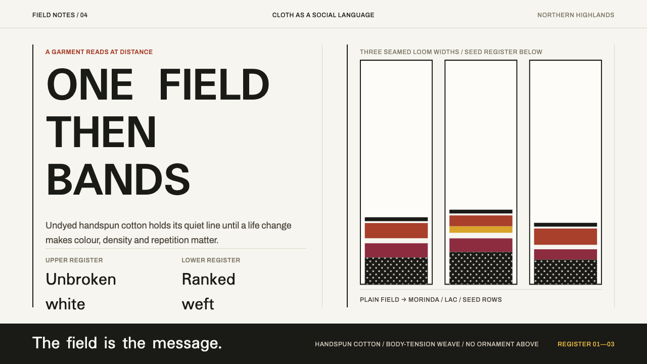 Karen Woven TunicOne field, then bands. Warm cotton white gives way to morinda registers and r…
 Konso WagaWeather makes the monument. Silver-grey timber, hard planes, and ochre held i…