What is Konso Waga?
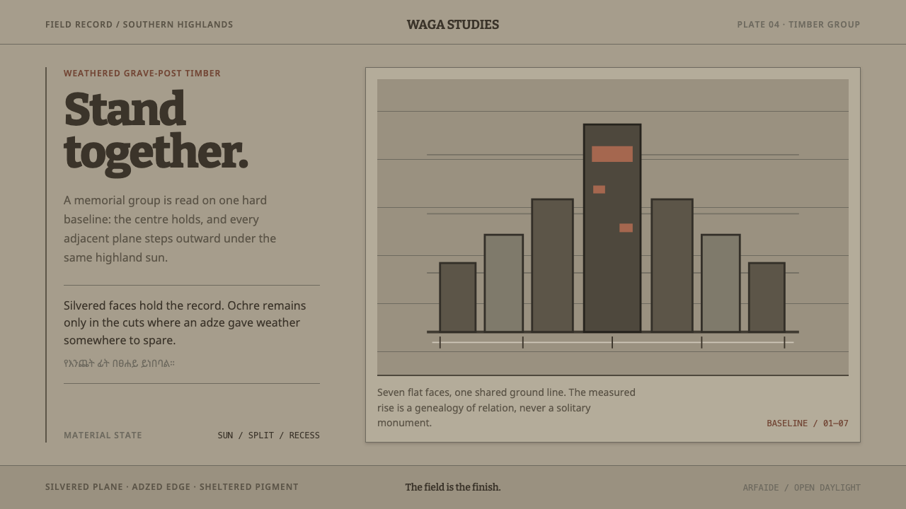
A waga is a grave post that weather finishes for the carver: silver-grey timber, hard planes cut by an adze, and red ochre surviving only where the blade left a hollow.
Konso Waga in brief
Konso Waga is a design style built from the carved grave posts of the Konso highlands in southern Ethiopia. A waga is a hardwood post shaped with an adze and set on the grave of a Konso man of standing. The style takes its look from the post as it actually exists in the field: a mid-toned silver-grey timber surface, flat planes meeting at hard edges, dark grain and shadow lying over the grey, and traces of red-ochre paint held deep in the recesses the blade left behind.
Its central idea is that weather is a co-author. A waga is not finished when the carver puts down the adze. Sun opens the grain, splits run along the length of the timber, insects cut channels across it, and the painted colour wears away everywhere except in the hollows. The style treats that weathered grey as the object's true state and builds its whole system from it, rather than from the polished gallery finish a museum might prefer.
The mood that results is solemn but not theatrical. Surfaces are matte and dry, geometry is blunt, and colour is scarce, appearing only in recesses and never as a broad fill. Typography leans on a squared slab serif that echoes the flat cut of a blade, and the Ethiopic script is used as genuine text rather than as pattern. The style is monumental because it is plain: it asks for weight, baseline and silence, and gives back a sense of something that has stood outdoors for a very long time.
Where does Konso Waga come from?
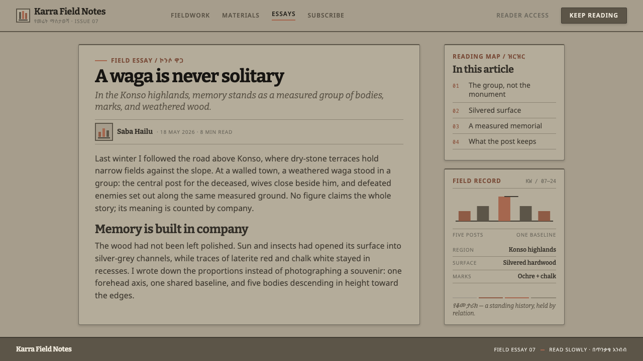
The posts come from the Konso highlands of southern Ethiopia, in the terraced country above the Omo valley, and the source record points to the Arfaide grove and the walled Konso towns as the places where the tradition lives. The practice is an established one that predates 1900, and it has not ended: posts are still carved and still standing today. That continuity matters for a design library, because the style does not describe a lost world. It describes a working funerary art that the Konso continue to make and maintain.
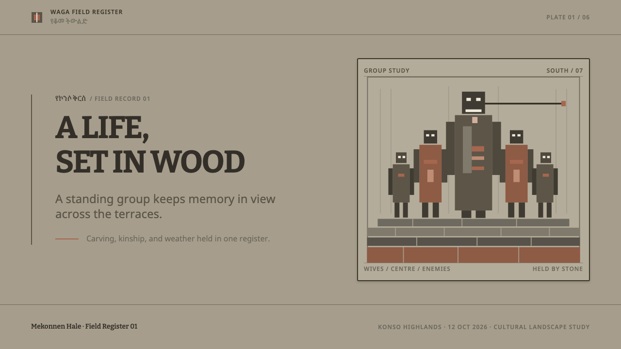
A waga never stands alone. The dead man holds the centre, and from his forehead projects the kallacha rod. His wives are ranged on one side and the enemies he killed on the other, all standing on one baseline, with the tallest figure in the middle and the rest stepping down on either hand. The carving is therefore a composition before it is a sculpture: a row, a centre, a hierarchy of height and a shared ground. The style takes this arrangement as its basic layout principle, a hero element at the axis, flanking elements reduced in scale, and everything resting on the same line.
The aesthetic is also a record of time. Left in the field, the wood silvers. Sun opens the grain, splits run the length of the timber, insects cut channels across it, and the red-ochre paint survives only in the places where the adze left a hollow. The source material insists that this weathered grey is the object's true state, and that the system is built from it rather than from a gallery finish. That insistence is a design decision with consequences: it means the surface is allowed to look dry, scarred and uneven, and that wear is treated as part of the finished form instead of damage to it.
The monument sits inside a larger landscape. Konso funerary sculpture belongs to the same culture as Konso dry-stone terrace agriculture, in which long retaining walls of stacked stone hold soil on steep ground, and in 2011 the area was inscribed as the UNESCO Konso Cultural Landscape. The system borrows that landscape directly: contour lines in the background run as long horizontal bands, because they stand for stone walls that hold the hillside, not for ornamental curves. The Brooklyn Museum is the museum named in the source record, and it represents the way the posts have been seen outside Ethiopia, as objects that deserve study as well as care.
What defines the Konso Waga look?
Weathered Silver-Grey
The base of the system is a mid-toned silver-grey, the colour wood reaches after long exposure. It is neither a clean light neutral nor a dark surface; it sits in the middle, which is why other values read clearly against it. The grey is matte and slightly dry. It is meant to look like timber the sun has worked on, not like a painted grey, and it explicitly rejects the polished, dark gallery sheen that museum display would give the same object.
Grain, Splits and Insect Channels
Darker grain and shadow are laid over the grey base as the surface character. Splits run the length of the timber, following the direction of the post, while insect channels cut across it at an angle to the grain. The two directions give the texture a legible logic: long cracks say the wood has stood and dried, short crossing channels say it has been lived in by something. Texture is an evidence trail here, not a decorative overlay.
Ochre in the Hollows
Red ochre survives only where the adze left a hollow, and the system follows that rule exactly. Ochre appears in recesses, inset marks and cut-in details, and never as a broad flat field. It reads as residue that the weather could not reach. Used this way, the colour is both scarce and meaningful, and it makes any ochre element look as if it had been preserved by the surface around it rather than painted on top.
Adze Planes and Hard Edges
Every face is a plane split off by the adze, and the place where two planes meet is a hard edge, not a rounded corner. Geometry is faceted and blunt. Shadow behaves accordingly: it falls as a crisp shape along an edge rather than as a soft haze. Components built in this language look cut rather than moulded, and the absence of soft rounding is one of the quickest ways to tell a faithful rendering from a loose imitation.
Slab Serif and Ethiopic Script
Headings are set in a slab serif whose square-cut terminals correspond to the flat face of a blade. Ethiopic letterforms are treated as body text, set to be read, in the way any script would be, and are never used as a repeating ornamental pattern. The pairing says something precise about respect: the script is a living language, not a texture, and the slab is a tool mark translated into type.
Centre Figure on One Baseline
The post's own composition becomes a layout rule. A tallest element holds the centre, flanking elements step down on either side, and everything stands on one shared baseline. The centre has a single projecting feature, the kallacha rod, which gives the hero an unmistakable silhouette. This produces a calm, ceremonial symmetry of rank rather than of mirrored decoration, and it gives pages a clear order of attention without needing a single bright colour to establish it.
Terrace Contours
In the background, long horizontal lines run like the contour of a terraced hill. They stand for dry-stone retaining walls that hold soil on the slope, and they are drawn as straight, load-bearing bands, not as the soft S-curves a generic landscape pattern would use. Treat them as structure: they divide space, mark levels and anchor the composition, much as the walls anchor the Konso hillside.

Who shaped Konso Waga?
Named in the source record as key figures of the tradition. The waga is carved for a man of standing, and lineage heads are the kind of person whose position such a monument records. They stand for the social meaning of the form: a post is a statement of rank and remembered deeds, not generic decoration, which is why the system asks for weight and order rather than ornament.
The carvers who shape the hardwood posts with an adze are the authors of the style's most characteristic feature: the flat, split-off plane. Each face is a deliberate stroke, and the hollows in which ochre survives are the marks of their blade. The look was made by hand before it was weathered by sun.
The one museum named in the source record. As an American art museum, it represents the outside gaze that sets Konso posts beside other sculpture. The system's stance is deliberately different: it declines the polished finish that display might favour and keeps the surface as it is in the field.
The 2011 inscription recognises the terraced highlands, walled towns and stone-built farming system in which the waga stands. It frames the post as part of a landscape rather than an isolated object, which is why the design system uses terrace contours as a background device and treats long horizontal lines as walls of stone.
How do you use Konso Waga today?
Konso Waga is a style of weight and permanence, and it transfers best to work that benefits from those qualities. Because it comes from a funerary tradition it carries gravity, so it suits subjects such as heritage, land, craft, archives and long-lived institutions better than anything playful. Applying it well means committing to its rules: matte grey surfaces, planar geometry, scarce colour in recesses, and a centred composition resting on a shared baseline.
For presentation slides, a cover can echo the post directly. A tall central block or title sits on the axis, flanking elements step down on either side, and all of them stand on a single baseline across a weathered grey field. The title is set in a squared slab serif. Content slides work as planar blocks with hard edges, and ochre is reserved for inset details such as a cut-in underline or a recessed marker. Data slides suit bars that stand like posts on a common baseline, with the key bar rising at the centre and a thin ochre mark held inside it.
For web interfaces, the style gives dashboards and archival tools a serious, durable character. Cards and panels are flat planes with square corners and crisp shadow along one edge; inputs are plainly outlined; navigation is typographic. A pricing page can arrange its tiers like a row of posts on one baseline, with the recommended tier taller at the centre. Ochre should appear only in recessed states, such as pressed buttons, active insets and selected markers, so that the colour keeps its meaning as something preserved in a hollow.
For editorial and marketing work, the long horizontal terrace lines are a useful structural device. Use them to separate sections of an article, to mark levels in a long page, or to hold a pull quote between two bands, in the way retaining walls hold a slope. Photography fits when it is dry, matte and outdoor in character. Where Ethiopic script appears, set it as real copy with proper size and spacing, and give it the same respect as the Latin text beside it.
The most common mistake is to polish the surface: adding gloss, a dark lacquered wood look, soft rounded corners or smooth gradients, which is exactly the gallery finish the system sets out to reject. A second mistake is to spread ochre across large areas as a flat accent colour, which removes the idea of a pigment that survived only in hollows. A third is to turn the Ethiopic script into a repeating ornamental border, or to draw the terrace contours as pretty curves. Each of these converts a structural reference into decoration.
Konso Waga — FAQ
What is a waga, and what is the Konso Waga design style?
A waga is a hardwood post carved with an adze and set on the grave of a Konso man of standing in southern Ethiopia. It usually appears in a group: the dead man at the centre, his wives on one side and the enemies he killed on the other, all on one baseline. The design style borrows the post's weathered silver-grey surface, hard planes, recessed ochre and centred composition.
Why does the style use weathered grey instead of polished dark wood?
Because the post in the field is grey. Left outdoors, sun opens the grain, splits run the length of the timber and insects cut channels across it, and the wood silvers. The source material treats that weathered state as the object's true one, and builds the system from it instead of from a gallery finish. The grey is also practical: as a mid-tone it lets dark grain and ochre read clearly.
Where does the red ochre go in a layout?
Only in recesses. On the real posts, red-ochre paint survives only where the adze left a hollow, so the system places ochre in inset marks, pressed states and cut-in details, never as a broad flat fill. Used this way the colour stays scarce and keeps its meaning as something preserved by the surface around it. If ochre starts to fill whole panels, the style has been misread.
How should Ethiopic script be used in this style?
As real text. The style sets Ethiopic letterforms as readable body copy, with proper size and spacing, and never as a repeating decorative pattern. The headings use a squared slab serif that echoes the flat cut of a blade, so the pairing is between a living script and a tool mark translated into type. Using the script purely as ornament would contradict the respect built into the system.
Where does the style fit, and where does it struggle?
It fits projects that want weight, permanence and plainness: heritage and archive sites, craft and land-related brands, long-form editorial, serious analytical dashboards. It struggles where a product wants glossiness, playfulness or high-saturation energy, and because its source is a funerary monument it should not be used for light-hearted or disposable subjects. Use it where solemnity and endurance are the message.
Related design styles
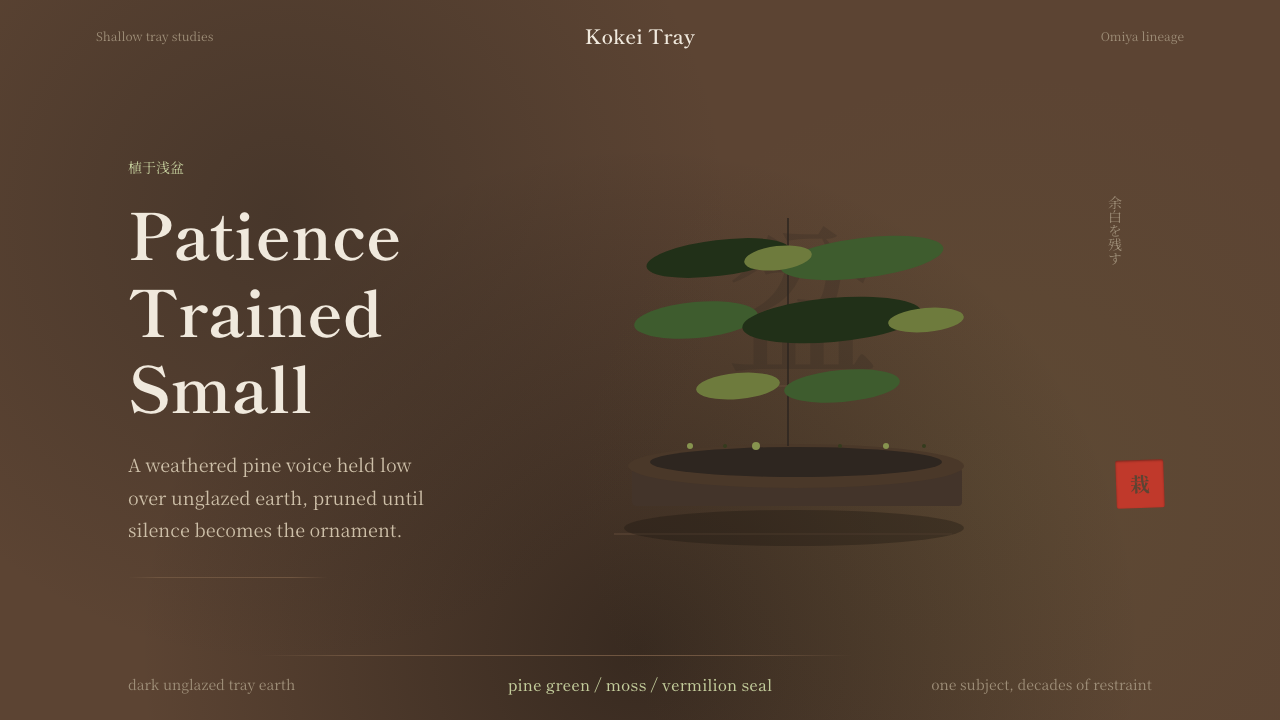 Bonsai CultivationQuiet asymmetry. Pine green rests on dark tray earth, sealed by one vermilion…
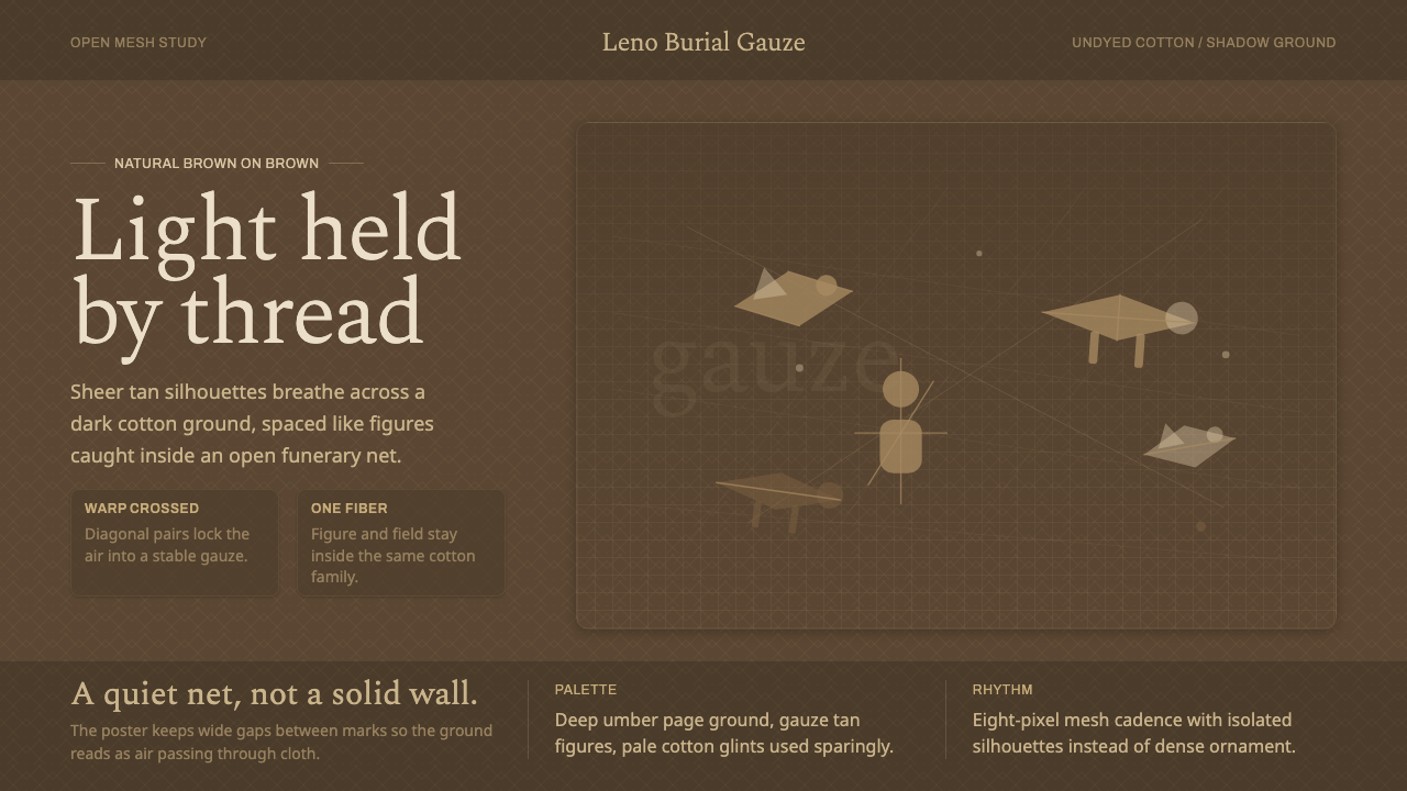 Chancay Gauze TextileQuiet woven dignity. Tan silhouettes float through a dark open cotton mesh.
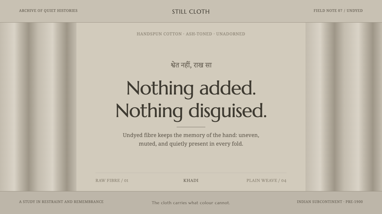 Hindu Widow White SariRestraint carries the weight. Ash-toned khadi, quiet serif type, and vertical…
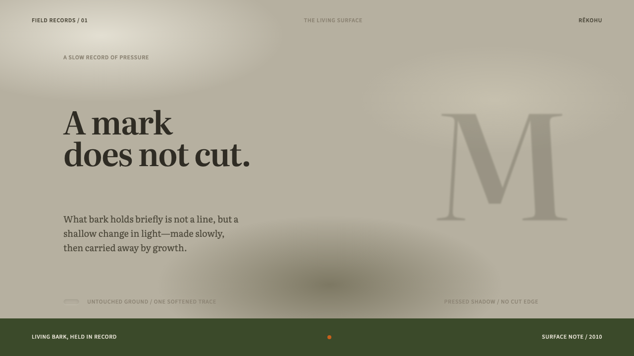 Moriori Rakau MomoriPressure, not incision. Literata shadows sink softly into pale, lichened bark.
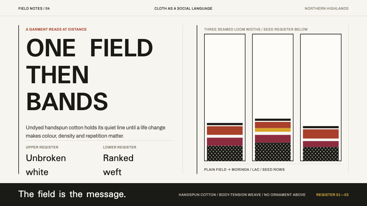 Karen Woven TunicOne field, then bands. Warm cotton white gives way to morinda registers and r…
 Rapa Nui Moai PetroglyphMonumental sparseness. Basalt black, scoria red, and pecked-dot borders hold…