What is Karen Woven Tunic?
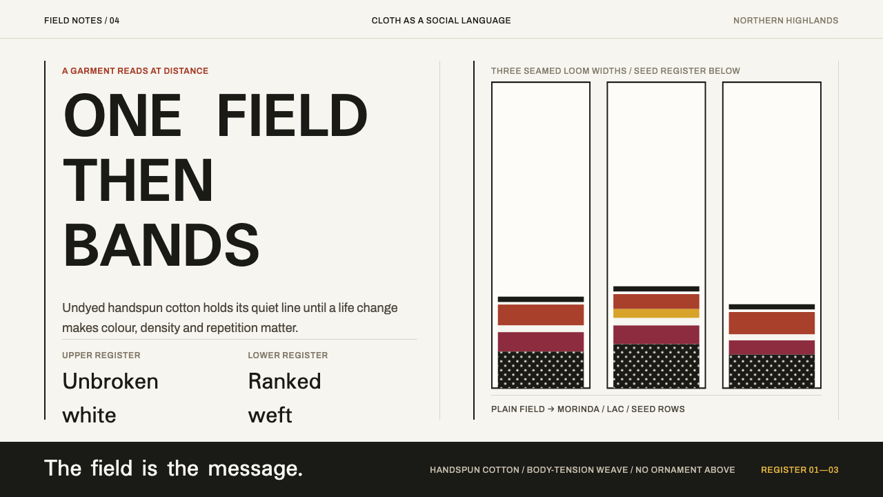
The Karen hse says everything by what it leaves out: one unbroken field of undyed white cloth for a girl, and a dense ladder of red bands and white seed rows for a wife.
Karen Woven Tunic in brief
The hse is the long shift an unmarried Sgaw or Pwo Karen girl wears from childhood until her wedding day. It is handspun cotton, woven on a backstrap loom, left undyed, and worn entirely without pattern. One uninterrupted field of bright white cloth is the whole statement. After marriage the white is put away and a banded tunic takes its place: stripes of morinda red and near-black, with the lower half loaded with rows of hard white Job's tears seeds woven straight into the weft.
As a design reference, the Karen woven tunic is a lesson in structure rather than motif. The garment sets a long plain field above and dense banding below, and it permits nothing to float in between: no scattered ornament, no pattern drifting through the middle distance. Empty space is not background here. It is the message, and in a village where cloth is read as readily as writing, it is a specific one.
Translated to screens and print, the style yields pages that open with a calm, uninterrupted expanse and resolve into tightly ranked horizontal registers. Hierarchy is carried by density: the further down the surface you travel, the more it compresses into rows. The palette is small and earthy, made of warm cotton white, a root-dyed red, near-black, and the hard white of the seeds. Every band exists because it marks a boundary, never because the surface seemed to need decoration.
Where does Karen Woven Tunic come from?
The garment belongs to the Sgaw and Pwo Karen communities of Karen State (Kayin) in Myanmar and of Mae Hong Son, Chiang Mai and Tak provinces in northern Thailand. Its roots lie before 1900, and it has been worn continuously into the present, which separates it from the many textile references that survive only in museum cases. It sits within the wider family of Southeast Asian backstrap weaving, also called body-tension weaving, in which the warp is held taut between a fixed point and a strap around the weaver's own back. The weaver's posture is part of the machine. Cloth that comes off such a loom is made at the scale of a body, and its edges, tension and small irregularities record the hands that produced it.
What makes the hse unusual among traditional garments is that it works as a signal. Karen dress is catalogued in this reference as a marital signal: the plain white shift marks a girl from childhood to the day of her wedding, and after marriage the white goes away. The change has nothing to do with fashion or season. One kind of garment announces a stage of life through colour and density, so no label or badge is ever needed. That is a strikingly modern design idea, a change of state communicated by the surface itself, and it is why the style translates so readily into interface states and tiers.
Outsiders noticed the effect. The traveller Dries Touw, writing in a diary about Karen villages, remembered the young women in bright white robes and white head wraps, a whole group of them reading from a distance as one brilliant field. That record is valuable precisely because it is an outsider's eye describing what the cloth did at range, which is the same thing a designer wants from a hero section: an impression that lands before the details resolve.
The colour of the married tunic has also been studied in the laboratory. Dye analysis by the British Museum's Dye Detective research team identified the red as morinda root bark, with a deeper, pinker lac red alongside it, while the blue is always indigo. That finding explains the look: this is a lived, warm red with variation inside it, not a flat primary. Finally, the seeds that crowd the lower half are Job's tears (Coix lacryma-jobi), set into the weft in a tradition catalogued as Job's tears seed appliqué. They are plant seeds, hard and white, and they turn a woven surface into something with a rhythm you can almost hear.
What defines the Karen Woven Tunic look?
The Unbroken Field
The girl's hse is one uninterrupted expanse of undyed cotton. In design terms this is a large, quiet ground with no pattern, no border and no interruption, and the white is warm and slightly creamy because it comes from handspun cotton rather than bleach. The emptiness is deliberate and carries weight. When this style opens a page or a slide, the first thing the viewer should feel is the authority of a field that has been left alone.
Registers of Red and Near-Black
After marriage the surface divides into horizontal bands in morinda red and near-black. These bands are registers: each has a clear upper and lower edge, a consistent thickness within itself, and a job to do. They stack rather than interlock, so the eye reads them like lines in a ledger. Red carries emphasis, near-black carries weight, and neither is ever used to draw a picture.
Seed Rows
The lower half of the married tunic is loaded with rows of hard white Job's tears seeds. This is the densest zone of the whole garment, a texture built from repeated small units laid along straight lines. In a layout it becomes a field of evenly spaced small marks, such as dot rows, counters and tick bars, which gives the lower surface a beaded, ranked rhythm and sets it sharply against the calm above.
Handspun Texture
Handspun cotton and body-tension weaving leave a surface that is never perfectly uniform. Thread thickness wanders slightly, edges breathe, and the white carries a faint grain. A faithful interpretation keeps a trace of this, through a soft paper-like grain or tiny irregularities in the weight of rules, and avoids the glassy perfection of a pure screen-white fill. The point is not distress, since the cloth is new and clean. It is simply made by hand.
Dyes with Provenance
The red here is not a generic red. Dye analysis traced it to morinda root bark with a deeper, pinker lac red alongside, and the blue is always indigo. Natural dyes give colour depth and slight variation, so the warm red leans earthy and a little brick-like instead of fire-engine bright, and the dark bands read as near-black rather than pure black. Choose a red that looks like a pigment someone dug out of a root.
Nothing Floating
The structural rule of the style is that nothing hangs in the middle. A long plain field sits above, dense banding sits below, and the passage between them is a decision, not a gradient. No icon floats unanchored, no decorative motif hovers between sections, and no card sits half in the field and half in the bands. Every element attaches to either the calm zone or the ranked zone.
Two States, One Garment
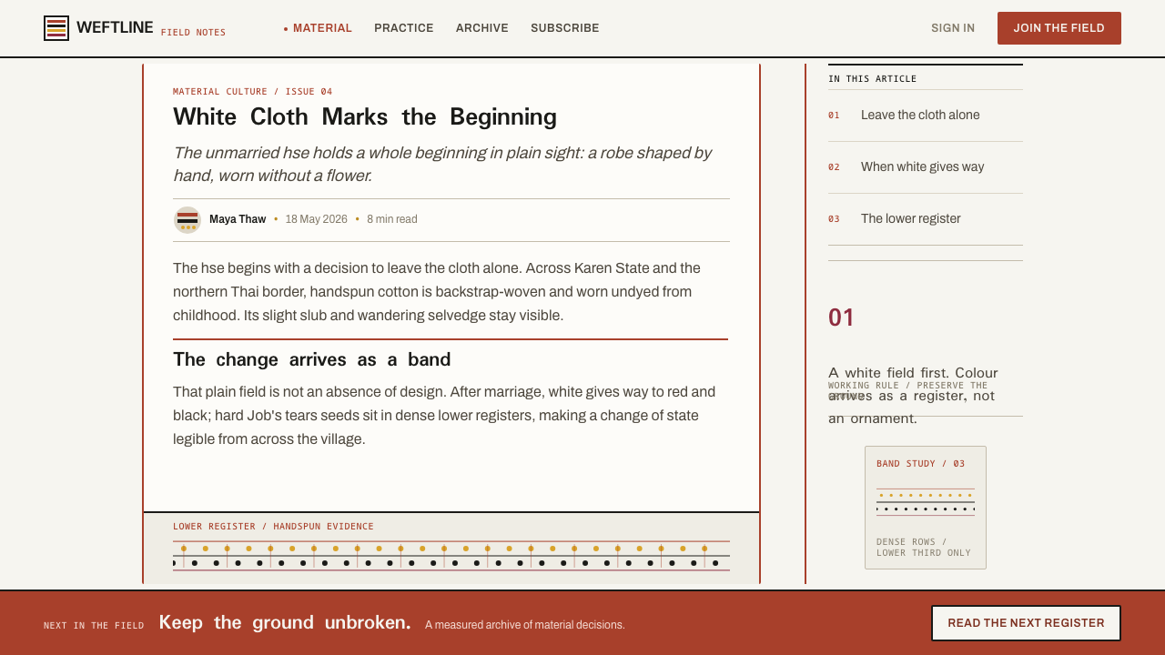
The same silhouette serves a girl and a married woman, but the surface changes entirely: white field before, bands and seeds after. For designers the lesson is state through surface. Free versus paid, empty versus filled, unread versus read: a single layout can switch between the field state and the banded state without inventing any new shapes, only by changing density.
Who shaped Karen Woven Tunic?
Touw is the traveller whose diary entries about Karen villages preserve an outsider's first impression: groups of young women in bright white robes and white head wraps. His account is useful to designers as evidence of how the white field reads at a distance, as a single luminous statement rather than a plain background, and it roots the style in lived observation rather than in a museum label.
The real authors of this style are the Sgaw and Pwo Karen weavers who remain anonymous in the record. They spin the cotton, set up the backstrap loom, decide when cloth stays undyed and when morinda red and near-black go in, and set the seeds into the weft. Crediting them as anonymous makers is the honest way to cite the style: the system describes their craft rather than a designer's invention.
The British Museum's Dye Detective team analysed the dyes in Karen textiles and identified the married tunic's red as morinda root bark with a deeper, pinker lac red, and the blue as indigo. Their work gives the style an unusually grounded colour story. The palette is documented rather than guessed, which is why it feels earthy and specific instead of reading as a generic red-and-white scheme.
How do you use Karen Woven Tunic today?
Karen Woven Tunic is best understood as a two-zone system. Every surface it touches should have a long calm field and a compact ranked field, and the style works when the viewer can tell instantly which is which. It rewards restraint and punishes decoration, and it is particularly effective for products that need to communicate status, progress or tier without extra symbols.
On slides, a cover can leave most of the page as the warm white field, with the title set in near-black low on the canvas and a single band of morinda red beneath it as the only colour. Content slides can use the red band as a section marker at the top or bottom and keep body text quiet in near-black. Data slides take naturally to the seed-row idea: replace gridlines with rows of small even marks, give tables alternating warm bands as backing, and let a bar chart read like a register of bands, with values labelled directly rather than through a legend. Keep the upper area of a slide empty; the weight lives lower down.
For dashboards, the style suggests a calm summary region at the top, with a headline figure and a short sentence, above a dense lower area of ranked rows such as tables, activity lists and log entries. Pricing pages can use tiers as bands: the free tier is the plain field, and each paid tier adds another register of red or near-black plus a row of small marks for its features. Navigation should be quiet and typographic. Buttons should be solid blocks in near-black or red, with no gradients, glows or floating shadows, since nothing here should hover.
In editorial work, the long plain field becomes generous opening space: a title, a standfirst and wide margins before the first paragraph. Bands then act as section dividers, thick enough to be structural and few enough to stay meaningful. Marketing pages can open with an almost empty hero and let density increase as the page descends, ending in a compact lower section of ranked proof points, logos or testimonials. That sequence mirrors how the garment behaves from shoulder to hem.
The most common mistake is to treat the style as a red-and-white colour scheme and scatter red accents everywhere. The red works only when it is organised into bands; a red icon here and a red badge there turns the structure into confetti. A second mistake is adding pattern to the white field, whether a faint texture, a watermark or a decorative border, which breaks the statement the girl's cloth makes by being plain. A third is mixing in extra hues, since the palette is deliberately short and the near-black and white do most of the work. Finally, do not let elements float: if an item cannot attach to the plain field or to a band, it probably should not be on the page.
Karen Woven Tunic — FAQ
What is the hse in Karen dress?
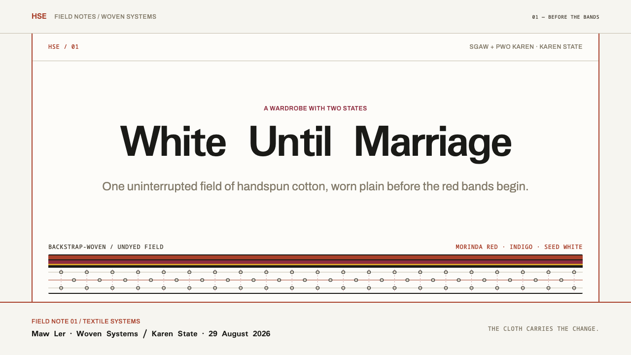
The hse is the long shift worn by unmarried Sgaw and Pwo Karen girls from childhood until their wedding day. It is handspun cotton, backstrap-woven and left undyed, with no pattern at all. After marriage a banded tunic in morinda red and near-black replaces it, with rows of Job's tears seeds woven into the lower half. This design style takes both halves of the story: the long plain field and the dense banding.
Why is the white field left completely plain?
Because the plainness is the meaning. In the reference record, the unpatterned white shift marks a girl before marriage, and that single uninterrupted field is the whole statement. For designers it shows that restraint can be a primary visual device: negative space deliberately left open signals state and intention as strongly as a decorated surface would.
What colours does the style use?
A short, earthy set: warm cotton white, a morinda red with a deeper, pinker lac red alongside it, near-black, and the hard white of the seeds. Dye analysis found that the red comes from morinda root bark and lac, and that the blue is always indigo. Treat the red as a warm natural red rather than a bright primary, and keep every colour organised into bands.
Does this style work on a dark background?
The reference is a light-ground system, and its central idea depends on a bright white field sitting above dense bands. A dark version is possible, but the quiet-field-over-ranked-registers logic is easy to break: if the plain field becomes a heavy dark block, it stops reading as calm emptiness. If you invert it, keep the upper region generous and sparse, keep the bands tightly ranked, and use the seed white as the single bright accent.
Is it appropriate to borrow a Karen garment as a design reference?
It can be, if done with care. The style takes structure from the garment, a field above, bands below and state expressed through surface, rather than copying a pattern or imitating dress. Credit the Sgaw and Pwo Karen weavers as the source, avoid costume imagery, and do not present the result as a Karen product. The safest path is to use the structural ideas and acknowledge where they come from.
Related design styles
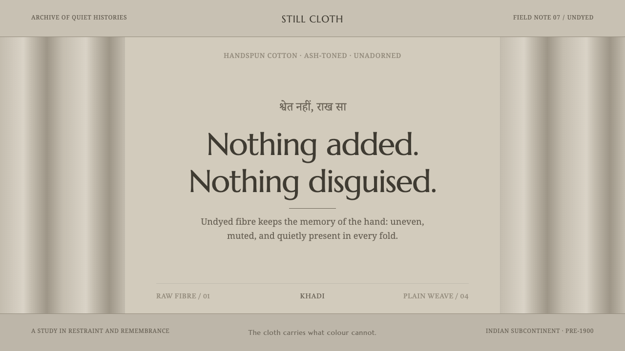 Hindu Widow White SariRestraint carries the weight. Ash-toned khadi, quiet serif type, and vertical…
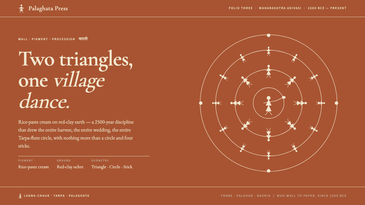 Warli Tribal PaintingTwo triangles make a human. Rice-paste cream on red-clay ochre, dancers proce…
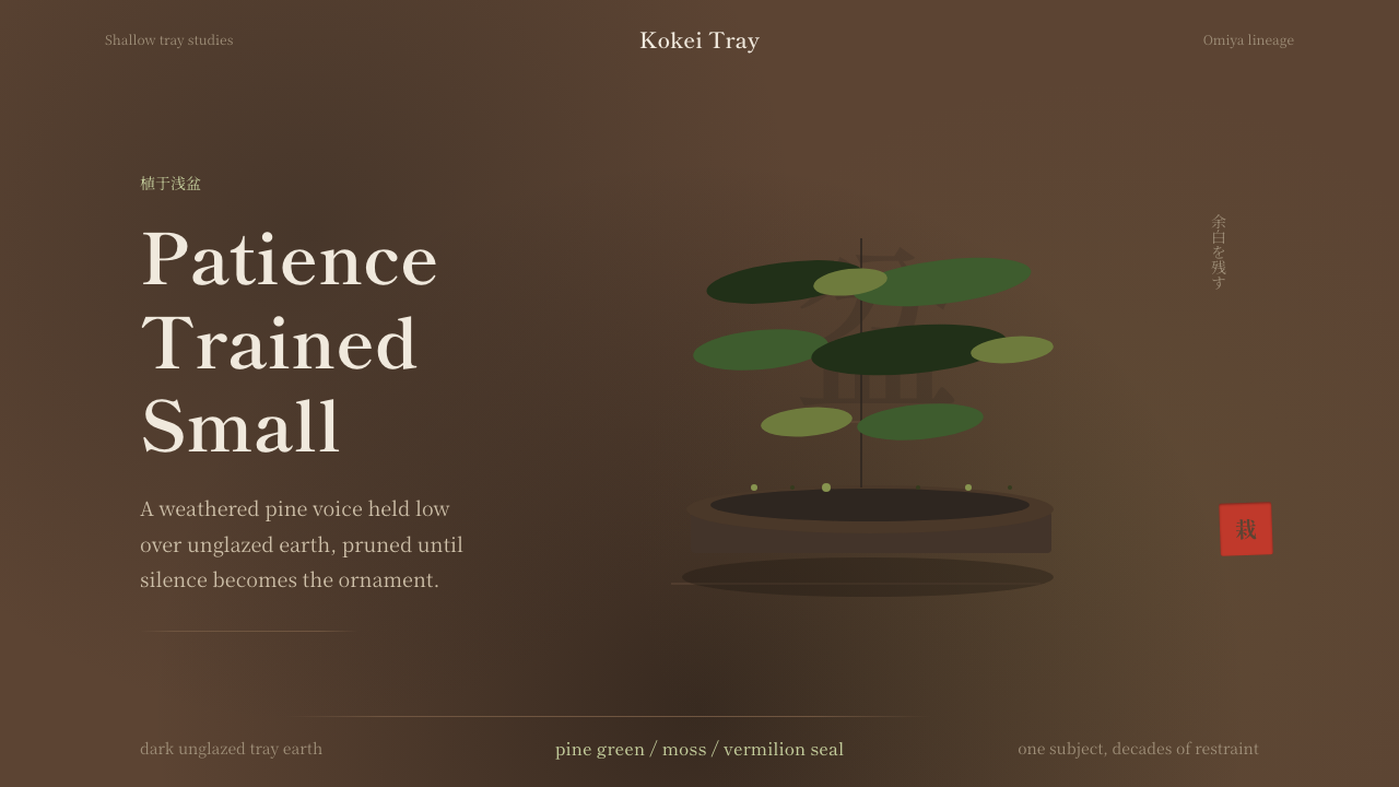 Bonsai CultivationQuiet asymmetry. Pine green rests on dark tray earth, sealed by one vermilion…
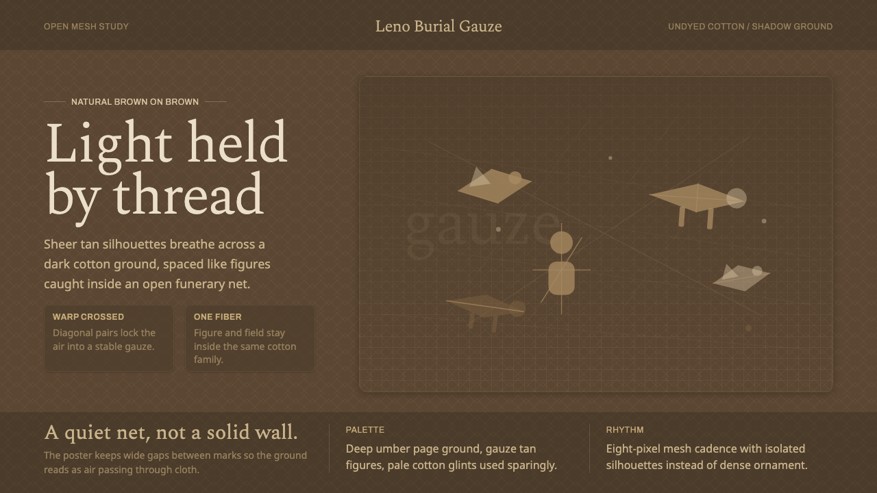 Chancay Gauze TextileQuiet woven dignity. Tan silhouettes float through a dark open cotton mesh.
 Konso WagaWeather makes the monument. Silver-grey timber, hard planes, and ochre held i…
 Moriori Rakau MomoriPressure, not incision. Literata shadows sink softly into pale, lichened bark.