What is Moriori Rakau Momori?
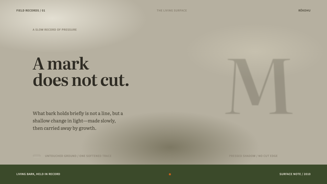
Rākau momori are ancestors pressed, not cut, into the living bark of trees on Rēkohu, and this style learns from them: low contrast, soft edges, one mark per surface and far more bare ground than incident.
Moriori Rakau Momori in brief
Moriori Rākau Momori is a light, quiet design system drawn from the ancestor figures pressed into kōpi trees on Rēkohu, the Chatham Islands of New Zealand. Its ground is pale, lichened bark. Its marks are faint, darker shadows with rounded shoulders, soft at every edge. Contrast is deliberately pressed to its lowest, only one mark sits on a surface, and the untouched ground outweighs the incident by a wide margin.
The source object sets the terms. Rākau momori are figures in living trees, and Te Papa's conservators are careful about the word for them: not carvings but bruisings. A bruising is a wide, shallow indentation whose shoulders are rounded, so a figure reads as a faint darker shadow on the bark and never as a cut line. The design system takes that distinction seriously. It treats every mark as a pressure on a surface rather than a stroke drawn upon it.
The trees are alive, and that fact governs the whole style. As a trunk thickens, the bruised figure is stretched and, over time, steadily erased. The design system takes that condition literally, which is why nothing in it is crisp, framed or permanent-looking. It is a style about presence that is quiet, fragile and bound to its host, and it asks a designer to leave room, accept softness and let one thing speak at a time.
Where does Moriori Rakau Momori come from?
Rēkohu is the Moriori name for the Chatham Islands, in New Zealand. The marked trees stand in the J M Barker (Hāpūpū) National Historic Reserve, and the record dates the marks to before 1900, made on kōpi trees that are still living today. They belong to the Moriori, the people of Rēkohu, and to a tradition built around the karapuna, the ancestors. The figures pressed into the trees are images of those ancestors.
The marks are described as physical evidence of the Nunuku peace covenant, named for Nunuku-whenua. They are not simply art, then, but a record: ancestor figures standing in a living landscape as a sign of a covenant of peace. That context shapes how the design system should be handled. It is a visual language drawn from ancestral figures, and it asks for quiet and careful treatment.
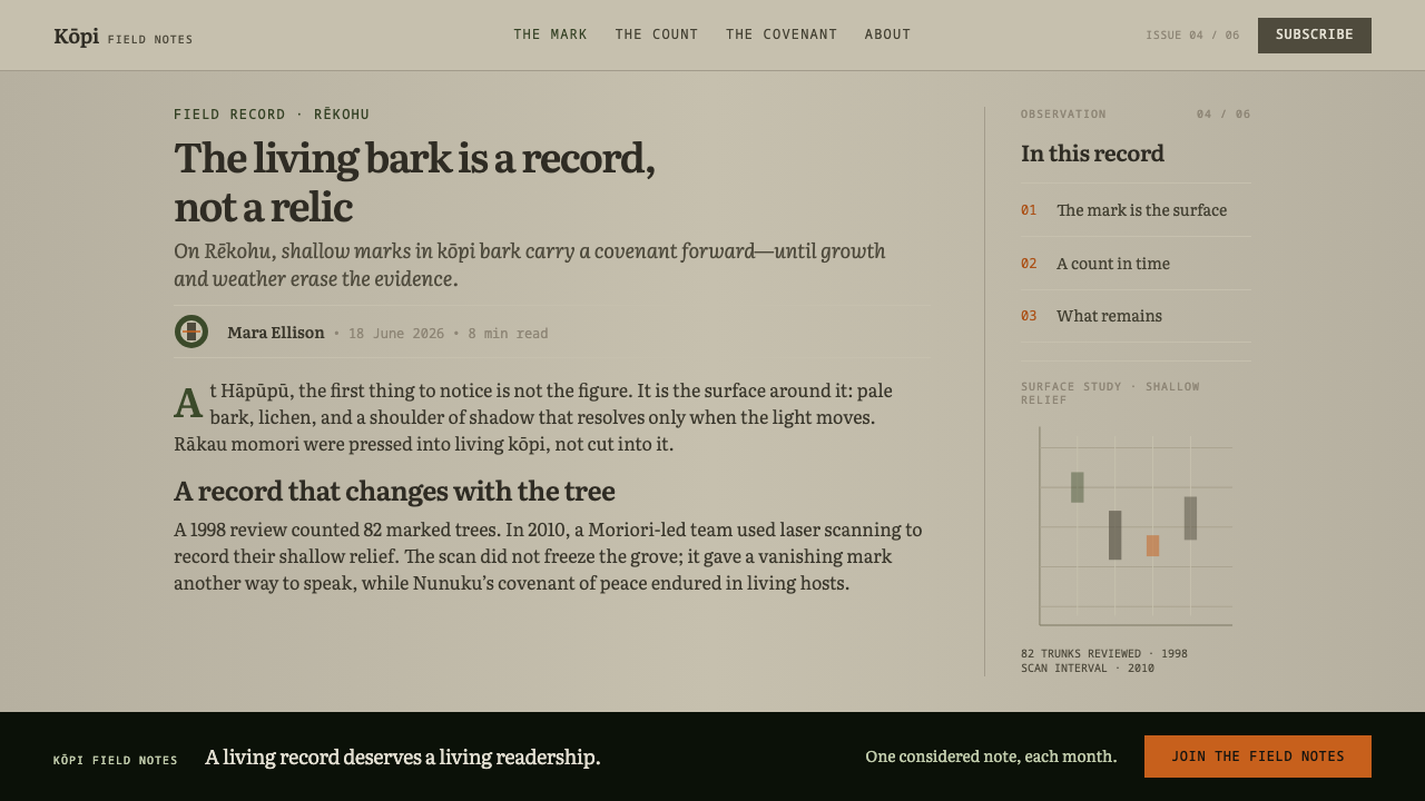
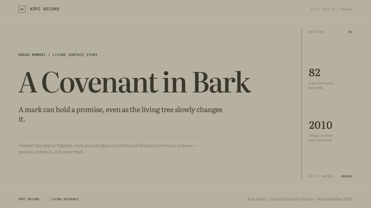
The modern history of the trees is a history of protection and measurement. A reserve gift in 1979 is part of the story of how the site came to be protected, and the reserve carries J M Barker's name. A survey in 1998 recorded 82 trees bearing marks. In 2010 the Department of Conservation, the University of Otago and the Moriori carried out the first national laser scanning of these surfaces, because the figures are disappearing as the trees grow. The scan kept them as data, so that the shapes of the bruisings would survive even where the bark does not.
From these facts the design system draws its manner. Contrast is pressed to the minimum, and edges are blurred. A single mark sits on each surface, with far more ground than incident, and nothing is framed, because the original has no frame. The karapuna stand frontal, with large heads and hands hanging at their sides, and beside them appear the pātiki, the flounder, and the hopo, the albatross. The system is a designer's reading of that condition, not a reproduction of the figures: it borrows how the marks sit in the world, and it credits the Moriori for the tradition.
What defines the Moriori Rakau Momori look?
Pressure, Not Incision
The foundational idea is that a mark is made by pressing rather than cutting. A bruising is wide and shallow, with rounded shoulders, so it never produces a sharp line. In design this means no hairlines, no crisp outlines and no precise vector edges for decorative marks: shapes are broad, gently depressed and soft where they meet the ground, as though made by a thumb rather than a blade.
Faint Shadow Contrast
Marks are a slightly darker shadow on a pale, lichened ground and nothing more. Contrast is held at its lowest on purpose, so a figure is found rather than announced. The ground itself is the colour of weathered bark, a pale neutral with a trace of lichen, and the marks sit within the same tonal family. The effect is closer to a watermark seen at an angle than to a drawing.
Soft Edges
Every edge is softened. Shadows sink in gently, outlines dissolve into the ground, and no boundary is drawn as a hard line. Where a contemporary interface would use a crisp divider or border, this style uses a change of tone. Cards, buttons and panels are therefore described by faint depressions and gentle tonal shifts, not by rules and outlines.
One Mark per Surface
Each surface carries a single mark. A tree trunk shows one figure, not a pattern, and the composition follows that rule: one subject per panel, one shape per slide, one focus per view. This is the system's strictest compositional constraint and the source of its calm, because the eye never has to choose between competing marks.
More Ground Than Incident
Untouched ground outweighs the marked area by a wide margin. Empty bark is not a failure to fill the surface; it is the main material of the composition. Margins are generous, spacing between elements is large, and a page may be mostly blank with a faint presence at one side. The restraint makes each mark feel significant and gives the whole system a stillness.
No Frame
Nothing is framed, because the original mark has no frame. There are no bordered boxes around figures, no picture-frame treatments for images and no enclosing panels to say that this is the important thing. Importance is carried by position and by the amount of empty ground around it. Images fade or merge into the surface instead of stopping at a hard rectangle.
Ancestral Vocabulary
The tradition itself supplies a small, consistent set of subjects. The karapuna are drawn frontal, with large heads and hands hanging at the sides, and beside them appear the pātiki, the flounder, and the hopo, the albatross. The lesson for a designer is the plainness of this vocabulary: a few simple, front-facing shapes, repeated by tradition. The figures themselves belong to the Moriori, so the system borrows their manner of sitting on a surface, not the figures as decoration.
Who shaped Moriori Rakau Momori?
Nunuku-whenua is the name given to the peace covenant to which these marks are tied. The ancestor figures are described as the physical evidence the covenant left behind, which is why they should be handled as a record and not as ornament. The name belongs here as the reason the surfaces carry meaning at all.
J M Barker is the name carried by the reserve in which the marked trees stand, the J M Barker (Hāpūpū) National Historic Reserve. The record dates the reserve gift to 1979. The name matters to the design story because protection is part of what survives: without the reserve, the surfaces would be harder to study and keep.
The Hokotehi Moriori Trust is the Moriori body named in the record alongside the trees. It stands for the people to whom the marks belong and who took part in the conservation work. Mentioning it is a reminder that this is a living culture's heritage, to be credited by name, not an anonymous aesthetic.
Te Papa's conservators are the source of the key distinction: not carvings but bruisings. Their care over the word is the reason the whole design system is organised around pressure and soft shoulders rather than cut lines. It is a good example of how precise vocabulary can generate a coherent visual rule.
New Zealand's Department of Conservation and the University of Otago, working with the Moriori, carried out the first national laser scanning of these trees in 2010. Their work turned vanishing surfaces into data. For the design system it supplies the final principle: a mark that cannot last is worth recording, and the record is not a replacement for the tree.
How do you use Moriori Rakau Momori today?
Moriori Rākau Momori is a style for work that wants to be quiet and still be unmistakable. Because its marks are faint and its edges soft, it asks for a different kind of design confidence: the willingness to leave a surface mostly empty. It suits subjects that deserve attention without shouting, and it works best when each page has a single thing to say.
On slides, a cover can be a wide pale field with the title set modestly and a single faint mark, a soft shadow or a dim shape, offset to one side. Content slides should carry one idea each and leave more empty space than content. Data slides need care: choose one series to carry the meaning, render it in a soft darker tone on the pale ground, and keep gridlines nearly invisible. The reading text itself should stay clearly legible, because the softness belongs to marks and shapes rather than to the words.
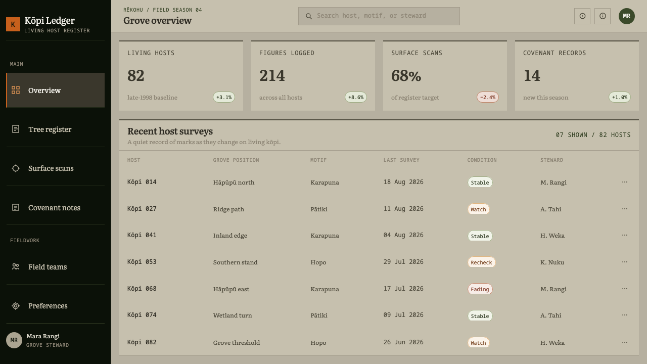
For web interfaces the style suits calm reading experiences, journaling and note-taking tools, cultural and nature products, and landing pages that want a gentle first impression. Use a pale, slightly textured ground and text in a clear dark tone, and let secondary elements such as dividers, icons and card boundaries fade into soft shadow rather than hard borders. An active state can be shown by a slightly darker depressed shape behind the item. Dense dashboards are the hard case: if you use the style there, keep data text sharp and let only the decoration go soft.
In editorial and marketing work, the one-mark-per-surface rule gives long pages a strong rhythm. Let each section open with a lot of quiet space and a single soft shape or image. Photography of bark, lichen, trees, coastlines or birds suits it when it is cropped without a frame and allowed to fade at its edges. Campaigns about conservation, heritage, memory or patience are a natural fit. Resist stacking several badges, borders and call-outs on the same view.
The first common mistake is to harden the system. Sharpening edges, boosting contrast on decorative marks or adding a frame turns a bruising into a cut and removes the style's meaning. The second is to fill the emptiness, because the system's meaning lives in what it withholds. The third is to use the ancestor figures themselves as a decorative pattern or tourist motif. The karapuna are ancestors, so borrow the quality of the surface, with its pressure, softness and space, and credit the Moriori. Finally, do not let low contrast leak into body text: keep the words readable and make only the ornament soft.
Moriori Rakau Momori — FAQ
What are rākau momori, and why are they called bruisings?
Rākau momori are ancestor figures pressed into the living bark of kōpi trees on Rēkohu, the Chatham Islands. Te Papa's conservators prefer the word bruisings to carvings because the marks are wide, shallow indentations with rounded shoulders: they read as a faint darker shadow, never as a cut line. The distinction is the basis of the whole design system.
Is such low contrast a problem for accessibility?
It can be, if you apply it to text or controls. The low contrast belongs to decorative marks, shapes and surfaces, the faint shadows that echo the bruised bark. Reading text, labels, buttons and any information a user must act on should stay clearly legible and meet normal contrast needs. A sound approach is to keep ornament soft and function sharp, so the style stays quiet without making anything hard to read.
Can I use the ancestor figures in my own design?
It is better not to. The karapuna are ancestors of the Moriori, and the marks are described as physical evidence of the Nunuku peace covenant. The design system borrows the manner of the marks, meaning low contrast, soft edges, one mark per surface and generous empty ground, rather than the figures themselves. If you refer to the tradition, name the Moriori and treat the subject with care.
How do I apply one mark per surface to a busy interface?
Treat each panel, card or screen as a single surface and give it one point of emphasis. Everything else on it should be present but quiet: soft tonal shifts instead of borders, no competing badges, no stacked calls to action. If a screen genuinely needs several points of emphasis, split it into several surfaces with generous ground between them, so each one still has a single mark.
Why does the style treat fading and impermanence as a feature?
Because the original marks are on living trees. As a trunk grows, the bruised figure stretches and is steadily erased, and the 1998 survey and the 2010 laser scan exist because that loss is real. The design system accepts the same condition: softness, space and a lack of permanence-signalling frames. It is a style for work that is honest about being temporary.
Related design styles
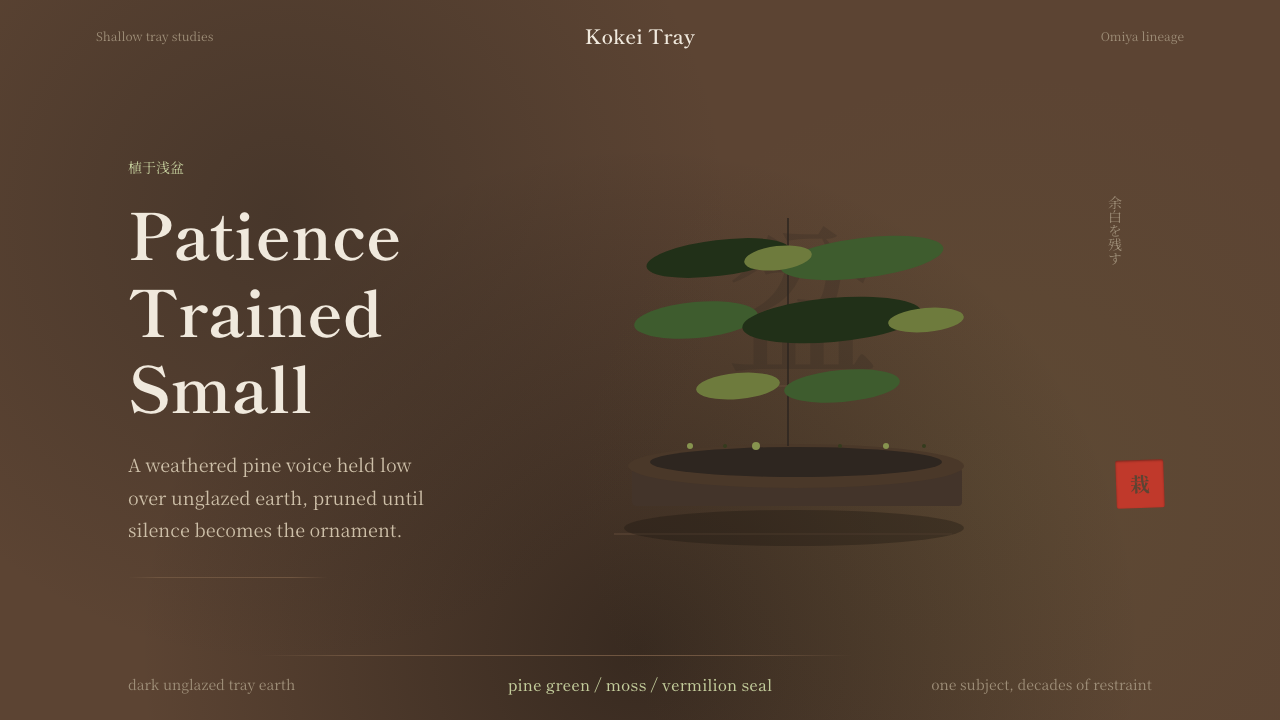 Bonsai CultivationQuiet asymmetry. Pine green rests on dark tray earth, sealed by one vermilion…
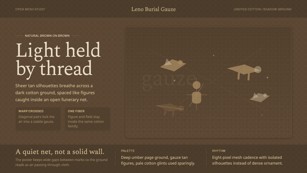 Chancay Gauze TextileQuiet woven dignity. Tan silhouettes float through a dark open cotton mesh.
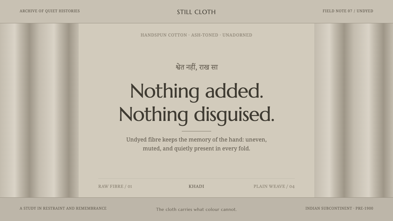 Hindu Widow White SariRestraint carries the weight. Ash-toned khadi, quiet serif type, and vertical…
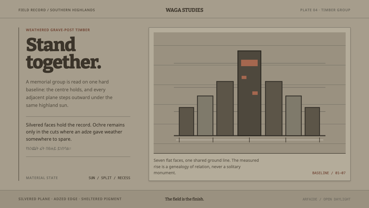 Konso WagaWeather makes the monument. Silver-grey timber, hard planes, and ochre held i…
 Rapa Nui Moai PetroglyphMonumental sparseness. Basalt black, scoria red, and pecked-dot borders hold…
 Karen Woven TunicOne field, then bands. Warm cotton white gives way to morinda registers and r…