What is ICEHOTEL?
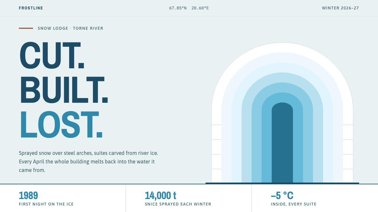
ICEHOTEL is a building that lives for one winter, and its style is the colour of that material: matte sprayed snow, translucent ice, and the blue that light leaves behind inside a thick block.
ICEHOTEL in brief
ICEHOTEL is a design style built on a building that lasts one season. Every winter since 1989, sprayed snow and clear blocks cut from the Torne river have been set over steel arches in Jukkasjärvi, a village in Swedish Lapland inside the Arctic Circle. Invited artists carve the interior into suites, and each spring the whole structure melts back into the river it came from.
The style takes its palette from the material itself: the matte white of sprayed snow, the milky translucence of pale ice, the blue that light gathers while passing through a thick block, and small accents of reindeer hide and timber as the only warm notes. Its layouts follow the vaulted corridor instead of the rectangular slab, with thick walls, deep openings and sawn, faceted edges.
What makes it distinctive is not only how it looks but what it admits: that a thing can be designed to disappear. Pages in this style feel quiet, cold-lit and hushed, with narrow blue capitals and nested arches, and they carry the sense that what you are looking at was cut, built, enjoyed and then lost. That gives the style an unusual emotional register, part wonder and part farewell.

Where does ICEHOTEL come from?
ICEHOTEL begins with a river. The Torne runs through Jukkasjärvi in the municipality of Kiruna, in Swedish Lapland, and freezes each winter into a thick sheet of clear ice. In 1989 Yngve Bergqvist organised an ice-sculpture workshop on the frozen river, an event that planted the idea of building with ice rather than merely carving it. The hotel's founding is therefore the story of an art event slowly becoming an institution, and the style inherits that modest, experimental beginning.
The method matured into a repeatable annual cycle. Each year roughly fourteen thousand tonnes of 'snice', a dense hybrid of snow and ice sprayed over steel forms shaped like inverted catenary arches, are used to create the load-bearing vaults. Clear river ice is harvested for the carved parts, and artists from around the world are invited to turn some fifty rooms into art suites. When temperatures rise in spring, the hotel melts into the Torne and the cycle restarts. That seasonality is the design's central fact: this is a building with a birth, a life and a death every year.
In 1994 the first Absolut Icebar appeared, a bar made entirely of ice that gave the project a second public face and showed that its materials could serve hospitality as well as art. The three strands of the style's lineage meet here. Ephemeral and site-specific architecture asks that a building belong to one place and one time; ice sculpture supplies the craft of carving a light-bearing material; and Nordic experience design supplies the idea that the stay itself is the product, shaped by cold, darkness, texture and silence. Arne Bergh is another name tied to the early story, part of the founding circle around Bergqvist.
For design, the lesson is a particular relationship to material and loss. Most digital interfaces aim at permanence; the ICEHOTEL style asks what a page looks like when it is honest about impermanence. The answer is restraint: a limited, cold palette, thick and sculptural forms, and warmth reserved for small, human touches. The result reads less like a hotel brochure than a document about a season, which is why the style travels well to anything with a seasonal, one-time or limited-edition character.
What defines the ICEHOTEL look?
Sprayed-Snow White
The ground is the matte, slightly soft white of sprayed snow rather than a glossy or clinical white. It has body but no shine, and it absorbs light rather than reflecting it. Large fields of this white give the layout a hushed, muffled quality, like a room whose walls are made of snow.
Translucent Ice
Pale, milky, semi-transparent tints stand in for glass and ice. They are used for panels, overlays and cards that let a little of what lies beneath show through, suggesting depth through thickness rather than through shadow. The effect is cool and clean, never mirror-bright.
Blue from Within
Blue is not applied as pigment; it is the colour that light gathers while travelling through a thick block of ice. It appears as a deepening tone in the thicker, nearer or more important areas, and is used for accents, rules and headlines. It should feel like a glow from inside the material, not like a brand colour painted on top.
Warm Accents of Hide and Timber
Reindeer hide and wood supply the only warm notes, and they are kept small: a brownish fleck, a pale timber tone, a rough fur-like warmth. They signal shelter against the cold and mark the human elements, such as a button, a bed or a hand-drawn detail. Using them sparingly is what keeps the cold dominant.
Vault and Corridor Layouts
Compositions follow the arched corridor rather than the rectangular slab. Nested arch shapes frame content, sections recede like successive vaults, and layouts draw the eye along a central axis, as when walking down the hotel's main hall. Thick walls and deep openings become generous margins and recessed panels.
Condensed Blue Capitals
Headings use tall, narrow capital letters in blue, like lettering cut into a block with a saw. The condensed proportions echo the vertical rhythm of arches and give titles a monumental, carved feel, while keeping long headlines compact. Body text remains plain and calm so that the capitals can act like signage.
Sawn, Faceted Edges
Edges are faceted and slightly irregular, bearing the trace of a saw or chisel rather than the polish of a machine. Cards and images may have clipped corners and angular cuts, and surfaces show subtle texture. The edges tell the viewer that everything on the page was cut from a larger block.

Who shaped ICEHOTEL?
The person associated with the hotel's beginning: in 1989 he held an ice-sculpture workshop on the frozen Torne river in Jukkasjärvi. That event is the seed from which the annual rebuilding grew. For the style, he stands for the experimental, hands-on spirit of a project that began as a gathering of makers and only later became a destination.
A name tied to the early story of the hotel, part of the founding circle around Bergqvist. The details of his role are best left modest here; what the style takes from the founding story is its attitude, the belief that a place can be started by a small group of people who simply decide to build with what the winter provides.
Each year artists from many places are invited to carve the hotel's suites from river ice, so the building has a new set of authors every winter. This collective, rotating authorship is the reason the style prizes variety within a restrained palette: no two suites are the same, yet all of them belong to one material and one season.
The ice bar whose first version dates from 1994, a second public face for the project. It shows how the same materials and the same language can be carried from an art-led hotel into hospitality and brand experience, and it is a useful reminder that the style can serve commerce as long as it keeps its honesty about cold and impermanence.
How do you use ICEHOTEL today?
The ICEHOTEL style suits subjects with a seasonal, one-time or limited character, as well as hospitality, travel, wellness, Nordic and sustainability topics, where quiet and a sense of place matter more than energy. Its power is atmosphere: it makes a page feel cold-lit, hushed and carefully made.
On slides, a cover can use a large snow-white field with a nested arch shape in pale translucent tints, a condensed blue capital title and nothing else. Content slides work as corridors: a central axis, generous margins and sections that step back in sequence. Data slides should be spare, with a single blue series, soft translucent bars and plain labels, so the chart reads like a block of clear ice with the figures set into it.
In web interfaces the style suits booking pages, travel and hospitality sites, wellness and meditation products, seasonal campaign pages and calm editorial front pages. Use the matte white as the base surface, pale translucent panels for cards and overlays, the blue for primary actions and headings, and a tiny hide-brown or timber tone for human touches such as badges or icons. Prefer thick margins and clear spacing over decoration, and keep transitions slow and soft.
For editorial and marketing work, the style is excellent for annual reports with a seasonal theme, climate and sustainability stories, limited-edition launches, event and exhibition pages, and long-form features about places. Photography should be cold, clear and sparsely composed; headlines should be short and set in condensed capitals; and the copy can lean on the poetry of temporary things. The page should read as an invitation to witness something that will not last.
The most common mistake is to treat 'ice' as a licence for glittering effects. Neon cyan gradients, sparkles, snowflake clip-art, glossy crystal highlights and heavy blur all betray the matte, thick, architectural nature of the original material. A second mistake is to let the warm accents spread until they rival the blue; once the page turns brown and cosy, the cold is lost. A third is to set the condensed capitals in long sentences, where they become tiring. Use them for short titles and labels, and let everything else stay quiet.

ICEHOTEL — FAQ
Is this just a generic winter or frost theme?
No. A generic winter theme tends to lean on snowflakes, bright cyan gradients and sparkle. This style is drawn from a specific material and structure: matte sprayed snow, translucent river ice and thick vaulted walls. It is quieter, heavier and more architectural, and it deliberately avoids glitter.
Why is blue used the way it is?
Because in thick ice, blue is an optical effect rather than a surface colour: light passing through the block comes out blue. The style imitates that by treating blue as depth and glow, deepening where the block would be thicker or the content more important, rather than painting it on as flat brand colour.
Does it work outside hospitality and travel?
Yes, wherever the story involves seasons, limited runs, impermanence or calm. Climate and sustainability reports, seasonal product launches, wellness and meditation products, and cultural programmes can all borrow its palette and its patient pace. It is a weaker fit for loud, playful or high-urgency brands, where its hush would feel like absence of energy.
How does it relate to glassmorphism?
Both use translucency, but glassmorphism usually pairs heavy blur with saturated gradients and glossy highlights. ICEHOTEL's translucence is pale, matte and weighty, closer to thick ice than to glass. Keep blur and glare to a minimum, and let thickness, edge and tint do the work.
Can it have a dark version?
The style is a snow-white, light one, but the long dark of a Lapland winter suggests a natural night variant: a deep blue-black ground with ice tones glowing from within, like a lit corridor. If you build one, keep the warm accents tiny, let the blue carry the light, and avoid pure neon, which would break the matte, physical character of the material.
Related design styles
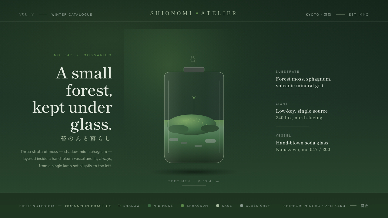 Moss TerrariumWabi-sabi, kept under glass. Layered moss greens on shadow ground, mincho ser…
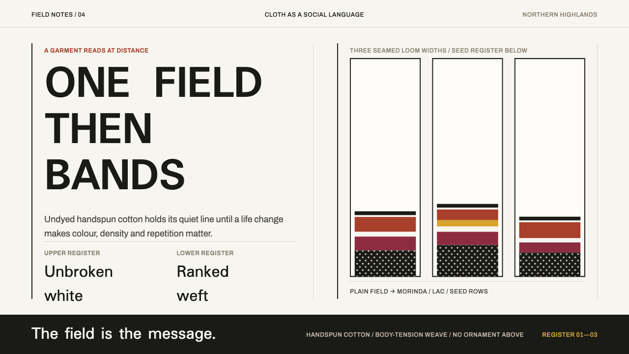 Karen Woven TunicOne field, then bands. Warm cotton white gives way to morinda registers and r…
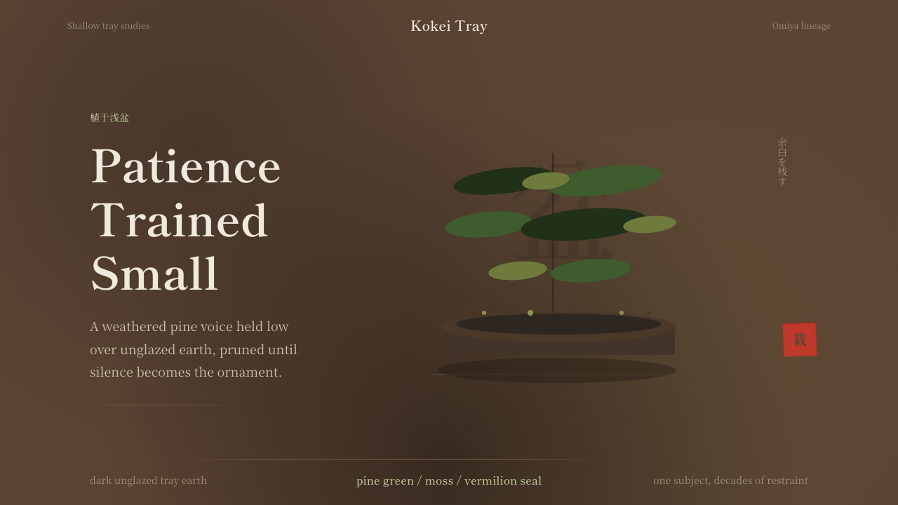 Bonsai CultivationQuiet asymmetry. Pine green rests on dark tray earth, sealed by one vermilion…
 Calm App Purple MeditationWhispers at bedtime. Dusk-purple gradients, cream serif type, and dawn-pink w…
 Chancay Gauze TextileQuiet woven dignity. Tan silhouettes float through a dark open cotton mesh.
 Hindu Widow White SariRestraint carries the weight. Ash-toned khadi, quiet serif type, and vertical…