What is Ikebana Sōgetsu?
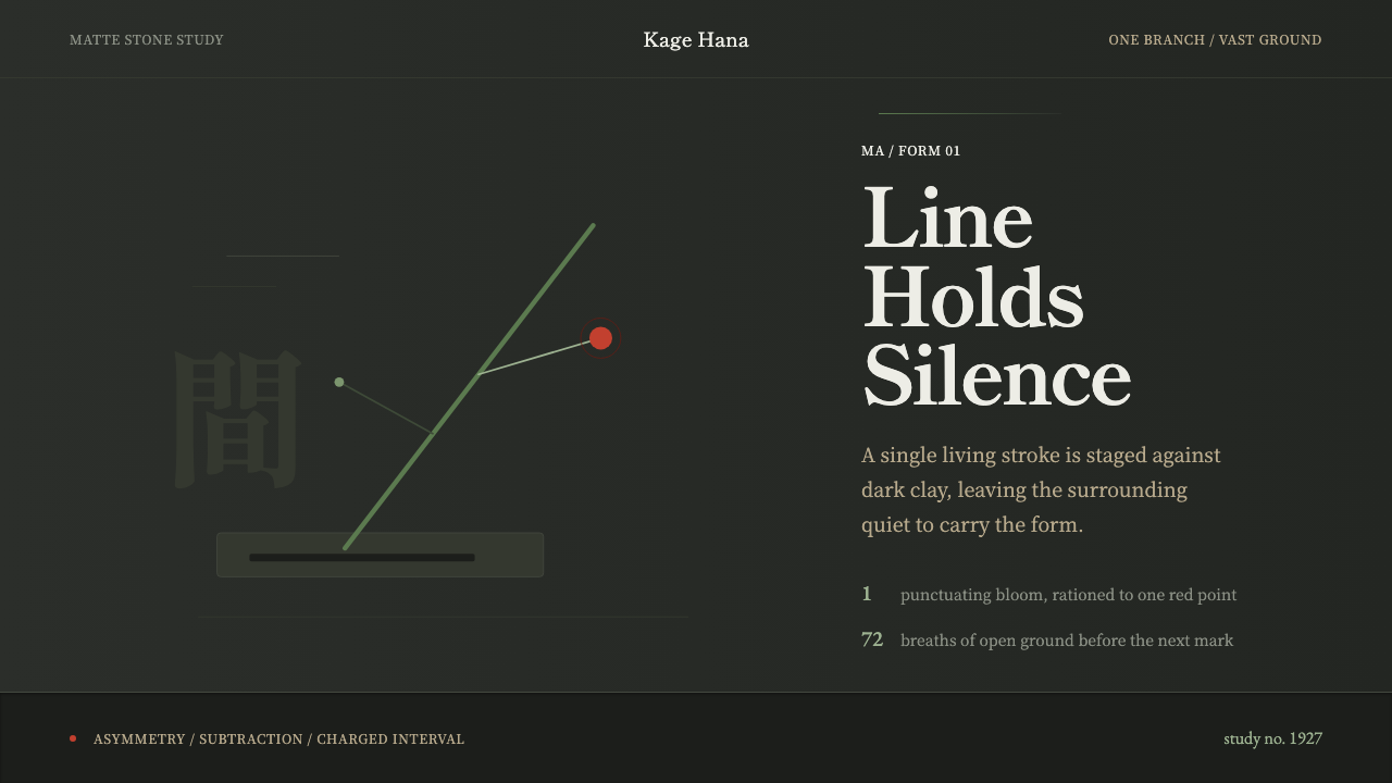
Sōgetsu ikebana treats a single branch and the emptiness around it as the whole composition — this system stages that same discipline of subtraction on dark stoneware grounds.
Ikebana Sōgetsu in brief
Ikebana Sōgetsu Modern is a design language built from the avant-garde school of Japanese flower arrangement founded in Tokyo in 1927. Its visual signature is instantly legible: near-black, matte, stone-like grounds; a small set of quiet neutral tones standing in for foliage and vessel; one emphatic accent — a line of green, a single dot of red — placed with the deliberateness of a cut branch; and generous, unclaimed space that is not empty by accident but empty by design.
The style rests on a single conviction carried over from its source discipline: an arrangement (or a screen) does not need many elements to be complete. It needs the right elements, positioned with total intention, surrounded by enough quiet that each one can be read individually rather than absorbed into a crowd. Where a maximalist interface adds until something feels finished, this one subtracts until nothing further can be removed without collapsing the composition.
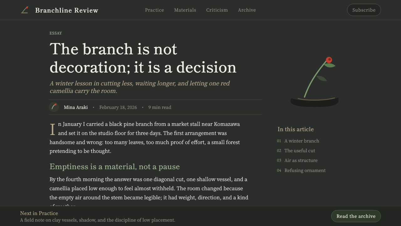
Visually, the palette behaves less like a brand's color system and more like a stage. Dark neutral grounds function as the tokonoma — the recessed alcove where a scroll or a single arrangement is displayed in a traditional Japanese room — and every other visual choice defers to whatever sits in front of them. Type is quiet and structural rather than decorative. Asymmetry is the default, not the exception. Nothing repeats for the sake of pattern; repetition would dilute the one gesture the whole composition is built around.
Where does Ikebana Sōgetsu come from?
Sōgetsu-ryū was founded in Tokyo in 1927 by Sofu Teshigahara, then a young man breaking from the rigid, decades-long apprenticeship system that governed older ikebana schools such as Ikenobō. Traditional schools taught arrangement through fixed forms passed down almost unchanged for centuries, with strict rules about the number, angle, and species of branches a student was permitted to use before advancing. Teshigahara's founding premise inverted that entirely: flowers, he argued, could be arranged anytime, anywhere, by anyone — a claim that sounds modest today but was genuinely radical in the context of a discipline built on hierarchy and codified technique.
This was not arrangement for arrangement's sake; Teshigahara was explicitly reaching toward sculpture. He treated a branch the way a sculptor treats a line in space — bent, cut, and positioned for its formal and emotional charge rather than its botanical correctness. He introduced materials outside the traditional plant vocabulary — driftwood, metal, painted surfaces — and insisted that ikebana could hold its own alongside painting and sculpture as a fine art, not a domestic accomplishment. This ambition placed Sōgetsu in conversation with the wider avant-garde and modernist currents moving through Japan and the West in the early twentieth century, rather than isolating it inside a purely decorative craft tradition.
The school's central formal ideas — an emphatic single line, deliberate asymmetry, and the charged emptiness the Japanese aesthetic vocabulary calls ma — are drawn from a much older well of Japanese design thinking that also shaped garden design, architecture, and ink painting. Ma is not merely 'blank space'; it is treated as an active compositional element, a pause that gives the surrounding gesture its meaning, the way a rest in music shapes the notes around it rather than merely interrupting them. Sōgetsu's innovation was to strip this idea out of its purely botanical context and apply it as a general theory of composition.
The school flourished across the mid-twentieth century under Sofu Teshigahara and continued through successive generations of the Teshigahara family, including his son Hiroshi Teshigahara — an acclaimed filmmaker and sculptor in his own right — and later Akane Teshigahara, who carried the practice forward while keeping its founding premise intact: the discipline belongs to whoever is willing to look closely, not to a closed lineage of masters.
What defines the Ikebana Sōgetsu look?
Color
The palette is dominated by dark, near-black grounds with the matte, faintly granular quality of unglazed stoneware — closer to wet clay or aged stone than to a printed black. Neutral greys and warm off-whites carry secondary information. Against this near-monochrome field, one accent color is permitted at a time: a single green, evoking a stem or leaf, or a single red, evoking a flower head or a seal mark. These accents never compete with each other in the same composition; the discipline is one strong color per gesture, never two.
Typography
Type leans toward classical Japanese Mincho letterforms — the serif tradition rooted in woodblock printing, with its characteristic contrast between thick vertical strokes and finer horizontal ones — paired with a restrained, quiet companion for Latin characters. Type is never loud. It behaves like the calligraphy on a hanging scroll: present, legible, and clearly considered, but never competing with the composition's single visual gesture for attention. Scale changes are used sparingly, and mostly to distinguish a title from supporting text rather than to build a dense hierarchy.
The single line
Where most design systems build hierarchy from repetition — a grid of cards, a row of icons — this one builds it from a single dominant line or form and the negative space around it. In an interface, this translates into one strong compositional axis per screen: a lone rule, a lone accent shape, a lone highlighted element, always positioned off-center. Multiple competing focal points are treated as a failure of composition, not a stylistic choice.
Asymmetry
Balance is never achieved through mirroring. A composition might place a dense cluster of content low and to one side, counterweighted only by a thin accent line far across the field — the same visual logic Sōgetsu arrangements use when a heavy branch on one side is balanced by a single small bloom on the other. This asymmetry is not random; it is calculated tension, the sense that the composition would tip if either element were removed or moved toward the center.
Ma — negative space
Empty space is not treated as unused area waiting to be filled; it is treated as an active element with its own weight, in the same way a rest in a musical bar shapes the notes around it. Interfaces built in this idiom tend to look sparse by conventional product-design standards — wide margins, single elements on otherwise bare fields, generous distance between a label and the thing it labels. The instinct to fill remaining space with a secondary element should be resisted; the space is doing compositional work precisely because it stays empty.
Texture over gloss
Surfaces read as matte and faintly organic rather than glossy or synthetic. The reference point is unglazed ceramic and raw stone, not lacquer or polished metal. Any texture or grain applied to a surface should feel like a property of the material itself, comparable to the visible clay-body of a stoneware vessel — never a decorative pattern layered on top for visual interest. This restraint keeps the composition feeling handmade and considered rather than manufactured.
Restraint as subject
The most encompassing principle: restraint here is not a minimalist aesthetic applied for its own sake, but the actual content of the composition. One branch, one flower, and a vast quiet ground is not a stripped-down version of a fuller arrangement — it is the complete statement. Any addition beyond what is structurally necessary is treated as noise that drowns out the one gesture the whole system exists to showcase.
Who shaped Ikebana Sōgetsu?
Teshigahara founded Sōgetsu-ryū in 1927, breaking from the closed apprenticeship model of older ikebana schools and declaring that arrangement could be practiced by anyone, anywhere, at any time. He treated flower arrangement as a form of sculpture, introducing non-botanical materials such as driftwood and metal and pushing the discipline into direct conversation with the fine-art avant-garde of his era rather than leaving it as a purely domestic accomplishment.
Sofu's son Hiroshi carried the school forward while building a parallel and celebrated career as a filmmaker and sculptor, most famously directing Woman in the Dunes. His dual practice reinforced Sōgetsu's founding claim that ikebana belonged in the company of the other fine arts, and his sensibility for stark, tactile, texture-driven composition — visible across both his films and his arrangements — closely parallels the matte, material-forward quality this design language draws on.
As a later generation head of the Sōgetsu school, Akane Teshigahara continued the family's stewardship of the practice while keeping its founding premise — accessibility over hierarchy — intact. Her tenure demonstrates the school's core claim in action: that the discipline survives not through a closed lineage of secret technique, but through successive practitioners willing to keep reinterpreting the same formal ideas of line, asymmetry, and ma for their own moment.
How do you use Ikebana Sōgetsu today?
Because Sōgetsu Modern is built from a discipline of subtraction rather than a decorative motif, applying it well means resisting the urge to fill space, not finding new ways to occupy it. Before adding any element, the working question should be whether the composition still communicates its single main idea without it — if the answer is yes, the element does not belong.
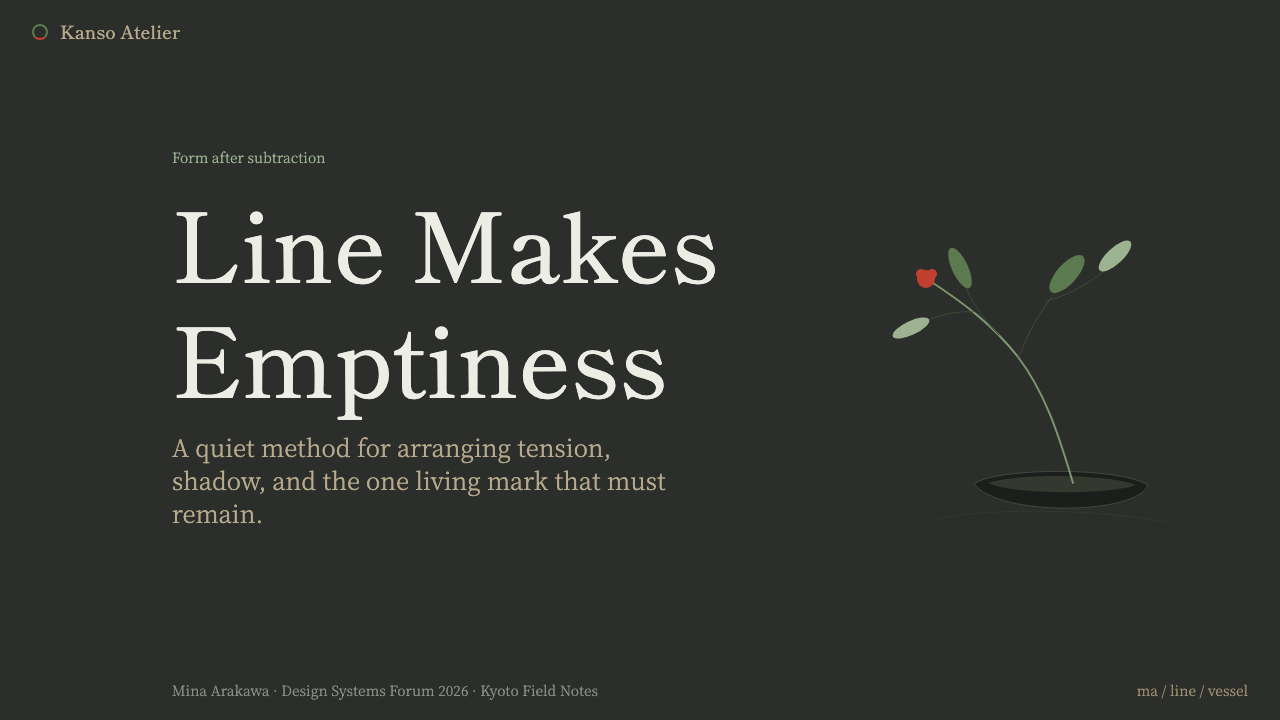
For presentation cover slides, the style calls for a single strong compositional gesture against a dark, matte-feeling ground: one accent line or shape placed off-center, generous surrounding quiet, and a title set in restrained type that never competes with that gesture for attention. Content and data slides should resist the instinct to fill every quadrant — a single chart or a short block of text, positioned asymmetrically with a wide margin of true emptiness around it, communicates more authority than a densely packed layout. Where a data point needs emphasis, one accent color does the work; a second competing accent undoes the effect entirely.
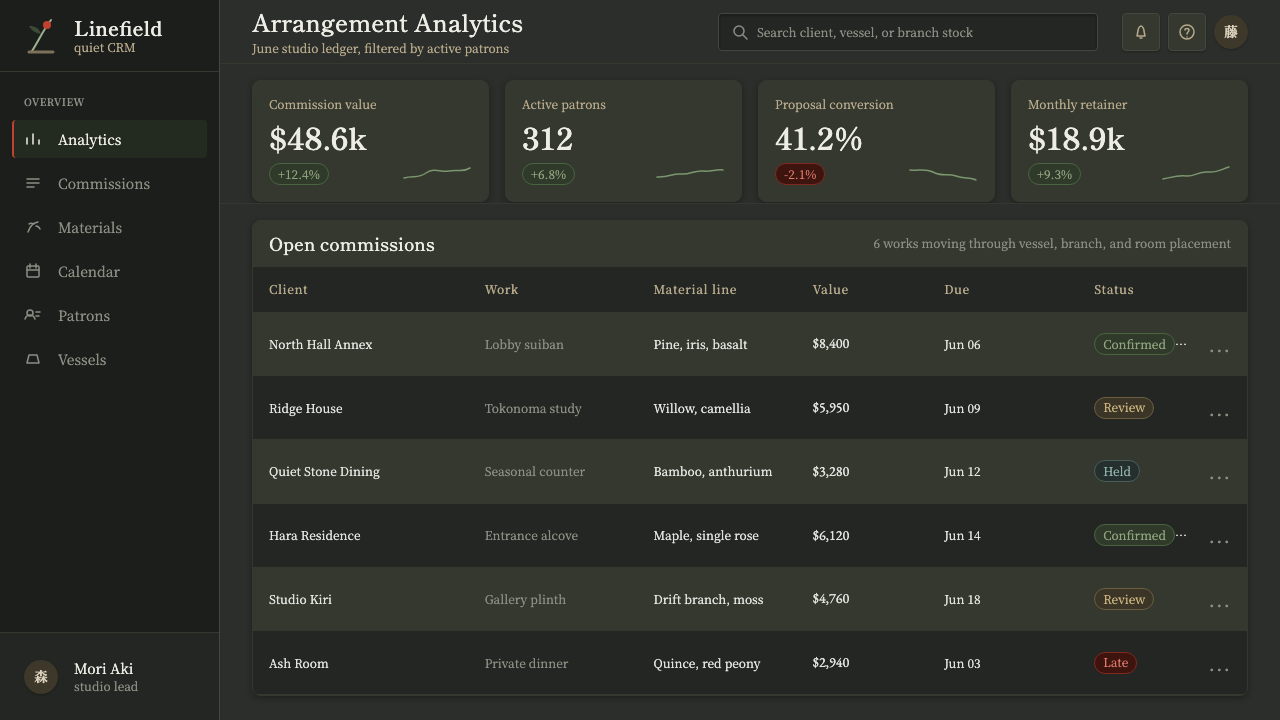
For web interfaces, this idiom suits dashboards and pricing pages that want to read as calm rather than busy. A dashboard built this way limits itself to one dominant metric or visual per view, uses the dark matte ground as a stage rather than a backdrop to be decorated, and reserves its single accent color for the one number or action that actually matters on that screen. Pricing pages benefit from the same restraint: rather than three visually equal tier cards competing for attention, one tier is elevated through asymmetric placement and a single accent mark, while the others recede into quieter neutral treatment.
For editorial and marketing work, the style rewards long, quiet negative space over dense grids of imagery. A feature article or landing page in this idiom might run a single striking image or pull-quote against a wide dark field, with the surrounding copy set narrow and unhurried — closer to a gallery wall presenting one framed piece with generous space on either side than a typical content-dense marketing page. Calls to action should appear as a single considered gesture, not a repeated pattern of buttons.
The most common mistake in applying this style is mistaking 'dark background' for the whole idea and then filling that dark background with as much content as a lighter layout would carry. The darkness is only the stage; the actual discipline is committing to one focal gesture per composition and defending the emptiness around it. A screen that uses the correct palette but is as dense as a typical dashboard has borrowed the costume without the practice.
Ikebana Sōgetsu — FAQ
Is this the same as generic 'dark mode' design?
No. Dark mode is a color inversion applied to an otherwise ordinary layout — the same density of content, just on a dark ground. Sōgetsu Modern uses a dark ground as a stage for one deliberate gesture surrounded by true emptiness. A dashboard in generic dark mode still packs in a full grid of cards and metrics; the same dashboard in this idiom would isolate the single most important metric and let everything else recede. The color is similar; the compositional philosophy is opposite.
How much accent color is too much in this style?
As a working discipline, one accent per composition is the ceiling, not the floor. A single green line or a single red mark carries the entire emotional and structural weight of a screen precisely because it is alone. Introducing a second accent color in the same view — even a complementary one — splits attention and undoes the effect the whole system depends on. If a design needs to distinguish multiple states or categories, vary placement, scale, or the neutral tones first before reaching for a second accent color.
Can this style work with a light background instead of a dark one?
The source material — dark stoneware, the recessed alcove of a tokonoma — is central enough to the style's identity that a light-ground version risks losing what makes it recognizable. That said, the underlying compositional principles (a single dominant gesture, deliberate asymmetry, generous true emptiness, one accent color) can transfer to a lighter neutral ground if the darkness itself is not the constraint a project is working within. What must not be lost in translation is the restraint — a light version that fills its space densely is no longer working in this idiom at all, regardless of ground color.
Why does the negative space matter so much — isn't it just unused screen real estate?
In this idiom, empty space is treated the way ma functions in Japanese aesthetics generally: as an active element that gives the surrounding gesture its meaning, not an absence waiting to be filled. A single accent line means very little crowded next to five other elements; the same line, surrounded by wide true emptiness, reads as deliberate and considered. Removing that surrounding space to fit in 'one more useful thing' does not make the composition more efficient — it removes the very thing that made the one element legible in the first place.
What kinds of products should avoid this style?
Products that fundamentally depend on density — data-heavy analytics tools where users need to scan dozens of values at once, comparison tables, or any interface where the value proposition is 'see everything in one view' — will fight against this style's core discipline rather than benefit from it. Sōgetsu Modern is suited to contexts where a small number of choices or a single message deserves full attention: premium positioning, a signature feature, a hero moment. Forcing a data-dense admin panel into this idiom means either abandoning the style's restraint or making the product genuinely harder to use.
Related design styles
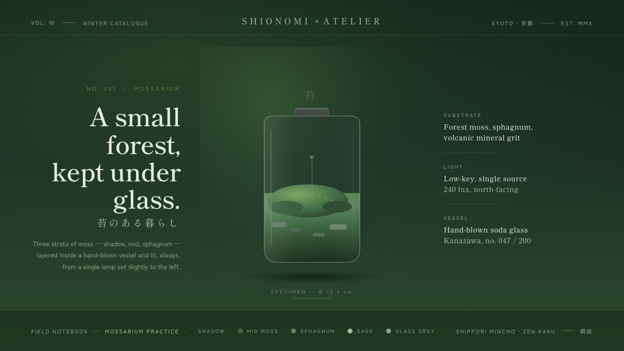 Moss TerrariumWabi-sabi, kept under glass. Layered moss greens on shadow ground, mincho ser…
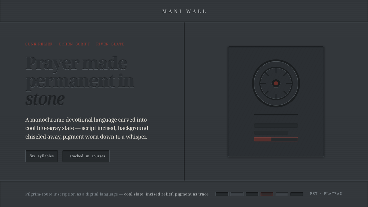 Tibetan Mani StonePrayer made permanent in stone. Sunk-relief glyphs incised into cool slate, p…
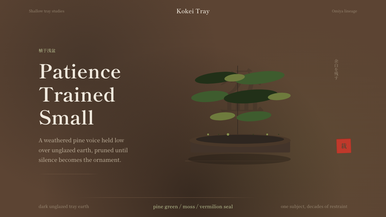 Bonsai CultivationQuiet asymmetry. Pine green rests on dark tray earth, sealed by one vermilion…
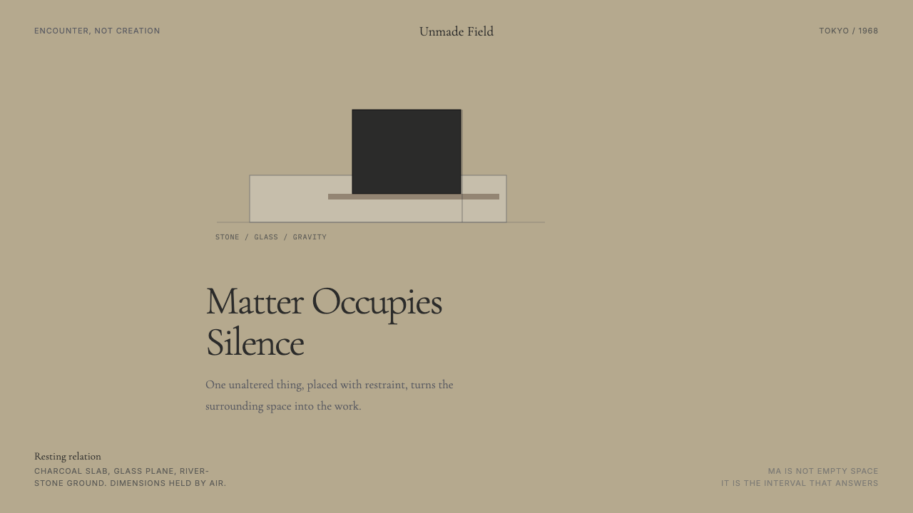 Mono-ha (Lee Ufan, 1968)Silence has weight. River-stone ground, Cormorant type, and one charcoal slab…
 Rapa Nui Moai PetroglyphMonumental sparseness. Basalt black, scoria red, and pecked-dot borders hold…
 Sori Yanagi ButterflyQuiet objects speak. Pale plywood and matte porcelain glow on a sumi-charcoal…