What is Modern Sumi Brush?
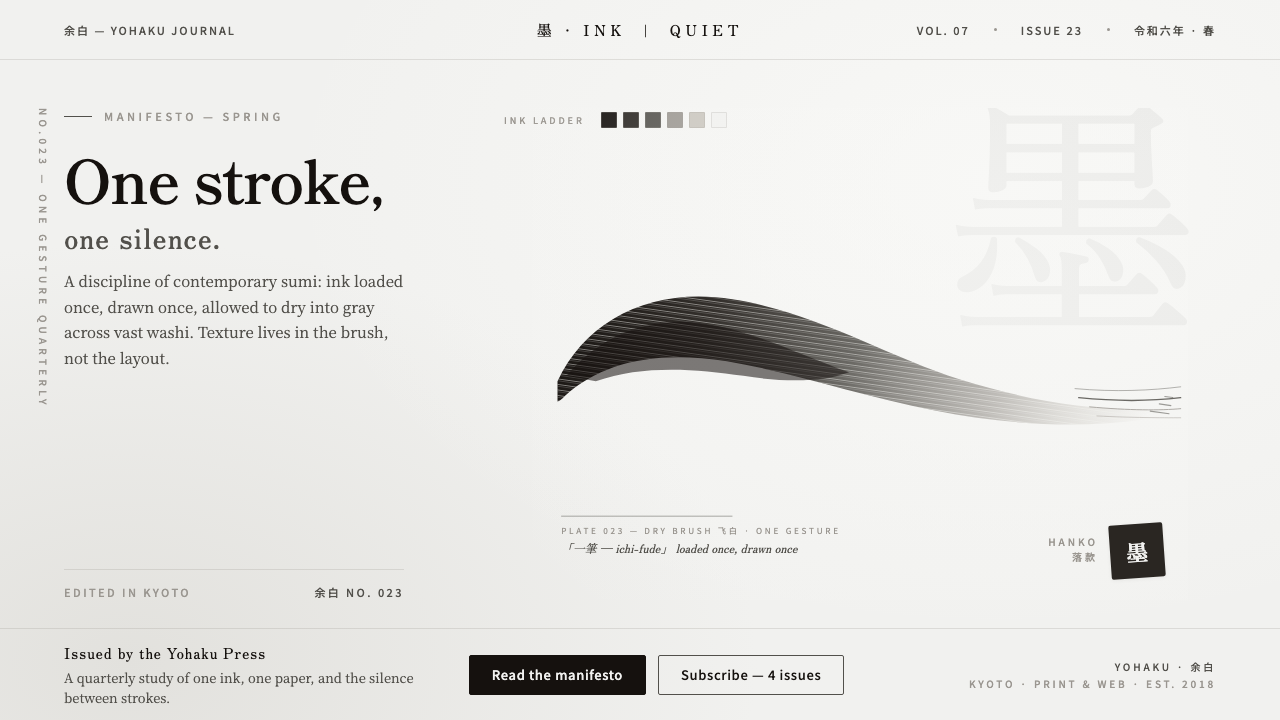
Modern Sumi Brush turns a single ink gesture into an entire visual language of warmth, restraint, and silence.
Modern Sumi Brush in brief
Modern Sumi Brush is a contemporary East-Asian design style rooted in brand calligraphy, modern sumi-e, and minimalist monochrome practice. Its defining image is a single confident sumi stroke placed across a broad washi ground, with the ink moving from warm near-black toward soft gray as the loaded brush begins to dry. The result is expressive without becoming ornamental, and traditional in material without presenting itself as classical calligraphy.
The style treats yohaku, or deliberate empty space, as an active compositional force. The blank field is not leftover room around the mark; it is what allows the mark to carry weight. Texture comes entirely from the ink: wet density, dry-brush streaks, softened edges, and the gradual loss of pigment as the brush travels. There is no secondary palette, visual clutter, or decorative surface treatment competing with that process.
Modern Sumi Brush is recognizable because it makes very few decisions, then makes each one strongly. A dark stroke establishes presence, a pale washi ground establishes calm, and the tonal passage between them supplies movement. Its contemporary character comes from reduction: the system borrows the physical authority of brushwork while leaving behind the historical setting, formal repertoire, and visual density associated with classical calligraphy.
Where does Modern Sumi Brush come from?
The style belongs to the contemporary period from 2010 to the present and is located in East Asia, especially Japan and the wider East-Asian region. Its origin is not a single historical school or named individual. It is better understood as a current design vocabulary assembled from brush-based practice, modern sumi-e, 書道-derived branding, and a broader commitment to minimalist monochrome composition.
Modern sumi-e supplies the style's sensitivity to ink, atmosphere, and the expressive potential of an apparently simple mark. Yet Modern Sumi Brush is explicitly non-classical. It does not attempt to reproduce a historical painting format or preserve a complete calligraphic tradition. Instead, it isolates the qualities most useful to contemporary identity work: the authority of a gesture, the physical trace of the tool, and the quiet created by restraint.
書道-trained designers and contemporary brand calligraphers form the style's central human influence. Their contribution is not merely the ability to make an attractive stroke. It is the discipline of controlling pressure, loading, direction, and release so that the mark feels intentional even when its edges remain irregular. In branding, that controlled irregularity gives a visual identity a human source without requiring illustration, ornament, or a large color system.
The third origin is minimalist monochrome design, which gives the brush gesture a contemporary operating environment. By reducing the surrounding field to ink, gray, and washi, the style can move between identity, packaging, editorial work, interfaces, and presentation surfaces without losing its central idea. The historical reference remains visible in the material, but the design logic is modern: reduce the vocabulary, preserve the gesture, and let empty space do structural work.
What defines the Modern Sumi Brush look?
Monochrome Ink
The palette is strictly monochrome. Pure sumi supplies the darkest register, while the stroke itself opens into warm near-black and soft gray as the brush loses moisture and pigment. The washi ground remains quiet and light, giving the ink its contrast. No colored accent is needed; tonal change within the ink provides enough hierarchy and atmosphere.
Dominant Gesture
A single confident brushstroke is the visual protagonist. It may feel broad, tapered, dry, or forceful, but it must read as one continuous act rather than a collection of decorative marks. The gesture carries identity through its direction, pressure, and ending. Its strength comes from commitment, not from visual complexity.
Dry-Brush Texture
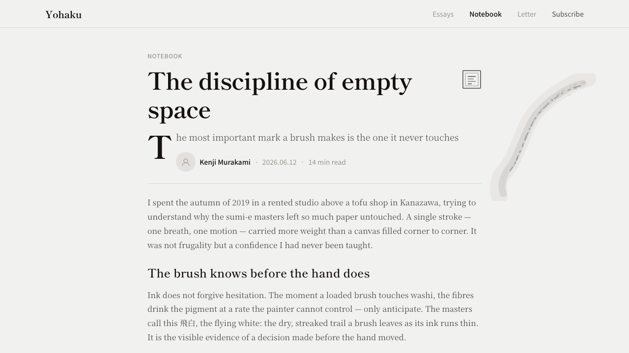
Texture appears through the drying brush rather than through added patterns. As the stroke travels, pigment breaks into fine streaks and pale interruptions, exposing the movement of the tool and the resistance of the ground. These marks should remain legible as ink behavior. Simulated grain, ornamental noise, and unrelated surface effects weaken the style's material honesty.
Yohaku
Yohaku is not passive background. It creates the pressure, scale, and pause that make the stroke feel substantial. A generous empty field gives the eye somewhere to rest and prevents the mark from becoming an illustration pasted onto a page. The relationship is reciprocal: the ink defines the silence, and the silence defines the ink.
Washi Ground
Washi gives the composition a tactile, receptive ground. It is the visual counterpart to the ink: quiet, absorbent in character, and present without demanding attention. The ground should support the stroke's warmth and irregularity instead of looking like a sterile digital white. Its role is to make the mark feel placed, not merely displayed.
Contemporary Restraint
Modern Sumi Brush is contemporary because it refuses to overstate its historical reference. There is no ceremonial clutter, no ornamental calligraphic framing, and no demand that every surface look ancient. The brush carries cultural memory, while the surrounding system remains spare, adaptable, and clear enough for modern brand communication.
Who shaped Modern Sumi Brush?
Contemporary brand calligraphers translate brushwork into recognizable identity. Their task is to make a stroke feel owned rather than generic, balancing spontaneity with repeatable intent. They treat direction, pressure, loading, and dry-out as parts of a brand voice, allowing a single mark to carry presence across otherwise quiet applications.
書道-trained designers bring disciplined brush knowledge into contemporary systems. They understand that irregularity is meaningful only when it comes from controlled movement. Their contribution is the bridge between an expressive act and a usable identity: the stroke remains alive, but it can still support layouts, interface surfaces, campaigns, and presentation material.
Modern sumi-e practitioners represent the movement's material and atmospheric side. They keep attention on ink behavior, drying, space, and silence rather than on historical reconstruction. In Modern Sumi Brush, that sensibility becomes a contemporary design principle: let the physical character of sumi do the expressive work, and remove everything that does not strengthen it.
How do you use Modern Sumi Brush today?
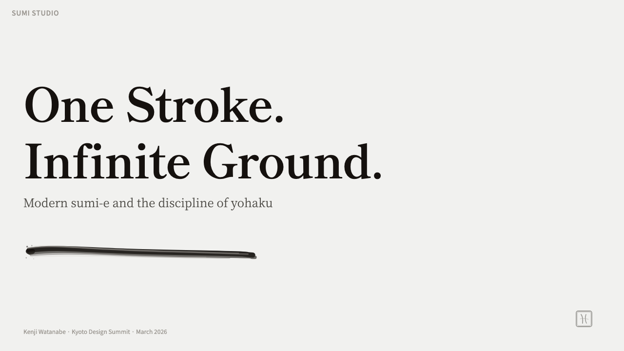
For presentation slides, the cover should give the dominant brushstroke enough room to operate as the central statement. A quiet washi-like field can hold the title and supporting information without competing with the mark. On content slides, the stroke can act as a section anchor or identity signature. Data slides should preserve the same logic: use ink density, gray tonal movement, and open space to organize information, rather than introducing a new color system or decorative chart treatment.
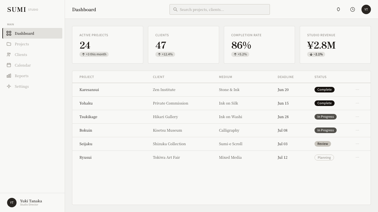
For web dashboards and pricing pages, Modern Sumi Brush works best as a restrained identity layer around functional content. Keep the interface field light and calm, let near-black carry the main reading structure, and reserve the brush gesture for brand framing, major headings, or moments of emphasis. Pricing tiers can be differentiated through spacing, tonal contrast, and carefully placed ink accents rather than a row of competing colors. The interface should feel deliberate and quiet even when the information is dense.
For editorial work, the style supports a strong relationship between a small amount of copy and a large amount of breathing room. A feature opening can pair a single sweeping mark with a concise title, while later sections use the washi ground and tonal ink passage to create pauses. Pull quotes, metadata, and navigation should remain subordinate. The page gains authority from the tension between the physical stroke and the disciplined silence around it.
For marketing and brand campaigns, Modern Sumi Brush gives a product a human signature without making the entire identity handcrafted or nostalgic. The gesture can appear on a package, landing page, campaign image, or presentation cover, while the rest of the system stays contemporary and uncluttered. Messaging should be concise enough for the stroke and the empty field to remain visible as active parts of the communication.
The common mistake is confusing restraint with simply placing a black brush image on a white background. The mark must have controlled character, the dry-brush fade must feel like ink behavior, and the yohaku must be large enough to create silence. Adding several strokes, colored accents, ornamental borders, artificial texture, or classical visual props turns the system into decoration. The strongest application usually removes one more element than expected.
Modern Sumi Brush — FAQ
Is Modern Sumi Brush traditional Japanese calligraphy?
No. It draws from sumi, modern sumi-e, and 書道-trained practice, but its approved origin is contemporary East-Asian brand calligraphy from 2010 to the present. The style is explicitly non-classical. It uses the physical authority of a brushstroke while adapting that gesture for modern identity, editorial, interface, and presentation contexts.
Can the style use colors besides black and gray?
Its defining rule is strict monochrome, so additional colors should not be introduced as part of the core system. The visual variation comes from sumi moving between warm near-black and soft gray, supported by the washi ground. A colored version may be inspired by the style, but it is no longer faithful to the Modern Sumi Brush material provided here.
Does Modern Sumi Brush work on a dark background?
The light washi ground is central to the style because it gives the brushstroke room, contrast, and silence. A dark background can reverse that relationship and make the mark feel more like an isolated graphic effect. If a dark application is unavoidable, keep the composition highly restrained and preserve the internal tonal movement of the ink, but the light-ground version is the more faithful expression.
Can a composition contain several brushstrokes?
The system is organized around one dominant brushstroke. Supporting marks may be possible in an application, but several equally forceful strokes weaken the central gesture and fill the silence that gives it meaning. If more than one mark appears, the hierarchy should remain unmistakable: one stroke leads, and everything else supports it.
What makes the style contemporary rather than nostalgic?
Its contemporary character comes from reduction and use, not from adding modern effects. The style avoids ceremonial clutter, historical reconstruction, and decorative framing. It takes the brushstroke's material presence into a clear brand system where yohaku, monochrome ink, and concise communication do the work. The result remembers its East-Asian source without pretending to be an antique artifact.
Related design styles
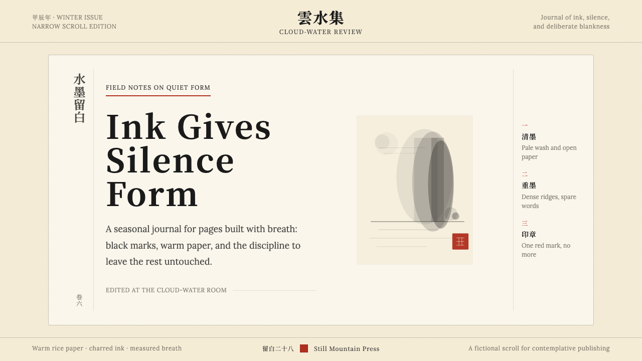 Chinese Ink Wash 水墨A thousand years of restraint. Six tones of ink on rice-paper warmth, a singl…
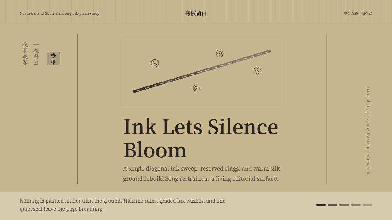 Plum Blossom Ink (宋)Silence carries the ink. Tea-tan ground, reserved blossoms, and one diagonal…
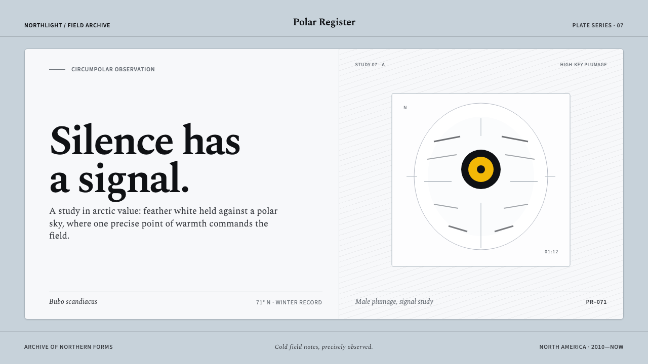 Snowy Owl TundraCold precision, one warm signal. Feather white and charcoal frame a lone lemo…
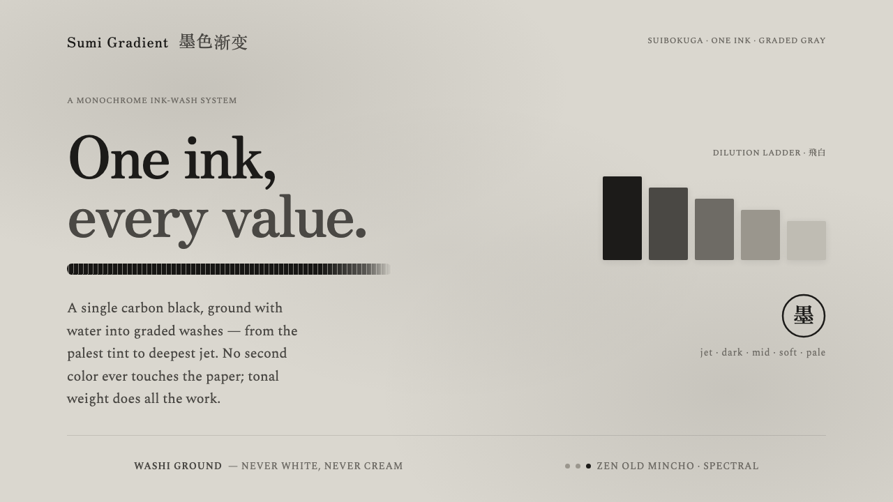 Sumi Grayscale GradientOne ink, every value. A single carbon black diluted into graded grays, marked…
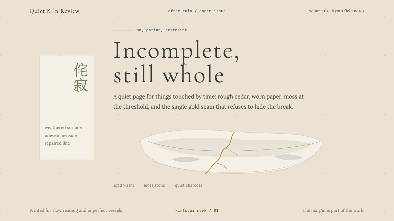 Wabi-SabiStillness makes imperfection whole. Washi beige, moss sage, and a spare gold…
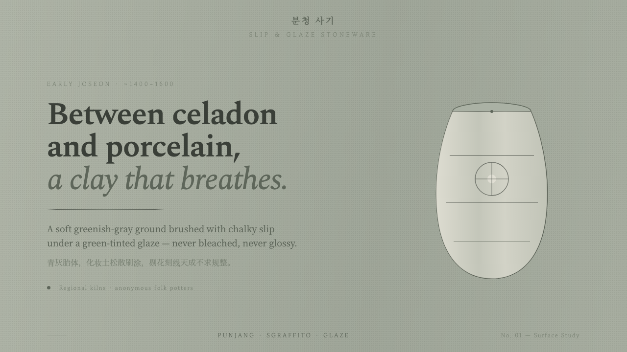 Buncheong Gray Slip WareBetween celadon and porcelain. Greenish-gray clay, chalky slip brushwork, dar…