What is Hopepunk?
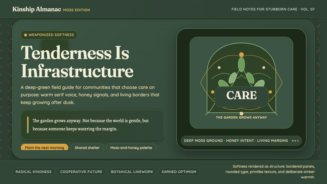
Hopepunk turns softness into defiance, using deep moss, honey amber, botanical texture, and living curves to make care feel structural rather than fragile.
Hopepunk in brief
Hopepunk is a storytelling ethos built around radical kindness, gentle empathy, cooperation, and care. Alexandra Rowland coined the term in 2017 as a deliberate opposite to grimdark, whose worldview treats cruelty as the only honest response to a damaged world. Hopepunk makes the contrary claim: choosing tenderness in a harsh environment is not surrender but resistance.
The visual language follows that ethical position. Hopepunk does not represent hope as polished optimism or sterile brightness. It gives hope weight, texture, and persistence through deep moss, honey amber, hand-drawn illustration, botanical printmaking, vine-like borders, and flowing whiplash curves. The result feels cultivated rather than manufactured, as though a garden has continued growing through the cracks of an inhospitable structure.
Hopepunk is closely related to solarpunk, borrowing its Art-Nouveau-adjacent warmth and its belief that visual culture can imagine a more livable world. Yet hopepunk is defined first by its emotional and narrative stance. Its palette and imagery are not merely decorative signals; they make softness visible as a built condition, a shared practice, and an active refusal to reproduce cruelty.

Where does Hopepunk come from?
The word hopepunk was coined by Alexandra Rowland in 2017 within late-2010s speculative-fiction discourse. Its starting point was opposition: where grimdark treats violence, suspicion, and cruelty as the most truthful responses to a broken world, hopepunk treats kindness and empathy as difficult choices with political and emotional force. The term names a way of continuing to care when care appears impractical.
Hopepunk developed through a global online SFF community rather than from a single school, institution, or national program. Its identity therefore remains open and participatory. The movement is less a fixed visual canon than a shared vocabulary for stories and images that insist cooperation matters, that tenderness can be courageous, and that hope must be practiced rather than merely announced.
Its visual roots are connected to contemporary solarpunk and, further back, to European Art Nouveau. Solarpunk cover artists helped establish the adjacent visual register of warm illustration, botanical imagery, organic ornament, and optimistic environmental imagination. Hopepunk borrows that language while redirecting its emphasis toward care itself: not only the world being repaired, but the relationships and habits that make repair possible.
The movement’s visual development follows its central metaphor. A dark ground can hold moss, amber, and plant forms without becoming bleak; a border can resemble a vine without feeling ornamental if it suggests continuity and protection; a hand-drawn mark can remain visibly human rather than resolving into mechanical perfection. Hopepunk emerged as an ethos, but its images make that ethos tangible by treating softness as something with structure, endurance, and agency.
What defines the Hopepunk look?
Color
Hopepunk uses a dark, earthbound palette led by deep moss and honey amber. The contrast is warm rather than aggressive: green suggests living growth and shelter, while amber introduces warmth, nourishment, and human presence. Color should feel gathered from a garden, a workshop, or a well-used home rather than extracted from a sterile interface.
Typography
Typography should act as a calm carrier for the movement’s emotional argument. Letterforms need enough presence to remain legible against a dark field, but they should not feel militarized, technological, or brutally compressed. A restrained typographic system, supported by generous breathing room and clear hierarchy, lets the hand-drawn and botanical elements feel intentional rather than chaotic.
Illustration
Warm hand-drawn illustration is central to hopepunk because visible human touch counters the impersonality of a damaged world. Lines may retain slight irregularity, and forms may appear gathered, tended, or repaired. The image should communicate participation: someone has made this, someone cares for it, and it remains open to further care.
Botanical Texture
Botanical printmaking texture gives the style its sense of life and continuity. Leaves, stems, seed forms, and garden-like marks can behave as fields of texture, quiet framing devices, or visual evidence of growth. They should feel printed, cultivated, and tactile rather than glossy or photorealistic, allowing the surface to suggest memory and persistence.
Curves and Borders
Flowing whiplash curves and vine-like borders bring movement into the composition. Their role is not to decorate empty edges but to connect spaces, soften transitions, and suggest that the interface or page is a living environment. Curves work best when they guide attention or create enclosure, turning softness into an organizing device.
Contrast and Atmosphere
Hopepunk is dark without being despairing. Deep backgrounds create an intimate, protective atmosphere, while honey-colored accents keep the composition inhabited and generous. Contrast should reveal warmth inside darkness rather than produce a harsh battle between light and shadow. The mood is resilient, sheltered, and quietly active.
Care as Structure
The defining characteristic is conceptual: care must shape the system, not merely appear as a decorative theme. Borders can protect, spacing can give room, hierarchy can reduce stress, and imagery can make cooperation visible. A hopepunk design feels as though its softness has been engineered to support people rather than applied afterward as surface treatment.

Who shaped Hopepunk?
Rowland coined hopepunk in 2017 and articulated its opposition to grimdark. The movement’s central language of radical kindness, gentle empathy, and weaponized softness begins with this framing: tenderness is not an escape from conflict but a deliberate way of meeting it.
Solarpunk cover artists helped establish the adjacent visual register from which hopepunk draws: warm hand-drawn imagery, botanical forms, organic curves, and a sense that the future can remain inhabited, fertile, and worth caring for. Their work provides a visual bridge between speculative storytelling and cultivated environments.
The global online speculative-fiction community is the movement’s wider setting. Hopepunk developed through shared discourse rather than a single formal institution, allowing its vocabulary to remain collaborative, adaptable, and connected to stories that treat cooperation and care as meaningful forms of action.
How do you use Hopepunk today?
Hopepunk is most effective when the entire experience makes care legible. Use deep moss to establish shelter, honey amber to mark warmth or invitation, and botanical or hand-drawn elements to show that the environment is maintained rather than imposed. The style should not merely look optimistic; it should reduce friction, make room for attention, and communicate that people belong inside the system.
For presentation slides, the cover can establish the movement through a dark field, a warm amber focal element, and a flowing botanical frame that feels grown rather than mechanically drawn. Content slides should preserve generous breathing room and let each idea sit inside a clear visual shelter. Data slides can turn relationships and progress into cultivated diagrams, using plant-like lines, organic framing, and restrained color contrast so information feels supportive rather than punitive.
For web interfaces, hopepunk suits dashboards and pricing pages that want to feel trustworthy, humane, and durable. Deep backgrounds can create focus, while moss and amber distinguish states, invitations, or levels of participation without making the interface feel alarmist. Panels should feel held rather than boxed in; borders can behave like protective vines, and empty space should be treated as a form of hospitality. The result should remain clear enough for practical use while retaining the warmth of a living environment.
For editorial and marketing work, the style supports stories about community, resilience, repair, speculative futures, and shared responsibility. Botanical textures can frame an article without overwhelming its argument, while hand-drawn illustrations can make abstract ideas feel touched by human experience. Marketing pages can use the tension between a dark ground and warm amber highlights to create memorability, provided the message remains grounded in care rather than turning hope into a hollow slogan.
The common mistake is treating hopepunk as a decorative bundle of leaves, amber accents, and nostalgic curves. If the layout remains cramped, hostile, confusing, or emotionally cold, the visual references contradict the movement’s premise. Another mistake is making softness so delicate that it loses agency. Hopepunk should feel tender but capable: its borders protect, its hierarchy helps, its imagery grows, and its visual system makes cooperation easier to perceive.

Hopepunk — FAQ
Is hopepunk the same as grimdark?
No. Hopepunk was coined as a deliberate opposite to grimdark. Grimdark treats cruelty as the most honest response to a broken world, while hopepunk treats kindness, cooperation, empathy, and care as difficult but meaningful forms of defiance. Hopepunk does not deny hardship; it rejects the idea that hardship makes tenderness naive.
How is hopepunk related to solarpunk?
They are sibling movements. Hopepunk draws from solarpunk’s visual atmosphere, including warm illustration, botanical imagery, organic curves, and an investment in livable futures. The distinction is emphasis: solarpunk is strongly associated with constructive future visions, while hopepunk is defined by the ethical insistence that choosing care and softness can itself be an act of resistance.
Can hopepunk use a dark background?
Yes. A dark ground is compatible with the style and helps create intimacy, shelter, and visual depth. The important distinction is between darkness and despair. Deep moss can anchor the atmosphere, while honey amber and living botanical marks keep the composition warm, inhabited, and open to care.
Why are botanical textures and vine borders important?
They make the central metaphor visible. Growth, tending, continuity, and protection can all be suggested through botanical marks and flowing borders. Used well, these elements do more than decorate: they connect regions, frame attention, create a sense of shelter, and turn softness into part of the structure.
How can a design avoid becoming decorative hopepunk?
Make care affect the actual system. Give content room to breathe, make hierarchy reduce confusion, use borders to guide or protect, and ensure imagery supports the message. Hopepunk should feel deliberately hospitable and quietly capable. If the leaves and amber disappear, the underlying experience should still be considerate, clear, and cooperative.
Related design styles
 Lofi Hip-Hop Anime Girl (2018)Solitude glows warm. Caveat notes, plum night, and amber geometry loop like v…
 Starbucks (Siren)Hospitality becomes an emblem. Forest green medallion on cream paper, with re…
 Y Tu Mamá TambiénSun-bleached road-movie warmth. Highway gold and dusty teal on dusky film, ha…
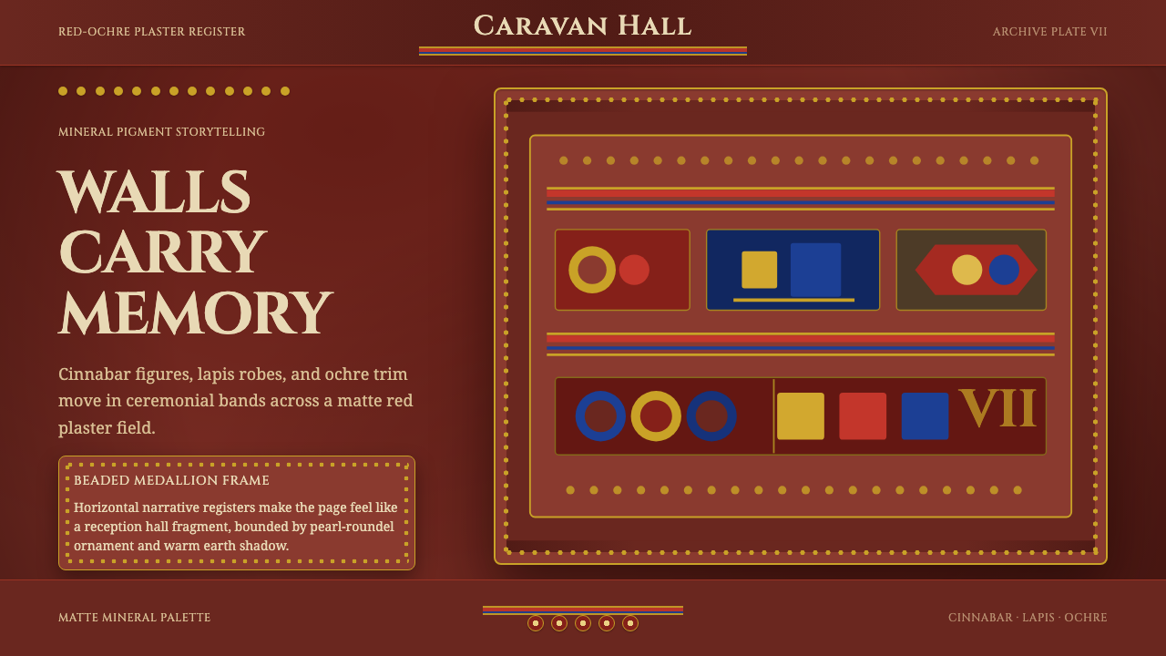 Sogdian FrescoAncient ceremony glows. Cinnabar, lapis and ochre stack into beaded fresco ba…
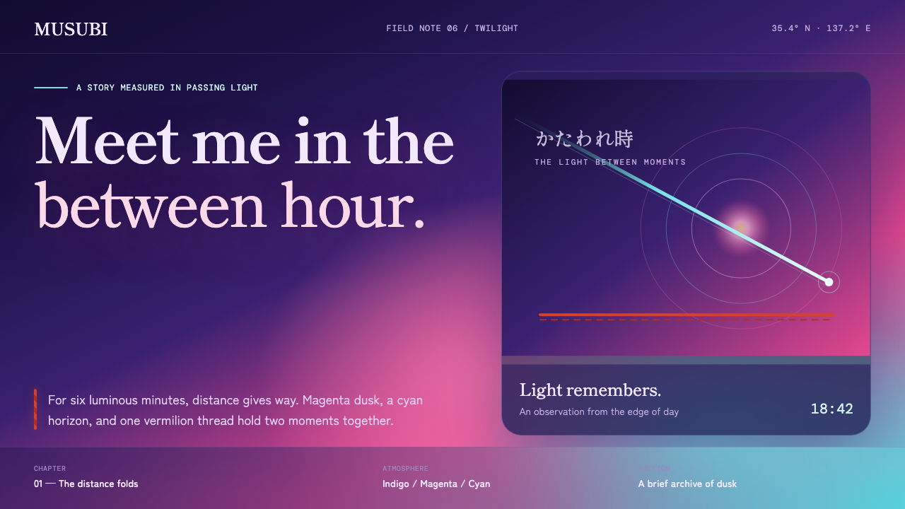 Your Name (Shinkai, 2016)Twilight makes time tangible. Magenta melts into cyan, held by one vermilion…
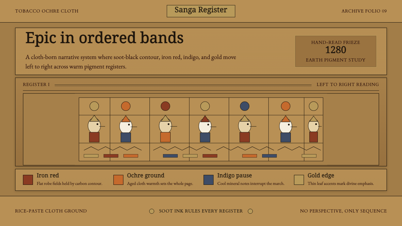 Balinese Kamasan PaintingAncient cloth, ordered as story. Ochre bands, soot outlines, indigo and gold…