What is Your Name (Shinkai, 2016)?
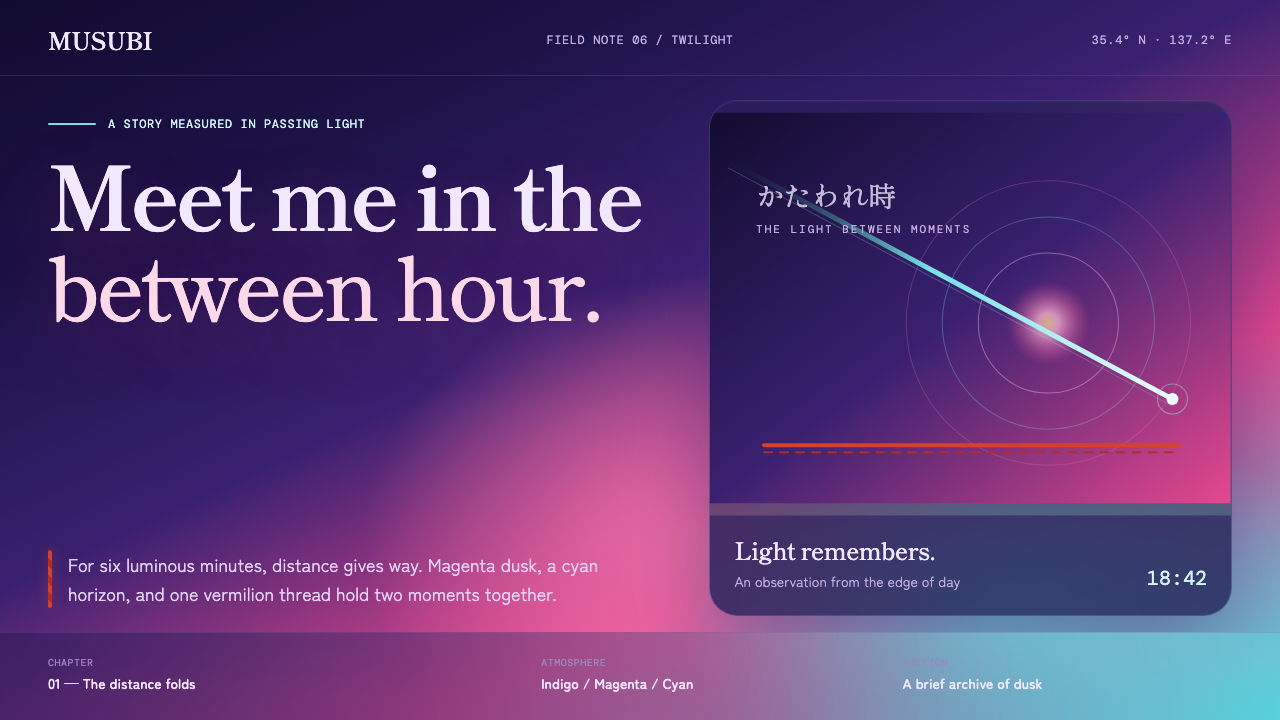
Your Name turns twilight into a visible force: magenta dissolves into cyan while a single vermilion cord holds time, distance, and connection together.
Your Name (Shinkai, 2016) in brief
Your Name, released theatrically in 2016, belongs to a visual world often described through Shinkai sky cinema, photoreal digital background painting, and new-wave anime. Its defining atmosphere is kataware-doki, the twilight interval in which ordinary boundaries feel temporarily unstable. The style does not treat dusk as a neutral backdrop. Twilight is the subject: a saturated event in which the horizon, clouds, water, architecture, and human figures appear to share the same suspended emotional weather.
The visual language begins with a deep indigo field illuminated from one side by magenta, pink, violet, and cool cyan. These colors do not arrive as separate decorative accents. They melt into one another across the sky, producing a sense of time passing visibly through the image. A green comet cuts through this atmosphere, while vermilion appears as the decisive warm line: the braided cord that gives the composition an emotional center and turns color into narrative meaning.
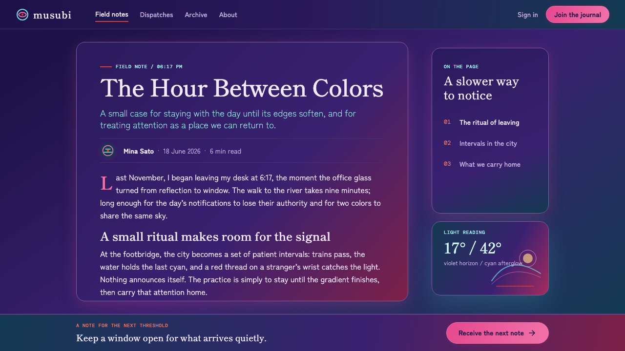
Although the environments are hyperreal and photographic in feeling, the interface language derived from this world should remain clean, rounded, and nearly weightless. It should feel as if it floats above a lake reflecting comet light, or sits against a train window at dusk. The contrast matters: the background carries density, bloom, and vastness; the foreground carries calm, legibility, and gentle human scale. The result is not darkness for its own sake, but a luminous dark system in which every bright element feels briefly held against night.
Where does Your Name (Shinkai, 2016) come from?
The style is rooted in Your Name, a Japanese theatrical film released on August 26, 2016. Its production spanned 2014 to 2016, with Comix Wave Films in Tokyo associated with the project and the landscapes of Hida and Gifu forming an essential geographic reference. That combination of metropolitan production and regional landscape gives the visual system its characteristic tension: intimate everyday life is placed inside skies that feel immense, unstable, and emotionally charged.
Makoto Shinkai is named among the work's key figures, alongside Masayoshi Tanaka, Masashi Ando, Takumi Tanji, and RADWIMPS. In a design reading, these names matter less as isolated credits than as a reminder that the film's atmosphere is assembled across image, character presence, environmental detail, and music. The style should therefore not be reduced to a sunset palette. Its emotional force comes from coordination: sky, light, landscape, movement, and the recurring vermilion cord all seem to belong to the same temporal condition.
The source material identifies photoreal digital background painting as one of the central movements behind the theme. This is why the sky should feel observed rather than merely decorated. Light pools, cloud edges, distant terrain, reflective surfaces, and atmospheric haze are treated with unusually high visual conviction. Yet the image remains heightened rather than documentary. It is reality pushed toward emotional clarity: over-lit, bloomed, and intensely colored without becoming muddy.
The other two stated movements, new-wave anime and Shinkai sky cinema, explain the system's balance between immediacy and spectacle. The scene may begin from a familiar place, but the sky transforms it into a threshold. A good application preserves that threshold quality. It gives practical interface elements a stable, quiet role while allowing the environment to suggest distance, memory, coincidence, and the fragile sensation that two moments might touch.
What defines the Your Name (Shinkai, 2016) look?
Twilight Gradient
The central device is a full-saturation twilight transition rather than a flat dark background. Deep indigo moves toward magenta and pink, then into violet and cyan near the remaining light. The blend should feel atmospheric and directional, as though the horizon itself is carrying the scene forward. Preserve distinct color temperature changes so the sky remains luminous instead of becoming a uniform purple haze.
Vermilion Thread
Vermilion is the system's warm hard line. Against the soft, blooming sky, it acts as a point of decision: a cord, path, marker, or small focal gesture that visually binds separate regions together. It should be used with restraint. Its power comes from being singular and legible, not from competing with every cool color in the composition.
Comet Contrast
The green comet supplies a sharp interruption within the blended sky. It is not merely an accent color; it introduces direction, rupture, and scale. In contemporary compositions, an equivalent element may be a slender streak, a diagonal light path, or a precise green signal emerging from the softer atmospheric field. It should feel exceptional, like an event passing through a still moment.
Hyperreal Atmosphere
The background should have photography-grade conviction: recognizable depth in clouds, terrain, water, and air, with light appearing to collect on surfaces. But literal realism is insufficient. The scene is deliberately heightened through bloom, saturation, and a sense of exposure at the edge of plausibility. Detail should support atmosphere, never turn the image into a technical landscape study.
Weightless Interface
Foreground UI should be calm, rounded, and light enough to coexist with a visually intense sky. Components should read as floating layers rather than opaque blocks that erase the environment. Their shapes can be soft and welcoming, but their content hierarchy must remain crisp. The visual experience depends on the interface seeming present without claiming ownership of the scene.
Luminous Darkness
This is a dark style, but darkness is the ground from which color becomes emotional. Indigo establishes depth and quiet; magenta and cyan create the sensation of residual light; vermilion restores human warmth. Avoid gray, murky overlays that flatten these relationships. The dark field should make the bright areas feel suspended, not merely increase contrast.
Who shaped Your Name (Shinkai, 2016)?
Shinkai is identified as a key figure in the source material and anchors the theme's association with Shinkai sky cinema. The design language takes its strongest cue from the film's treatment of sky as an emotional structure rather than passive scenery: light, distance, and color become the conditions through which connection is felt.
Masayoshi Tanaka appears among the key figures for Your Name. Within this visual system, character presence is essential because the enormous sky never stands alone; its scale becomes meaningful through the small, immediate human moments placed beneath it.
Masashi Ando is named as a key figure in the supplied material. The theme's lesson is one of coherence: expressive atmosphere and readable human presence must remain connected, so emotional intensity never makes the scene difficult to inhabit or understand.
Takumi Tanji is included among the film's key figures. The style foregrounds the environmental side of the image: broad skies, distant horizons, and light collecting through atmosphere. These elements establish the spatial stage on which the vermilion thread and human-scale interface can appear with clarity.
RADWIMPS is listed as a key figure in the source material, emphasizing that the theme is inseparable from rhythm and emotional timing. Even in a static visual application, composition should suggest a held musical moment: a pause before night, a line crossing the sky, and color changing while the viewer remains still.
How do you use Your Name (Shinkai, 2016) today?
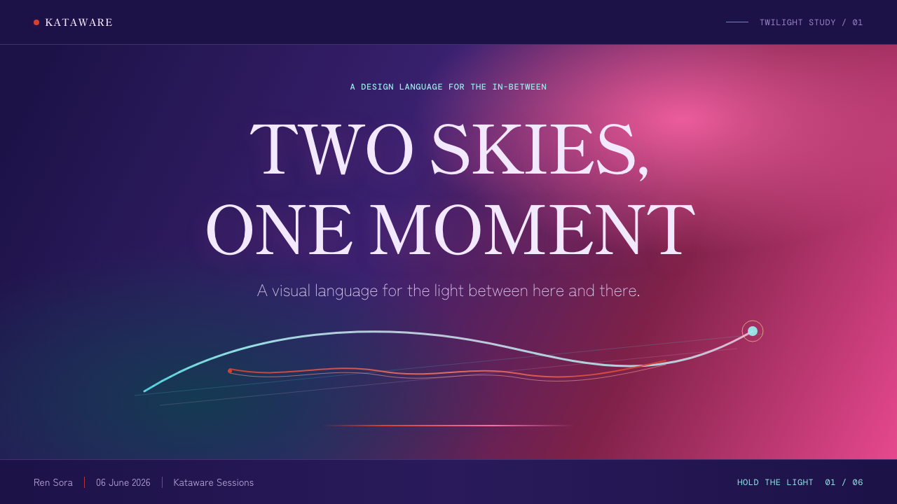
For presentation covers, use the sky as the principal stage rather than a background image placed behind unrelated content. Let indigo establish the field, allow magenta and cyan to define the emotional direction, and introduce a single vermilion line or knot-like gesture near the title. The title should remain calm and direct, with ample open atmosphere around it. A cover succeeds when it feels like a moment of arrival at dusk, not like a poster crowded with celestial effects.
For content slides, preserve the difference between atmospheric imagery and functional information. Use a quieter portion of the twilight field behind text, or place restrained floating surfaces above it when sustained reading is needed. Organize headings, body copy, and small labels through clear hierarchy, while letting a comet-like diagonal or a thin vermilion connector guide the eye between sections. On data slides, charts should remain intelligible first; the palette can distinguish emotional emphasis, but gradients must never obscure comparison or turn quantitative information into scenery.
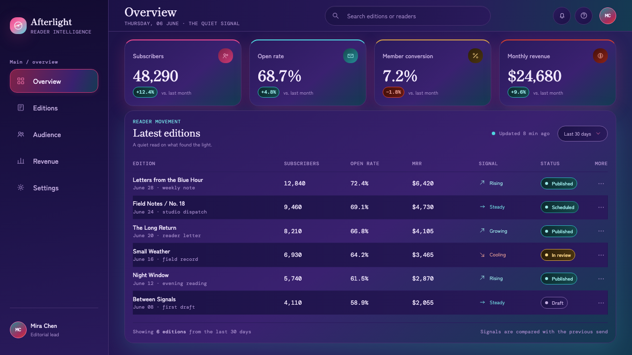
For web dashboards and pricing pages, the style works best when the dark environment establishes focus and the UI remains composed. A dashboard can use indigo depth behind calm rounded panels, with cyan indicating live attention, magenta marking expressive emphasis, and vermilion reserved for the most consequential connective action. Pricing pages can use the horizon-like shift in light to make tiers feel like distinct zones without turning every card into an illuminated object. Keep decisions easy to scan; the atmosphere should reward attention, not demand it.
For editorial and marketing pages, treat the system as a narrative sequence. Open with the most expansive sky state, then move readers through closer details: a cord, reflected color, a bright interruption, a quiet dark field. Long-form text benefits from generous breathing room and consistent foreground contrast, while feature moments can use cropped atmospheric scenes to reset the pace. Marketing copy should speak with restraint. The visual world already carries longing, coincidence, and scale; too many dramatic claims will make it feel less believable.
The common mistake is to imitate the style by applying every available neon-like hue, bloom effect, and transparent panel at once. That produces spectacle without the film's discipline. The authentic relationship is selective: indigo gives depth, magenta and cyan describe changing light, green interrupts as an event, and vermilion binds the composition. Another mistake is making the interface as textured as the sky. Keep one layer emotionally rich and the other quietly useful, or both will become noisy.
Your Name (Shinkai, 2016) — FAQ
Is this style simply a dark neon gradient aesthetic?
No. The dark, saturated sky is important, but it is meaningful because it represents twilight as a condition of changing time. The magenta-to-cyan movement, green comet, and vermilion cord each have distinct roles. If the colors are used only for visual intensity, the result may resemble a generic nightlife interface rather than the suspended, emotionally precise atmosphere of Your Name.
Why is vermilion used so sparingly?
Vermilion is described as the one warm hard line running through the film's visual thesis about connection and time. Its rarity makes it legible against the soft, blended sky. When it appears everywhere, it stops functioning as a bond or focal gesture and becomes another competing color. Reserve it for the places where the composition needs to say that separate things are linked.
Can the style work without a literal comet or landscape image?
Yes. The comet can be translated into an exceptional directional event: a narrow diagonal light, a green interruption, or a single element that cuts across an otherwise calm atmospheric field. Likewise, a landscape can become an abstract horizon, reflection, or layered depth cue. What should remain is the relationship between expansive atmosphere, a precise interruption, and a quiet foreground system.
How should text remain readable over such a vivid background?
Treat readable content as a distinct foreground layer. Place sustained text over quieter portions of the sky, use calm floating surfaces when necessary, and keep type hierarchy direct. Do not solve readability by covering every image with a dull gray veil, because that destroys the luminous relationship between indigo, magenta, and cyan. Selective quiet areas are more faithful to the style than universal dimming.
Where does this style struggle in product design?
It struggles when emotional atmosphere is allowed to outrank immediate comprehension. Dense administration screens, highly repetitive workflows, or interfaces requiring many simultaneous comparisons can become tiring if every surface blooms and shifts in color. In those contexts, use the style to frame the experience rather than saturate every task. Let the sky carry the opening mood and major transitions, while routine work stays visually steady.
Related design styles
 Tehran Cafe ModernismQuietly dense, warmly literary. Dusty rose, sage panels, and italic serif gri…
 HopepunkSoftness becomes defiance. Deep moss, honey amber, and vine borders make care…
 Provence LavenderSaturated pastoral dusk. Violet rows, ochre soil, and sun-gold haze build the…
 Starbucks (Siren)Hospitality becomes an emblem. Forest green medallion on cream paper, with re…
 Y Tu Mamá TambiénSun-bleached road-movie warmth. Highway gold and dusty teal on dusky film, ha…
 Hiroshige — Tokaido RoadA road print in motion. Prussian blue blocks, vermilion cartouches, diagonal…