What is Y Tu Mamá También?
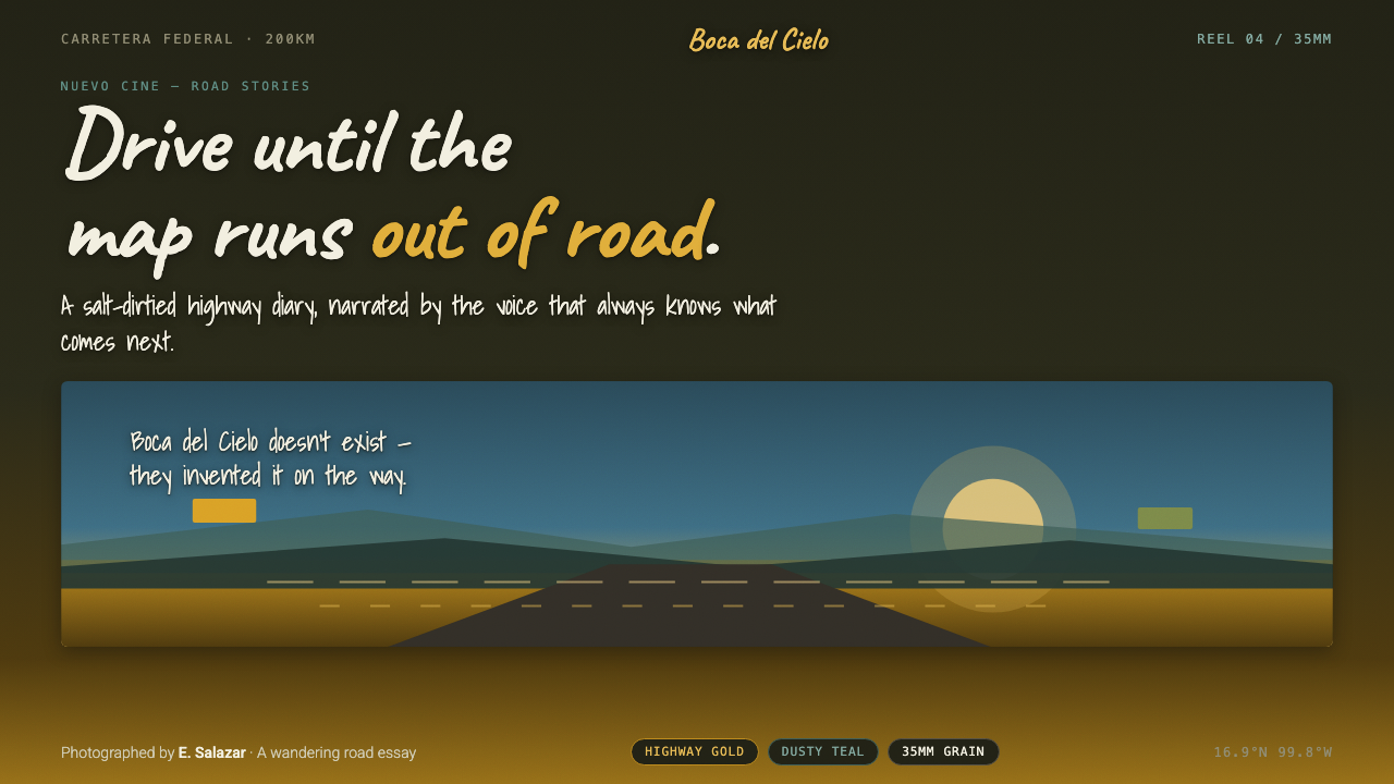
Y Tu Mamá También turns the warmth of a sun-struck road movie into a visual language of dusty color, visible grain, wide horizons, and handwritten interruptions.
Y Tu Mamá También in brief
Y Tu Mamá También is the visual world associated with Alfonso Cuarón’s 2001 Mexican road movie, photographed by Emmanuel Lubezki in a naturalistic 35mm Eastmancolor look. It is not glossy travel imagery. The image feels sun-bleached, slightly desaturated, and marked by the environment: highway light, dry vegetation, coastal air, and a warmth described as dirtied by salt. Gold, dusty teal, muted green, and darkened film-like grounds establish a mood that is intimate rather than polished.
The style’s most recognizable gesture is the white handwritten caption drifting over a coastal landscape while an omniscient narrator interrupts the drive. That interruption matters as much as the lettering itself. The caption is not merely a label or decorative title card; it changes the emotional distance of the image, allowing a quiet, observational voice to enter a scene without turning the composition into a conventional editorial layout.
As a design system, the theme translates wandering naturalism into controlled contrast. Wide framing gives imagery room to breathe. Dusky surfaces make warm highlights feel earned rather than loud. Hand-scrawled text brings a human, provisional quality to otherwise cinematic compositions. The result is a style that feels remembered rather than manufactured: sun-faded, coastal, lightly roughened, and always aware of the distance between the road and the horizon.
Where does Y Tu Mamá También come from?
The theme begins with Y Tu Mamá También, released in 2001 during the 1990–2010 Nuevo Cine Mexicano wave. Its setting is inseparable from Mexican highways and the Pacific coast. The road and shoreline are not interchangeable backdrops; they establish the style’s visual logic. Open distance, dry land, coastal light, and long stretches of travel create the conditions for images that feel exposed to weather and time rather than enclosed within a studio world.
Alfonso Cuarón’s film provides the governing cinematic attitude: movement through landscape without a polished, postcard-like finish. The source material identifies the work with naturalistic handheld road cinema, a description that helps explain why the resulting design language should not be overly symmetrical, pristine, or decorative. It should retain the feeling of being encountered along the way, with compositions that can hold stillness, drift, and sudden narration at once.
Emmanuel Lubezki’s naturalistic 35mm Eastmancolor photography supplies the material character of the palette. The look is sun-bleached and slightly desaturated, with visible grain and warmth complicated by salt and dust. This is a crucial distinction. The colors are not bright lifestyle colors presented on clean white surfaces; they are colors filtered through film, heat, and atmosphere. Their force comes from coexistence with subdued grounds and imperfect texture.
The white hand-scrawled caption title completes the system. Floating over coastal imagery, it acts as an omniscient narrative interruption rather than a conventional information panel. In contemporary design, that device becomes a lesson in restraint: text can arrive as a human trace over a broad visual field, but it must preserve the image’s air and silence. The strongest adaptations keep the caption sparse, legible, and emotionally detached enough to feel observed rather than promoted.
What defines the Y Tu Mamá También look?
Sun-Bleached Color
Warm highway gold is the emotional center, supported by dusty teal and scrubby green. None of these hues should feel newly printed or cosmetically vivid. They are softened by the sense of harsh daylight, dry air, and salt exposure. Color works best in broad fields or large photographic regions, where it can suggest atmosphere instead of behaving like a collection of isolated decorative accents.
Dusky Film Ground
Dark grounds give the palette its depth. They should feel like film falling into shadow, not like a sleek black interface. A dusky surface creates room for gold, teal, and white lettering to emerge with quiet force. The effect depends on softness of mood rather than visual luxury: the darkness should hold grain, wear, and atmospheric ambiguity instead of looking perfectly uniform.
Hand-Scrawled Captions
White handwritten captions are the theme’s signature typographic device. They should feel direct, lightly irregular, and placed as if they arrived after the image was already there. Their power comes from contrast with the broad cinematic frame: a small human trace against coast, road, or sky. Use them for short observations, titles, and transitions, not for dense navigation or long explanatory passages.
Wide Road Framing
Composition should privilege distance and lateral space. A road, horizon, coastline, or open band of landscape provides an expansive field in which text and interface content can remain small without feeling lost. Avoid crowding every corner with information. The visual rhythm comes from allowing a large portion of the composition to remain environmental, quiet, and apparently unclaimed.
Visible Grain
Film grain is not a generic retro overlay here. It supports the source image’s naturalistic 35mm character and makes the surface feel exposed to light, dust, and time. Grain should be perceptible but subordinate to hierarchy. If texture becomes the first thing a viewer notices, it has turned the cinematic reference into a costume rather than preserving its lived-in quality.
Narrative Interruption
The omniscient caption introduces an unusual editorial rhythm: the image proceeds, then language briefly steps across it. In design, this can guide the use of notes, annotations, pull quotes, or section titles that interrupt without taking over. The interruption should feel observant and spare. It is a pause in the journey, not an alarm, a badge, or a demand for attention.
Who shaped Y Tu Mamá También?
Cuarón is the director of Y Tu Mamá También, the 2001 road movie from which this design language is drawn. The film establishes the theme’s central tension between movement and observation: Mexican highways and Pacific-coast landscapes are treated as lived environments, while the omniscient caption interrupts the journey with detached narrative awareness.
Lubezki photographed the film in a naturalistic 35mm Eastmancolor style. The source look is sun-bleached, slightly desaturated, visibly grainy, and warmed by an atmosphere described as dirtied by salt. His contribution is the basis for the theme’s refusal of sterile polish and its preference for weathered color, open light, and tactile imperfection.
The film belongs to the 1990–2010 Nuevo Cine Mexicano wave identified in the source material. Within this theme, the movement functions as historical context rather than a decorative label: it grounds the imagery in Mexico, in road travel, and in a cinematic naturalism that values atmosphere and landscape as part of the visual argument.
How do you use Y Tu Mamá También today?
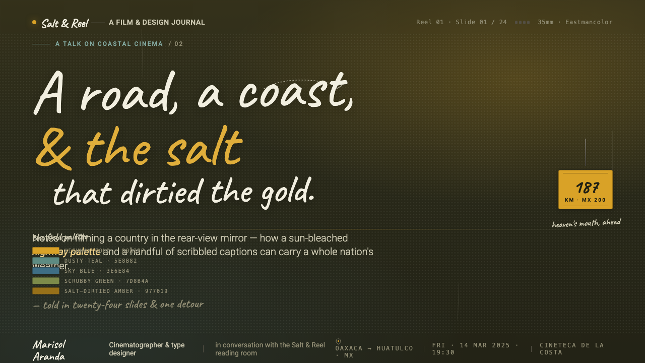
For presentation covers, begin with a wide image field or a dark, grain-touched ground that suggests road, coast, or fading daylight. Let one warm band of color carry the emotional weight, then place a short white handwritten title where it can float rather than lock into a rigid block. Content slides should become calmer and more editorial: retain the dusky ground, use clear readable text for the main argument, and reserve the hand-scrawled voice for a framing observation or chapter break.
Data slides need more discipline than mood boards. Keep charts and labels clean enough to scan, then use the theme through atmosphere rather than distortion: subdued grounds, restrained warm and cool contrast, a broad margin that behaves like open landscape, and a short handwritten note that explains the takeaway. Do not make values look aged, blurred, or handwritten. The cinematic texture belongs around the data, while the data itself must stay precise.
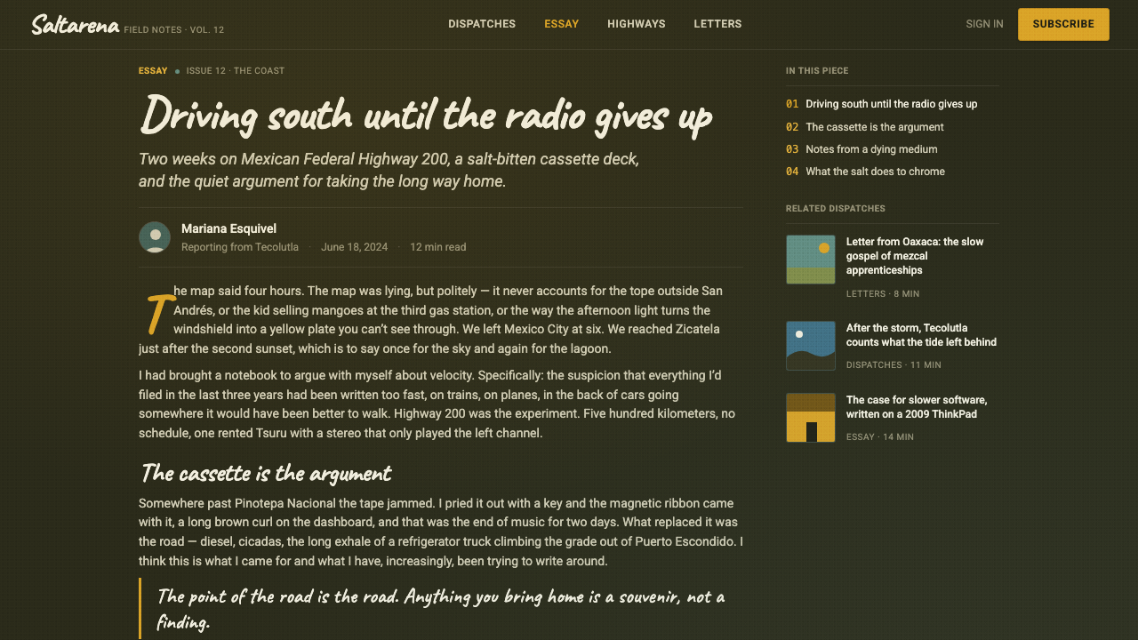
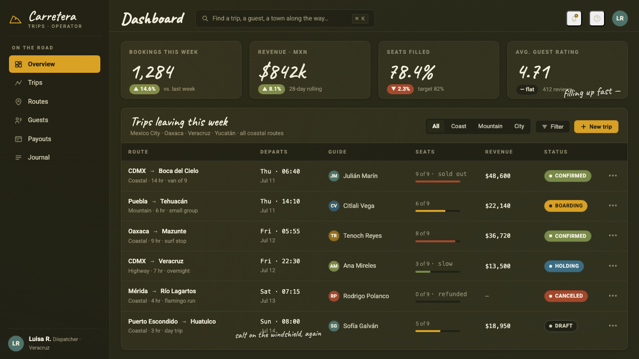
For web interfaces, the style is strongest in dashboards, journals, travel-oriented collections, and pricing pages that need an emotional outer layer without losing hierarchy. Use a dark, film-like foundation; build reading order with clear type and generous open areas; and let gold and dusty teal identify important states or sections. A dashboard can use handwritten captions for summaries or empty-state reflections, but its controls, tables, and account information should remain direct and dependable.
For editorial and marketing work, use wide image-led sections to establish place before introducing copy. Long-form stories can alternate between broad coastal or highway imagery, dark narrative panels, and short caption-like interjections. Marketing pages should avoid the language of luxury gloss. They work better when they feel observational and tactile: one image, one sentence, one warm shift in atmosphere, then enough empty space for the viewer to feel the journey continue.
The common mistake is treating the style as a generic vintage filter. Excessive grain, exaggerated handwritten type, bright tropical color, or crowded travel-collage layouts all miss the source’s restraint. The reference is naturalistic, not nostalgic; warm, not cheerful by default; and cinematic, not merely decorative. Preserve the tension between sun and shadow, road and pause, image and narration. If every element announces the theme at once, the sense of distance disappears.
Y Tu Mamá También — FAQ
Is this style simply a retro film look?
No. Visible grain and sun-bleached color are important, but they are consequences of a larger naturalistic system. The essential relationship is between highway warmth, dusty coastal atmosphere, wide framing, and the quiet interruption of handwritten narration. A generic retro treatment usually foregrounds effect; this style foregrounds place, distance, and observation.
Can handwritten captions be used for all interface text?
They should not. Their value comes from being exceptional: a title, a brief note, a reflective summary, or a transition between visual sections. Navigation, forms, data labels, controls, and long passages need a more neutral readable typographic voice. When every line is handwritten, the narrator’s interruption becomes the entire interface and loses its narrative force.
How should imagery be selected for this theme?
Favor images with open land, coast, road, sky, dry vegetation, or a strong sense of weather and distance. The image should leave room for a caption and should feel naturally lit rather than heavily staged. Avoid crowded city scenes, highly polished product photography, and imagery whose color treatment is too vivid or pristine to coexist with the film-like atmosphere.
Where does the style work poorly?
It struggles where immediate density, clinical precision, or cheerful high-energy branding is the primary requirement. Transaction-heavy interfaces and tightly packed operational views can borrow its color atmosphere, but should not inherit its spacious framing or narrative pauses at the expense of speed and clarity. It is strongest when a product has room for reflection, place, or editorial pacing.
Related design styles
 HopepunkSoftness becomes defiance. Deep moss, honey amber, and vine borders make care…
 Azerbaijani Gobustan PetroglyphAncient rock speaks. Ochre incisions glow across dark lichen-mottled stone.
 Baybayin ScriptCarved, not written. Curvilinear baybayin ash-rubbed into tobacco-brown bambo…
 Bean-to-Bar ChocolateOrigin tastes tactile. Cocoa serif, kraft panel, and molded squares carry the…
 Firefly BioluminescenceQuietly luminous. Yellow-green 557 nm sparks drift through ruled indigo plate…
 Lofi Hip-Hop Anime Girl (2018)Solitude glows warm. Caveat notes, plum night, and amber geometry loop like v…