What is Cranbrook?
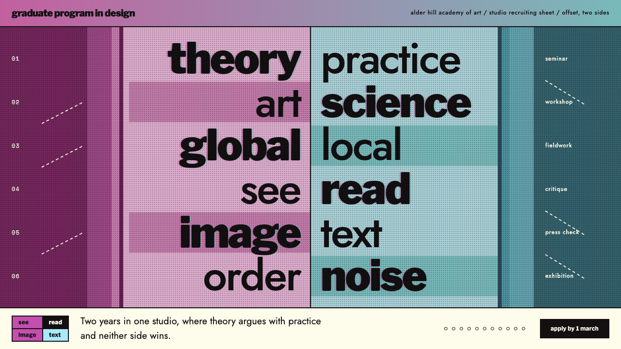
Cranbrook design refused the single reading order: type, image and diagram share one layered space and the reader chooses the route.
Cranbrook in brief
The Cranbrook style takes its name from the Cranbrook Academy of Art in Bloomfield Hills, Michigan, and above all from a 1989 recruiting poster that Katherine McCoy designed for the school's graduate program in design. The poster set out to show, rather than describe, a way of thinking about communication: that a page can offer several entry points and several readings at once instead of one fixed path from top to bottom.
Visually it is recognisable at a glance. Heavy black Franklin Gothic and Futura run down a central axis in pairs of words, such as theory and practice, art and science, global and local. The left half of the sheet, the 2D half, is covered in magenta duotone photographs, and the right half, the 3D half, in teal. A band that fades from magenta to cyan runs along the top and holds the title. The ground is a pale offset card, the type is black, and images sit beneath the text as a layer.
As a design language it belongs to postmodern and deconstructive typography. The method is layering: text, photographs, diagrams and labels overlap in the same space and negotiate with each other. Instead of the orderly neutrality of a strict grid, the page asks to be read, looked at and decoded, and it trusts the reader to do some of the work.

Where does Cranbrook come from?
The system is built from Katherine McCoy's 1989 recruiting poster for the Cranbrook Graduate Program in Design. The poster was a practical object, meant to attract prospective students, but it also worked as a statement of what the program believed. Its subject matter and its form were the same thing: a design department arguing for plural meaning in a layout that itself had plural routes.
The context was the Cranbrook design department, which was co-chaired by Katherine McCoy and Michael McCoy from 1971 to 1995. Across that long tenure the department became known for bringing theory into studio practice. The movements named in its background are postmodern typography, deconstructive typography, and post-structuralist design theory, and the poster shows how those abstract ideas could be turned into concrete decisions about type, colour and arrangement.
Post-structuralist thinking, as applied to design, questions the idea that a message has one correct meaning delivered by one correct sequence. Designers influenced by it began to treat layout as a field where readers construct meaning for themselves. The paired words on the poster, theory and practice, art and science, global and local, are a miniature of this argument: each pair puts two ideas side by side without declaring one the winner.
Michael McCoy is the other half of the leadership pairing, and the couple's co-chairing of the department over more than two decades is part of why Cranbrook is remembered as a school with a coherent approach rather than an assortment of individual styles. The 1989 poster is the most distilled visual record of that approach, and it is the source from which this style is drawn.
What defines the Cranbrook look?
Color
Colour comes as a duotone split. Magenta covers the 2D half of the sheet and teal covers the 3D half, with a band fading from magenta to cyan across the top. Against these saturated tints, the ground is a pale offset card and the type is black. The two hues are not decoration; they sort the poster into two worlds that the reader is invited to cross between.
Typography
Heavy black Franklin Gothic and Futura run as paired words down a central axis. The contrast between a blunt American grotesque and a geometric sans gives the column an internal tension, while the heavy weight keeps each word readable even when images lie beneath it. Small black tab labels set in reversed type work as signposts rather than as headings.
Layout
There is no single entry point. A see, read, image and text matrix of four cells, dashed diagonals crossing the sheet and black tab labels offer several routes through the same space. Type, pictures and diagrams crowd into one layered field instead of occupying separate zones, and the page rewards wandering rather than scanning top to bottom.
Layering
The image sits underneath as a layer and the text rides on top. Photographs are not illustrations placed beside copy; they are a field the copy lives inside. Because words and pictures overlap and press against each other, neither can be treated as the main content, and meaning comes from how they interfere.
Duality and pairing
The paired words, theory and practice, art and science, global and local, give the whole layout a structural logic of polarity. The 2D and 3D halves repeat the idea in colour and imagery. It is a system of opposites held in the same frame, and the design never resolves them into a single answer.
Diagrammatic marks
Dashed diagonals and tab-like labels borrow the language of diagrams and technical drawings. They do not decorate; they imply relationships and routes. Their thin, light presence contrasts with the heavy type and gives the dense composition places for the eye to travel.

Who shaped Cranbrook?
McCoy designed the 1989 recruiting poster for the Cranbrook Graduate Program in Design, which is the direct source of this style. She co-chaired the Cranbrook design department with Michael McCoy from 1971 to 1995, and the poster stands as one of the clearest visual statements of the approach the department stood for.
Michael McCoy co-chaired the Cranbrook design department alongside Katherine McCoy across the same twenty-four-year span. The shared leadership gave the department continuity, and the poster belongs to that jointly built culture of bringing theory into practice.
How do you use Cranbrook today?
On slides, the Cranbrook language is best for talks that have an argument rather than a list of facts. A cover can pair two ideas as black heavy words on a central axis over a pale card ground, with a magenta to cyan band holding the title. Content slides can use the see, read, image and text matrix to organise a topic into four approaches, and a dashed diagonal can link related ideas. For data, place charts as a layer under annotation instead of beside it.
In web interfaces, it suits editorial products, exhibition and school sites, research portfolios, and anywhere that wants a point of view and layers of meaning. Navigation can be built from black tab labels, and a central axis of paired terms can serve as a table of contents. It is a poor fit for transactional flows such as checkout or forms, where a single clear path is better than several.
In editorial and marketing work, it fits manifestos, campaign posters, program recruitment, and cover stories. Duotone photography, one half magenta and one half teal, gives a quick way to divide a topic into two sides without needing a diagram. Because the system depends on a pale offset card and heavy black type, it also prints well and works as a physical poster.
The most common mistake is to read the style as chaos. Layering is a controlled act: the type stays heavy and black so it never disappears, the axis stays central, and the palette stays limited to two tints and one band. A second mistake is to drop the pairs, since the paired words are what make the structure make sense. A third is to bury the text under images until it can no longer be read, which defeats the purpose of having several readings in the first place.
A useful rule of thumb is to ask whether a reader could start in at least three places and still understand the page. If they can, you are using the system as intended. If there is still only one way in, the layout has been tidied back into a conventional grid.

Cranbrook — FAQ
What is the Cranbrook design style?
It is a postmodern, layered approach to graphic design associated with the Cranbrook Academy of Art. This version is drawn from Katherine McCoy's 1989 recruiting poster for the school's graduate program in design, which pairs heavy black type on a central axis with magenta and teal duotone imagery and gives the reader no single reading order.
How is it different from the Swiss grid?
A Swiss-style grid aims for order, neutrality and one clear route through the page. The Cranbrook look layers text, images and diagrams in the same space and offers several entry points. It is less about tidy alignment and more about letting the reader construct meaning, which is why it is described as deconstructive.
Which fonts and colors define it?
Heavy black Franklin Gothic and Futura define the type, run as paired words down the middle of the page. The colours are magenta for the 2D half and teal for the 3D half, with a band fading from magenta to cyan at the top, all over a pale offset card ground.
Can it work for a website?
Yes, for editorial, portfolio, school and exhibition sites where a point of view matters. Use the central axis of paired terms, black tab labels and layered imagery. Avoid it for checkout, forms, or anything that needs one obvious path.
Why does the poster use pairs of words?
The pairs, such as theory and practice, art and science, and global and local, express the idea that two things can sit together without one being declared correct. They give the layout its structure and echo the 2D and 3D halves of the sheet.
Related design styles
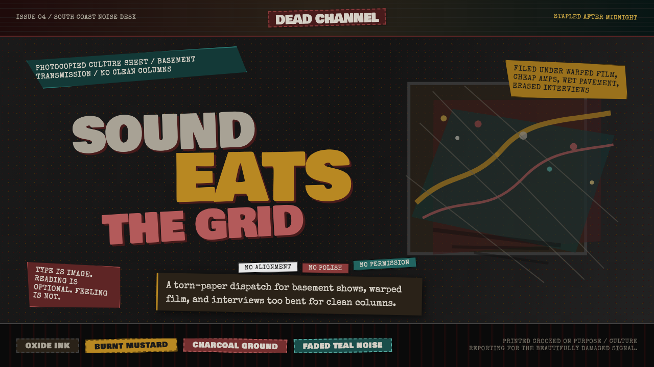 Grunge (Carson 1993)Carson's anti-rules, photocopied. Oxblood on charcoal, distressed type, delib…
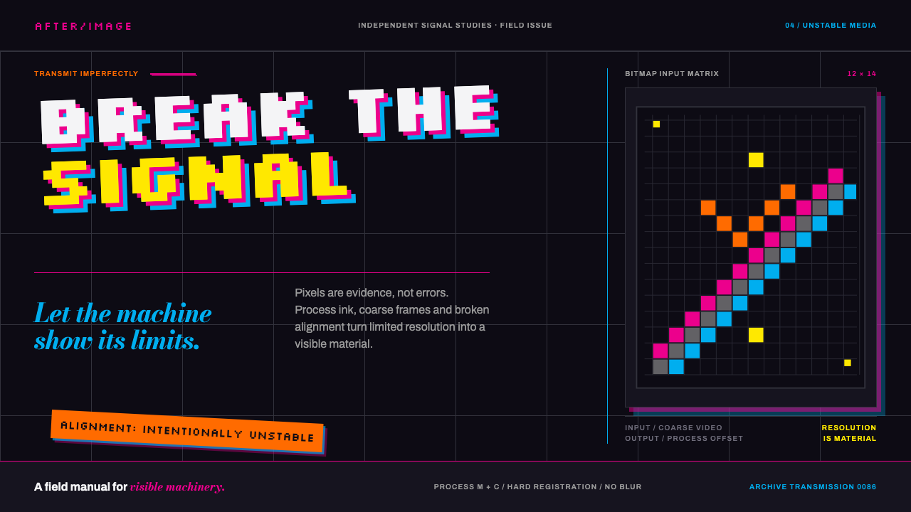 April Greiman HybridResolution becomes material. Bitmap type and process magenta collide on a bro…
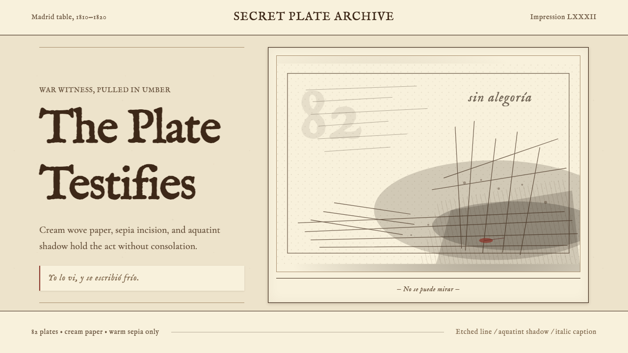 Goya — Disasters of WarWitness without ornament. Cream paper, umber line, aquatint shadow, italic ca…
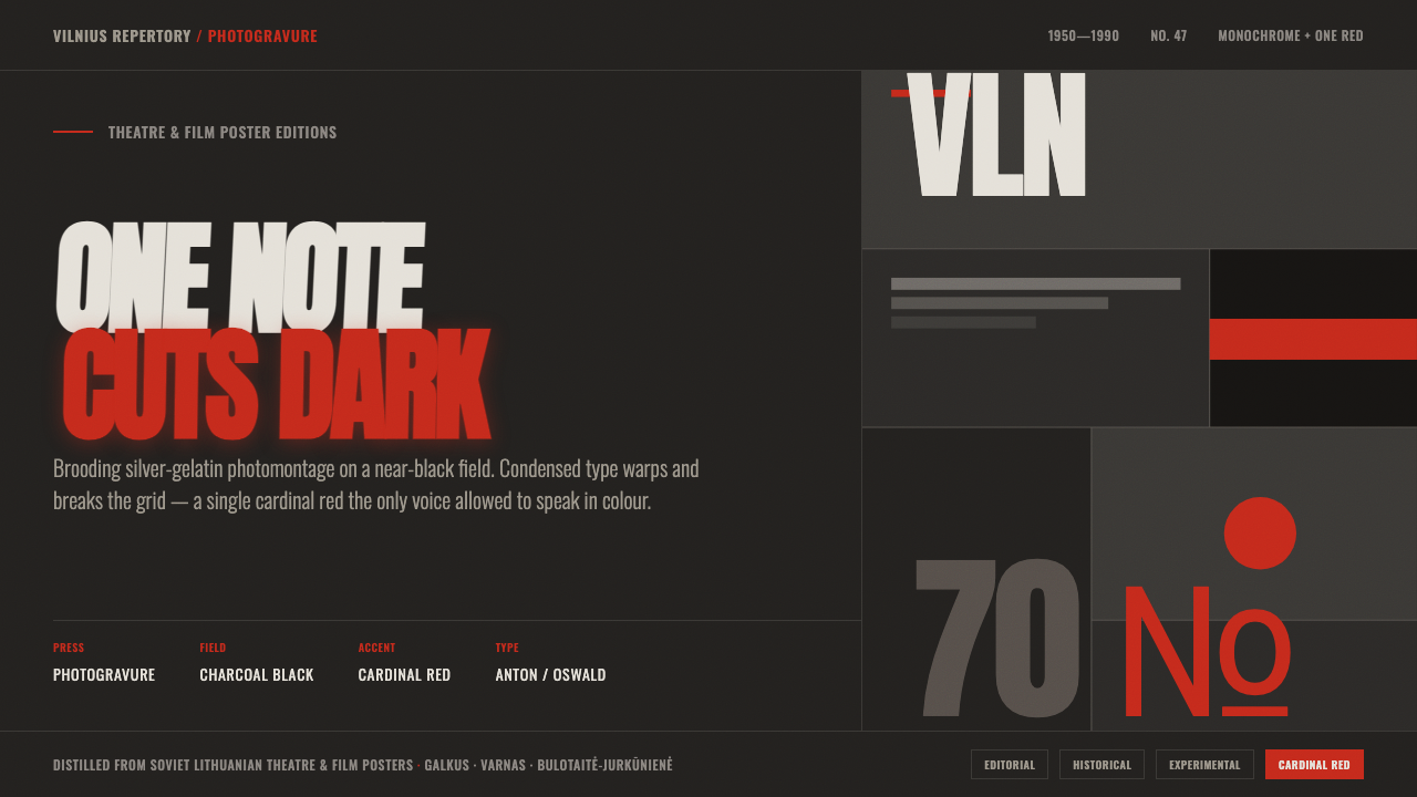 Lithuanian Poster ArtMonochrome plus one red. Charcoal photogravure field, warped Anton type, a lo…
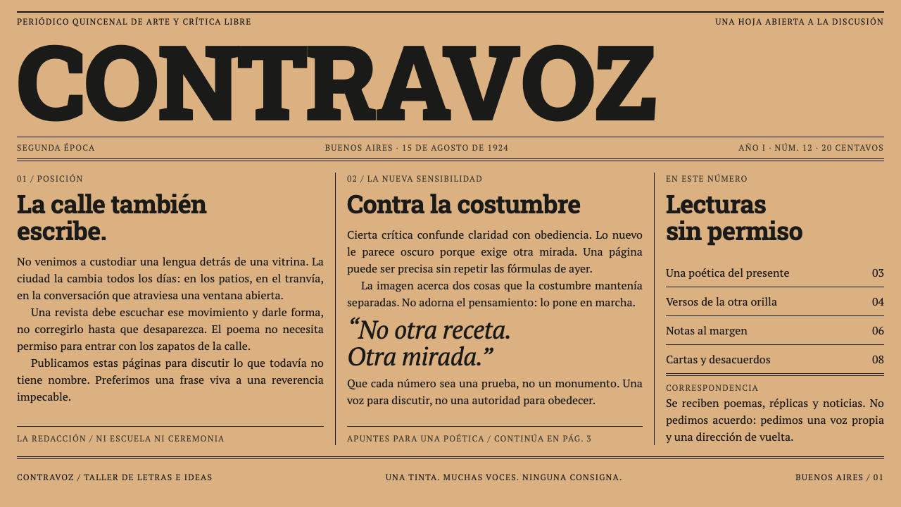 Martín Fierro MagazineA newspaper that argues. A heavy slab masthead and ruled columns press black…
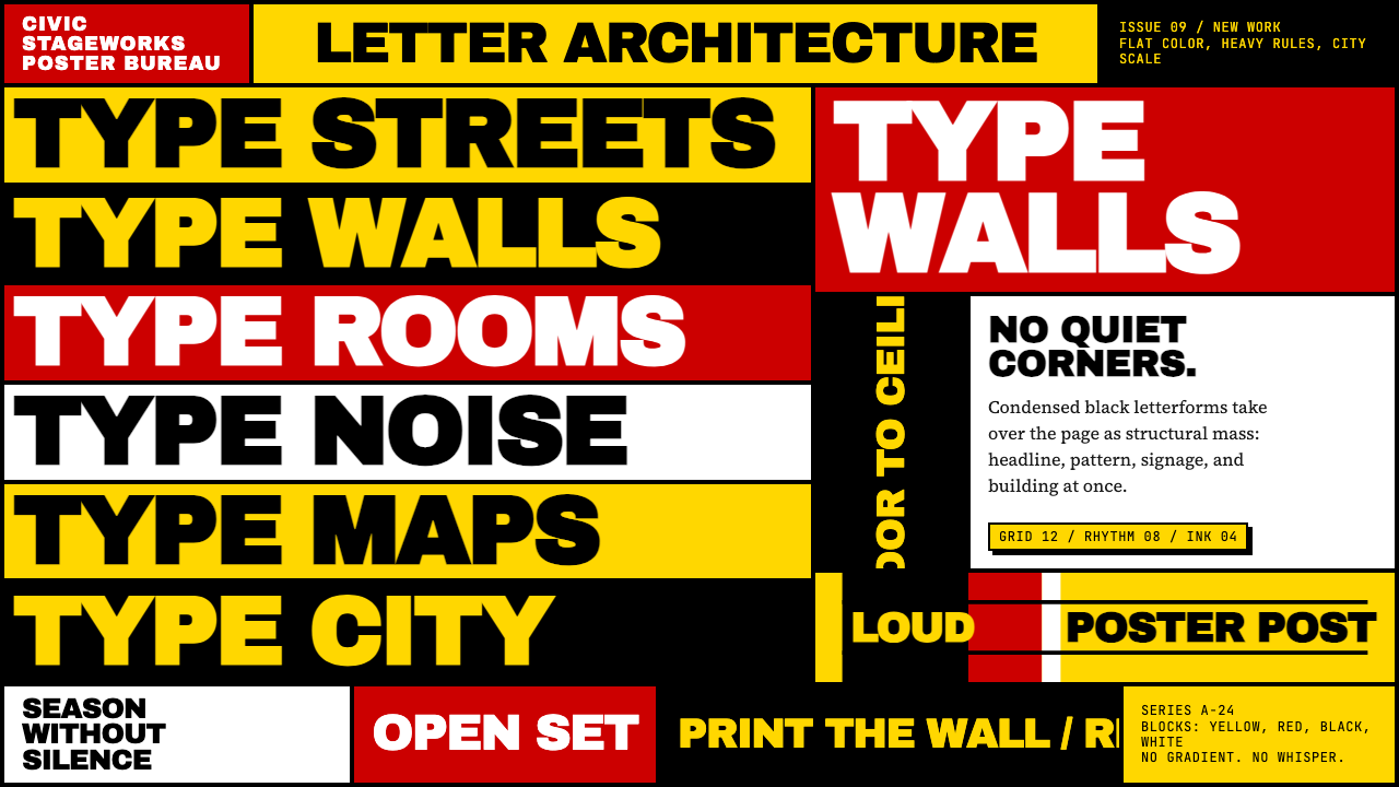 Paula Scher / PentagramType becomes architecture. Yellow-red-black blocks and stacked condensed caps…