About Cranbrook
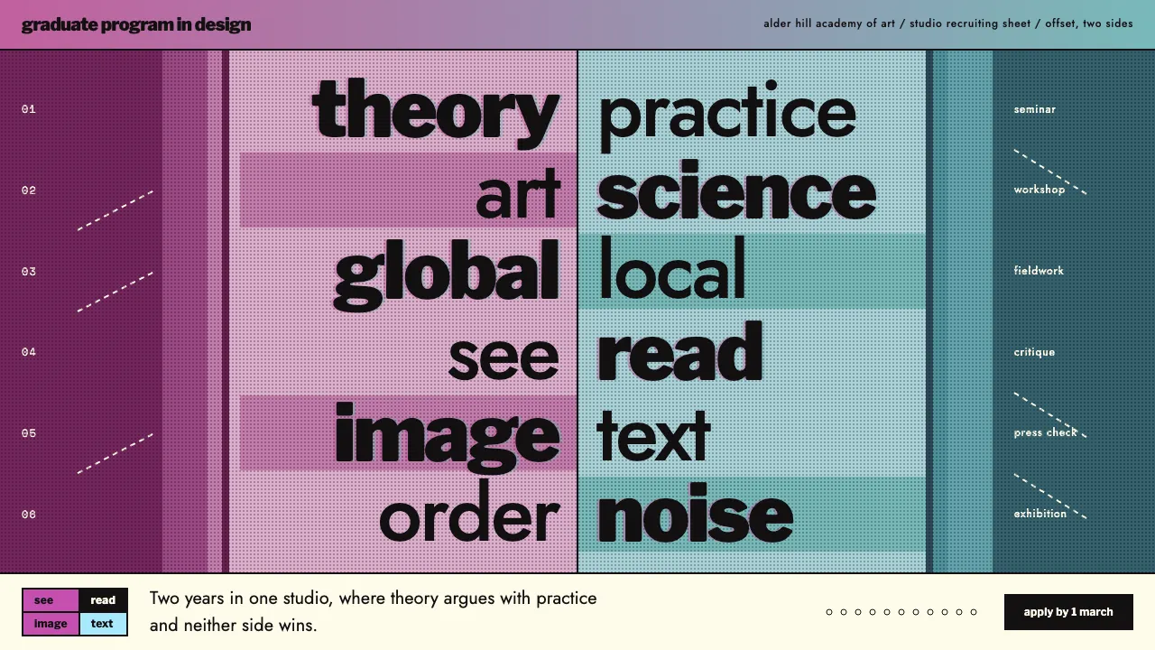
A system built from Katherine McCoy's 1989 recruiting poster for the Cranbrook Graduate Program in Design. Heavy black Franklin Gothic and Futura run down a central axis of paired words, theory and practice, art and science, while magenta duotones fill the 2D half of the sheet and teal duotones the 3D half.
The page is pale offset card, the type is black, and the image sits underneath as a layer. There's no single entry point. A see / read / image / text matrix, dashed diagonals and black tab labels give the reader several routes through the same space.
- Origin
- Bloomfield Hills, Michigan, USA
- Era
- 1989 poster; Cranbrook design department co-chaired by the McCoys 1971–1995
- Key figures
- Katherine McCoy · Michael McCoy
- Movements
- Postmodern typography · Deconstructive typography · Post-structuralist design theory
Cranbrook design spec
Colors
Typography
The other 11 sections — buttons, cards, spacing, motion, techniques and more — open once you unlock. Download the DESIGN.md or send it to your AI in one click. Unlock once, yours forever.
Sign up nowStyles similar to Cranbrook
Also inspired by art & artists, with a close feel.
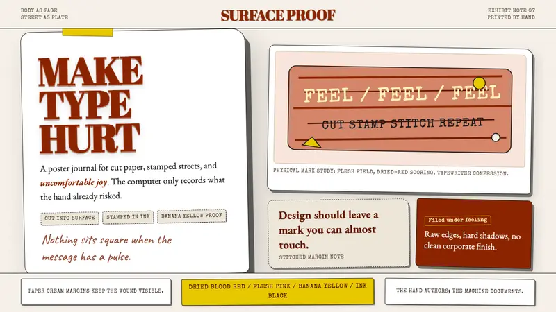 Stefan SagmeisterPain becomes typography. Flesh pink, dried blood red, banana yellow; broken paper stack.
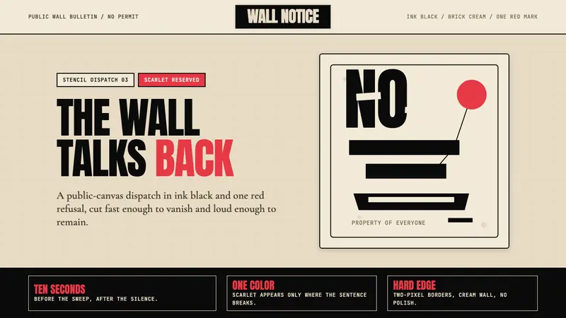 Banksy Stencil GraffitiProtest is reduced to a cut mark. Anton black on brick cream, one scarlet red interruption.
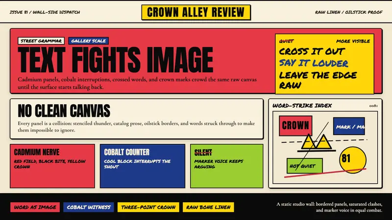 Basquiat Neo-ExpressionismExplodes off raw linen. Cadmium red, cobalt blue, Anton blocks, and struck marker text collide.
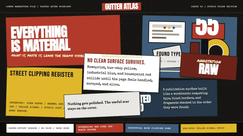 Rauschenberg Combine (1955)Street debris becomes syntax. Ink black, torn type, red-blue-yellow scraps collide.