What is Emigre / Zuzana Licko?
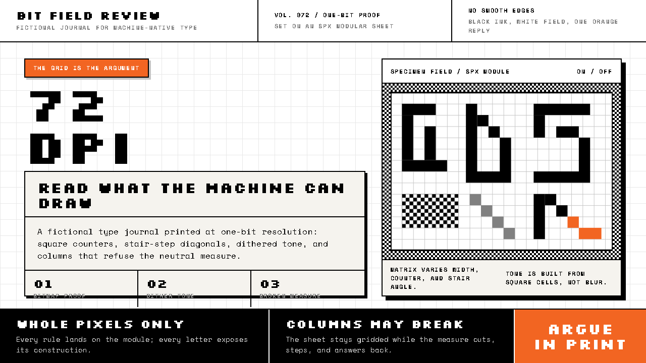
Emigre treated the low resolution of the first Macintosh screens as a material to design with, and turned coarse black pixels from a compromise into a position.
Emigre / Zuzana Licko in brief
Emigre / Zuzana Licko is the visual language of a Berkeley type foundry and magazine that began in 1984, the year the Macintosh shipped. It is built from bitmap letterforms: black pixels on white paper, hard edges, stair-stepped diagonals, dithered grey wherever a tone is needed, and a single orange interruption. It is usually filed under first-wave digital type design and American postmodern typography, and it marks a deliberate break with the International Typographic Style.
The founding idea is simple and slightly perverse: draw each letter at the resolution the screen actually has. Zuzana Licko drew Emperor, Oakland and Emigre as coarse bitmaps sized to that grid, instead of pretending the machine could do more than it could. A pixel is either on or off, so there is no grey scale, no smoothing and no softening. The limitation is not hidden behind a nicer-looking approximation. It becomes the grammar of the letterform.
On the page the effect is immediate. The ground is white, the type is black, and tone is made from dither, the patterned scatter of black dots that stands in for grey when grey does not exist. Sizes are whole numbers of the grid, so nothing blurs. Around that rigid, mechanical letter the layout behaves restlessly: column widths change mid-page, text blocks turn at an angle, headlines run across the body copy. It is a style that makes its medium visible instead of pretending to disappear into it.
Where does Emigre / Zuzana Licko come from?
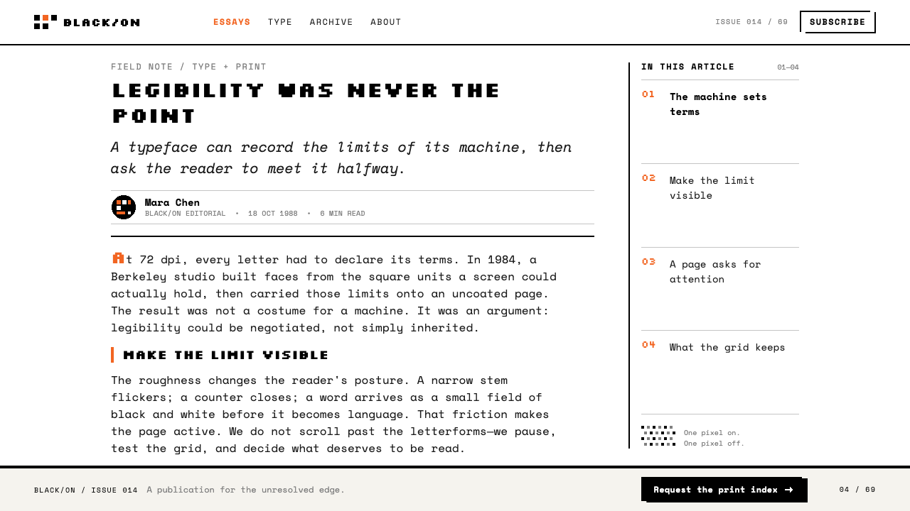
Emigre started in Berkeley in 1984, the year the Macintosh shipped, and the machine decided the terms. A screen of that period offered a fixed, low-resolution grid, and a fixed grid is a limit. Licko's choice was to design with the limit rather than around it. The work is placed in Berkeley and Sacramento, California, and the record dates its run from 1984 to 2005.
The type came first. The Lo-Res bitmaps were drawn in 1985, and the three families that define the early period, Emperor, Oakland and Emigre, were all sized to the pixel grid the screen really had. Each stair-step on a diagonal and each blocky counter is a decision made at the level of the individual pixel. This is why the work sits at the beginning of digital type design: it was not an older typeface adapted for a new machine, but letterforms conceived from the machine's own constraints.
The magazine carried the argument. Rudy VanderLans edited Emigre, which ran to sixty-nine issues, and its pages were as unruly as its type. Columns changed width midway, text blocks were turned at angles, headlines crossed over the body. For more than a decade it quarrelled in print with the orthodoxy of the day, the neutral, gridded rationalism of the International Typographic Style, and it won that quarrel for long enough to change what type was allowed to look like. Low resolution stopped being something to apologise for and became something one could defend.
Emigre sits inside the wider movement usually labelled American postmodern typography, and designers such as Barry Deck and Jeffery Keedy are named alongside Licko among its key figures. What unites them is a refusal of the idea that type should be transparent. Swiss neutrality asked letters to vanish into the message; this work asked them to be seen and to carry the history of the machine that produced them. That is the thread worth following if you want to use the style well. The pixels are not nostalgia. They are an argument about honesty of means.
What defines the Emigre / Zuzana Licko look?
Pixel as Material
Letterforms are drawn pixel by pixel at the resolution the screen actually has. Edges stay hard, diagonals climb in visible stairs, and curves are approximated by blocks. Nothing is anti-aliased and nothing is blurred; the grid is never hidden. The coarseness is the signature, and any smoothing applied afterwards destroys it.
Black on White
The backbone of the palette is plain black pixels on white paper. There is no tinted ground and no mid-tone fill. Contrast is total, and legibility comes from that stark on-or-off logic rather than from colour. The page reads like a printout from a machine that has only two states to offer.
Dither as Tone
When a tone is needed, the style uses dither: a pattern of black dots whose density suggests grey. Because a pixel can only be on or off, grey is never a flat fill but always a texture, visibly made of the same dots as the type. Shading, backgrounds and shadows all follow this rule, which keeps even the quiet areas of a page honest about how they were made.
Whole-Number Sizes
Type is set at sizes that line up with the pixel grid, so every pixel in a letter lands on a pixel of the page. Scaling to arbitrary sizes would resample and blur the forms, while whole-number multiples keep them crisp. Hierarchy therefore comes from stepping up in clear jumps, not from gentle gradations, and a headline is visibly a larger copy of the same grid.
Restless Layout
Set against Swiss neutrality, the page deliberately refuses to sit still. Column widths change midway, text blocks are turned at angles, and headlines run across the body copy. A grid exists but is broken on purpose. The energy comes from the tension between the rigid, mechanical letter and the unruly arrangement that carries it.
One Orange Interruption
Colour is held back to a single orange that works as an interruption, one spot cutting across black, white and grey. Because everything else is monochrome, a small orange element commands the page. Used more than once or twice, it turns into decoration and stops interrupting, so the discipline lies in spending it only where the eye must land.
Who shaped Emigre / Zuzana Licko?
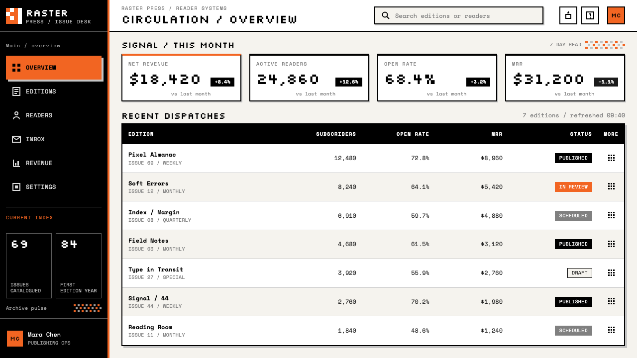
Licko is the designer at the centre of the style. She drew Emperor, Oakland and Emigre as coarse bitmaps sized to the resolution the screen actually had, and the Lo-Res bitmaps of 1985 are her work. Her contribution was less a single typeface than a stance: that a machine's limits are a legitimate source of letterforms, and that honesty about them is more interesting than imitation of something finer.
VanderLans edited the magazine Emigre through all sixty-nine issues. Under him the pages put the bitmap type to work in unruly layouts: columns that change width midway, text blocks turned at angles, headlines running over the body. The magazine was the platform on which the argument against Swiss neutrality was conducted in print, and it made the type a visible part of a public debate.
Deck is named alongside Licko among the key figures of Emigre-era American postmodern typography. His presence in the record is a reminder that this was a movement and not one designer's idiosyncrasy: several people, working at the same moment with the same new machines, arrived at a shared suspicion of typographic neutrality.
Keedy is the other designer the record names beside Licko, Deck and VanderLans as a key figure of the period. Together they stand for the break with the International Typographic Style: a generation that preferred letters that announce themselves, carry the traces of their making and refuse to be a transparent container for a message.
How do you use Emigre / Zuzana Licko today?
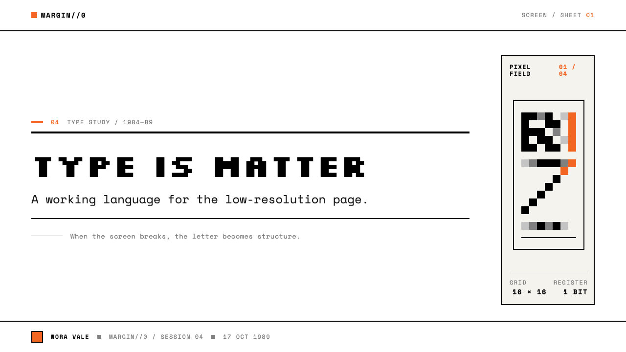
Emigre is a style with an opinion, so it works best where the product also has one. Its strength is that it makes technology look honest rather than slick, which suits tools, studios, type and design publications, and any brand that wants to show how it is made. Applying it correctly means keeping the rules that produce the look: hard pixel edges, black on white, dither for tone, whole-number sizes and a single colour interruption.
For presentation slides, a cover can be nothing more than one large line of black bitmap type on a white field, with a single orange element cutting across it. Content slides follow the same economy: two or three clearly stepped sizes, no tinted panels, and tone made from dither rather than fills. Data slides take well to the style. Bars can be solid black or dithered grey, charts stay flat and hard-edged, and the one orange element marks the number the audience must not miss.
For web interfaces, the style suits dashboards, developer tools and pricing pages with a distinct personality. Render the pixel type at its native grid with smoothing off, keep borders hard and square, and let the page background stay plain white. Use dithered patterns instead of opacity or soft shadows to show disabled or secondary states, and reserve the single orange for the one primary action on the screen. Body text for long reading deserves a calmer companion face, with the bitmap type kept for headings, labels and navigation.
For editorial and marketing work, Emigre offers the most freedom. A magazine-style spread can vary its column widths, turn a block of text at an angle, or let a headline overrun the body, provided there is still an underlying order a reader can feel. Marketing pages can use the same restless energy to feel like a printed manifesto, with an oversized pixel headline, plenty of white and one orange accent where the call to action sits.
The most common mistake is treating the look as retro decoration. Scaling the bitmap type to fractional sizes or letting the screen smooth it quietly removes the one thing the style is about. Others follow: adding gradients and soft shadows, spreading orange across the page until it stops interrupting, or setting long paragraphs entirely in pixel letters that were drawn for display. The style asks for discipline, and a few strict rules are more convincing than many loose gestures.
Emigre / Zuzana Licko — FAQ
Is Emigre the same thing as retro pixel art or 8-bit style?
No. Pixel art is mostly about drawing pictures with a limited grid. Emigre is about letterforms drawn to the resolution the screen actually had, and about the argument that came with them. The work also lives in print: a magazine of sixty-nine issues that quarrelled with Swiss neutrality. The pixels here are a typographic position, so imitating only the blockiness without the discipline of whole-number sizes, dither and one interruption misses the point.
Why is grey made from dither instead of a flat tint?
Because in the original medium a pixel is either on or off. There is no grey scale to draw from, so a tone has to be built by varying the density of black dots. Dither also keeps the page consistent: shading, backgrounds and shadows are made of the same material as the type, which is the style's way of staying honest about how everything on the page was produced.
How does Emigre differ from the Swiss International Typographic Style?
They are close to opposites in attitude. The International Typographic Style prizes neutrality: type should disappear into the message, and the grid should be obeyed. Emigre argued against that neutrality in print for more than a decade. Its letters are meant to be noticed, its columns change width midway, and its headlines overlap the body. Both are rigorous, but one is rigorous about being invisible and the other about being honest and visible.
Can the style work on modern high-resolution screens?
Yes, as long as the grid is kept. On a sharper display the pixel becomes a deliberate choice instead of a limitation, so the type must still be drawn on a coarse grid, shown at whole-number multiples and never smoothed. The look then reads as intent. If the letters are scaled freely or softened by the renderer, the blockiness turns into a blurry imitation and the argument disappears.
What is the orange for, and how much of it should I use?
The orange is an interruption: a single spot of colour cutting across a monochrome page. Its power depends on scarcity, so it should mark only the thing the eye must land on, such as the main action or the key number. Once orange appears in many places it becomes decoration, the page loses its contrast between the quiet and the loud, and the interruption stops being one.
Related design styles
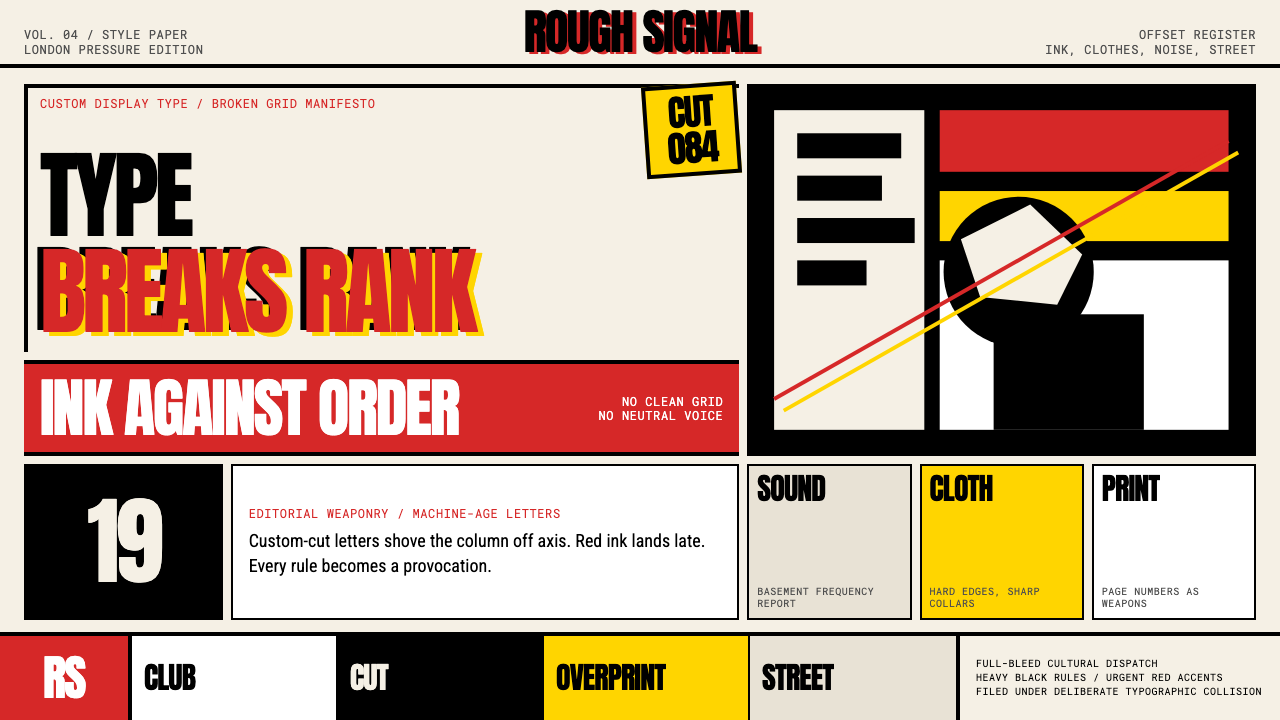 Neville Brody The FaceType mutinies on paper. Cream stock, black rules, urgent red overprint, broke…
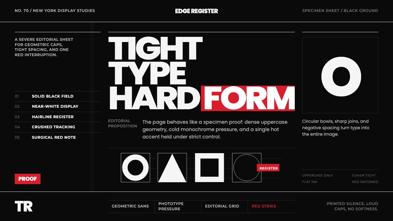 Avant Garde GothicType is the image. Tight white caps on black, ruled grids, one hot red strike.
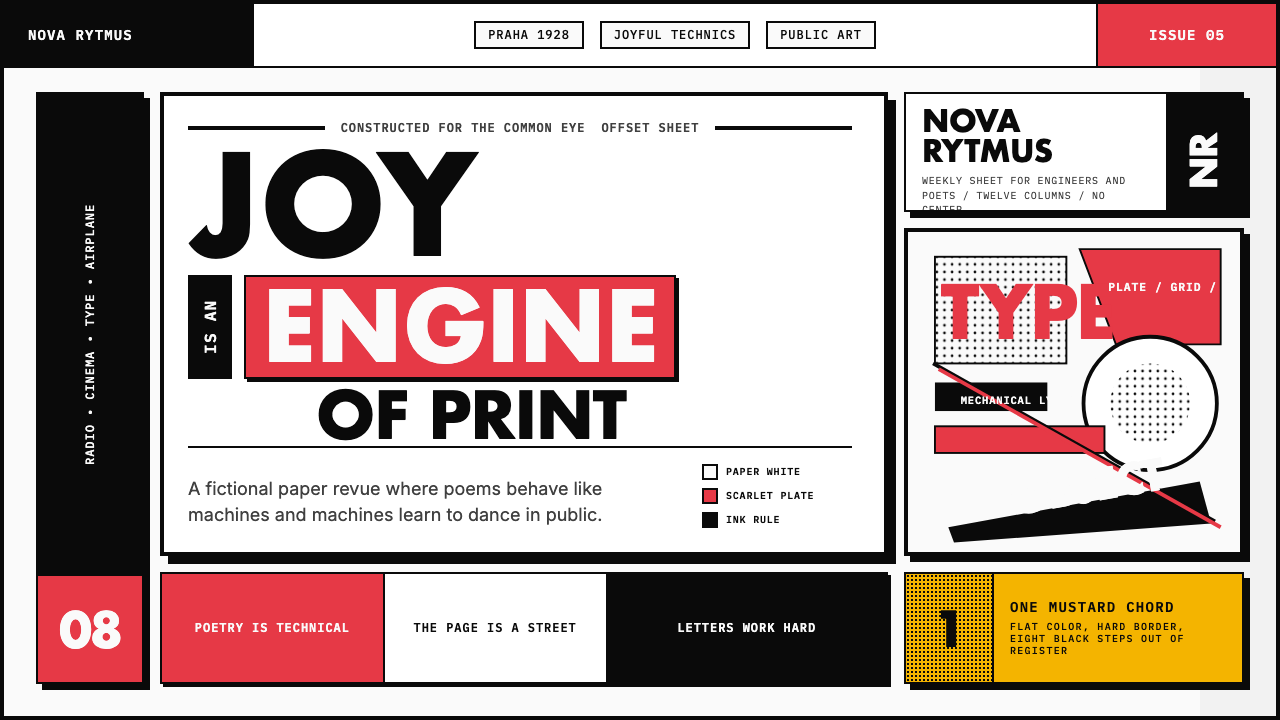 Czech Devětsil Avant-GardeJoy is engineered. Scarlet ink blocks and rotated sans type collide on an asy…
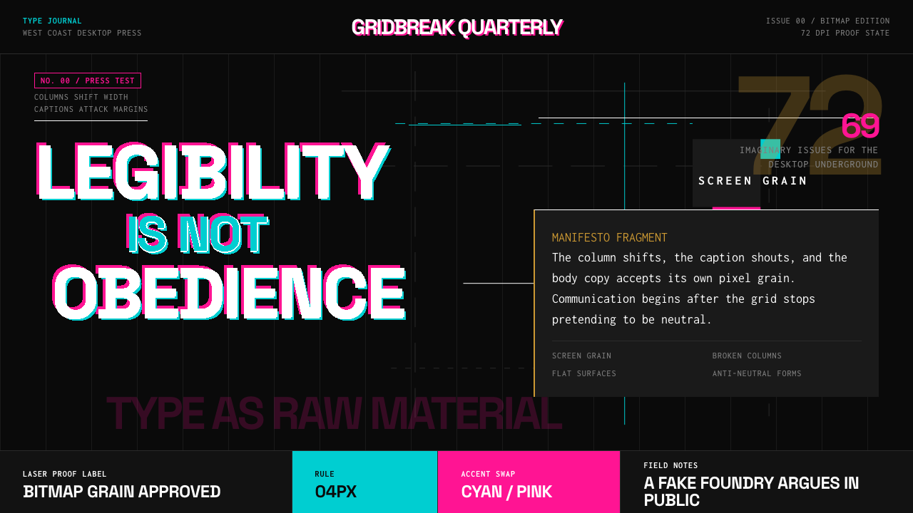 Emigre Magazine (1984–2005)Defies the tidy grid. Cyan, ochre, and hot-pink bitmap type collides on black.
 Grunge (Carson 1993)Carson's anti-rules, photocopied. Oxblood on charcoal, distressed type, delib…
 Nirvana — NevermindAnti-pop in pool blue. Cream cards, dollar-gold accents, and marker type roug…