What is Mondo 2000?
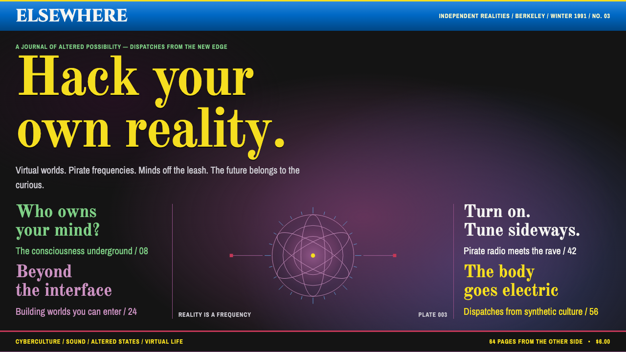
Mondo 2000 made the future look like a crowded, glowing, slightly dizzy magazine cover where every line was shouting in a different typeface.
Mondo 2000 in brief
Mondo 2000 was a glossy magazine founded in Berkeley, California in 1989 that blended cyberpunk with psychedelia and named the result 'cyberdelic'. Virtual reality, smart drugs, hackers and rave culture were all packed onto the same coated-paper cover. The visual style named after it takes the first years of the magazine, 1989 to 1991, as its source, and in particular the founding covers of issues one and three.
The look is easy to recognise even at a glance. Photographic black night scenes or purple nebulae fill the whole page, so that the background reads as a signal field rather than empty space. Cover lines run down the left and right edges row after row, in yellow, green and magenta taking turns. A single line of text may use three typefaces at once. The result is crowded, loud and slightly dizzying, but every piece of information manages to catch the eye.
It is a dark style in the literal sense: the base is black and purple, and every colour is a light source, not a pigment. Text does not sit on the page; it glows out of it. That quality, combined with the refusal to leave any area calm, is what separates Mondo 2000 from the cleaner, minimal futures that came later.

Where does Mondo 2000 come from?
Mondo 2000 began in 1989 in Berkeley, California, edited by R.U. Sirius and published with Queen Mu. The magazine ran until 1998, and its founding cyberdelic covers of 1989 to 1991 are the source for this style. Berkeley mattered. The Bay Area had a long tradition of counterculture, psychedelic art and early computer hobbyism, and the magazine treated these as one continuous story rather than separate subcultures.
The word cyberdelic captures the editorial idea. Cyberpunk contributed the dark urban imagery of networks, hackers and technology slipping out of institutional control. Psychedelia contributed an interest in altered states, expanded perception and visual excess. Mondo 2000 insisted that the two belonged together: the computer was another mind-altering device, and virtual reality was a kind of trip. The covers were the visual form of that argument, with bright, shouting typography over deep-space backgrounds.
The look was also a product of its tools. Early desktop publishing and Photoshop collage were new, and designers were discovering that a page could now be layered, tinted and re-typeset on a screen in a way that had been expensive or impossible before. The names of Bart Nagel and Brummbär are connected with the magazine's visual experiments of that era. Nagel's covers in particular are remembered for putting several typefaces into a single line, as the system does today.
Mondo 2000 came out just before the web became a mass medium, and it fed the imagination of what the digital world might feel like. Its mix of utopian excitement and punk disrespect shaped how many people in the early 1990s pictured cyberspace. The style that survives from it is therefore more than a retro curiosity: it is a record of the moment when technology was imagined as a party, not a utility.
What defines the Mondo 2000 look?
Black and purple signal field
The base is a deep black, often a photographic night scene, mixed with purple nebula-like gradients that fill the entire page. This turns the background into an atmosphere. Instead of a flat colour behind the content, the viewer feels they are looking into a screen or deep space, with the text floating in front.
Cover lines stacked on both edges
Headlines are arranged in stacks running down the left and right sides of the page, leaving the centre for an image or a figure. Each line is a separate teaser competing for attention. The effect is like a crowd of voices at the edges of a room, all trying to pull you in a different direction.
Yellow, green and magenta type
Text is set in a rotation of acid yellow, bright green and hot magenta, all of which glow against the dark ground. Colour is used less to organise information than to make each line distinct. The palette is intentionally garish, belonging more to neon signs and monitor phosphor than to print inks.
Three typefaces in one line
A single cover line may mix a bold serif, a condensed sans and an angular display face. The mixing is deliberate, a rejection of the single-family discipline taught in modernist design. It makes every headline feel assembled, like a ransom note or a collage, and rewards close reading.
Yellow serif for the main line
The main title is often a large yellow serif, which feels both old-fashioned and glowing. This is a small irony that runs through the style: the future is announced in letters that look like those of a traditional magazine, only lit from within.
Collage and layering
Images, type and colour fields overlap freely. Photographs are tinted, cropped and layered with graphic elements, a look made newly possible by early desktop publishing and Photoshop. Nothing is neatly aligned in a grid; the arrangement relies on density and rhythm instead.
Deliberate overload
The style never offers a resting place. Every edge of the page is occupied. This is intended as an experience of overload, matching the era's excited sense that information was multiplying faster than anyone could handle it. Hierarchy comes from brightness and size, not from empty space.

Who shaped Mondo 2000?
R.U. Sirius is credited as editor of Mondo 2000. He shaped the magazine's voice and its editorial idea that cyberpunk and psychedelia were one story. The overloaded, enthusiastic tone of the covers matches the voice of the writing inside.
Queen Mu is named as the magazine's publisher alongside R.U. Sirius. Together they ran the Berkeley project and turned a niche interest in virtual reality, hackers and rave into a glossy cover that could sit on a newsstand.
Bart Nagel is associated with the magazine's early cover design. His covers are remembered for placing several typefaces on one line and for filling the page with colour and information, which is the approach this system borrows.
Brummbär is listed among the key figures of the magazine's early visual era. The name is connected with the experimental graphics of the period, when desktop publishing and image manipulation were just becoming available to designers.
How do you use Mondo 2000 today?
For slides, this style suits talks about technology culture, music, games, the history of the internet, or any subject that benefits from a sense of overload and excitement. A cover can be a full black or purple field with a large yellow serif title and two or three stacked teaser lines at the edges. Content slides work best with one dominant statement and a few small side lines. Data slides can use bright colours against the dark ground to make each series clearly separate, which suits charts with several categories.
On the web, the style fits event pages, music and festival sites, hacker or maker communities, gaming landing pages and creative portfolios. Navigation can run along the edges as stacked coloured lines. Because the page is dark, glowing colours keep strong contrast, but body text must be handled with care: keep paragraphs short, in a plain light colour, and reserve the colourful typography for headings and teasers. Dashboards are rarely a good match unless the product is meant to feel like a night-time control room.
In editorial and marketing work, the style is useful for launches that want to feel like a cultural event rather than a product update. A poster, a zine, a magazine cover or a campaign built around a retro-futurist theme can use the stacked cover lines, the mixed typefaces and the purple signal field. It works well in print and on screens alike, since it was born as a magazine cover.
The common mistake is to apply the colours without the density. A purple gradient and a neon heading on a spacious, minimal layout looks like a generic dark theme. The style depends on crowded cover lines, mixed typefaces and a refusal to leave areas empty. A second mistake is to apply the overload to everything. Long reading text, forms and checkout flows need a calm area, so keep the maximalism for the surfaces where attention is meant to be won.

Mondo 2000 — FAQ
What does 'cyberdelic' mean?
It is a blend of cyberpunk and psychedelic, the name Mondo 2000 used for its own mix of virtual reality, hackers, smart drugs and rave culture. In visual terms it means dark, glowing backgrounds, acid colours and dense, loud typography.
Which years of the magazine does the style come from?
The magazine ran from 1989 to 1998, but this style takes its source from the founding cyberdelic covers of 1989 to 1991, especially issues one and three.
Why mix three typefaces in one line?
It is a deliberate rejection of the single-family discipline of modernist design, and a way to make each cover line look assembled like a collage. The mixing gives every headline its own character and fits the magazine's mood of overload.
Can I use it for a serious product?
Use it with care. It is designed to feel loud, crowded and exciting, which suits events, cultural projects and creative work. For products that need calm and trust, use only small touches such as a purple signal background or a glowing heading, and keep the core reading and form areas quiet.
Related design styles
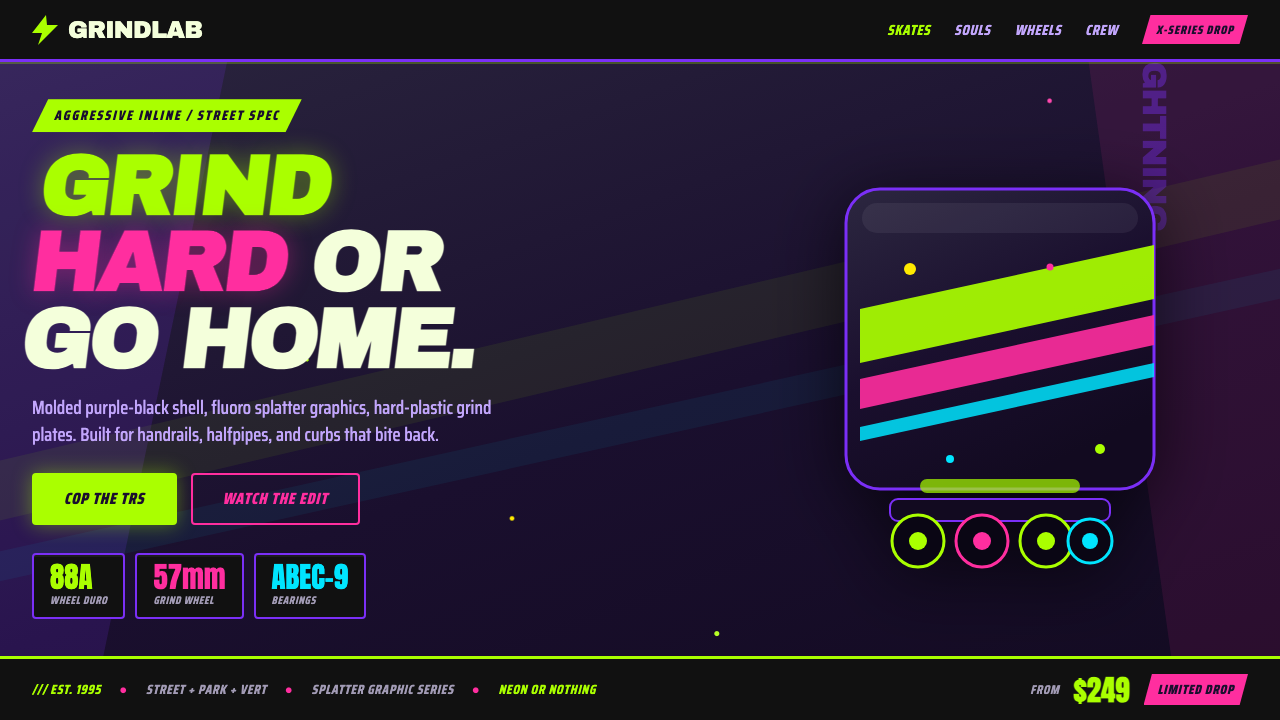 90s Aggressive Inline SkateX-Games attitude in plastic and paint. Fluoro lime and magenta slash across m…
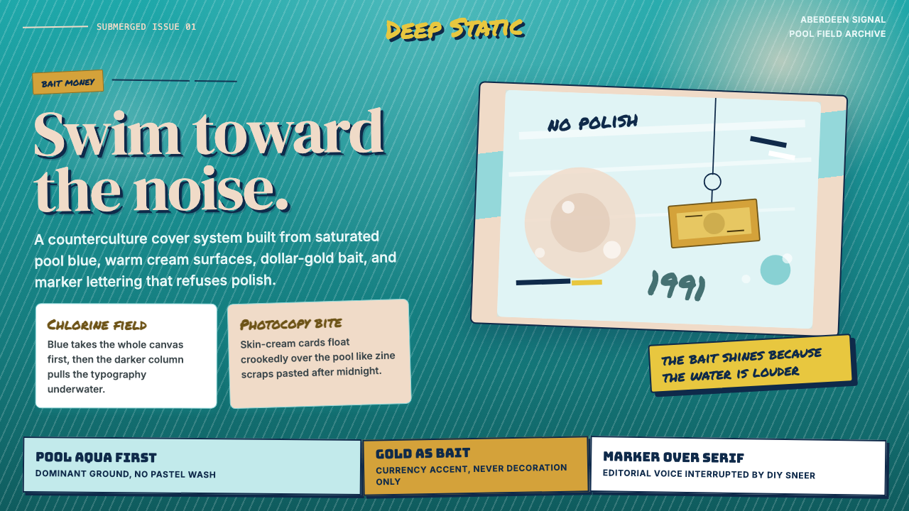 Nirvana — NevermindAnti-pop in pool blue. Cream cards, dollar-gold accents, and marker type roug…
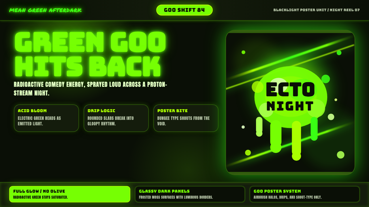 Slimer Ghostbusters GreenBlacklight goo shouts. Ecto-green Bungee type, drips, and proton streaks hit…
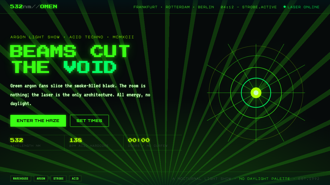 Acid Rave Laser Show 1992Beams cut the void. Argon green on pitch-black smoke, pixel marquee type, add…
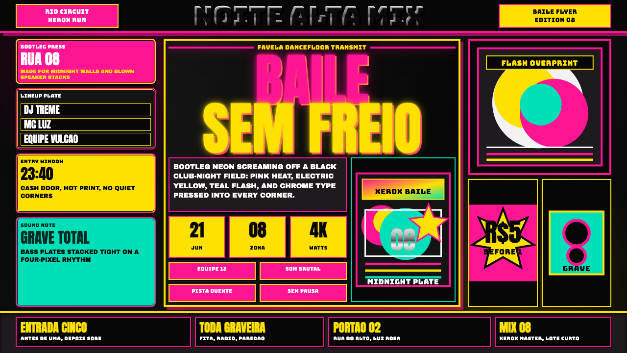 Funk Baile MixtapeNight refuses subtlety. Neon pink/yellow flyer plates cram chrome type on bla…
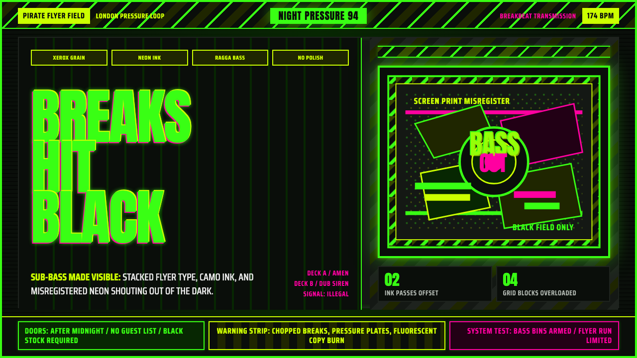 Jungle / Drum & BassRaw rave voltage. Neon green Anton, camo strips, and xerox grain hit black.