What is ZERO Group?
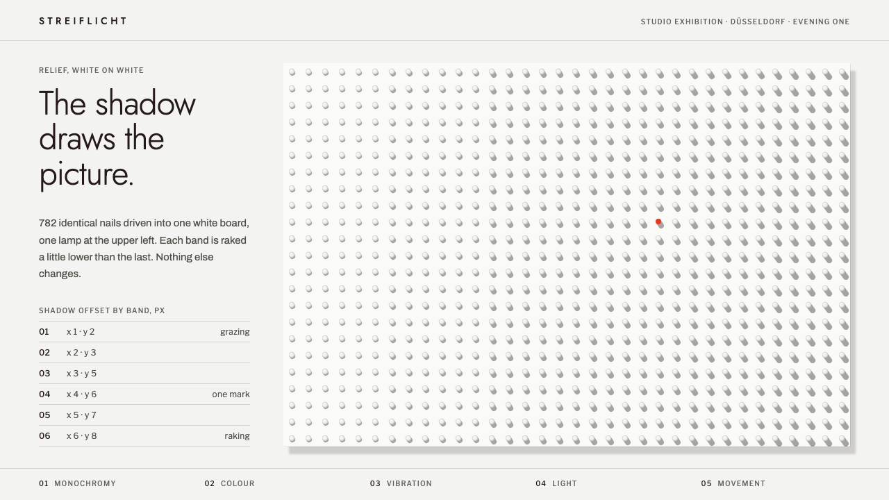
ZERO wiped painting back to nothing and rebuilt it from light — a white nail field raked by a single lamp, with one mark of vermilion.
ZERO Group in brief
The ZERO style is the visual language of the Düsseldorf artists' group that began in 1958 and dissolved in 1966. Its founding gesture was a clean restart: no image, no expressive brushwork, no story, only light, movement and the monochrome surface. In design terms that becomes a screen treated as a white-painted board, lit from one fixed side, where the picture is produced not by drawing but by relief and shadow.
Three elements define it. Surfaces are raised, so cards and panels sit proud of the page like pieces of shallow sculpture. Shadows are hard and fall from a single consistent direction, as they would under a raking lamp, and they do the work that outlines and fills do elsewhere. The palette is a ladder of greys and whites, and the only colour in the entire system is one fire-like vermilion, used exactly once as the single point where the eye is invited to stop.
What distinguishes the style from ordinary minimalism is that it is not empty; it is active. The surface is full of tiny regular events, rows of nails or ridges that catch light differently as the angle changes. Interaction follows the same logic: when a visitor hovers, colour does not change, the light moves. The page behaves like an object in a room rather than an image on a glass.

Where does ZERO Group come from?
ZERO began in a Düsseldorf studio in 1958, when Heinz Mack and Otto Piene decided that painting needed a fresh start after the heated gestural abstraction that dominated postwar Europe. The word itself signals the countdown at zero, the moment before launch, the blank point from which something new can begin. Their answer was to strip art of subject and personality and to build it from light, vibration and monochrome surface.
In 1961 Günther Uecker joined and brought the nail relief. By driving rows of nails into white-painted boards, he made pictures in which nothing was drawn at all; the shadows cast by the nails completed the work and shifted as the viewer or the lamp moved. This is the core image behind the design system: the screen as a painted board, and the picture as whatever light does to it.
The group did not work in isolation. It belongs to the broader current of the Nouvelle Tendance and kinetic art, which explored movement, optical effects and viewer participation, and to the tradition of monochrome painting, where a single colour field is treated as a complete statement. The Italian artist Lucio Fontana, who had opened the canvas itself with cuts and punctures, is counted among the key figures in the group's orbit, a reminder that the surface was now an object to be altered, not a window.
ZERO's international moment arrived with the Stedelijk exhibition in 1962 that carried the Dutch name for zero, nul, and spread the idea across Europe. The group wound down in 1966, but its vocabulary of light, rhythm and serial repetition proved durable. Its translation into interface design reads that vocabulary back as shadow direction, raised surfaces and a monochrome ladder, with a single chromatic accent standing in for Piene's use of fire.
What defines the ZERO Group look?
Color
The system lives almost entirely in greys and whites, from chalky paper tones through soft mid-greys to deep graphite for type. The sole chromatic note is a fire vermilion, a direct echo of the red in Piene's fire gouache work. Because it appears only once, it works like a pin in a map: instantly visible and impossible to confuse with decoration. Using it twice would break the rule.
Light and shadow
Light arrives from one fixed direction, like a lamp held low along the wall. Every shadow therefore falls the same way, with a hard edge and little blur. This consistency is what makes the page feel physical. Shadows are not an effect added afterwards; they are the drawing itself, replacing borders, dividers and filled backgrounds.
Relief and elevation
Cards, buttons and panels are raised from the board in shallow steps, like pieces of low relief. The hierarchy of importance is expressed as height rather than colour: what matters sits closer to the lamp. The depth is modest and architectural, never soft or cushiony, so the interface reads as carved, not inflated.
Pattern and rhythm
Repetition is the system's music. Regular grids of dots, ridges or nail heads create a steady rhythm across large areas, and small deviations from that rhythm become the focal points. This serial approach comes straight from the kinetic and optical interests of the movement, and it gives large white fields a quiet vibration instead of a blank stare.
Typography
Type is plain, upright and unemotional, closer to a catalogue label than to a manifesto. It sits in graphite against pale grounds and is kept small in relation to the surface, because the surface is the subject. There are no expressive flourishes; the letters are another set of regular marks in the field.
Interaction
Hover and focus states do not recolour anything. Instead the angle of the light shifts slightly, so highlights and shadows slide across the raised forms. It is a restrained, slightly uncanny kind of feedback that rewards attention and reinforces the sense that the page is a lit object with real surfaces.

Who shaped ZERO Group?
Co-founder of ZERO with Otto Piene in 1958. His interest lay in light, vibration and structured surfaces, work that makes a flat plane seem to shimmer. He is a primary source for the idea that repeated regular marks can produce movement without any depicted subject.
Co-founder of the group, and the source of the fire in the system: his fire vermilion is the single colour allowed. His practice joined light and fire to the monochrome field, so the one red mark in the interface is a direct citation of his method rather than a generic accent.
Joined in 1961 and brought the nail relief to the group. By hammering nails into white boards he let shadow complete the picture. His work is the clearest model for the style: surface as board, nail as unit, and shadow as the only drawing.
The Italian artist known for cutting and puncturing the canvas, counted among the key figures in ZERO's orbit. His gestures treated the picture surface as a physical thing that could be opened, which supports the system's insistence on surfaces with real depth rather than painted illusion.
How do you use ZERO Group today?
For slides, the ZERO style is suited to gallery talks, architecture and art-direction decks, and any presentation where restraint signals taste. A cover can be a large pale board with a few rows of raised dots and a small title set low beside them, with the single vermilion mark placed once. Content slides should be sparse: one raised card per idea, shadows falling the same way throughout. Data slides work when the chart is treated as relief, with bars as raised blocks and the vermilion reserved for the one number you want remembered.
For web interfaces, the style is a strong fit for portfolio sites, editorial galleries, product pages for physical goods and any interface where materiality should be felt. Cards, buttons and inputs sit as shallow raised forms; navigation can be quiet text on the board. Dashboards are possible but require discipline, because the single accent colour cannot carry the burden of status signalling. Use height and position for hierarchy and let colour remain exceptional.
For editorial and marketing work, the style supports posters, exhibition pages, long-form essays and launch pages for design-led products. Large fields of white with a regular pattern, a single sharp shadow direction and one vermilion detail can feel more luxurious than any gradient. Photography should be neutral and monochrome-leaning so it does not compete with the lamp.
Treat the lamp as a rule of the whole project. Decide the direction of the light once and apply it to every shadow, every raised card and every hover state. The system fails when light seems to come from two places. Likewise keep the pattern rhythm regular, because deviations only read as intentional if the grid is otherwise exact.
The most common mistake is spending the vermilion. Teams add a second accent for success states, a third for links, and the quiet logic collapses into an ordinary colourful interface. The other mistake is softening the shadows with generous blur and low opacity, which turns carved relief into a generic card effect. Keep the shadows hard, the greys disciplined, and the red singular.

ZERO Group — FAQ
What does ZERO mean as a design style?
It refers to the ZERO group, founded in Düsseldorf in 1958 by Heinz Mack and Otto Piene. As a style it means a restart from nothing: a white, monochrome surface, raised forms, hard shadows from a single light direction, and almost no colour beyond one vermilion mark.
How is ZERO different from minimalism or Swiss design?
Minimalism and Swiss design organise information through grids, type and flat colour. ZERO organises it through light and relief: the surface has depth, and shadows act as the drawing. It is also stricter about colour, allowing a single accent, and it is more concerned with materiality than with systematic typography.
Why is there only one colour?
Because the group sought a monochrome surface where light and movement are the subject. A single vermilion, echoing Otto Piene's fire work, appears exactly once so that it carries real weight. Repeating it would turn it into decoration and undo the discipline.
Which parts of the history does the style draw on?
It draws on ZERO itself (1958 to 1966, with Günther Uecker joining in 1961 and the Stedelijk exhibition in 1962), the Nouvelle Tendance and kinetic art, and the tradition of monochrome painting. Lucio Fontana's treatment of the canvas as a physical surface is also an important reference.
Is it practical for data-heavy products?
It can work, but with care. Because colour cannot signal status, hierarchy must come from elevation, position and typographic weight. It suits calm, curated products better than alert-driven dashboards, where several status colours are normally essential.
Related design styles
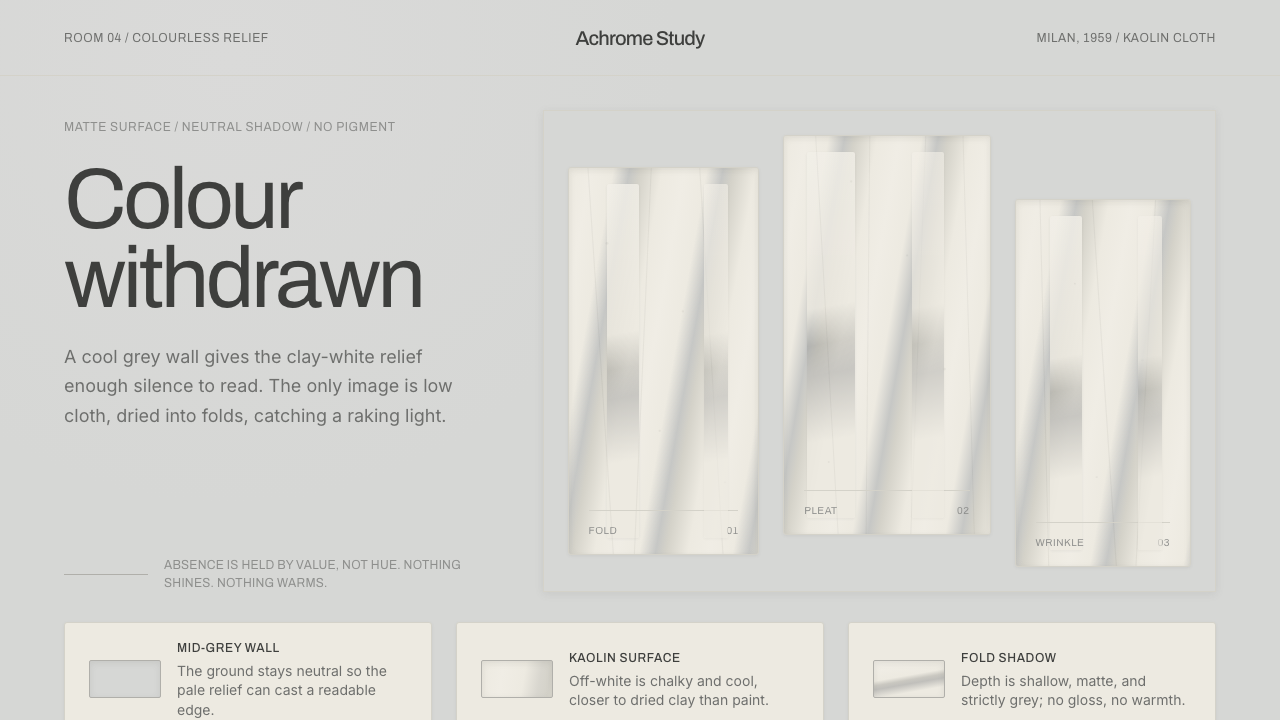 Piero Manzoni AchromeColour withdrawn. Kaolin off-white reliefs on mid-grey cast cool fold-shadows.
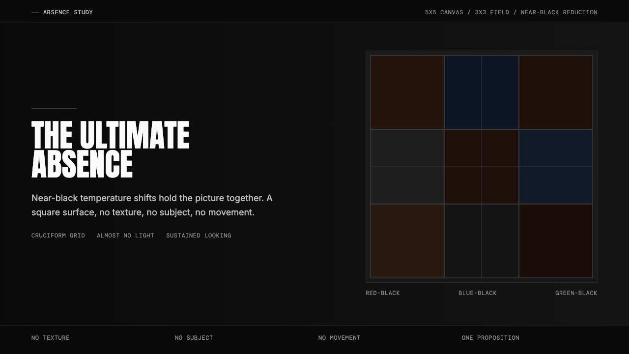 Ad Reinhardt Black Painting (1953)Austere absence. Near-black grid shifts reveal structure on sustained looking.
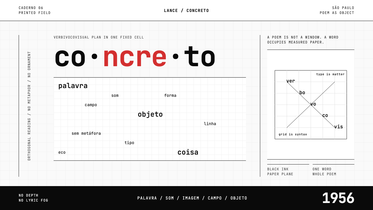 Brazilian Concrete PoetryWords become objects. Monospace cells, black-white paper, one cadmium red rup…
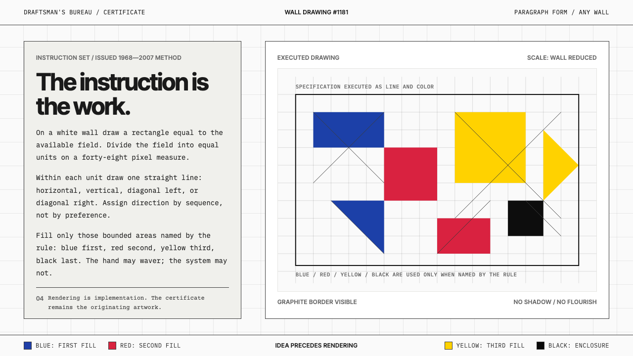 Sol LeWitt ConceptualInstruction becomes art. Mono certificates face wavering graphite grids in fo…
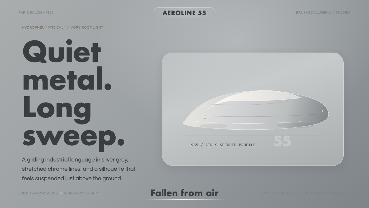 Citroën DSSilence made aerodynamic. Silver-grey ground, chrome hairlines, one long glid…
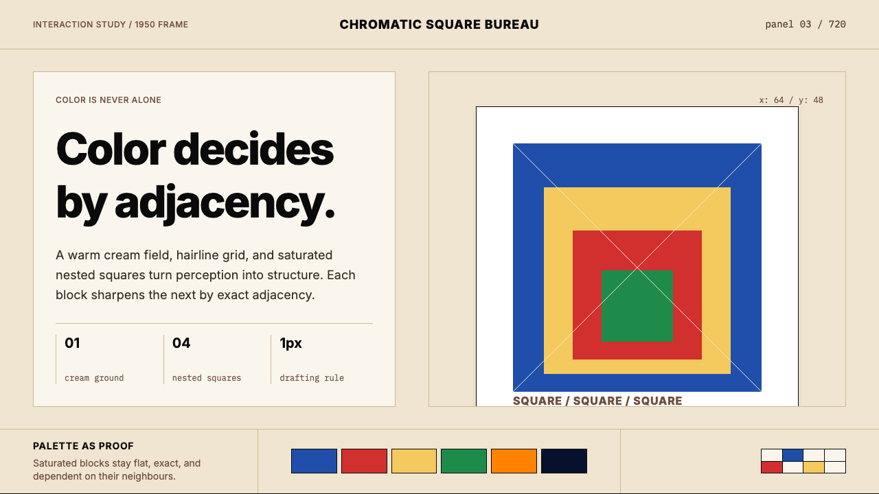 Josef Albers — Homage to the SquareColor becomes event. Warm cream, cobalt-red-yellow nested squares, exact hair…