What is Piero Manzoni Achrome?
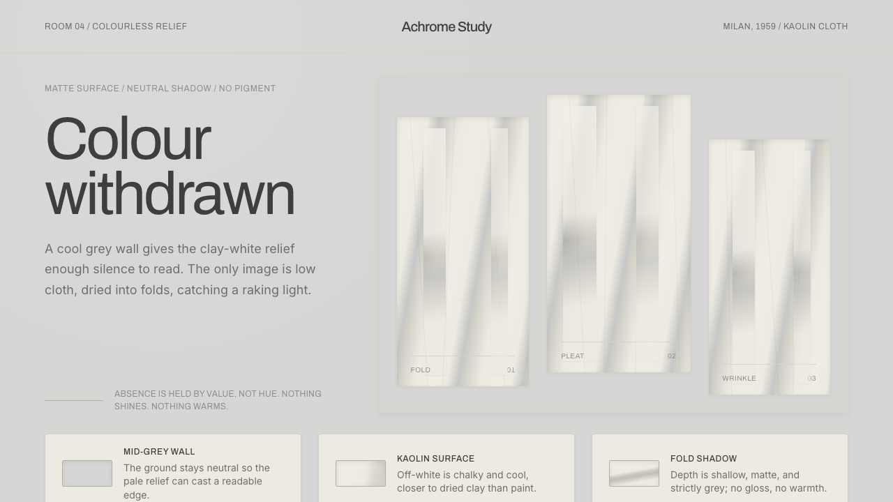
Achrome withdraws colour until material, fold, and shadow become the entire image.
Piero Manzoni Achrome in brief
Piero Manzoni Achrome takes its visual logic from the Achrome series made between 1958 and 1960. Manzoni soaked raw canvas in kaolin white clay, then allowed it to air-dry into wrinkles, pleats, and irregular folds. The result is not an image painted on a support. It is a pale, low-relief surface whose form emerges through its own drying process.
Achrome means colourless rather than simply white. Its off-white is matte, chalky, and porcelain-cool, never bright, creamy, decorative, or luminous. Under raking light, the folds cast restrained neutral-grey shadows. Set against a mid-grey wall, the relief becomes legible through small changes in depth, not through contrast, illustration, or expressive colour.
As an interface language, Achrome turns this withdrawal into a disciplined visual environment. A neutral grey field gives pale surfaces enough separation to read. Every panel carries the same kaolin-like calm; every shadow remains cool, quiet, and structurally useful. The objective is not emptiness for its own sake, but attention made possible by withholding visual noise.
Where does Piero Manzoni Achrome come from?
Achrome belongs to Piero Manzoni’s work in Milan, Italy, within the setting of Italian post-war modernism. The series is situated in an era marked in the source material as 1950–1990, while its defining kaolin-and-canvas works belong specifically to 1958–1960. That narrow material procedure gives the style its authority: raw canvas, white clay, air, gravity, and time are allowed to determine the surface.
The series is associated with the Azimuth group and with Nouvelle tendance and monochrome practice. These associations matter because Achrome does not use pale colour as a mood-setting background. It treats the removal of colour as the condition that lets surface become the subject. The canvas is not asked to represent an object, scene, or emotion; it is asked to reveal its own folds.
Manzoni’s choice of kaolin makes the work feel mineral rather than painterly. The material dries into a chalky, off-white skin, while the raw canvas remains present through the relief it produces. Light does not decorate the work from outside. It exposes the shallow peaks and recesses already embedded in the surface, allowing shadow to act as evidence of material form.
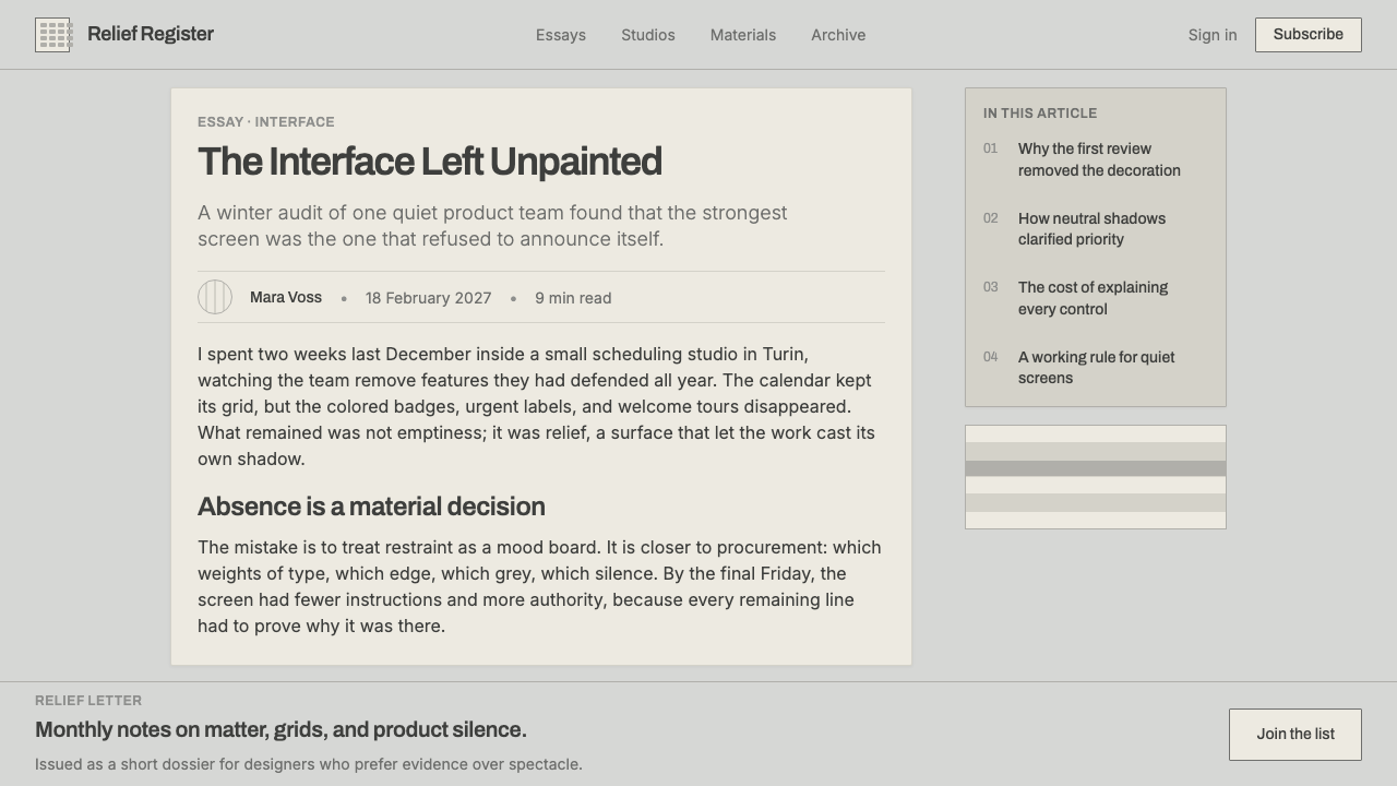
For contemporary design, this history should be understood as a method of restraint rather than a pale monochrome look to imitate casually. Achrome derives its force from the relationship between a mid-grey setting, an off-white relief, and neutral-grey shadow. If one of those relationships becomes glossy, warm, colourful, or theatrically dramatic, the system stops reading as an experiment in absence.
What defines the Piero Manzoni Achrome look?
Withdrawn Colour
Colour is withheld rather than replaced by decorative whiteness. The working range stays close to kaolin off-white, neutral mid-grey, and cool grey shadow. The pale surface should feel mineral and muted, with no saturated accent competing for attention.
Kaolin Surface
Surfaces are matte, chalky, and cool, closer to dried clay or porcelain than paper, paint, plastic, or polished stone. Their character comes from apparent material density and quiet irregularity, not from shine or visual richness.
Low Relief
Depth is deliberately shallow. Folds, seams, raised panels, and recessed areas should feel pressed into or lifted from one continuous field. The eye discovers form gradually, as it would across dried canvas, instead of encountering aggressive layers or floating objects.
Cool Neutral Shadow
Shadow is the system’s main instrument for separation, but it remains neutral and cool. It should describe a fold or edge with restraint, never imitate theatrical lighting, glossy elevation, warmth, or softness intended to make an interface feel luxurious.
Mid-Grey Field
The ground is neither blank white nor dramatic black. Mid-grey provides enough contrast for off-white reliefs and their shadows to remain visible, while preserving the muted continuity that makes the composition feel suspended and still.
Absence as Structure
The style gains clarity by refusing additions. Illustration, decorative colour, ornamental texture, and conspicuous gloss have no role unless they reveal material or hierarchy. Empty space is not leftover territory; it is the condition that allows relief and shadow to speak.

Who shaped Piero Manzoni Achrome?
Manzoni is the central figure of Achrome. Between 1958 and 1960, he used kaolin white clay and raw canvas to create air-dried folds and pleats, establishing an approach in which material process replaces painted depiction.
The Achrome series defines the visual reference: colourless off-white reliefs, matte and chalky in character, reveal themselves through folds and neutral-grey shadows under raking light rather than through conventional painted imagery.
Listed in the source material as an associated movement, the Azimuth group places Achrome within a Milan context connected to monochrome and Nouvelle tendance practice, where reduction is treated as an active artistic position.
How do you use Piero Manzoni Achrome today?
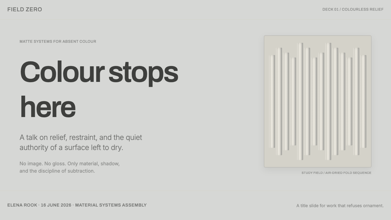
For presentation covers, use the mid-grey field as a quiet setting for one large off-white form, a restrained title, and a single relief-like division. The cover should feel discovered rather than announced. On content slides, keep information grouped into pale planes whose separation comes from cool shadow, subtle indentation, or folded-edge logic instead of coloured containers and decorative rules.
For data slides, Achrome works best when data is sparse, comparative, or observational. Let neutral value changes, spacing, and labelled structure do the explanatory work. Charts should read as quiet reliefs on the grey field, with emphasis created through one pale raised area or one deeper neutral shadow rather than through a rainbow of categories.
For web interfaces, the system suits dashboards, settings environments, libraries, and pricing pages where calm concentration matters. Use the grey ground to establish context, then place kaolin-like cards, fields, and sections as parts of a continuous material landscape. Active states should become slightly more present through edge, relief, or shadow, not through bright colour or glossy animation.
For editorial and marketing work, Achrome is strongest when the subject benefits from pause, tactility, or intellectual distance. It can frame a product story, collection, or long-form article with museum-like composure. The common mistake is treating the style as generic monochrome minimalism: pure white surfaces, warm shadows, dramatic black contrast, or shiny pale controls erase the specific relationship between kaolin relief, mid-grey ground, and cool neutral shadow.
Piero Manzoni Achrome — FAQ
Is Achrome simply a white monochrome style?
No. The source material describes Achrome as colourless rather than white. Its identity depends on a matte, chalky, porcelain-cool off-white in relation to a mid-grey setting and neutral-grey shadows. A bright white monochrome layout can be minimal, but it does not automatically carry the material logic of Achrome.
Why is the mid-grey background important?
The mid-grey ground gives off-white relief enough contrast to become visible without turning the composition into a stark black-and-white opposition. It also lets cool shadow remain legible as a structural cue. Against a white ground, the folds can disappear; against a dark ground, the work can become more dramatic than still.
Can this style use warm shadows or glossy surfaces?
They work against the supplied system. Achrome keeps shadows strictly neutral and cool, while the kaolin reference calls for a matte, chalky surface. Warmth and gloss introduce a cosmetic or luxurious effect that shifts attention away from folds, shallow relief, and the sensation of colour being withdrawn.
How should hierarchy work when colour is absent?
Use relief, edge definition, spacing, placement, and cool shadow. A section can become primary by appearing slightly raised, more clearly folded, or more isolated within the grey field. Hierarchy should feel like variation in material presence, not like an alert system demanding attention through contrast.
Related design styles
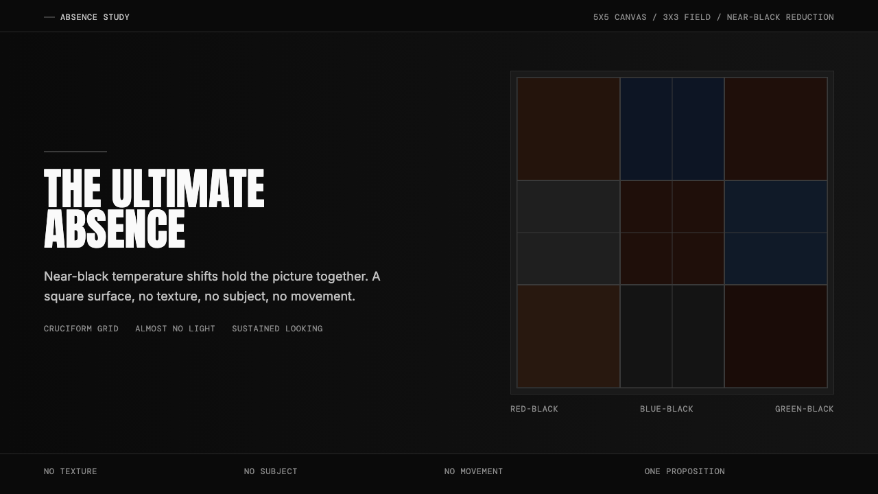 Ad Reinhardt Black Painting (1953)Austere absence. Near-black grid shifts reveal structure on sustained looking.
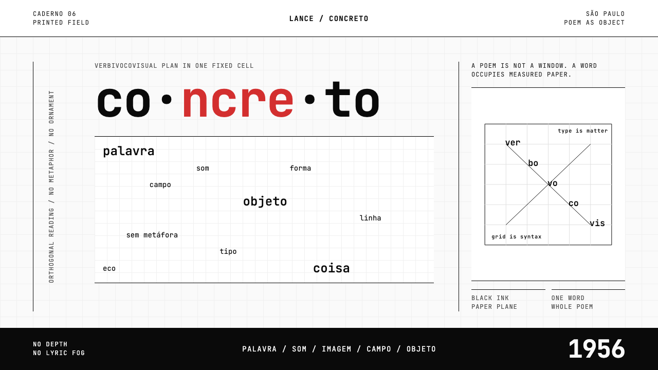 Brazilian Concrete PoetryWords become objects. Monospace cells, black-white paper, one cadmium red rup…
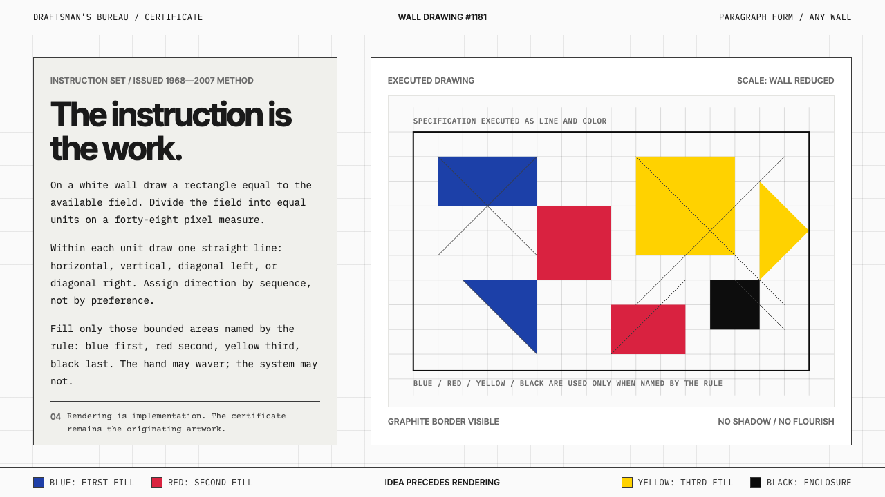 Sol LeWitt ConceptualInstruction becomes art. Mono certificates face wavering graphite grids in fo…
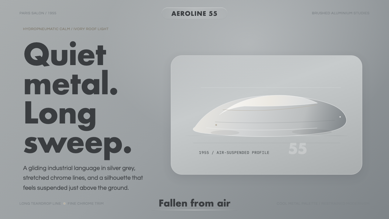 Citroën DSSilence made aerodynamic. Silver-grey ground, chrome hairlines, one long glid…
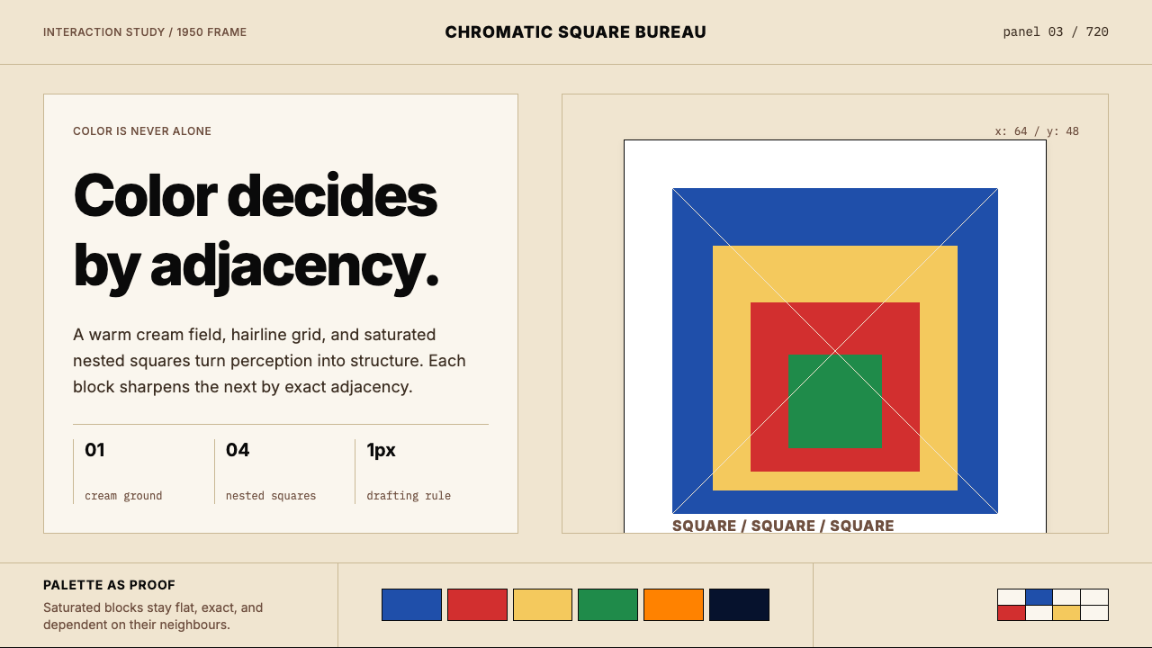 Josef Albers — Homage to the SquareColor becomes event. Warm cream, cobalt-red-yellow nested squares, exact hair…
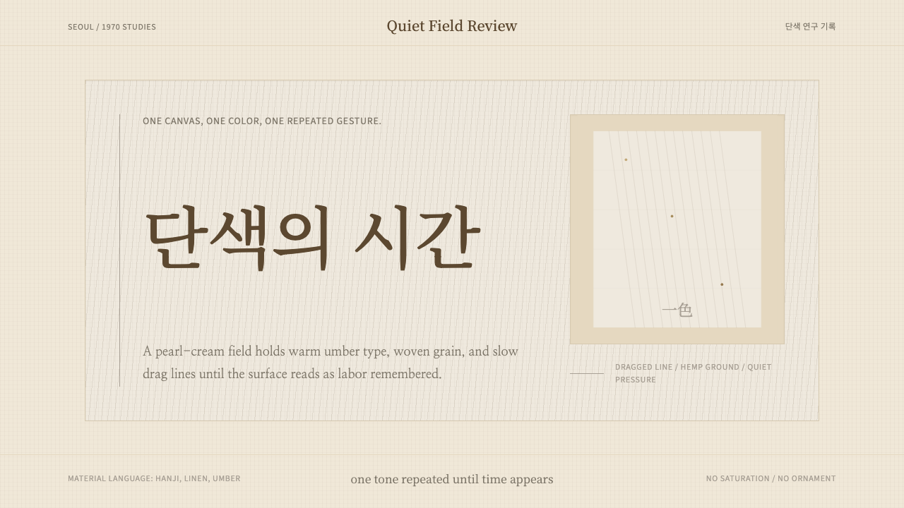 Korean Dansaekhwa MonochromeLabor becomes stillness. Umber serif type and drag lines on pearl cream.