What is Zambian Chitenge?
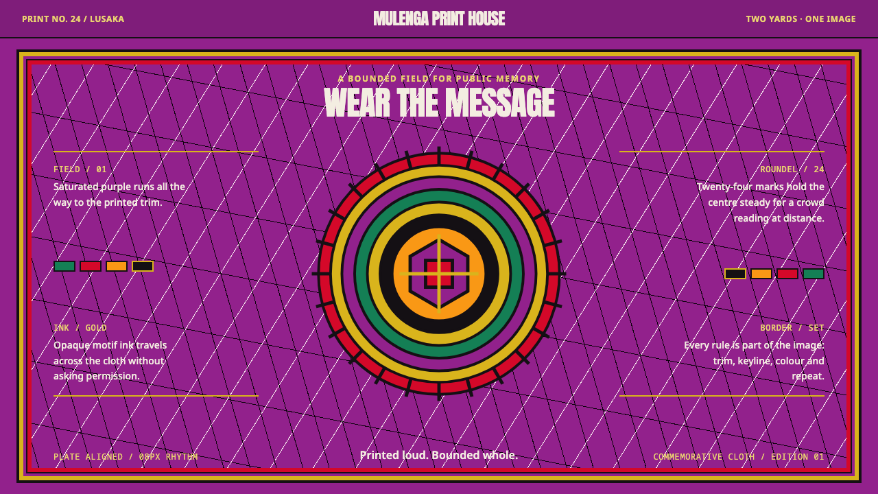
A chitenge is a cloth designed as one finished image — a saturated field, a gold motif, a portrait roundel at the center and a slogan curving overhead — and this style keeps that centered, bounded, unapologetically loud logic.
Zambian Chitenge in brief
Zambian Chitenge is a design style drawn from the commemorative chitenge, the wax-printed cotton cloth that Zambians wrap, wear, give and hang in their homes. A chitenge is sold as two yards of fabric, and the commemorative kind is designed as a single picture rather than a repeating swatch: the border is printed on, the color runs all the way to the trim edge, and no part of the cloth is left blank.
The classic layout is easy to describe. A magenta-purple field carries a gold motif that threads the pattern across the surface. A portrait roundel sits dead center, and its slogan curves overhead in an arc. When the cloth marks a national occasion, the colors of the Zambian flag — green, red, orange and black — are pressed in as flat, opaque blocks that clash with the field and with one another on purpose.
The style turns that cloth into four rules: centered rather than left-aligned, bounded rather than tiled, saturated rather than tasteful, printed rather than lit. The result is a dark, jewel-toned look in which every surface is claimed and every symbol speaks loudly, the visual equivalent of a public memory that refuses to whisper. It suits work meant to be seen across a room, worn by a crowd, or used to commemorate something rather than merely inform.
Where does Zambian Chitenge come from?
The chitenge belongs to the wax-print tradition, which reaches back to the late nineteenth century. In the usual telling, Dutch manufacturers set out to reproduce Indonesian batik by machine, using resin in place of hand-applied wax to resist the dye. The cloth never conquered its intended market, but it found a lasting one in West Africa, where buyers, traders and dressmakers adopted it, renamed patterns, assigned them meanings and gradually made the cloth their own. From there wax print traveled along trade routes across the continent, and by the twentieth century it was as much an African cloth as any woven in the region. The names Vlisco and ABC Wax, both recorded among the references for this style, belong to that history of industrial printing meeting local taste.
In Zambia the cloth is called chitenge (plural vitenge), and it is far more than yardage. It is wrapped at the waist as a skirt, folded into a head wrap, tied to carry a baby on the back, hung as a curtain or spread as a tablecloth, and handed over as a gift at weddings and other family occasions. It is also the starting point for tailored dresses, shirts and suits. A woman choosing a chitenge is choosing a message as well as a color: the pattern, the slogan and the occasion all speak to whoever sees it. Because the cloth is almost always seen folded, draped and moving with a body, its designs have to be bold enough to survive being bent around a person.
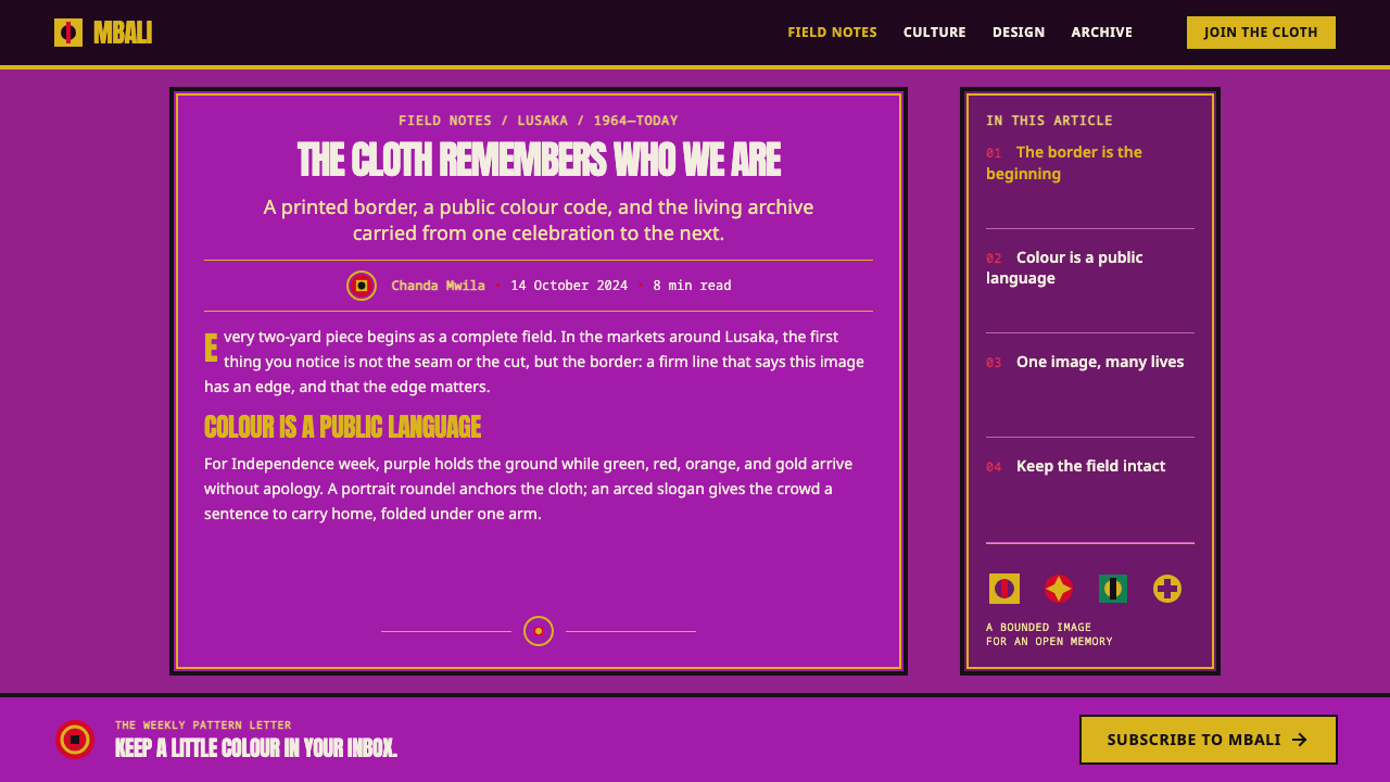
Commemorative cloth grew out of that habit of wearing the news. Independence-week dress is the clearest example. Zambia became independent in 1964 under Kenneth Kaunda, its first president, and national days came to be marked by cloth carrying a portrait, a slogan and the colors of the flag, printed in quantity so that a whole street could dress in the same picture. The source era for this style is the commemorative cloth of the 1990s and 2000s, when such pieces were part of everyday public life in Lusaka, Livingstone and the Copperbelt.
Zambia's own producers sit inside this story too. Mulungushi Textiles is among the Zambian names tied to the tradition in this style's reference record, a reminder that the commemorative chitenge is not simply an import with a local label: its subjects, slogans and flag colors are Zambian, even where the printing technique descends from the Dutch, Indonesian and West African line. That layering, a borrowed technique carrying a local subject, is what makes the visual language distinctive. It is bright, industrial, symbolic and deeply specific, all at once.
What defines the Zambian Chitenge look?
Centered and bounded composition
Everything organizes around the middle. The portrait roundel sits at the exact center, the slogan arcs above it, and the eye is pulled inward from a printed border rather than led across the page from a left margin. The cloth is a bounded object, one picture with an edge, not a swatch cut from endless pattern. Symmetry is the default, and any asymmetry has to be earned by a flag block or a motif that pulls the balance on purpose.
Saturated color field
The ground is a magenta-purple that runs to the trim edge with no white margin and no blank corner. It is saturated rather than tasteful: the color is chosen for presence, not restraint, and it gives the style its dark, jewel-toned character. There is no neutral resting zone. Contrast comes from what is printed on the field, not from leaving parts of it empty.
Gold motif
A gold motif carries the pattern across the purple, running in a rhythm that links the roundel to the border and gives the surface its connective tissue. Gold here is a printed color, flat and warm, not a glowing metallic highlight. It plays the role that line work plays in other systems: it organizes, outlines and ornaments at once, and it is the color most often reserved for what should be noticed first.
Flag-color blocks
On commemorative pieces the flag colors — green, red, orange and black — arrive as flat, opaque blocks pressed against the field. They are not blended, tinted or faded into one another, and the clash with the purple is intended. The blocks work like stripes on a banner: they mark identity first and decorate second, and each one is allowed to be a full-strength color.
Portrait roundel and arced lettering
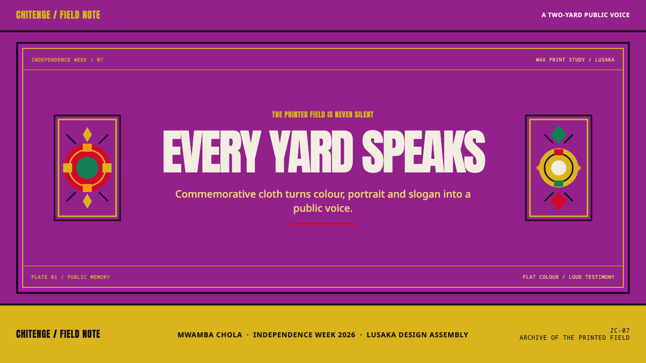
The portrait roundel is the cloth's focal device, a circular frame that holds a face or emblem. A slogan curves over it in an arc, so type behaves as inscription rather than running text: short, shaped to follow a form, and meant to be read at a distance. The lettering is heavy and declarative. It names the occasion and gives the cloth its voice, much as a monument carries its dedication.
Printed surface, not lit surface
Depth comes from the printing process, not from light. Edges are crisp, colors are flat, and the only texture is the kind a wax print produces: slight misregistration between colors, a faint crackle where the resin cracked in the dye bath, and a matte cotton surface. There are no soft shadows, glows or gradients. Where one layer needs to sit above another, it is overprinted, outlined or set in a contrasting block.
Who shaped Zambian Chitenge?
Kaunda led Zambia to independence in 1964 and served as its first president until 1991. He is the figure most closely tied to independence-era public life in Zambia, and cloth bearing a leader's portrait is a recognizable part of the commemorative genre. In this style he stands for the idea behind the portrait roundel: a national occasion given a face, printed on cloth and worn by the people who share it.
A Zambian textile producer named in this style's reference record. It matters here as the local side of a trade that is often told only through European and West African mills: cloth made in and for Zambia, carrying Zambian subjects. For design purposes it anchors the style in a place, so that the saturated field and the flag blocks read as national rather than as generic African wax print.
A Dutch wax-print house and probably the best-known name in the whole tradition. Its industrial resin-and-dye printing, which puts the same bold image on both faces of the cloth and leaves the fine crackle lines that collectors look for, defines what many people mean by genuine wax print. For this style, Vlisco stands for the technical lineage: flat, saturated, overprinted color with a built-in texture of cracks.
Another wax-print label recorded among the references for this style. Its presence beside Vlisco is a reminder that the chitenge look is a shared vocabulary across many makers and markets rather than the property of any one name. Designers borrowing from the style should treat it the same way: as a grammar of centered pictures, flat color and printed texture, not as a trademark to imitate.
How do you use Zambian Chitenge today?
Zambian Chitenge rewards designers who treat the screen as a cloth instead of a page. Start from a single centered image, give it a frame, fill the field to the edge, and let a few flat colors do the talking. The style is at its strongest when the work has something to commemorate, announce or celebrate, and at its weakest when it is asked to stay neutral.
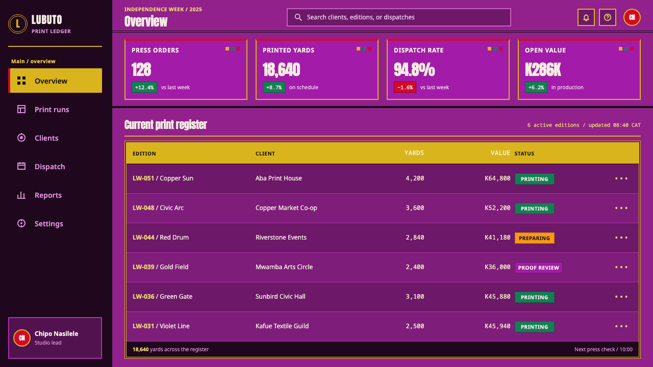
For presentation slides, the cover is the natural home of the style. Put a roundel or central emblem in the middle of a deep purple field, curve the title above it like a cloth slogan, and let a gold motif run along the border. Content slides can keep the same bounded frame, with text centered in a flat panel and no more than one flag-colored block as an accent. Data slides work best when charts are built from flat color blocks: bars or segments in the flag colors on the purple ground, one gold series for the headline figure, and labels in light, heavy type. Avoid gradients and glossy fills; a chart here should look printed.
For web interfaces, the style fits campaign sites, event pages, cultural platforms and marketing heroes better than dense tooling, but it can carry a dashboard or pricing page if the saturation is spent carefully. Use the purple field and gold motif for the frame and hero, set tier cards as flat, bordered blocks, and keep gold for the primary action. Reserve the flag colors for status and category markers so they stay meaningful. In data-heavy areas, give tables and forms calm, high-contrast panels inside the frame; the cloth can surround the work without being printed on every cell.
For editorial and marketing work, think of the cloth as a poster that happens to be wearable. A single central image, a curved slogan and a printed border make strong campaign covers, festival announcements, anniversary features and merchandise. Long-form text should leave the cloth logic at the margins: let the frame, the roundel and the section openers carry the style, and set the body in a plain, readable column. Because the cloth carries real national colors and often real faces, use flag colors and portraits only when the project is actually about the occasion they represent.
The most common mistake is to flatten the style into wallpaper: tiling the gold motif seamlessly, left-aligning everything, or softening the purple and the flag colors until they look tasteful. That removes exactly what makes a chitenge a chitenge. A second mistake is to add soft shadows, glows or glassy gradients, which replace printed depth with lit depth. A third is to use all four flag colors at equal weight in small interface elements, where the clash turns into noise; let one block lead, and let the others appear at the scale of banners.
Zambian Chitenge — FAQ
What exactly is a chitenge?
A chitenge is a rectangular cloth of wax-printed cotton, sold as about two yards, that is worn, wrapped, carried and gifted across Zambia. It can be a skirt, a head wrap, a baby carrier, a curtain or the raw material for tailored clothes. The commemorative kind that inspires this style is designed as one complete picture, with a printed border, a central portrait roundel and a slogan, rather than as repeating yardage.
Is this the same as Ankara or African wax print?
They are related, not identical. Ankara is a widely used name for wax-print fabrics in West Africa and beyond, and the Zambian chitenge belongs to the same industrial tradition. The difference this style captures is the commemorative layout: where much wax print is a repeating pattern meant to be cut and sewn, this style follows the cloth designed as a single bounded image with a portrait, a slogan and flag colors.
Why is the style centered and bounded instead of tiled?
Because the cloth it is based on is. A commemorative chitenge is composed like a poster: the border is printed in, the center of gravity sits at the roundel, and the slogan arcs above. Tiling would turn it into generic pattern and remove the focal portrait. Treating the layout as a framed picture keeps the sense of occasion that the cloth exists to carry.
Can it work on a light background?
The style is built on a saturated purple field and reads as dark, so a fully light version is really a different design. If you need a light surface for readability, keep the purple as the frame, hero or header, and place text on contained cream or white panels set inside that frame, edged with the gold motif. The purple should still reach the edge of the layout.
Is it appropriate to use flag colors and portraits?
Use them with care. The flag's green, red, orange and black, and the faces on commemorative cloth, are national symbols with real meaning, so they belong in work that is genuinely about the occasion or the country. For other projects, borrow the structure instead: the centered roundel, the arced slogan, the flat blocks and the saturated field, with colors and a central emblem of your own.
Related design styles
 South African Ndebele House PaintNoon color, hard border. Vermilion, cobalt, mustard and emerald lock into a w…
 Mexican Día de Muertos (Marigold Ofrenda)Joy outruns mourning. Marigold orange and magenta lattice blaze on velvet pur…
 Bissau-Guinean Pano de PenteIndigo remembers. Narrow bands and kaolin seams turn weave grammar into pixel…
 Fon Applique Banner AbomeyRoyal cloth speaks plainly. Flat saffron, green and indigo silhouettes on bla…
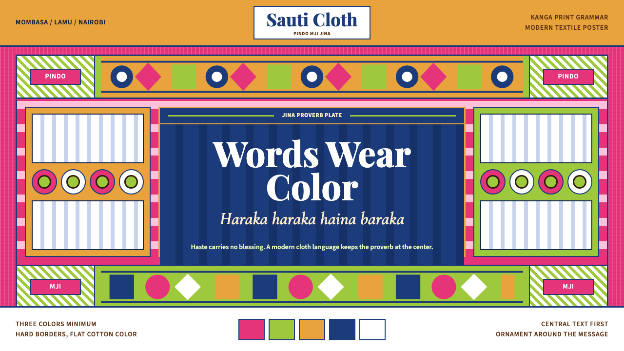 Kenyan Kanga PrintText speaks first. Hot pink ground, lime pindo border, indigo italic proverb…
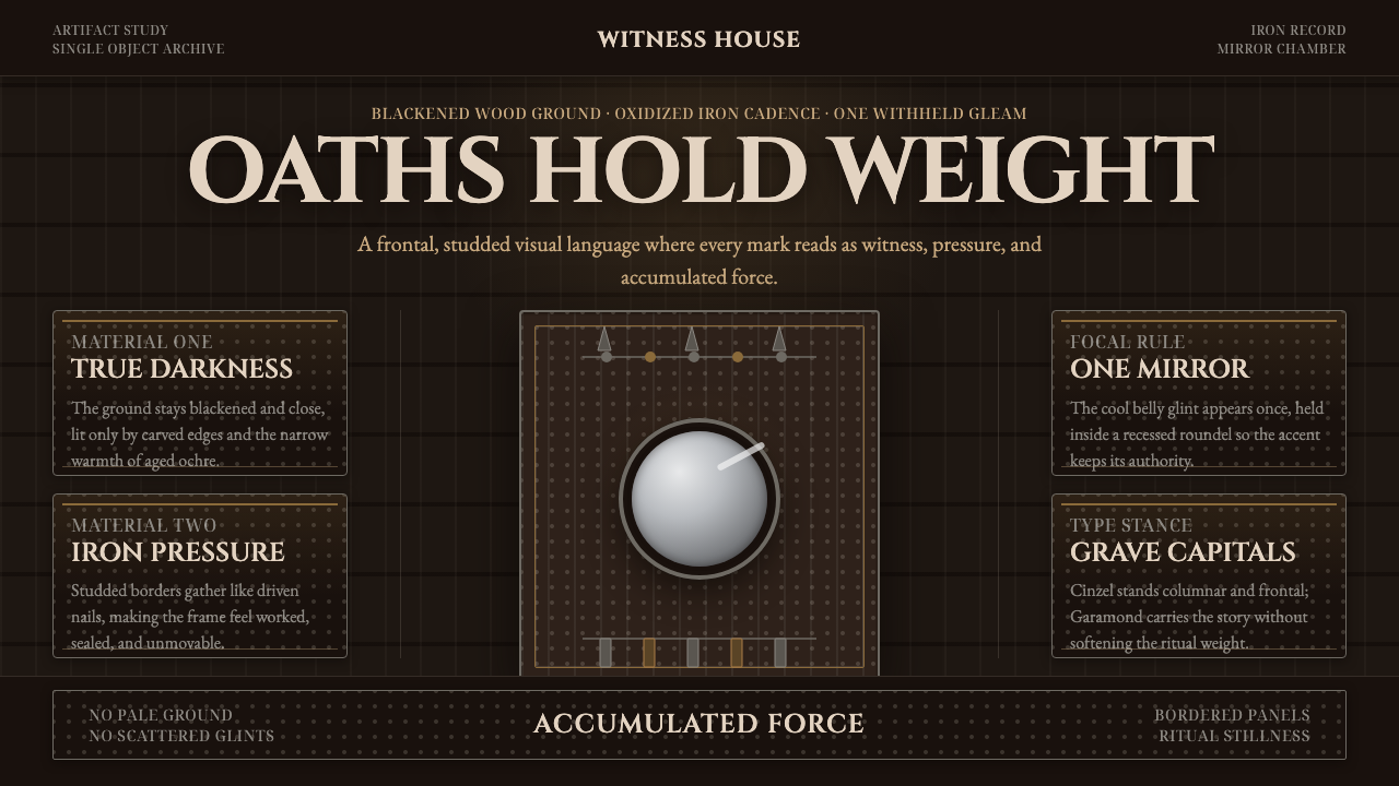 Kongo Nkisi Nkondi FigurePower accumulates in darkness. Black wood, iron studs, and one mirror glint h…