What is NSK / Laibach Retro-Avantgarde?
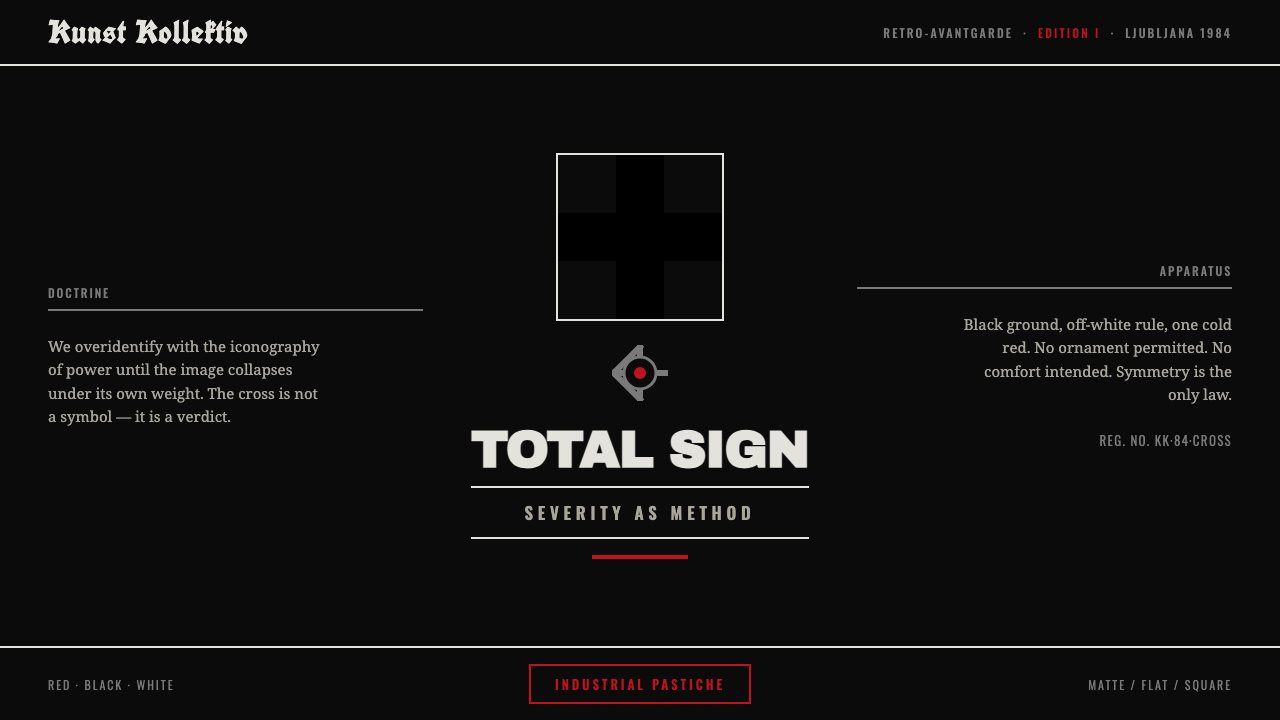
NSK and Laibach turn the visual language of authority against itself: a black cross on matte black, held in rigid symmetry and cut by a single cold red wound.
NSK / Laibach Retro-Avantgarde in brief
Neue Slowenische Kunst, usually known as NSK, and its musical core Laibach developed a severe retro-avantgarde visual language in socialist Slovenia from 1984 onward. Its basic field is dark, spare, and confrontational: matte black dominates, white is used for legibility or graphic interruption, and a cold blood-red accent appears with unusual restraint. The most recognizable emblem is a black cross derived from the visual legacy of Malevich, often joined by an industrial cog. These signs do not decorate a surface; they occupy it like official marks.
The style works through appropriation and pressure. It borrows the posture of institutional power—monumental symmetry, heavy rules, emblematic insignia, stencil-like grotesque lettering, and strict black-red-white contrast—then presents that posture so forcefully that its authority becomes unstable. The result is totalitarian pastiche in the critical sense: imagery associated with command, discipline, industry, and collective identity is repeated until the viewer must notice how it operates.
Visually, NSK / Laibach Retro-Avantgarde feels less like an illustration system than a controlled public environment. Album sleeves, concert backdrops, gallery walls, and posters become sites of visual command. Empty matte-black space is not neutral atmosphere; it is a field of restraint. A central cross, cog, wordmark, or rule is allowed to carry disproportionate weight. The style avoids warmth, softness, and decorative relief because each would weaken the sensation that the image is issuing an order while also exposing the machinery behind that order.
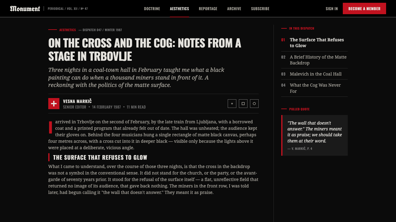
Where does NSK / Laibach Retro-Avantgarde come from?
The origin of this language lies in Ljubljana, Slovenia, within the Yugoslav socialist period from 1950 to 1990. NSK emerged in 1984 as a collective framework, with Laibach as its musical core and Irwin among its key figures. Rather than presenting a forward-looking modernism in a simple sense, the group worked through retro-avantgarde: a return to earlier radical visual forms, deliberately brought into contact with the symbols and atmosphere of political authority.
The Malevich-derived black cross is central to that method. It links the style to Suprematism as an appropriated source rather than a neutral historical reference. On a matte-black ground, the cross becomes difficult, dense, and emblematic rather than airy or purely abstract. Its repetition across concert backdrops, album sleeves, and gallery contexts gives it the force of a collective sign. The industrial cog extends this vocabulary toward labor, machinery, and the impersonal visual rhetoric of organized production.
Laibach's industrial music and NSK's art practice share the same severity. Their visual system rejects the sentimental cues that often make cultural work feel intimate or comforting. Instead, it favors controlled confrontation: symmetry that can feel ceremonial, black fields that absorb context, thick structural divisions, and type that appears stamped or issued. The language is severe because its subject is not private expression alone, but the public force of images that claim to represent order.
This is why the term retro-avantgarde is more useful than a simple label such as dark modernism. The style does not merely look historical, industrial, or authoritarian. It stages those visual traditions as material for interrogation. Its signs are recognizably forceful, but their force is never offered as uncomplicated endorsement. The viewer is asked to confront the seduction of coherence, discipline, and symbolic power—and to notice how easily visual certainty can become a political performance.
What defines the NSK / Laibach Retro-Avantgarde look?
Matte Black Field
Matte black is the governing ground, not a background chosen merely for drama. It absorbs decorative noise, suppresses atmosphere, and makes every remaining sign appear intentional. The field should feel dense and non-reflective, allowing black-on-black forms to emerge through edge, material contrast, or placement rather than through soft lighting effects. Cream, warmth, and inviting neutrality are fundamentally outside the system.
Black Cross and Cog
The Malevich-derived black cross is the signature motif, with the industrial cog functioning as a companion sign. Both are reduced to blunt, emblematic silhouettes. They should read immediately at a distance, then become more unsettling on inspection because their apparent certainty carries historical and political weight. Their power comes from repetition, frontal placement, and restraint—not from elaborate rendering or ornamental detail.
Cold Red Accent
Red is used as a wound, a signal, or a rupture in an otherwise black-white order. It is never a soft balancing color and should not spread into a cheerful palette. A single red mark can divide a field, identify a command, puncture a symmetrical composition, or make a word appear dangerous. Its rarity is essential: red gains force because it interrupts a visual regime built on darkness and discipline.
Symmetry and Heavy Rules
Compositions rely on frontal symmetry, centered emblems, and thick structural rules. This is not calm classical balance. It is ceremonial and coercive, as though the page has been organized by an institution rather than by an individual. A design may use a centered cross or wordmark, mirrored masses, and strong horizontal or vertical divisions, but every axis should increase tension rather than offer comfort.
Stencil Grotesque Type
Typography should feel issued, stamped, or industrially marked. Stencil grotesque forms are especially appropriate because their interruptions and blunt construction suggest utility, signage, and institutional production. Type is treated as a structural object rather than a voice of personal intimacy. Dense capitals, emphatic alignment, and stark spacing can make language feel declarative, while decorative scripts or refined luxury lettering dissolve the necessary severity.
Totalitarian Pastiche
The defining principle is critical distance. The style borrows the iconography and discipline of authority, but its purpose is to interrogate that authority rather than simply celebrate it. This requires precision. If the work becomes playful, it loses pressure; if it becomes merely admiring, it loses critique. The strongest applications let the imagery feel commanding while making the viewer conscious of the command's constructed nature.
Who shaped NSK / Laibach Retro-Avantgarde?
Laibach is the musical core of NSK and a defining carrier of the retro-avantgarde language from 1984 onward. Its use of severe black grounds, emblematic marks, industrial atmosphere, symmetry, and cold red accents gives the visual system a public, performative force. In concert and album contexts, the imagery functions as more than branding: it establishes an environment in which the iconography of power can be staged and questioned.
Irwin is identified as a key figure within NSK. In the collective context, its significance lies in sustaining the visual and artistic dimension of retro-avantgarde: appropriated Suprematist reference, severe emblematic composition, and the deliberate use of historical authority as critical material. Irwin helps make clear that NSK is not only a musical identity, but a broader cultural system of images, symbols, and staging.
The NSK collective provides the framework in which Laibach, Irwin, and the retro-avantgarde approach operate together. Its importance is conceptual as much as organizational. By making collective identity part of the work, NSK intensifies questions of institution, command, representation, and authority. The resulting visual language gains its force from acting like a system—coherent, impersonal, recognizable, and open to critical reading.
How do you use NSK / Laibach Retro-Avantgarde today?
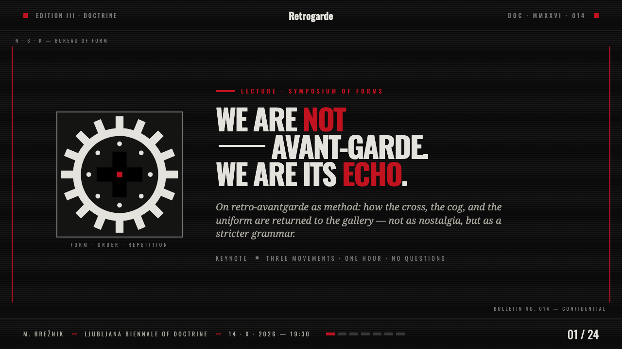
For presentation covers, this style is strongest when the composition behaves like a proclamation. Use a matte-black field, one central or near-central emblem, and a title that reads as an issued statement rather than an invitation. A black cross may emerge from the field through material contrast, while a cold red line, word, or marker creates the only decisive interruption. Content slides should retain the same discipline: clear axes, heavy rules, limited text blocks, and typography that appears structurally placed rather than casually arranged.
Data slides can use the same vocabulary without turning information into decoration. Treat charts as institutional diagrams: strong black or white masses, simple categories, emphatic divider lines, and red reserved for the critical comparison, warning, or active measure. Avoid colorful series, soft panels, or friendly pictograms. The goal is not to imitate propaganda, but to make the visual hierarchy unmistakable and to preserve the tension between apparent command and critical reading.
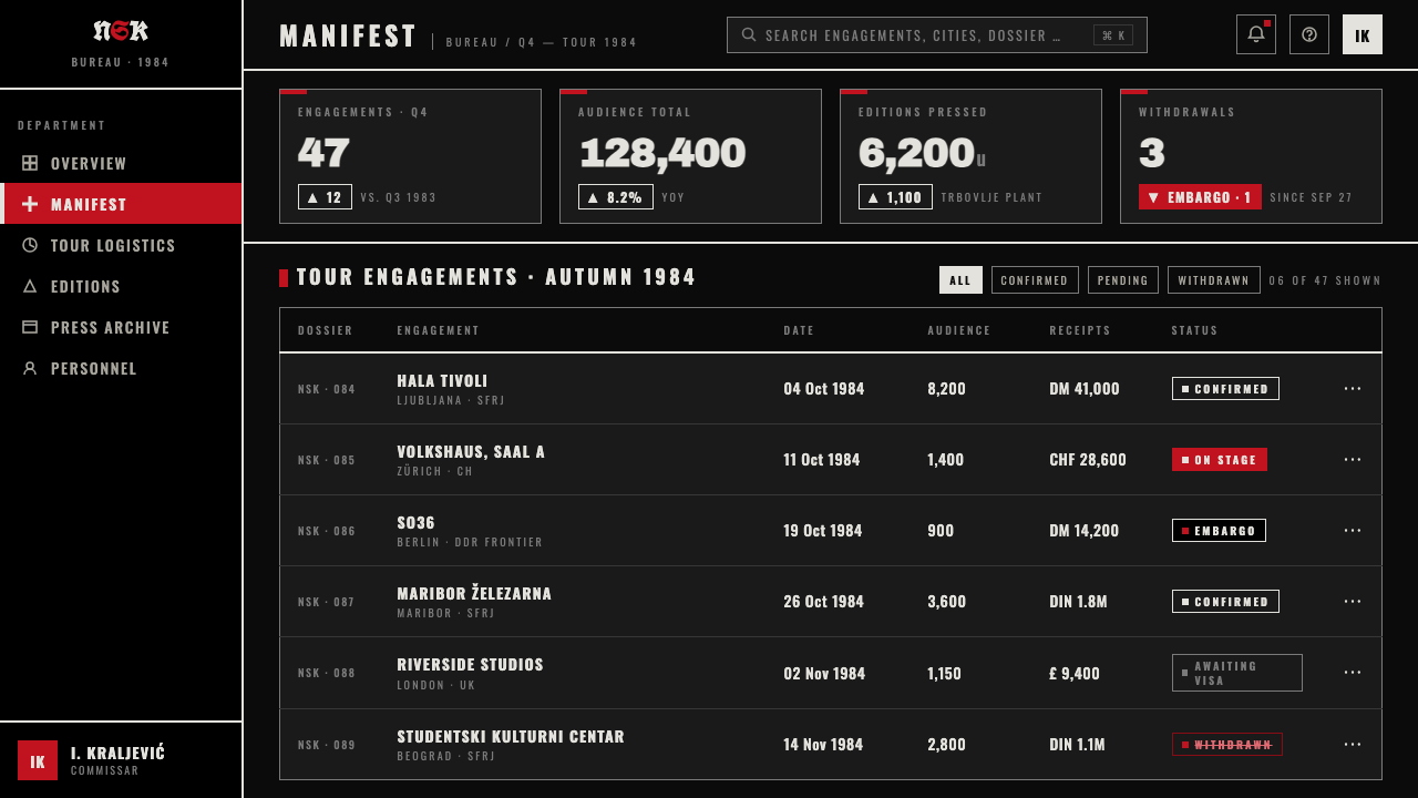
For web interfaces, the style suits cultural archives, music releases, exhibition platforms, editorial databases, and dashboards where a severe public character is appropriate. Navigation can be typographic and emphatically aligned; cards may be replaced by bordered fields or stark divided modules; the black cross or cog can operate as an orientation device rather than a decorative logo. In pricing or membership pages, the language can clarify hierarchy through monumental plan names and strict comparison columns, provided the experience remains readable and does not obscure essential choices behind theatrical darkness.
For editorial and marketing work, use the approach to frame a campaign, manifesto, exhibition announcement, or long-form cultural feature. Large black sections, controlled white text, stark image cropping, and a single red interruption can make the work feel like an artifact from an institutional archive. Keep photographs and illustrations subordinate to the system: crop them hard, isolate their structural forms, and use them as evidence or confrontation rather than atmosphere. The style is most persuasive when the subject genuinely concerns systems, ideology, industrial culture, or the politics of public images.
The common mistake is to mistake this for generic dark branding. Adding red splashes everywhere, distressed textures, random military references, or ornamental gothic type turns critical retro-avantgarde into costume. Another mistake is treating the black cross as an interchangeable edgy icon. The system depends on restraint, symmetry, institutional force, and critical intent. If the work does not make viewers feel both the attraction and the constructed danger of authoritative imagery, it has copied the surface while losing the argument.
NSK / Laibach Retro-Avantgarde — FAQ
Is NSK / Laibach Retro-Avantgarde simply an industrial music aesthetic?
No. Industrial music and art are named sources for the movement, and Laibach is NSK's musical core, but the visual language reaches beyond a genre identity. It is a collective system of symbols, staging, graphic discipline, and critical appropriation. The same black cross, cog, symmetry, and institutional tone can operate on a concert backdrop, an album sleeve, or a gallery wall because they address the iconography of power rather than only the sound of a band.
Why is the black cross difficult to use well?
Because it is not a neutral decorative motif. In this visual system, the Malevich-derived cross carries the weight of appropriation, abstraction, authority, and critical distance. Used casually, it can become an empty sign of darkness or provocation. Used within a restrained matte-black field, with symmetry and a carefully limited red accent, it can retain the ambiguity that makes the style meaningful: it appears authoritative while inviting scrutiny of authority.
Can the style use more than black, white, and red?
The approved visual language is defined by black-red-white contrast, with matte black as the dominant ground and cold blood-red as the decisive accent. Adding a broad secondary palette weakens the system because it distributes attention away from its central tension. If a design needs more differentiation, use scale, placement, rules, spacing, and shifts between black and white fields before introducing additional color.
When should a designer avoid this style?
Avoid it when the product needs softness, trust through warmth, playful sociability, or emotionally reassuring interaction. The style's force comes from severity and from its engagement with the iconography of power; using it for an unrelated cheerful campaign can turn its critical language into empty spectacle. It is most appropriate when the subject can sustain its pressure: music, art, political imagery, archives, industrial culture, exhibitions, or editorial work about systems and authority.
Related design styles
 Dadaism (Zürich 1916)Chaos is the grammar. Aged newsprint, stamp red, Prussian blue, and tilted ty…
 Grunge (Carson 1993)Carson's anti-rules, photocopied. Oxblood on charcoal, distressed type, delib…
 Peter Saville / Factory RecordsAnti-design becomes high art. Void black, white pulsar lines, and FAC mono la…
 Acid Rave Laser Show 1992Beams cut the void. Argon green on pitch-black smoke, pixel marquee type, add…
 Akira (Otomo)Cyberpunk at impact. Kaneda red, cyan kanji, halftone concrete, and diagonal…
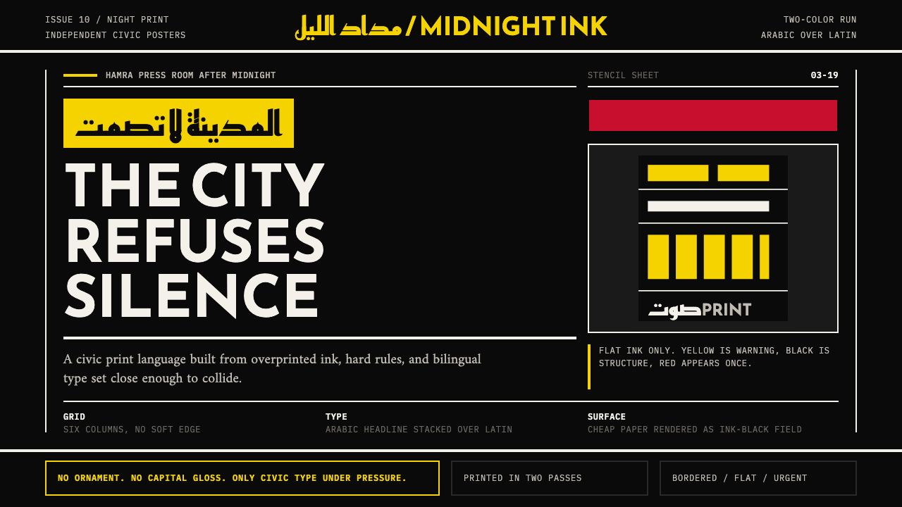 Beirut Indie Graphic DesignCivic type as protest. Sulfur yellow Arabic blocks collide with ink-black pos…