What is Yohji Grisaille?
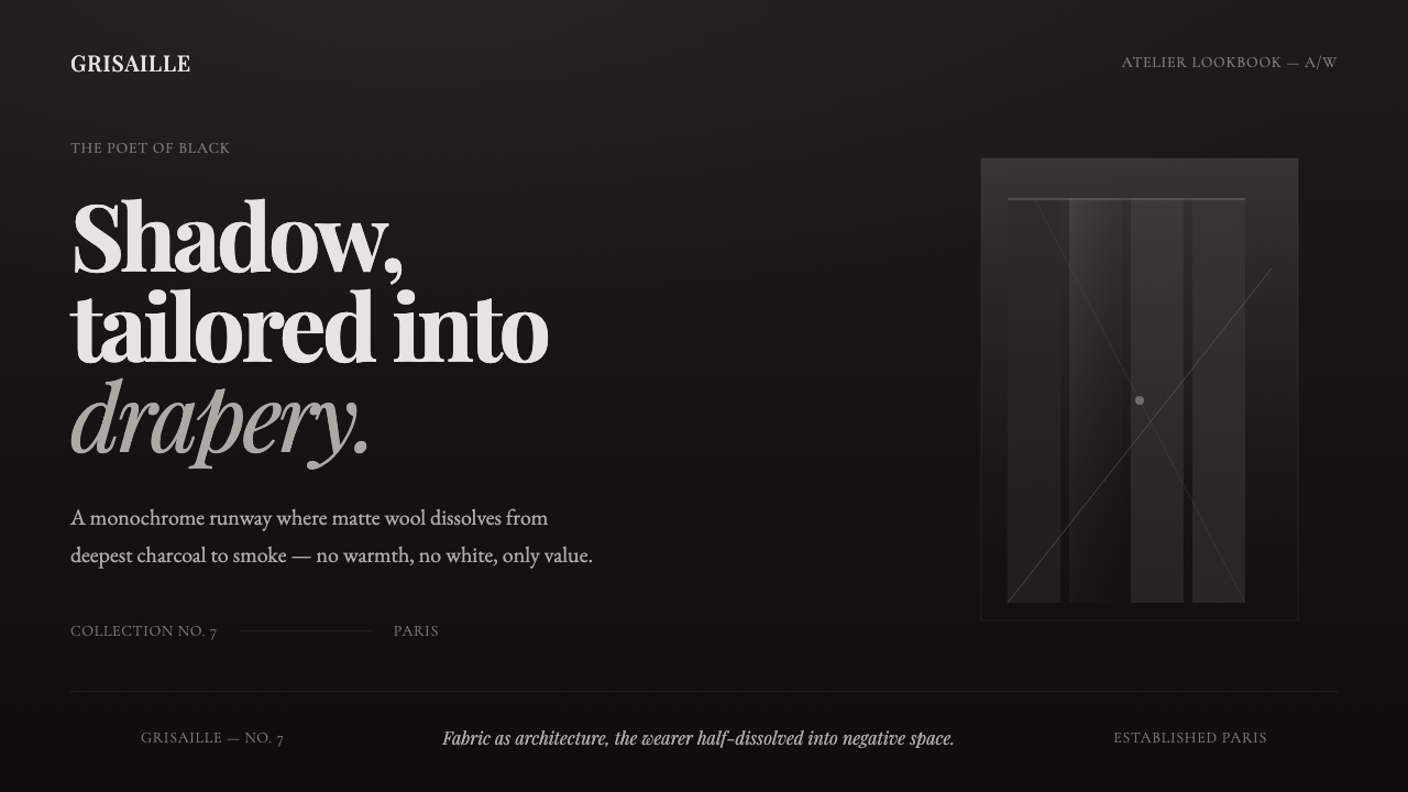
Yohji Grisaille turns the poet of black into a screen: a near-black runway field where smoke-gray layers carry the weight of draped matte wool.
Yohji Grisaille in brief
Yohji Grisaille is a dark editorial style distilled from Yohji Yamamoto’s draped, asymmetric, oversized tailoring during his Paris runway era from 1990–2010. It does not imitate a garment literally. Instead, it translates the visual atmosphere around the garment: black as a field, gray as a fold, emptiness as a deliberate part of the composition.
The screen reads like a smoky runway or a restrained fashion lookbook. Near-black grounds establish depth without becoming theatrical, while charcoal and smoke-gray layers suggest the changing planes of matte wool. The result is monochrome rather than merely dark: every visible tonal shift belongs to one cool-neutral shadow family.
Its restraint is essential. There is no warmth, no glossy richness, and no pure white breaking the field. Vast negative space creates distance around text and imagery, while spare editorial serif typography gives the composition the measured, contemplative presence of a fashion page rather than a conventional interface.
Where does Yohji Grisaille come from?
The style begins with Yohji Yamamoto’s position as the poet of black. In the Paris runway era from 1990–2010, his visual language was defined here by drape, asymmetry, and oversized tailoring. These are not decorative gestures. They make the body, the fabric, and the surrounding space read as an uneven composition whose meaning changes through shadow.
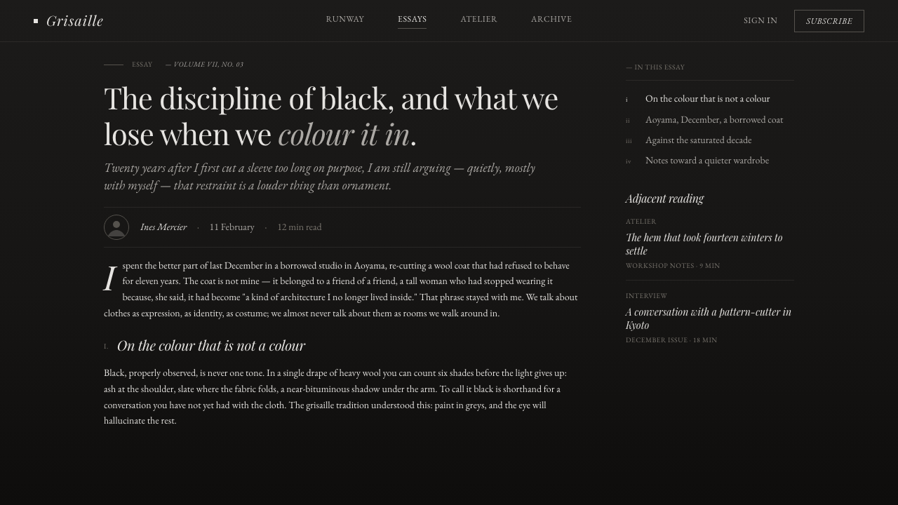
Yohji Grisaille draws its palette logic from that tailoring. Matte wool does not communicate through shine or bright contrast; it reveals itself through folds, recesses, and soft changes between charcoal and smoke. The digital style treats those gray transitions as the primary visual material, allowing an interface to feel constructed from fabric-like depth without simulating fabric texture.
Its cultural frame is Japanese avant-garde and anti-fashion, presented through the Paris runway. The opposition matters: the work refuses easy glamour, conventional polish, and decorative abundance. Darkness is not used as a luxury backdrop for bright objects. It is the environment in which form becomes legible only through restraint.
Editorial grisaille provides the final translation layer. Grisaille reduces an image to tonal relations rather than local color, and this style applies that discipline to screens. A title, a panel, a photograph, or a pause of empty space must all earn their place through value, proportion, and atmosphere. The visual system remains quiet because its drama is carried by tonal pressure, not by ornament.
What defines the Yohji Grisaille look?
Near-Black Field
The background is not a neutral absence. It behaves like the runway field around a Yohji look: deep, smoky, and deliberately unrevealing. It holds the composition together while allowing gray surfaces and serif text to emerge gradually rather than arriving as hard, bright statements.
Cool Grisaille
Charcoal through smoke-gray creates the visible range. These tones are cool-neutral and related, not a collection of separate accent colors. Their purpose is to articulate layers, folds, hierarchy, and pause. No warm note enters to soften the mood, and no pure white claims visual dominance.
Draped Asymmetry
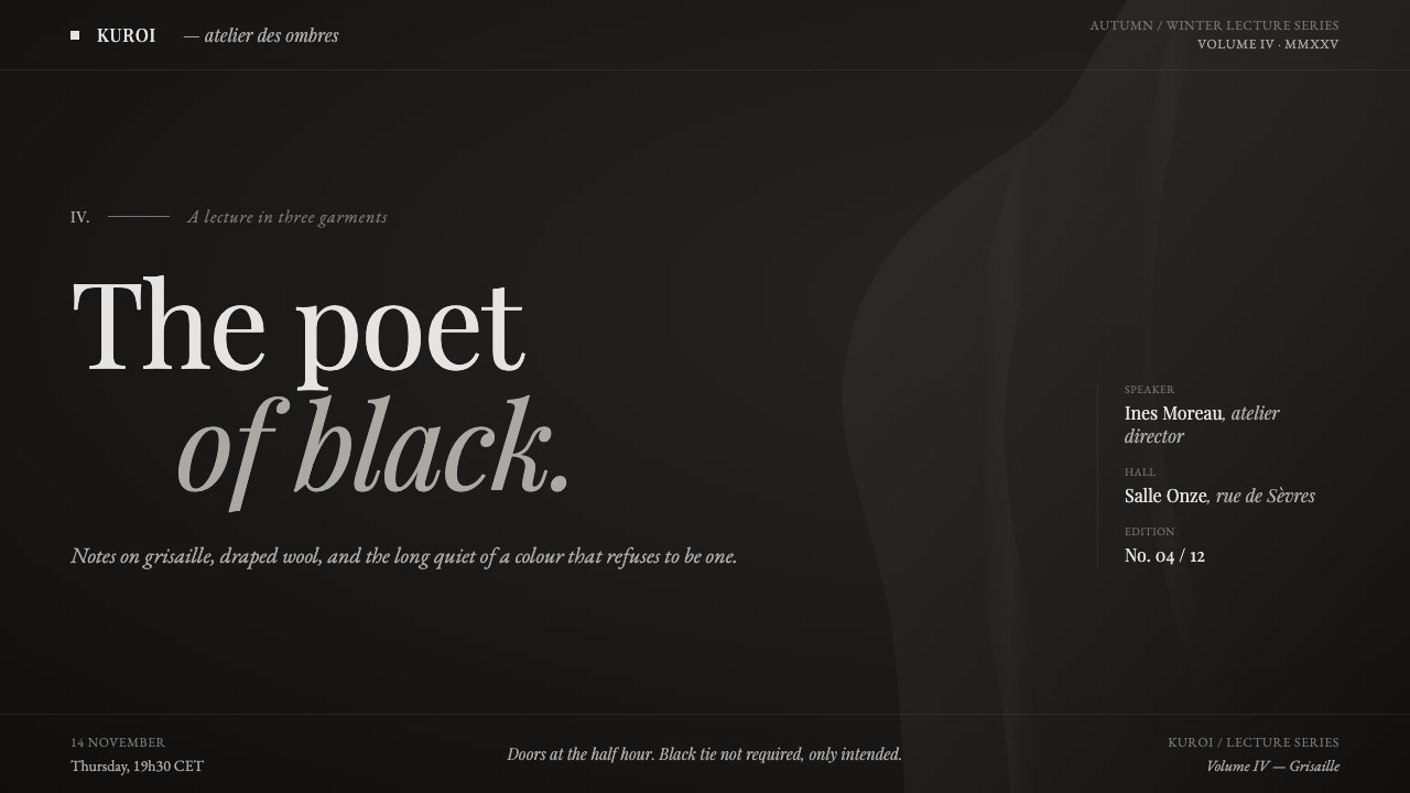
Layouts should feel weighted rather than centered. A large quiet region may sit beside a compressed text block, or a panel may appear slightly displaced from an expected alignment. The asymmetry should resemble fabric falling under its own weight: composed, intentional, and never mechanically decorative.
Editorial Serif
Serif typography carries the style’s literary and lookbook-like voice. It should be spare, spacious, and treated as an editorial presence rather than a dense utility layer. The type does not need ornamental flourish; its authority comes from measured placement against darkness and from the silence surrounding it.
Matte Depth
Depth comes from tonal recession, not shine. Surfaces should suggest the folds of matte wool through subtle charcoal-to-smoke separation, with edges that can soften into the field instead of insisting on polish. The visual effect is tactile in mood but remains abstract and screen-native.
Austere Negative Space
Empty space is not a gap to be filled with imagery, controls, or decoration. It is the counterpart to oversized tailoring: an expanse that lets the visible material breathe and makes each interruption consequential. A dense composition weakens the style because it removes the tension between presence and absence.
Who shaped Yohji Grisaille?
Yohji Yamamoto is the sole named figure behind the style’s source language. His Paris runway work from 1990–2010 supplies its defining cues: draped construction, asymmetry, oversized tailoring, black as a primary field, and the austere emotional distance that Yohji Grisaille translates into a screen system.
Japanese avant-garde and anti-fashion provide the style’s critical posture. In Yohji Grisaille, this becomes a refusal of decorative warmth, easy glamour, and visual excess. The screen is allowed to be difficult, quiet, and shadowed, because restraint is treated as meaning rather than as missing content.
The Japanese black school establishes black as an active visual language rather than a default backdrop. Yohji Grisaille extends that premise into interface composition: black contains space, gray reveals form, and every lighter element must justify why it interrupts the field.
How do you use Yohji Grisaille today?
For presentation covers, Yohji Grisaille works best when the title is treated like an editorial inscription on a dark runway field. Give the serif headline room to stand apart from supporting information, and let a smoke-gray plane or cropped monochrome image establish the visual weight. The cover should feel more like an opening look than a summary of every topic inside it.
Content slides should preserve the same measured hierarchy. Use near-black as the continuous field, reserve lighter gray for the current point of attention, and leave broad quiet margins around copy. Data slides can use tonal contrast to distinguish major values from secondary ones, but they should remain diagrammatic and subdued rather than becoming bright analytical displays.
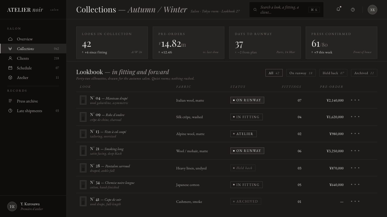
For web interfaces, the style is especially suited to portfolios, archives, fashion editorial experiences, and premium dashboards whose value lies in reflection or curation. A dashboard can use charcoal surfaces to separate modes and smoke-gray text to surface supporting context, while the principal action remains rare and deliberate. Pricing pages should foreground atmosphere and hierarchy rather than competing badges, warm reassurance, or crowded conversion signals.
In editorial and marketing work, use the style to create a sequence of pauses. Long-form stories can alternate dense serif passages with image-led voids, while campaign pages can frame a collection, film, or object as a study in silhouette and shadow. The voice should remain observational and precise; every image and line of copy should feel selected rather than accumulated.
The common mistake is mistaking Yohji Grisaille for generic dark luxury. Adding warm metallic accents, pure-white text everywhere, glossy surfaces, or dense ornamental details breaks the monochrome shadow system. Another mistake is making asymmetry look random. The layout should feel displaced by weight and drape, not scattered for visual novelty.
Yohji Grisaille — FAQ
Is Yohji Grisaille simply a black-and-gray version of luxury design?
No. Generic dark luxury often depends on glossy contrast, bright highlights, warm metallic cues, and obvious display of status. Yohji Grisaille is more austere. Its near-black field, cool grisaille range, and editorial serif voice are meant to create distance, weight, and contemplation rather than shine or opulence.
Why does the style avoid pure white?
Pure white would interrupt the smoky continuity that makes the screen resemble a field of shadow and matte folds. Yohji Grisaille relies on gradual emergence: text, panels, and imagery should appear through cool-gray contrast rather than jump forward as stark white objects. The absence of white protects the atmosphere as much as the hierarchy.
Can Yohji Grisaille work with photography?
Yes, when photography is treated as part of the monochrome shadow system. A photograph should contribute silhouette, drape, smoke, recess, or negative space instead of introducing unrelated color and visual noise. It works most convincingly when it feels like another tonal surface inside the runway field.
Where does this style struggle?
It struggles when a product depends on warmth, immediate reassurance, playful abundance, or highly visible utility at every moment. Its generous negative space and restrained contrast can make crowded workflows feel under-signaled. It is strongest where a measured editorial mood and an anti-fashion sense of distance support the product’s purpose.
Related design styles
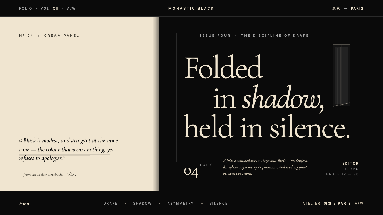 Yohji Yamamoto Monastic BlackBlack as philosophy. Monastic ink ground, warm cream reprieve, low-weight Gar…
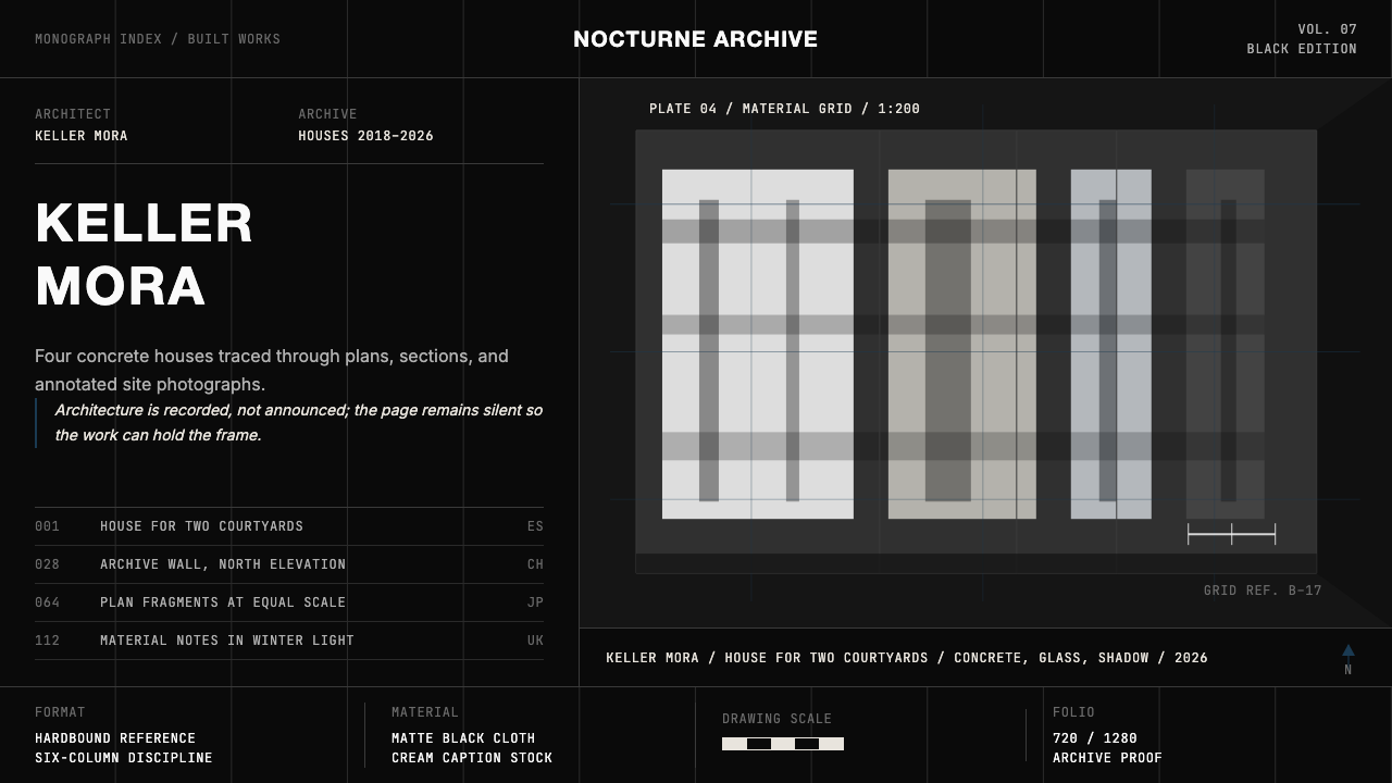 Architect Monograph (Black Edition)Architecture stays sovereign. Matte black, Helvetica caps, hairline grids, bl…
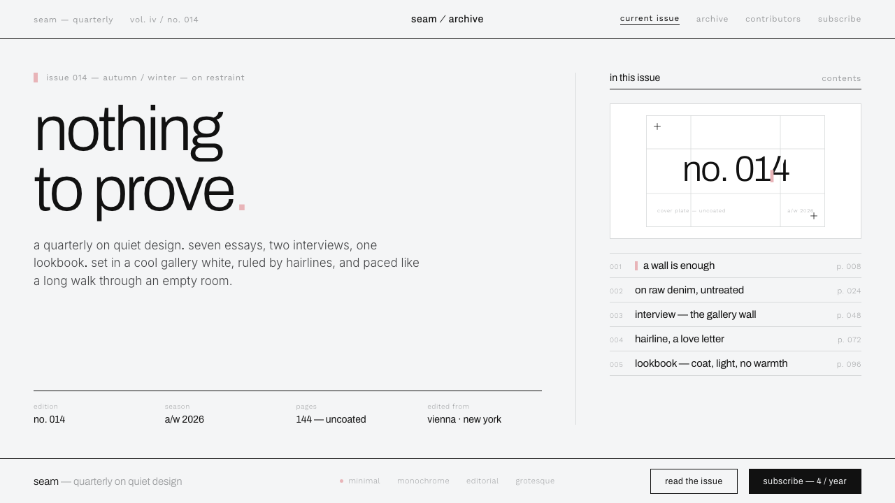 Helmut Lang MinimalismNothing to prove. Cool gallery white, 1px black hairlines, lowercase Archivo…
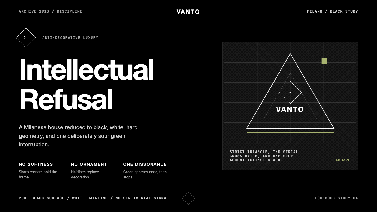 Prada Milan MinimalistLuxury refuses ornament. Pure black, austere sans, and one sour green hairlin…
 Thassos White MarbleWhite becomes material. Crystalline serif forms float on deep, cool Aegean sl…
 Wallpaper* ArchitecturePhotography does the speaking. Gallery-white grid, Inter captions, and hairli…