What is Yeşilçam Film Poster?
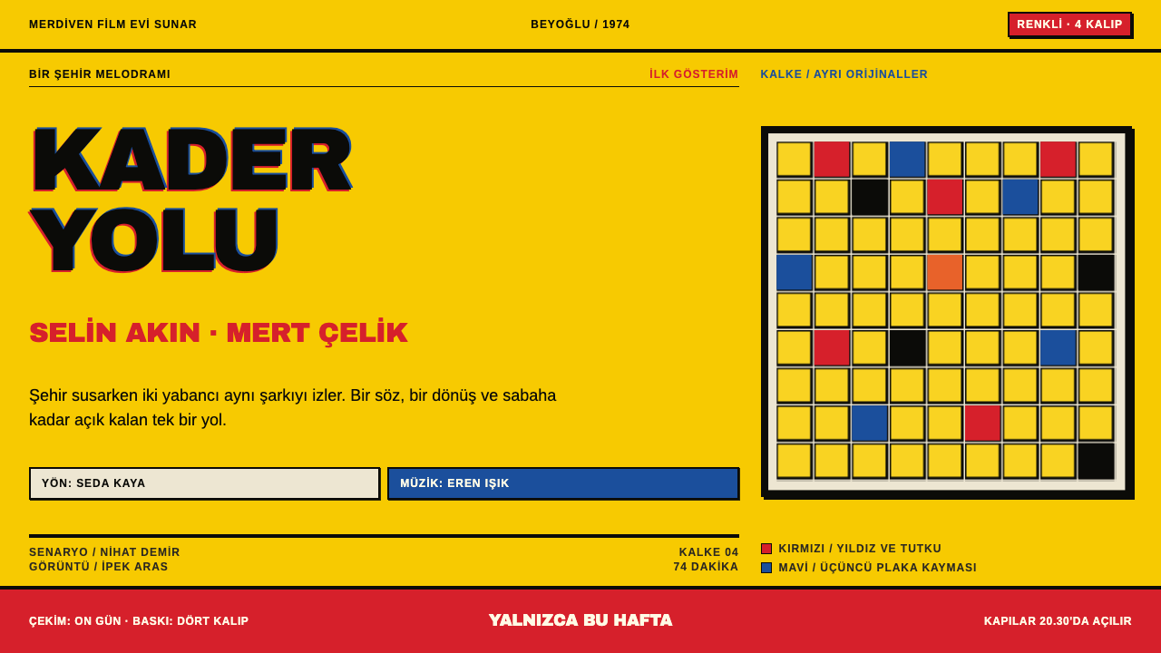
Yeşilçam Film Poster is what Turkish cinema looked like on a Friday-morning wall: a flood of chrome yellow, a heavy hand-painted title, stars named almost as large as the film, and ink plates that never quite lined up.
Yeşilçam Film Poster in brief
Yeşilçam Film Poster is a design language drawn from the hand-made movie posters of the Turkish popular cinema known as Yeşilçam, which ran from 1950 to 1990 and peaked through the 1970s. It is loud by design. A saturated chrome-yellow field runs edge to edge, a photograph or an airbrushed portrait panel is dropped in on top, the title is hand-lettered in heavy black, and the names of the stars are set nearly as large as the title itself.
The mood is announcement rather than invitation. A Yeşilçam poster does not whisper that a film exists; it shouts that a film is on this week, that these faces are in it, and that you should come. Information is crowded, layers are stacked without apology, and every area is competing for the passer-by's attention. The promise of the genre — melodrama, comedy, adventure — is carried by the volume of the page before a single line is read.
What makes the look distinctive is its production fingerprint. The posters were printed from four inks — red, yellow, blue and black — each made from a separate hand-prepared original and pressed on zinc plates, and the plates never landed perfectly on one another. Red and black fringe apart at the edges of the lettering, and that slight drift is not an error to be corrected but the visible signature of the process.

Where does Yeşilçam Film Poster come from?
Yeşilçam takes its name from a street in Beyoğlu, Istanbul, where the offices of Turkish film production and distribution clustered, and the word became shorthand for Turkish popular cinema as a whole. Between 1950 and 1990 the industry ran on volume: hundreds of films a year came off that one street, some of them shot in around ten days, and each one needed a sheet on the wall by Friday. That pace is the decisive fact for the poster style. Nobody had time for refinement; the work had to be fast, legible from across the road and undeniably exciting.
To meet the deadline, poster artists worked with a hand method of colour separation called kalke. Rather than photographing artwork through colour filters, the artist prepared one original by hand for each ink — red, yellow, blue and black — and the originals were transferred onto zinc plates and printed in register. There was no photographic film anywhere in the chain. Airbrush, crayon and brush supplied the images, and the final step often fell to the printer, who wrote the film title directly on the plate in the shop. The result was a poster in which hands, not cameras, determined every edge.
The audience and the stars shaped the page just as much as the method. Yeşilçam was a star system, and the posters sold faces: Türkan Şoray in the melodramas, Kemal Sunal and Şener Şen in the comedies, Cüneyt Arkın in the adventures, and Adile Naşit as the warm maternal presence of countless family films. Putting the star's name near title size was a commercial decision, because for much of the public the actor was the genre. The billing blocks, with their crowded lists of cast and crew in black, repeated the same logic: more names meant more reasons to buy a ticket.
The style belongs to the Turkish offset-litho poster trade, and it faded as the industry itself declined by 1990, when television and home video drew audiences away and production thinned. Today it survives in collectors' archives, in revival graphics and in the instinctive memory of anyone who grew up with those walls. Designers return to it for the same reason they return to any strongly handmade style: it carries the unmistakable trace of people working fast, with limited means, and making the limits look like a vision.
What defines the Yeşilçam Film Poster look?
Chrome-Yellow Flood
The field is a single saturated chrome yellow printed edge to edge, with no margin and no white border. It is closer to a warning signal than to a decorative background, and everything else on the page sits on it. The yellow is flat and ink-like, slightly warm, and it gives the whole poster an immediate, high-visibility temperature that carries across a street.
Misregistration as Signature
Because the red, blue and black plates were never perfectly aligned, edges show slim fringes of colour where one ink has slipped past another. In this style the offset is deliberate and visible, especially on large lettering, where red and black separate by a thin line. It is the tactile sign that the poster was made by hand and press, and removing it makes the style look like an imitation.
Hand-Lettered Black Title
The title is painted by hand in heavy black, with irregular, confident letterforms that carry the personality of the person who drew them. It dominates the composition and often overlaps other elements. The letters have weight and slight imperfection rather than the evenness of a typeface, and that is part of their persuasive force.
Star Names at Title Scale
The cast are not tucked into small print. The leading names are set almost as large as the title and arranged as part of the image, because the stars were the product. In a layout, this means a clear two-tier hierarchy of title and names at the top, followed by a long, much smaller supporting block, and almost nothing in between.
Dropped-In Photo Blocks
Photographs and airbrushed portraits are cut into rectangular or irregular panels and placed over the yellow rather than blended into it. Edges stay hard, scale shifts abruptly from one panel to the next, and there is no attempt at seamless composition. The effect is of a collage assembled quickly on a table, then translated into ink.
Crowded Black Billing
At the bottom or sides of the sheet, a dense block of credits fills the available space in black type. It is intentionally crowded: names, roles and production credits are packed tightly, creating a texture that signals a real, big production. The block works as a counterweight to the open yellow and the giant title.
Four-Ink Flatness
Everything is built from red, yellow, blue and black, with overprints creating a few extra tones. Large areas are flat and opaque; shadows are not simulated with soft blur; gradients appear only where the airbrush created them in an illustration panel. This limitation keeps the page graphic and punchy, and it also keeps the palette tightly tied to the logic of the press.

Who shaped Yeşilçam Film Poster?
A leading actress of Yeşilçam melodrama, Şoray's face was one of the most reliable selling points on a poster. Her presence sets the emotional register of the genre: large, direct portraiture with the title and her name given equal weight.
One of the most popular comic stars of the era, Sunal represents the everyman humour that filled cinemas. Comedy posters built around him lean into expressive faces, tilted type and the busiest, brightest compositions in the style.
A star of the action and adventure strand of Yeşilçam, Arkın appears on posters as a figure of motion and confrontation. His films call for dynamic cut-outs, dramatic poses and heavy title lettering that seems to strike the page.
A celebrated comic actor whose roles often mixed humour with social observation. On posters he shows how the style could carry a lighter, more character-driven comedy while still keeping the loud yellow ground and hand-lettered title.
A beloved screen presence known for warm, maternal roles in comedies and family films. Her image on a poster signals comfort, humour and a household audience, giving the loud style a gentle counterpoint.
How do you use Yeşilçam Film Poster today?
Yeşilçam Film Poster is a high-volume, high-attention style. It works when the goal is to be seen first and read second, and it works best for projects with a sense of humour, nostalgia or popular-culture swagger. It is not a style for quiet reassurance; it is a style for announcements.
For presentation slides, use the yellow flood as the background for covers and section openers, with an oversized title in heavy black and a small cut-out panel of a photograph set at an angle. Content slides can use a block structure: a large heading, one or two image panels and a compact black list. Data slides suit bold bar charts in the four inks with plain black labels. Keep the misregistration on the largest display lettering only; body text and chart labels must stay crisp.
For web interfaces, the style suits campaign landing pages, entertainment and ticketing sites, event promotions, sale banners and playful brand microsites. Hero sections can use the full yellow with a hand-lettered or hand-styled headline, a star-sized product or personality block and a dense strip of small black information underneath. Buttons should be solid black or red with flat edges and no soft shadows. Because the style is loud, keep forms and checkout flows calmer, using the palette but removing most of the layering.
For editorial and marketing work, it delivers instant personality for music, film, nightlife and pop-culture features, retro-themed campaigns and food or street-market brands. Treat photographs as dropped-in blocks, pair them with a single oversized headline and add a dense black credit block as a texture. Printed posters, flyers and covers benefit most, because the style's drift and overprint are at home on paper.
The most frequent mistake is to clean up. Perfect registration, tasteful margins, delicate gradients and neat spacing all drain the energy from the style. The opposite mistake is to apply the drift everywhere, which makes body copy unreadable; the misregistration belongs on large lettering and key graphics. A third error is using too many extra colours: the style depends on the discipline of four inks, so introducing purple, teal or pastel tints breaks the logic.

Yeşilçam Film Poster — FAQ
What does Yeşilçam mean?
Yeşilçam is the name of a street in the Beyoğlu district of Istanbul where Turkish film companies were based. The name became shorthand for Turkish popular cinema from roughly 1950 to 1990, with its peak in the 1970s, and for the whole culture around it: stars, genres, production habits and posters.
What is kalke and why does it matter for the look?
Kalke was a hand method of four-colour separation. The artist prepared one original per ink — red, yellow, blue and black — and these were turned into zinc plates and printed in register, without photographic film. Because every separation was drawn by hand and aligned on a press, the colours drifted slightly apart, and that drift became the visible character of the style.
Should I keep the misregistration in a digital design?
Yes, but selectively. Apply the red and black drift to large display lettering and key graphics, where it reads as a printing trait. Keep body text, form labels and data legible with clean alignment. If the offset appears everywhere, readability suffers; if it disappears entirely, the style loses its handmade signature.
Is the style only suitable for nostalgic or retro projects?
Not exclusively. Its core idea — a loud, saturated field with oversized, hand-made type and crowded information — can serve any campaign that wants to be seen quickly. It naturally fits retro and pop-culture themes, but contemporary event posters, sale banners and playful product launches can all use it, provided the tone of the project matches the energy of the page.
How should the star names and title be balanced?
In the original posters the stars were a main selling point, so their names are close to the title in size and prominence. A good adaptation uses a clear two-level structure: the title and the key names at the top, then a much smaller, dense credit block. Avoid giving every line a middling size; the style depends on the contrast between loud headlines and tightly packed small text.
Related design styles
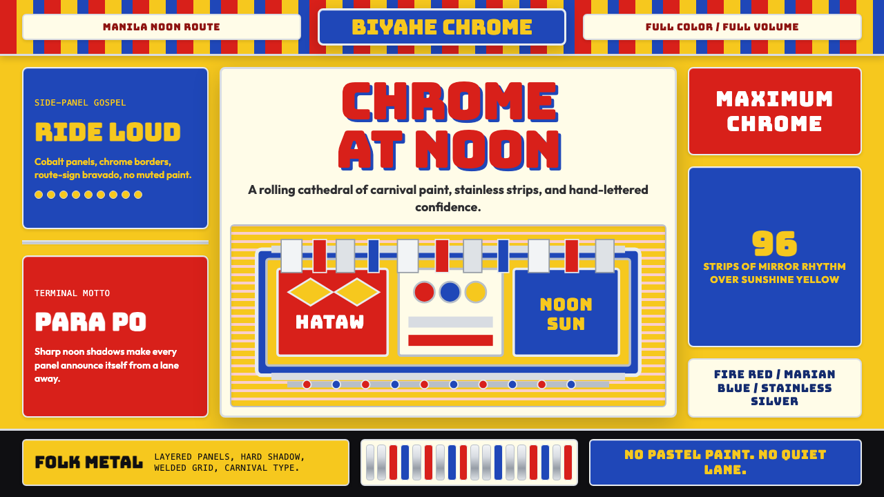 Filipino Jeepney (Chrome & Streamer)Maximalism has wheels. Sunshine yellow, chrome strips, Bungee route-sign type.
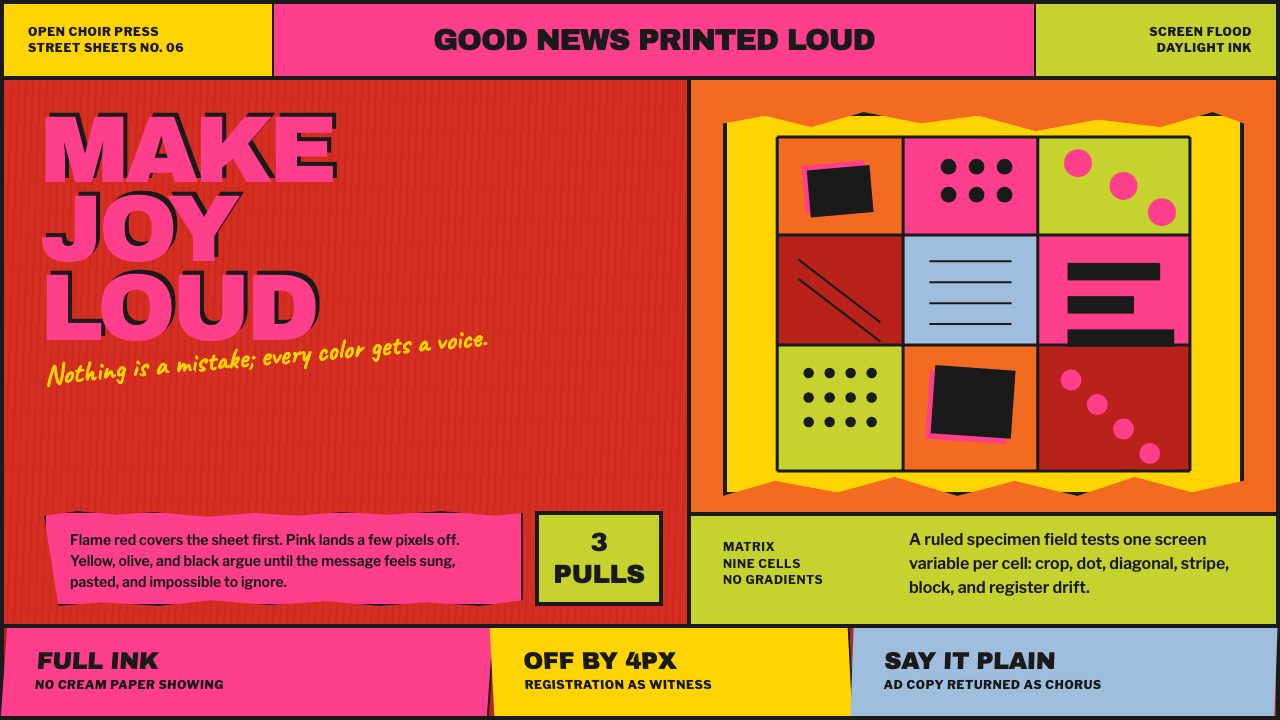 Corita Kent SerigraphJoy printed at full volume. Flame red, hot pink, and misregistered type flood…
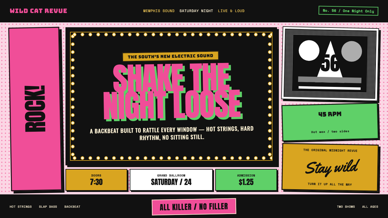 Elvis Presley (1956)Rock learned to shout. Bubblegum pink, acid green and jailhouse type land wit…
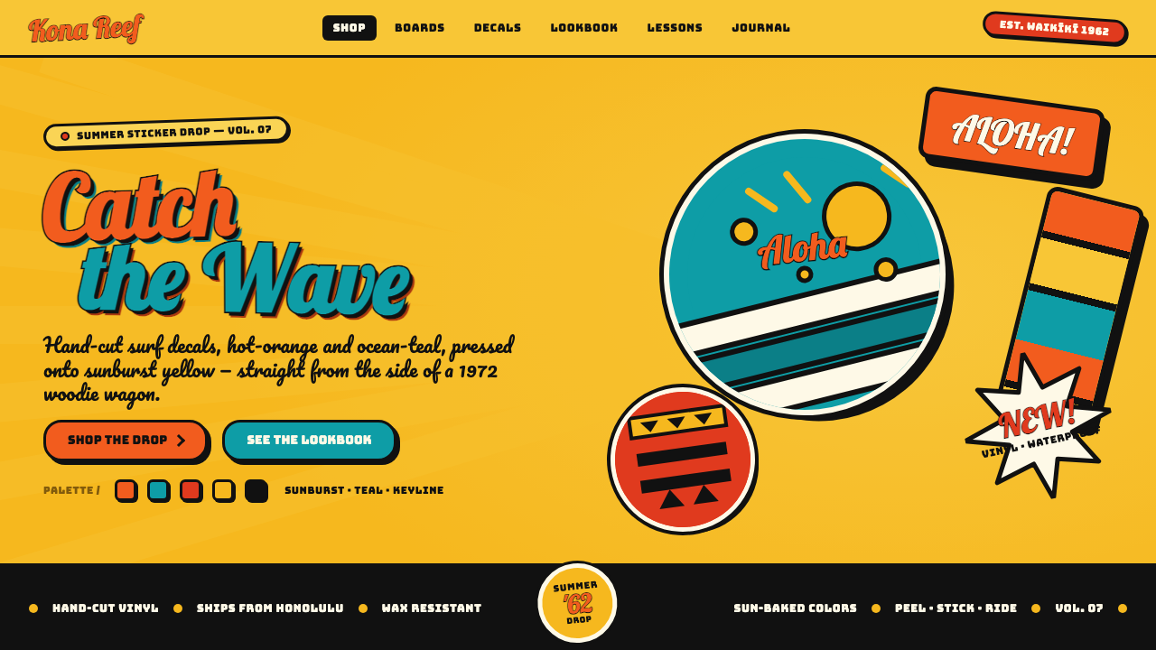 Hapa-Haole Surf DecalSurf-shop signage, loud and laminated. Sunburst yellow ground, chunky black k…
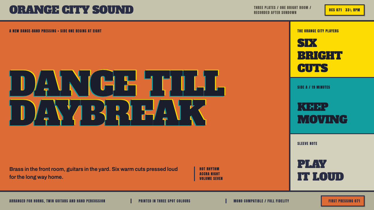 Highlife Record SleevePrint it loud. Hot orange fields and fat slab type keep the sleeve gloriously…
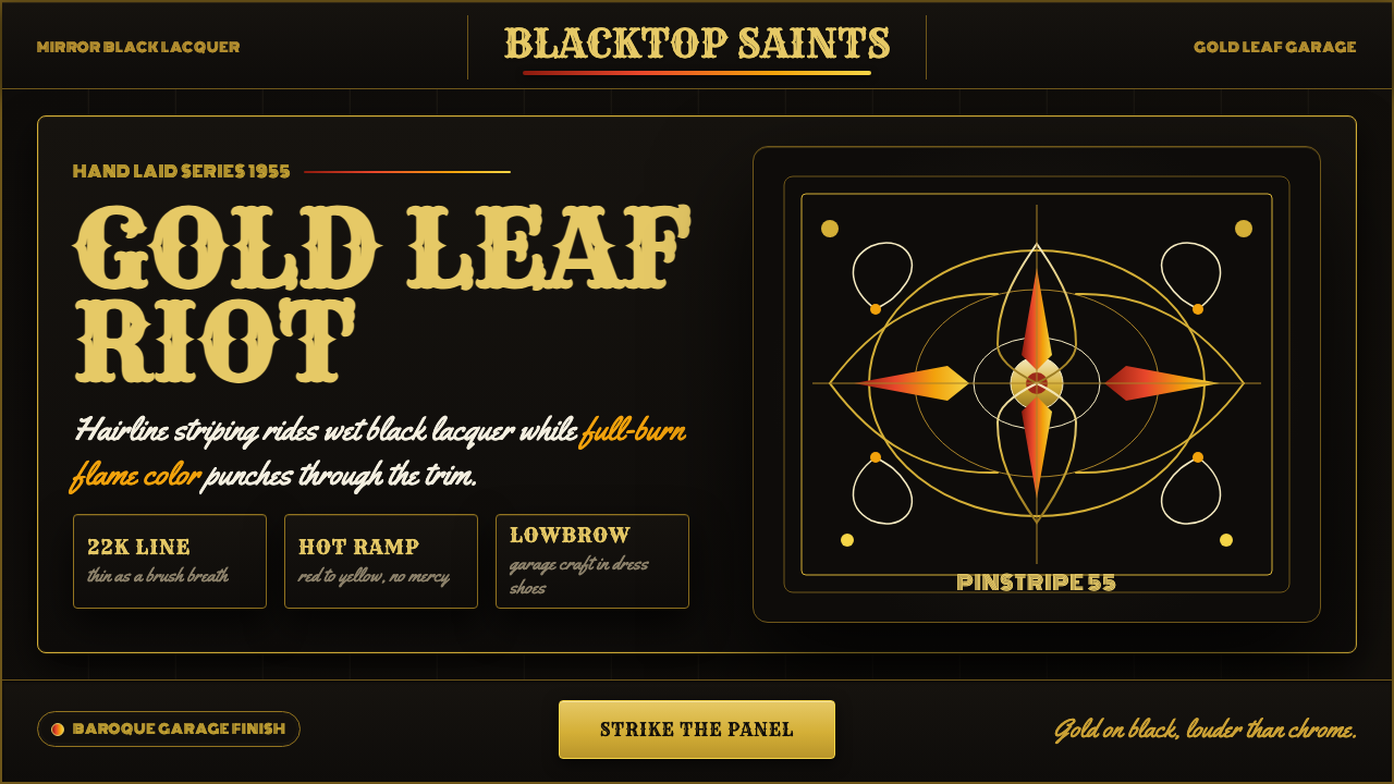 Kustom Kulture PinstripeGarage baroque burns hot. Rye woodtype, black lacquer, gold hairlines, flame…