What is Xiaomi?
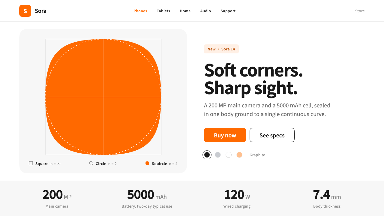
Xiaomi's 2021 identity changed one thing, the corners, and in doing so turned a mathematical curve into the shape of an entire product system.
Xiaomi in brief
Xiaomi, in the sense used here, is the visual system that grew out of the company's March 2021 identity refresh. The orange square and the lowercase 'mi' mark were kept, but the corners were redrawn as a superellipse, a curve that sits between a square and a circle. Presented under the concept of 'Alive', that squircle became the basic shape of the whole system, from the logo to app icons, image tiles and buttons.
The surrounding pages are deliberately quiet. A launch page is a white canvas divided into light-grey bands, with near-black text and large studio renders of the product. Each section gives one centred product its own stage, headline numbers are set very large, and the orange of the brand is withheld for the places where the visitor is meant to act. The restraint is the point: the product is the loudest thing on the page.
The result is a style that reads as calm, precise and confident. It borrows the discipline of Japanese minimalism and applies it to a Chinese consumer-electronics launch, replacing hard corners with continuous curvature and replacing decoration with scale, whitespace and a single reserved accent.

Where does Xiaomi come from?
The identity change was unveiled in March 2021 by Xiaomi, the Beijing-based consumer-electronics company led by Lei Jun. For years its logo had been an orange square with a lowercase 'mi' set inside it, a mark so simple and so widely seen that changing it carried real risk. The company chose to leave the colour, the square and the letters alone and to alter only the shape of the corners. It was a very small edit made with a very deliberate hand, and it was announced as a rethinking of the brand around the idea of being 'Alive'.
The designer behind the change was Kenya Hara, working with the Nippon Design Center in Tokyo. Hara is known for a particular strand of Japanese minimalism in which emptiness is treated as a positive quality, an invitation rather than an absence. His contribution here was not an ornament but a curve: a superellipse, a shape derived from a mathematical formula, lying between the square and the circle, with curvature that changes continuously rather than switching abruptly where a straight edge meets an arc. The tradition of mathematically generated form is one of the movements the source material names for this style.
The curve was then adopted as the system's organising shape. Because a superellipse has no visible seam between line and arc, it feels softer than a conventional rounded rectangle while remaining clearly geometric. It was applied to the logo, app icons, image cards and buttons, so the whole interface speaks with one consistent shape. In the same year the company also released its own typeface, MiSans, which gave the identity a matching typographic voice.
The launch pages that carry the system belong to a broader tradition of Chinese consumer-electronics launch design, where a single flagship product is presented with large imagery and big headline numbers. What distinguishes Xiaomi's version is the restraint borrowed from Japanese minimalism: white and grey rather than saturated backdrops, near-black type, one product at a time and a very sparing use of the signature orange. East Asian design traditions meet here in a commercial context, and the combination has remained the company's visual identity from 2021 onward.
What defines the Xiaomi look?
The Squircle
The superellipse is the system's one signature move. It sits between a square and a circle, and its curvature changes continuously instead of jumping at the point where a straight edge meets a curve. The eye reads it as smoother and more natural than an ordinary rounded rectangle. It is applied consistently to the logo, app icons, image tiles and buttons, so every container in the interface shares one family of corners.
Quiet Palette
The default surface is white, divided by light-grey bands that separate one section from the next. Text is near-black rather than pure black, which softens contrast without losing legibility. There is no gradient backdrop and no decorative colour. The overall impression is of a clean studio: neutral, bright and unhurried, a setting that lets the product's own colour and form stand out.
Reserved Orange
Orange is the brand's one loud colour, and the system rations it. It belongs to the logo and to the moments of action, such as a buy button, where the visitor is meant to tap. Everywhere else it stays out of the way. Because the accent appears so rarely, it works as a signal: wherever orange appears, something can be done there.
Studio Renders
Products are shown as large, clean studio renders, centred in their section and given plenty of surrounding space. There is usually one product per section, with no collage and no lifestyle clutter. The image works as the hero, the headline and the decoration at once, so everything else on the page is arranged to support it rather than compete with it.
Big Numbers, Small Units
Specifications are treated as headlines. A figure such as a camera resolution or battery capacity is set very large, while its unit and explanatory label are set small beside it. This hierarchy makes the number the thing the eye lands on and relegates the unit to a supporting role. It is a typographic habit borrowed from launch events, where the number is the message.
One Focus per Section
Each band of the page makes a single point. There is one product, one headline and one idea per section, with generous whitespace separating it from the next. This rhythm turns the page into a sequence of calm, self-contained scenes rather than a dense catalogue, and it is where the influence of Japanese minimalism is most visible: emptiness is used as a deliberate design material.

Who shaped Xiaomi?
Hara is the designer credited with redrawing Xiaomi's corners as a superellipse in 2021, working with the Nippon Design Center in Tokyo. He is associated with a Japanese minimalism in which emptiness carries meaning, and his contribution to Xiaomi is best understood as a single, precisely judged curve that reorganised a whole brand.
Lei Jun leads Xiaomi, the Beijing-based company whose identity this style documents. As the head of the company, he is the commissioning force behind the 2021 refresh, which kept the colour, square and letters of the old mark but changed the corners. His role is that of the client willing to make a very small, very visible change.
The Tokyo design studio behind the 2021 refresh, named in the source material as the home of the work. Its involvement ties the identity to a Japanese tradition of minimalism and careful geometry, and explains why a Chinese consumer-electronics brand was refined by a Japanese hand.
How do you use Xiaomi today?
The Xiaomi style is a good reference whenever the aim is a calm, product-led presentation with one reserved accent. It suits subjects that can speak for themselves, and it rewards a designer who is comfortable leaving large areas empty. Its core move, the superellipse, is simple enough to apply across a whole interface without much extra decoration.
For presentation slides, use a white or very light-grey field, near-black text and a single large image or number per slide. Covers can pair a centred product image with a short headline and a small orange mark, while content slides keep to one idea each. Data slides work well with the big-number, small-unit habit: set the figure large and the unit and label small. Use orange only for the one thing you want the audience to remember or do.
For web interfaces, the style fits product pages, launch pages and storefronts. Alternate white and light-grey bands to separate sections, use the squircle for cards, image tiles and buttons so every container shares the same corners, and keep primary calls to action in orange. Navigation and secondary controls stay neutral. Allow generous vertical space between bands so the page reads as a sequence of scenes.
For editorial and marketing work, favour a single centred image, a short headline and a measured amount of copy. Studio-style imagery on a clean ground carries the message better than a collage. Big specification numbers can serve as the main visual device when there is no hero image, with units set small beside them. Keep the tone confident but unhurried, in line with the quiet, precise character of the identity.
The common mistake is to treat the squircle as a generic rounded corner. A standard rounded rectangle has a visible join between line and arc, and replacing the superellipse with it quietly loses the point of the system. Another frequent error is spending the orange too freely, using it for decoration or headings; once orange is everywhere, it no longer signals an action. Finally, avoid filling the whitespace. The emptiness is part of the design, and crowding it turns a calm launch page into an ordinary catalogue.

Xiaomi — FAQ
What is a superellipse, and why does Xiaomi use it?
A superellipse is a curve defined by a mathematical formula that lies between a square and a circle. Unlike an ordinary rounded corner, where a straight edge meets an arc at a visible join, its curvature changes continuously. Xiaomi adopted it in 2021 as the basic shape of its identity, designed by Kenya Hara, because it feels smoother and more alive than a standard rounded rectangle while staying clearly geometric.
Did Xiaomi change its logo colour or letters in 2021?
No. The orange square and the lowercase 'mi' mark were kept. The only change was to the corners, which were redrawn as a superellipse. The new shape then became the basic form of the wider system, appearing in app icons, image tiles and buttons as well as in the logo.
Is this style light or dark?
It is a light style. The default ground is white, with light-grey bands between sections and near-black text. A dark variant is possible, but it would need to keep the same restraint: one product per section, orange reserved for action and the squircle as the only recurring shape. The quiet, studio-like feel depends on the bright, neutral background.
How should I use the orange accent?
Treat it as a signal rather than a decoration. Use it for the logo and for the elements that invite action, such as a buy button, and keep it out of headings, backgrounds and ornament. The less often it appears, the more clearly it tells the visitor where to act.
When is this style the wrong choice?
It is a poor fit for subjects that need density, texture or visual noise, such as news portals, marketplaces with many small listings, or brands that rely on loud, playful energy. The style depends on whitespace and a single focus per section, so content-heavy layouts will fight it. Choose it when you have a strong product image or number and want a calm, confident presentation.
Related design styles
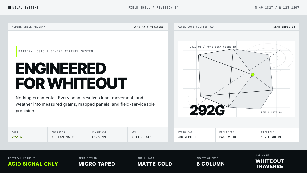 Arc'teryx Technical OutdoorEngineered, never ornamental. Glacier silver grid, mono specs, one acid-green…
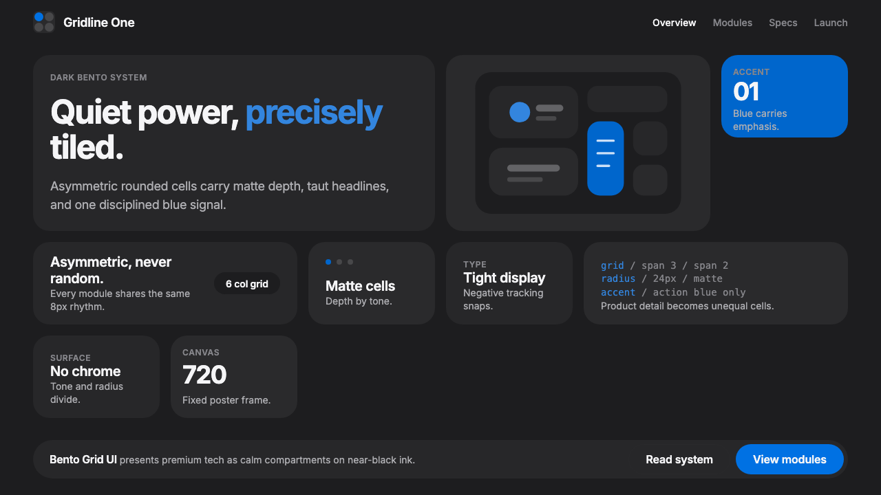 Bento Grid UIPremium tech, calmly compartmentalized. Near-black bento tiles and one Action…
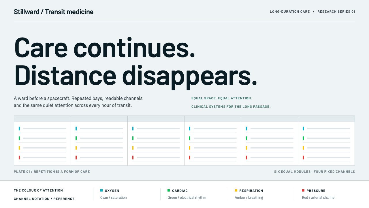 Cryosleep Transit WardCare without spectacle. Clinical white, equal bay grids and the fixed colours…
 Figma 2024A brand that looks like its canvas. Five dots scatter like cursors, soft card…
 OpenAI 2024Research-grade restraint. Black-on-white Inter, flat code panels, one leaf-gr…
 Rivian Adventure EVOne ochre truck, nothing behind it. Pure white sweep, light Hanken numerals,…