What is Rivian Adventure EV?
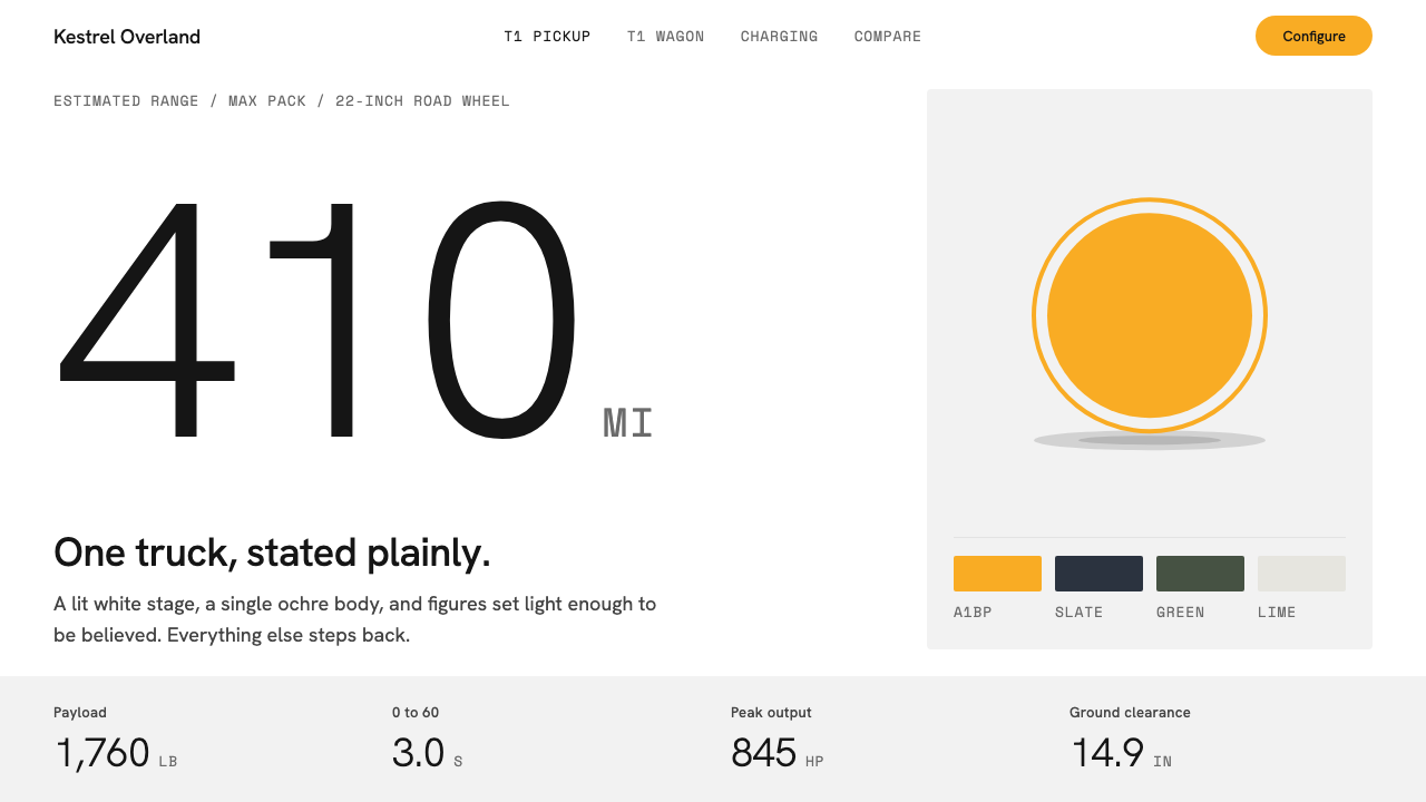
Rivian's visual language puts one ochre truck on an empty white field and lets everything else go quiet, so that the vehicle is the only saturated thing you see.
Rivian Adventure EV in brief
Rivian Adventure EV is a design language drawn from the way the American electric-vehicle maker presents its trucks and SUVs: on a seamless white studio sweep with no horizon, or inside a configurator page where the vehicle rotates slowly in a field of nothing. It belongs to the tradition of electric-vehicle product minimalism, but it is warmer and more outdoorsy than the cold showroom look of many rivals.
The idea is restraint with a single exception. Surfaces are white and a very pale grey. Type is calm and neutral. Numbers such as range, payload and power are allowed to be large, but the tone around them stays flat and factual. The one saturated element is an earthy ochre that belongs to the vehicle itself, and the interface is careful never to spend that color on anything else.
In practice this means a page that feels like a gallery wall with one object on it. There is very little chrome, almost no decoration, and no gradient theatrics. The visual drama is delegated to the product photograph, while the typography and layout simply hold the space and deliver specifications without raising their voice.

Where does Rivian Adventure EV come from?
Rivian was founded in 2009 by RJ Scaringe, and for its first years it was a company that mostly existed as an idea and an engineering effort rather than a product people could buy. The brand's public face came together slowly, and it matured around the first customer deliveries of the R1T pickup in September 2021. That moment is the anchor for this design language: a young company, with a single vehicle in its hands, had to explain itself to a public that had never seen a truck quite like it.
The company is associated with two American places, Irvine in California, where design and software work happens, and Normal in Illinois, where the vehicles are built. That geography matters to the look. California supplies a tradition of consumer technology presented on white, in which the product is the hero and the interface is a polite frame. The Midwestern factory and the outdoor customer base supply the other half: mud, rock, forest and weather, which appear in the photography but are kept out of the interface itself.
Design leadership under Jeff Hammoud shaped how the brand talks about itself visually. Rather than copying the glossy, chrome-and-neon vocabulary of performance-car marketing, the team leaned on the idea of an adventure vehicle for ordinary people who like being outdoors. That ambition connects to a second influence, overland and outdoor brand photography, with its wide landscapes, golden light and gear laid out with care. The interface borrows the calm of that world and removes the clutter.
A third influence is direct-to-consumer configurator design. Rivian sells directly to buyers rather than through dealerships, so its website is not a brochure but the showroom. Choosing a color, a wheel, a battery pack and an interior has to feel as satisfying as walking around the car. That pushed the system toward large imagery, generous empty space, and controls that do not compete with the vehicle. The first deliveries in 2021 gave the look its public debut, and the visual identity is generally dated from roughly that year through the middle of the decade.
What defines the Rivian Adventure EV look?
A white field, not a white page
The ground is a seamless white that behaves like a photographic studio sweep. There is no visible horizon, no floor line, no vignette. Secondary surfaces step down to a very pale grey that is barely different from the white, so panels separate by a whisper rather than by a border. The effect is that the vehicle seems to float in neutral light, and the layout feels more like a photograph than like a web page.
One ochre, owned by the truck
The only saturated hue is an earthy ochre, the paint color of the first deliveries, deliberately chosen to sit away from taxi-cab neon. It reads as sand, clay and autumn grass rather than as a signal. The system treats it as a possession of the vehicle: it appears in the photograph, and the interface stays neutral around it. Buttons and links are therefore dark and plain, and the page never competes with its own hero.
Calm sans-serif voice
Headlines and body text use a quiet grotesque with open, even letterforms. Large numerals are set light rather than bold, which makes a big figure feel confident instead of loud. The typography never uses all-caps shouting or tight display tricks. Hierarchy comes from size and space, not from weight contrast, so reading a specification page feels like reading a well-edited technical note.
Monospaced units and figures
Specification values such as range, power and payload are paired with a monospaced face for the units and labels. The mono type gives numbers a measured, engineered quality and keeps columns of figures aligned. It also acts as a quiet second voice: the grotesque speaks in sentences, the mono speaks in data. Together they signal a product that is both friendly and precise.
Generous emptiness
Spacing is wide and unhurried. A hero image can occupy an entire viewport with a single line of text beneath it, and a configurator step can contain one choice at a time. Empty space is treated as a feature, signalling confidence in the product and giving the eye somewhere to rest between dense sets of options.
Flat, quiet interface chrome
Controls are plain. Buttons have soft, modest corners, outlines are thin and low-contrast, and shadows are close to absent. Nothing glows, bevels or bounces. The interface behaves like good packaging: it protects and presents the object without announcing itself. Motion is limited to slow, even rotation of the vehicle and gentle fades between configuration states.
Outdoor photography as the only texture
Where the system needs warmth, it comes from photographs of landscape, dirt, water and forest, never from patterns or illustrations. The photography is wide, natural and usually unretouched in feel. This keeps the interface itself almost textureless while still giving the brand a sense of place, and it is the main way the design earns the word adventure.

Who shaped Rivian Adventure EV?
Founder of Rivian in 2009 and the person most closely tied to its mission of building electric vehicles for people who spend time outdoors. His founder-led approach set the tone that product, not marketing noise, should carry the brand, which is the root of the white, uncluttered presentation.
Design leader at Rivian, associated with the look of the vehicles and the way the brand presents them. His influence is seen in the decision to favor calm, adventure-minded imagery over aggressive performance-car styling, and in the consistency between the physical products and the screens that sell them.
A loose tradition rather than a single person. Photographers and art directors working for outdoor gear, camping and expedition brands established the visual grammar of wide landscapes, warm natural light and carefully placed equipment that this system borrows and then strips down.
How do you use Rivian Adventure EV today?
For slides, Rivian Adventure EV suits product launches and strategy decks where one object deserves full attention. A cover works best as a single large image on an almost empty white field, with the title set small and calm beneath or beside it. Content slides should carry one message each, with generous margins, and let a photograph or diagram do the persuasion. Data slides benefit from the large light numerals and monospaced labels: put one key figure at a time in front of the audience, with its unit in the mono voice, and avoid crowding a chart with competing colors.
For web interfaces, the language is a natural fit for configurators, product detail pages and hardware landing pages. A dashboard built in this style should be airy and quiet, with neutral panels, small restrained controls, and numbers that are easy to scan. On a pricing or comparison page, keep the grid uncluttered and let a single accent mark the recommended option, using the ochre idea sparingly rather than as a general fill. Navigation should be minimal and fade into the background so that product imagery owns the first screen.
For editorial and marketing work, the style rewards photography. Use wide, natural images with a clear subject, place them on white, and keep captions short. A campaign page can work as a series of full-width scenes separated by silence, each with one short sentence. Email and social assets should follow the same rule: one subject, one accent, plenty of air. The tone of the copy should match the visuals, calm and factual rather than excited.
The most common mistake is spending the accent color everywhere. As soon as buttons, headings, icons and highlights all turn ochre, the page loses the single focal point that makes the system work, and it starts to look like a generic warm-toned template. A second mistake is going cold and clinical: if the white is replaced with harsh pure grey panels, heavy borders or glossy gradients, the quiet confidence disappears. Finally, do not fill the emptiness out of nervousness. The system trusts the product and the reader, and the blank space is part of the message.

Rivian Adventure EV — FAQ
What makes the Rivian Adventure EV style different from other electric-vehicle design?
Many electric-vehicle brands lean on dark backgrounds, glowing lines and a futuristic, technical mood. Rivian's presentation goes the other way: bright white, a single earthy accent, calm type and a strong tie to outdoor photography. It sells capability and calm rather than speed and spectacle, which makes it feel more human and less showroom-cold.
Is this a dark or a light theme?
It is a light theme. The primary surface is white and the secondary surface is a very pale grey. There is no native dark mode in the original presentation, so adapting it to dark requires care: the accent should stay rare and the photograph should still be the only loud element.
Why is the accent color used so sparingly?
Because the ochre belongs to the vehicle. It is the paint color of the first trucks delivered in 2021, and the interface protects it as a signature. Keeping the rest of the page neutral means the eye always lands first on the product, and the color keeps its meaning instead of becoming ordinary decoration.
Can this style work outside of automotive products?
Yes. Any product with one hero object benefits from it: outdoor gear, bicycles, audio equipment, cameras, furniture or a single flagship device. The requirement is a strong photograph and a willingness to leave space empty. It is a poor fit for content-dense products such as news portals or marketplaces, where the sparse layout would hide too much.
How should numbers and specifications be displayed?
Show one figure at a time where possible, set the number large and light, and place its unit and label beside it in a monospaced voice. Keep columns aligned and avoid decorating the figures with color or icons. The restraint is what makes the number feel trustworthy.
Related design styles
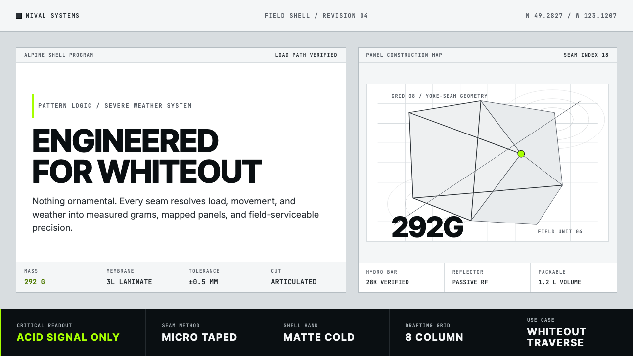 Arc'teryx Technical OutdoorEngineered, never ornamental. Glacier silver grid, mono specs, one acid-green…
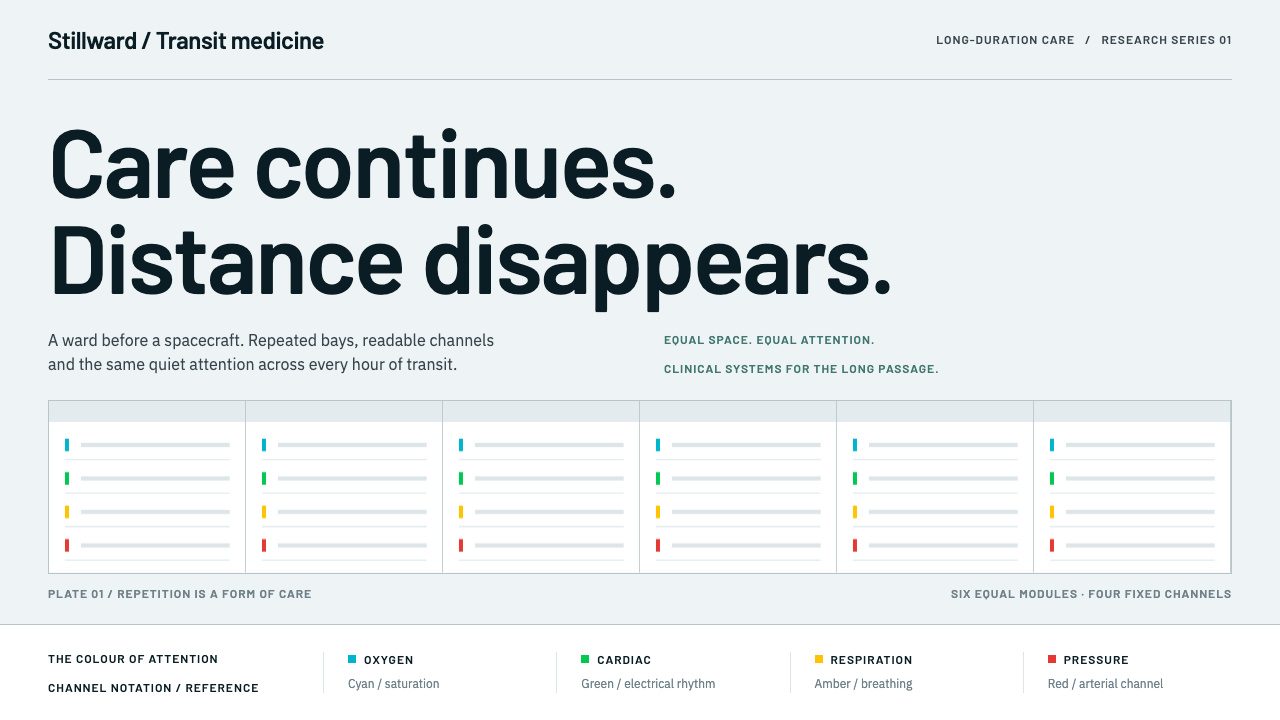 Cryosleep Transit WardCare without spectacle. Clinical white, equal bay grids and the fixed colours…
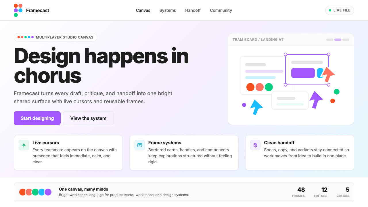 Figma 2024A brand that looks like its canvas. Five dots scatter like cursors, soft card…
 OpenAI 2024Research-grade restraint. Black-on-white Inter, flat code panels, one leaf-gr…
 Threads (Meta)Restraint is the brand. Black Inter type, narrow feed, thin connectors, white…
 Android Bugdroid GreenFriendly tech, reduced to geometry. Vivid green pops from Grey 900 and rounde…