What is Bento Grid UI?
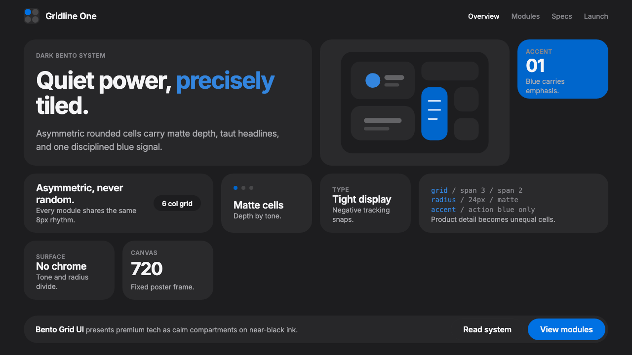
Apple's 2022 iPhone 14 product page turned a grid of asymmetric rounded tiles into the decade's most copied web layout, borrowing its name and compartmentalized logic from the Japanese bento box.
Bento Grid UI in brief
Bento grid UI is a layout pattern, not a color palette: a single tight grid holding tiles of varying size and span, each tile a self-contained rounded rectangle carrying one feature, statistic, or idea. A few large cells carry the headline moments; several smaller cells hold supporting details. The name comes directly from the Japanese lunch box it resembles — a tray of neatly separated compartments, each with its own contents, all fitting together into one coherent whole.
The dark variant popularized alongside Apple's product marketing sits on a near-black canvas rather than pure white. Individual tiles are differentiated from that canvas and from each other mainly through subtle surface lightness — a tile reads as slightly raised or slightly recessed through tone alone — rather than through hard borders or heavy drop shadows. The restraint is deliberate: the grid should feel calm and premium, not busy.
Typography carries most of the visual confidence. Headlines inside the larger tiles are set large, tightly tracked, and unapologetically bold against the dark ground, while supporting copy stays small and quiet. A single accent color, usually a saturated blue, is reserved almost exclusively for interactive elements — buttons, links, active states — so that its rare appearance always reads as 'you can act here' rather than as general decoration.
Where does Bento Grid UI come from?
The word 'bento' names a compartmentalized Japanese lunch box, and the term's application to web layout is a genuinely recent coinage — a 2020s design-community shorthand rather than an established term of art from print or interface design history. Even so, the underlying idea of organizing varied content into a modular grid of differently sized cells has a much older lineage in editorial and print design, where designers have long used modular grids to give visual order to unequal amounts of content on a single page or spread.
A closer digital ancestor is Microsoft's Metro design language, introduced with Windows Phone and Windows 8 around 2010 to 2012, which organized a Start screen into a grid of flat, colorful, differently sized tiles representing apps and live content. Metro established the conceptual template — asymmetric tile sizes within one grid, each tile self-contained — even though its visual execution, built from flat saturated color blocks, looked very different from the restrained, near-monochrome tone the term now usually implies.
The modern usage crystallized in September 2022, when Apple's iPhone 14 product page arranged its feature callouts — camera, chip, satellite emergency messaging, crash detection — as a grid of rounded tiles of varying size, several large enough to carry a headline and an image, others small enough to hold a single spec. The page was widely noticed and copied almost immediately within design communities on platforms like Dribbble and Twitter/X, and the term 'bento grid' began attaching itself specifically to this restrained, tile-based, Apple-style treatment rather than to modular grids in general.
Adoption accelerated fast after that. The link-in-bio product Bento, launched around the same period, built its entire personal-page format around literal bento-box compartments, helping fix the vocabulary in the design community's everyday language. Through 2023, software and AI startups adopted bento layouts for landing and pricing pages at a striking rate, treating the pattern as shorthand for 'premium, technical credibility' — to the point that, by 2024, design commentators were already describing bento grids as an oversaturated cliché of startup marketing, even as the pattern remained genuinely effective when executed with real hierarchy and restraint rather than applied as a template.
What defines the Bento Grid UI look?
Asymmetric Tile Grid
All tiles share one underlying grid, but occupy different spans within it — some stretching across multiple columns or rows, others sitting as small single cells. The asymmetry is intentional and hierarchical: tile size signals importance directly, with the largest tiles reserved for the ideas the layout most wants noticed.
Surface-Tone Differentiation
Tiles separate from the canvas and from one another primarily through subtle differences in surface lightness rather than through borders or heavy shadow. A tile reads as a distinct object because it sits a shade lighter or darker than its surroundings, producing a calm, unified surface rather than a page of visibly boxed cards.
Confident Display Type
Headline text inside the larger tiles is set large and tightly tracked, with letters sitting close together for a compact, confident block of type rather than loosely spaced display copy. This tight setting is part of what gives the layout its premium, engineered feeling.
Single Accent Discipline
Only one accent color appears across the entire layout, and it is reserved almost exclusively for interactive elements — buttons, active links, toggles. Everything else stays within the neutral canvas-and-text palette, so the single accent always carries meaning rather than becoming background noise.
Uniform Corner Language
Every tile, regardless of size, shares the same rounded-corner treatment, which is what visually unifies a grid holding very different kinds of content — a large hero tile, a small numeric callout, an icon-only tile — into one coherent family of objects rather than a mismatched collage.
Generous Negative Space
Gaps between tiles are kept wide and consistent, and no tile crowds its own content edge-to-edge. This breathing room is what keeps a grid holding many discrete pieces of information from reading as cluttered — density is managed through spacing discipline, not through shrinking individual tiles.

Who shaped Bento Grid UI?
Apple's in-house marketing design team built the September 2022 iPhone 14 product page that crystallized the modern bento grid template — asymmetric rounded tiles, a near-black or white canvas, and a single accent color — and turned it, almost overnight, into one of the most widely referenced layouts in contemporary web design.
Apple's broader interface design tradition — large confident typography, generous negative space, a restrained single accent color, and consistently rounded corner language — supplies the visual grammar that the bento grid trend borrows almost wholesale, which is part of why the pattern reads as 'premium tech' even when used by companies with no connection to Apple.
The design team behind Windows Phone and Windows 8's Metro language, introduced around 2010 to 2012, established the conceptual ancestor of the bento grid: a Start screen built from a single grid of asymmetrically sized, self-contained tiles. Metro's flat, saturated color execution looked very different from the restrained modern bento aesthetic, but the underlying tile-grid logic is a direct precedent.
This link-in-bio startup launched around the same period Apple's page went viral, building its entire product around literal bento-box-style personal pages. By naming itself directly after the concept, it helped fix 'bento grid' as the accepted term for the pattern within the broader design and startup community.
Across 2023, developer tools and AI startups adopted bento layouts for landing and pricing pages at a striking rate, treating the pattern as visual shorthand for technical credibility and premium positioning. This mass adoption is what pushed the style from an Apple-specific curiosity into a recognizable, sometimes over-relied-on genre of its own.
How do you use Bento Grid UI today?
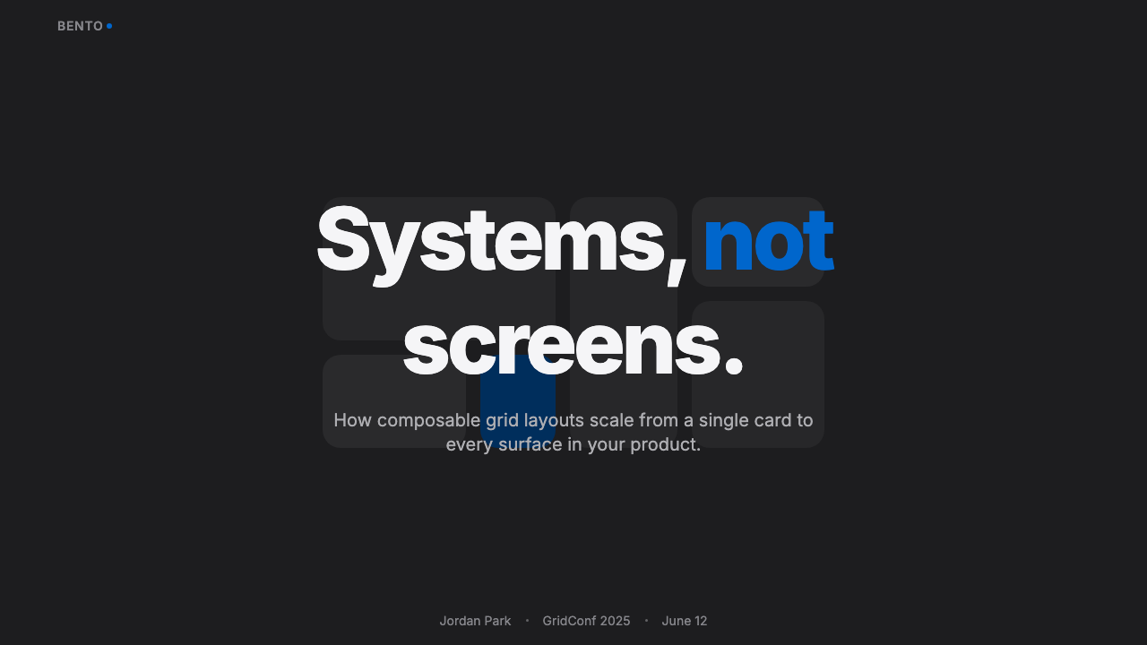
On presentation slides, bento thinking translates directly into a feature-overview slide: instead of a bulleted list, arrange the same information as a grid of tiles, one large tile for the headline capability and several smaller tiles for supporting features. Cover slides can use a single dominant hero tile with the deck title, echoing the way a large tile anchors the original web layout.
The style is a poor fit for genuinely narrative or emotional cover moments — its compartmentalized logic wants discrete facts, not a single sweeping statement, so save it for slides whose job is 'here are several distinct things,' not 'here is one big idea.'
For web interfaces, this is close to a native fit: dashboards can organize metrics as differently sized tiles with the most important number in the largest cell, and pricing pages can render tiers as bento cells of varying size, with the recommended tier occupying visibly more space rather than relying on a badge to signal importance. The single-accent-color discipline maps directly onto call-to-action buttons across both contexts.
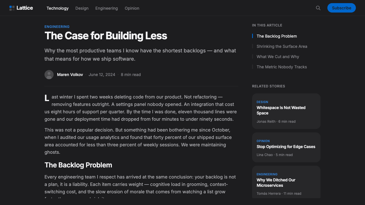
In editorial and marketing work, the pattern suits product marketing pages, portfolio and link-in-bio pages, and any 'everything you need to know' overview page where the content is genuinely a set of discrete facts rather than a continuous argument. It is a poor match for long-form editorial writing, where a reader needs continuous flow rather than compartmentalized chunks.
The most common mistake is building a grid with no dominant tile at all — when every cell is roughly the same size, the layout loses the hierarchy that makes bento grids readable and starts to look like an undifferentiated pile of cards. A second common mistake is applying the accent color across many tiles instead of reserving it for one or two truly interactive moments, which flattens the very signal the restraint is supposed to create. A third is ignoring the underlying grid discipline — tiles that don't actually align to consistent column and row lines read as sloppy rather than deliberately asymmetric.
Bento Grid UI — FAQ
Is a bento grid the same thing as a Pinterest-style masonry grid?
No, and the distinction matters. A masonry grid arranges items of varying height into flowing columns that shift dynamically based on content, with no fixed underlying grid governing where any single item sits. A bento grid does the opposite: every tile sits on a fixed, predetermined grid, and its size is a deliberate design decision rather than a byproduct of however tall its content happens to be. Masonry feels organic and unpredictable; bento feels engineered and intentional.
Does bento grid UI only work in dark mode?
No — Apple itself alternates between light and dark versions of the same underlying pattern across different product pages. The dark, near-black variant tends to read as more premium and tech-forward, which is why it dominates AI and developer-tool marketing, but the same asymmetric-tile, single-accent-color logic works equally well on a light or white canvas, where tiles are differentiated by very light shading or subtle borders instead of tonal lightness.
Is the bento grid trend already overused — should it be avoided?
It has become a recognizable cliché in certain categories, particularly AI and developer-tool landing pages, where it is sometimes applied as a template without real thought about hierarchy. That overuse is a criticism of lazy execution, not of the underlying pattern — a bento grid built with genuine tile-size hierarchy, disciplined spacing, and a single restrained accent still communicates clearly. The pattern is worth avoiding specifically when a team reaches for it by default rather than because the content genuinely consists of discrete, comparably weighted pieces of information.
How many tiles does a layout need before it reads as a proper bento grid?
There is no fixed number, but the pattern needs enough tiles — typically at least five or six — to establish a genuine size hierarchy, with at least one clearly dominant tile and several smaller supporting ones. Fewer than that, and the layout reads as a simple feature comparison or a basic card row rather than a compartmentalized bento composition; the whole effect depends on the eye being able to compare tiles of visibly different size and importance.
How is bento grid different from a classic Swiss or editorial modular grid?
Both rely on an underlying grid to organize content of unequal size, and in that structural sense bento grids are a direct descendant of the modular grid tradition long used in Swiss editorial design. The difference is emphasis: a classic modular grid typically governs a full page of continuous text and image, with the grid mostly invisible to the reader, while a bento grid makes the compartments themselves the visible subject — each tile reads as a distinct object with its own rounded boundary, rather than as an invisible scaffold beneath flowing content.
Related design styles
 Android Bugdroid GreenFriendly tech, reduced to geometry. Vivid green pops from Grey 900 and rounde…
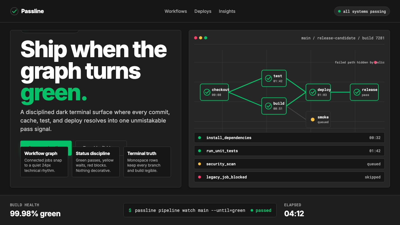 CircleCI Pipeline-GreenConfidence goes green. Emerald status lines cut through terminal-black pipeli…
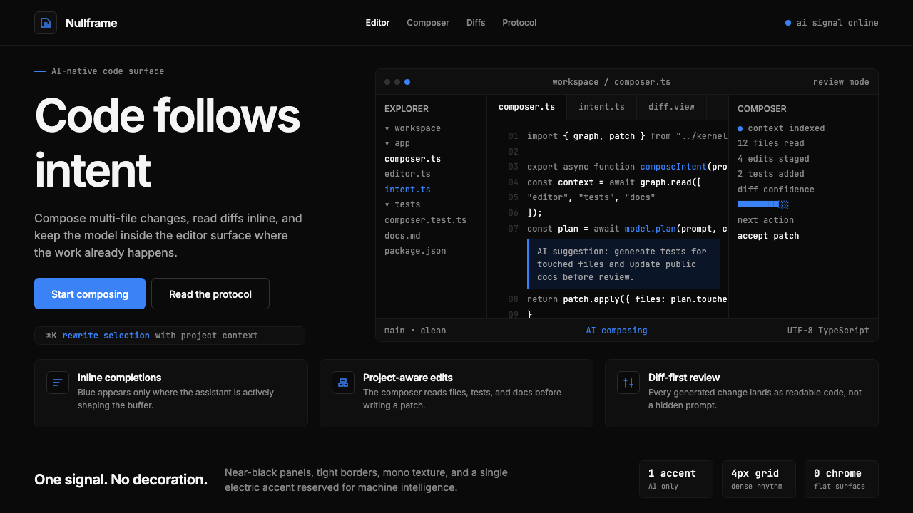 Cursor IDEAI-first code editor. Pure dark surfaces, off-white text, electric blue reser…
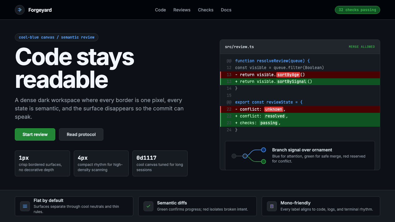 GitHub DarkCode-first darkness. Cool-blue canvas, 1px borders, green/red diff lines.
 Linear 2024Precision down to the millisecond. Near-black, indigo-violet accents, Inter D…
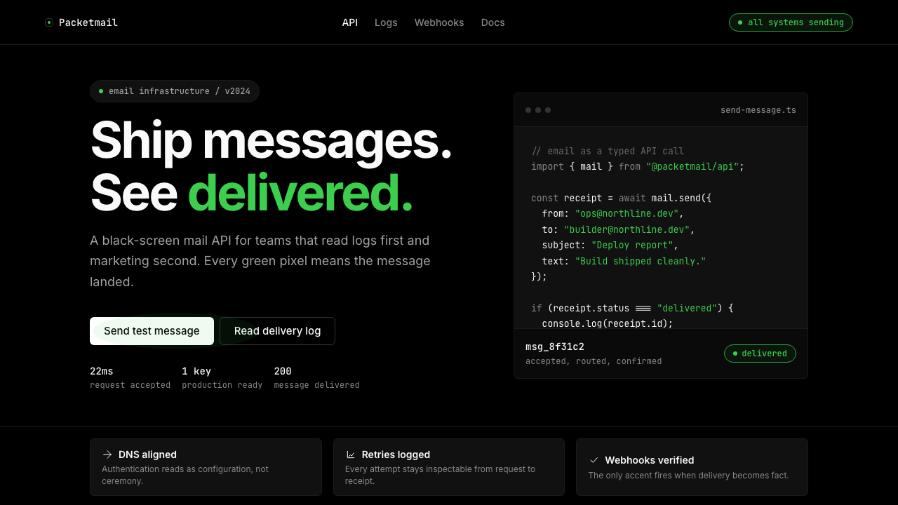 Resend 2024Clean code becomes brand. Pure black, JetBrains Mono, and one green delivered…