About Xiaomi
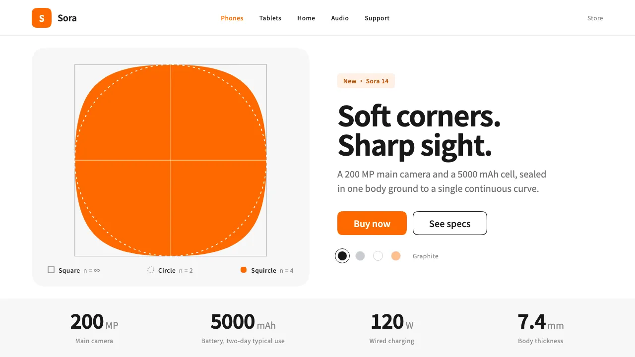
In March 2021 Xiaomi kept its orange square and "mi" mark and changed one thing: Kenya Hara redrew the corners as a superellipse. The squircle, presented under the concept "Alive", became the shape of the whole system, from the logo to app icons, image tiles and buttons.
The launch pages around it stay quiet. White pages with light-grey bands, near-black text and large studio renders. One centred product per section, big spec numbers, and orange only where you're meant to tap.
- Origin
- Beijing, China (Xiaomi), with design by Nippon Design Center, Tokyo, Japan
- Era
- March 2021 logo and "Alive" identity; MiSans released 2021; current visual 2021–now
- Key figures
- Kenya Hara · Lei Jun
- Movements
- Japanese minimalism · Mathematically generated form · Chinese consumer-electronics launch design
Xiaomi design spec
Colors
Background
Surface
Primary
Secondary
Accent
Text
Typography
Noto Sans SCHeadings
Roboto MonoMono
Unlock for 1 credit
The other 11 sections — buttons, cards, spacing, motion, techniques and more — open once you unlock. Download the DESIGN.md or send it to your AI in one click. Unlock once, yours forever.
Sign up nowHave an account? Sign in
Styles similar to Xiaomi
Also inspired by brands & products, with a close feel.
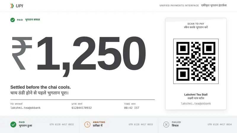 UPI PaymentsUtility, not brand. Grey Helvetica, a saffron-green chevron, black QR on white laminate.
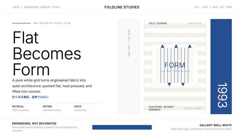 Issey Miyake Pleats PleaseEngineering wears white. Cobalt pleat stripes and a strict Inter grid turn fabric into form.
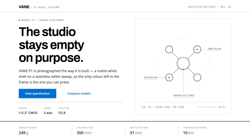 DJI PhantomWhite on white, one blue allowed. Hairline spec tables make the hardware the whole argument.
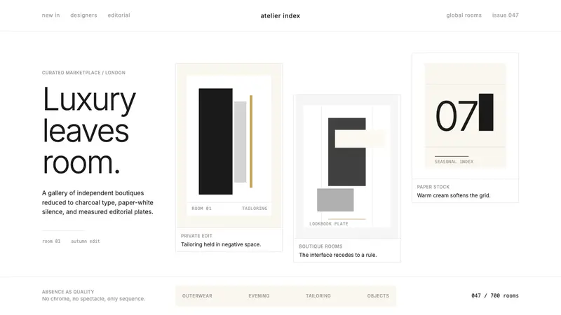 FarfetchLuxury as absence. Charcoal type, white canvas, and hairline editorial plates.