What is World of Warcraft (2004)?
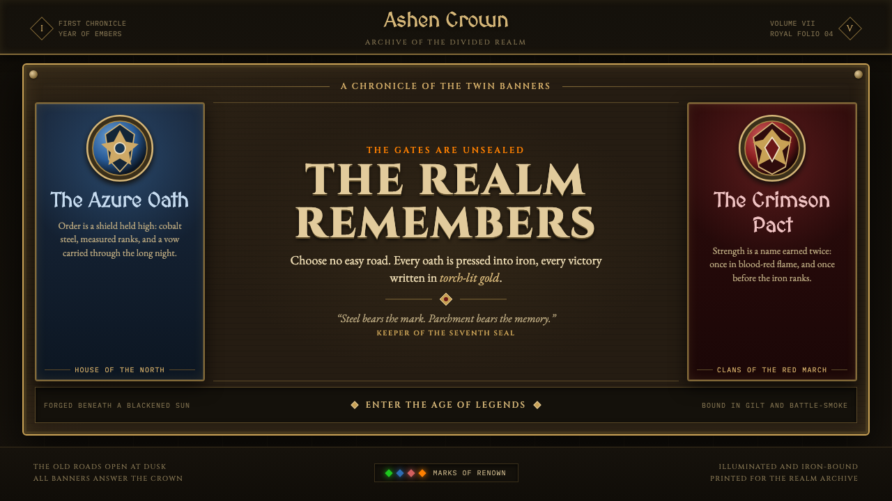
World of Warcraft turns interface into forged fantasy: dark parchment, gilt metal, heraldic color, and the sense that every command is a ritual.
World of Warcraft (2004) in brief
World of Warcraft’s launch-era visual language is high fantasy made functional. Its interface presents panels as smoke-darkened parchment set inside ornate cast-metal frames, with corner rivets, crawling gold filigree, and the density of an illuminated grimoire. A quest log does not read like a neutral document window; it appears to have been unfurled from an old archive. An action bar is not a simple strip of controls; it is bronze hardware fixed into the edge of an invented world.
The style relies on material illusion with unusual conviction. Surfaces are aged, stained, embossed, painted, bolted, and lit from within. Darkness is not merely a background choice but the condition that makes parchment warmth, metal shine, and rarity-colored tooltips legible. The interface asks the player to imagine that menus, inventories, maps, and commands have physical weight. Interaction becomes less like operating software and more like touching a collection of enchanted artifacts.
Two factional heraldic systems organize the emotional temperature of the aesthetic. Alliance imagery is associated with cobalt and gold, creating a noble, ceremonial character; Horde imagery turns toward blood red and iron, producing a harsher martial weight. Both sit inside Warcraft’s stylized realism, where painterly texture and slightly exaggerated form give low-poly geometry an epic presence. The result is deliberately unlike clean contemporary software: it is textured, theatrical, and proudly overbuilt.
Where does World of Warcraft (2004) come from?
This visual system belongs to World of Warcraft’s 2004 launch, released on November 23, and to the art-direction period extending through The Burning Crusade and Wrath era. It emerged at Blizzard Entertainment in Irvine, California, from a setting that needed fantasy information architecture to remain playable while preserving the identity of the Warcraft universe.
The source material identifies high-fantasy game art, Warcraft stylized realism, heraldic UI design, and painterly texture-over-geometry as its governing movements. Together, those ideas explain why the interface does not hide its framing devices. Borders, plates, seals, rivets, and sigils are allowed to announce themselves because they help turn abstract interface regions into objects that belong to a fantasy setting.
Warcraft stylized realism is especially important to the launch interface. It does not seek naturalistic simulation or minimalist restraint. Instead, it gives material surfaces painterly emphasis and gives forms enough exaggerated weight to read clearly under game conditions. Parchment looks aged rather than merely beige; bronze feels riveted rather than simply brown; a dark field behaves like an enclosing shadow rather than an empty canvas.
The key figures named in the supplied material are Samwise Didier, Chris Metzen, Rob Pardo, and Justin Thavirat. Their inclusion places the interface within a broader launch-era creative context rather than treating it as isolated decoration. The enduring lesson of this period is that a game UI can carry setting, faction, material, and emotional tone at the same time as it delivers information.
What defines the World of Warcraft (2004) look?
Dark Parchment
The primary field is not blank white space but a smoke-stained parchment surface. It carries warmth, age, and narrative residue while remaining dark enough to stage brighter type, icons, and glows. This makes information feel discovered inside an archive or spellbook rather than placed on a neutral application canvas.
Forged Frames
Panels are conceived as slabs mounted in ornate metal rather than as flat rectangles. Rivets establish attachment, filigree gives the edge ceremonial richness, and cast-metal framing separates zones with physical authority. The border is not an afterthought; it is evidence that the interface has been built, carried, and fastened into place.
Heraldic Color
Color operates through factional allegiance and emotional contrast. Cobalt with gold evokes the Alliance’s noble heraldry, while crimson with iron gives the Horde a bloodier, more martial identity. These colors are strongest when used as signals on a dark field: they crown a panel, mark an allegiance, or pull attention toward a consequential state.
Painterly Weight
Texture is allowed to do visual work that modern flat systems often remove. Painterly marks and slightly exaggerated volume help surfaces read as epic, even where game geometry is low-poly. The approach favors a hand-made impression over geometric purity: a panel may feel worn, a badge may feel hammered, and an icon may feel painted rather than drawn.
Ritual Interaction
Buttons, bars, and tooltips are treated as enchanted hardware. Pressing a control is imagined as setting a rune into iron, not merely activating a digital command. This transformation depends on the combination of bronze, rivets, parchment, shadow, and glow; no single decoration creates the effect by itself.
Rarity Against Shadow
Near-black space gives colored tooltip information an immediate theatrical contrast. Rarity color becomes more than a classification device: it behaves like a small magical flare in darkness. The hierarchy is therefore experiential as well as practical, directing attention while reinforcing the idea that valuable objects possess exceptional presence.
Who shaped World of Warcraft (2004)?
Samwise Didier is named in the source material as a key figure in the World of Warcraft launch-era context. His inclusion situates the visual language within the broader Warcraft creative identity: a world where exaggerated fantasy form and painterly force help information feel epic rather than merely operational.
Chris Metzen is identified among the key figures for this launch-era world. In the supplied context, that association matters because the UI consistently acts as worldbuilding: parchment, faction heraldry, and enchanted metal make even ordinary navigation feel embedded in fantasy fiction.
Rob Pardo appears in the source material’s key-figure list. The interface associated with this period demonstrates a design premise valuable to game makers: usability elements can remain readable while being fully committed to a setting’s material vocabulary, factional drama, and atmosphere.
Justin Thavirat is also named as a key figure in the approved material. The launch interface’s lasting significance is not that it decorates every control, but that it makes decoration, framing, texture, and hierarchy operate as one coherent fantasy language.
How do you use World of Warcraft (2004) today?
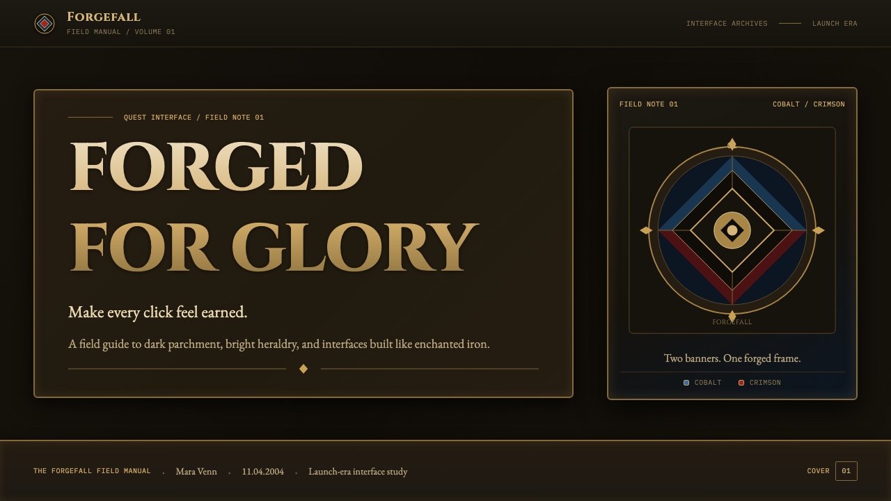
For presentation covers, use the style as a ceremonial frame for a single idea. Let a dark, aged paper field carry the title, set it within an illustrated-metal or gilt border, and use one heraldic accent to establish the dominant mood. The cover should feel like a chapter opening or a quest notice, not a generic game-themed poster. For content slides, keep the fantasy material language at the perimeter and let parchment-like fields support readable text blocks, section headers, and restrained iconography.
Data slides benefit when charts are treated as artifacts instead of sterile widgets. A comparison can sit within a metal-edged panel; legend markers can behave like faction seals or rarity signals; important totals can receive a controlled glow against shadow. Do not turn every bar, label, and gridline into ornament. The chart still needs to be scanned quickly, so texture belongs mostly to its container while the information itself remains calm and distinct.
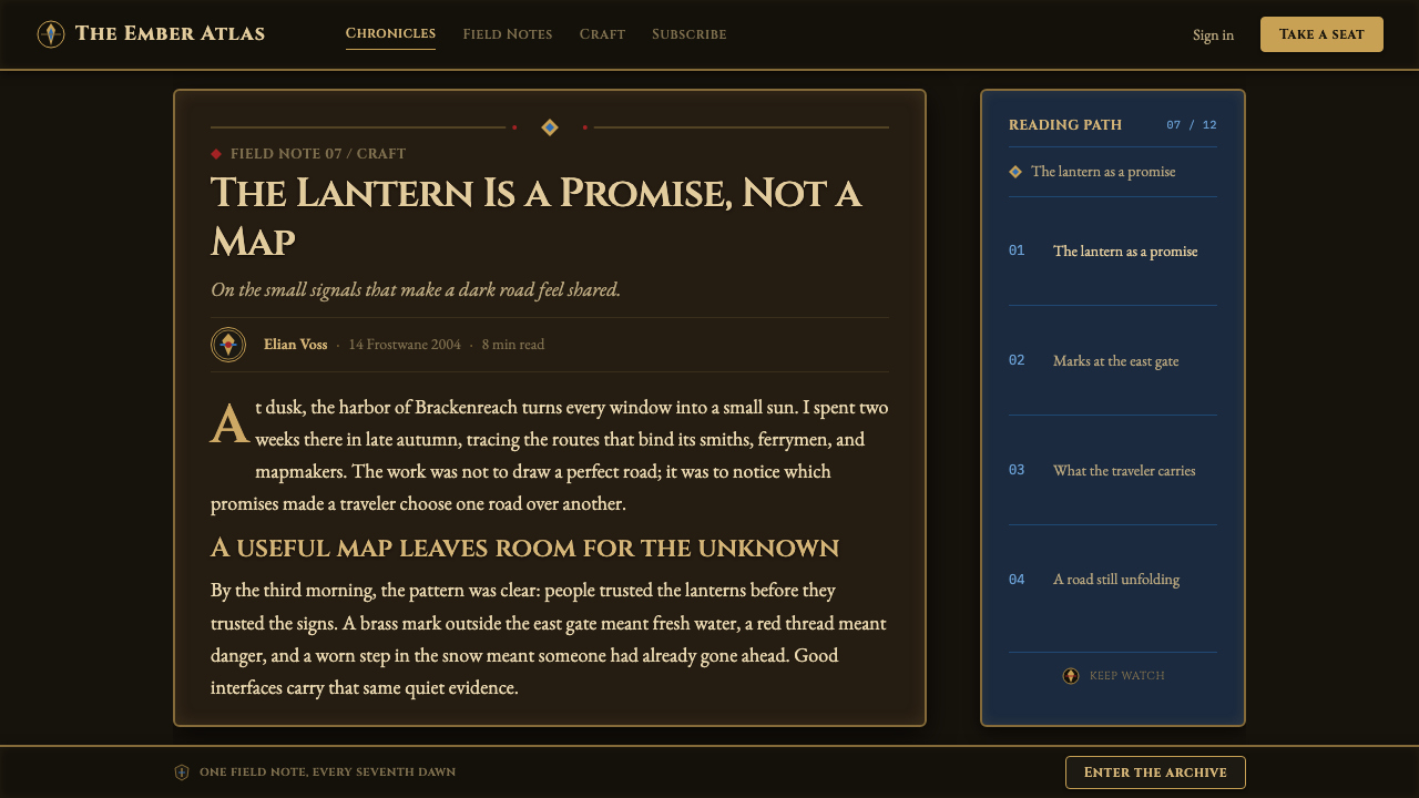
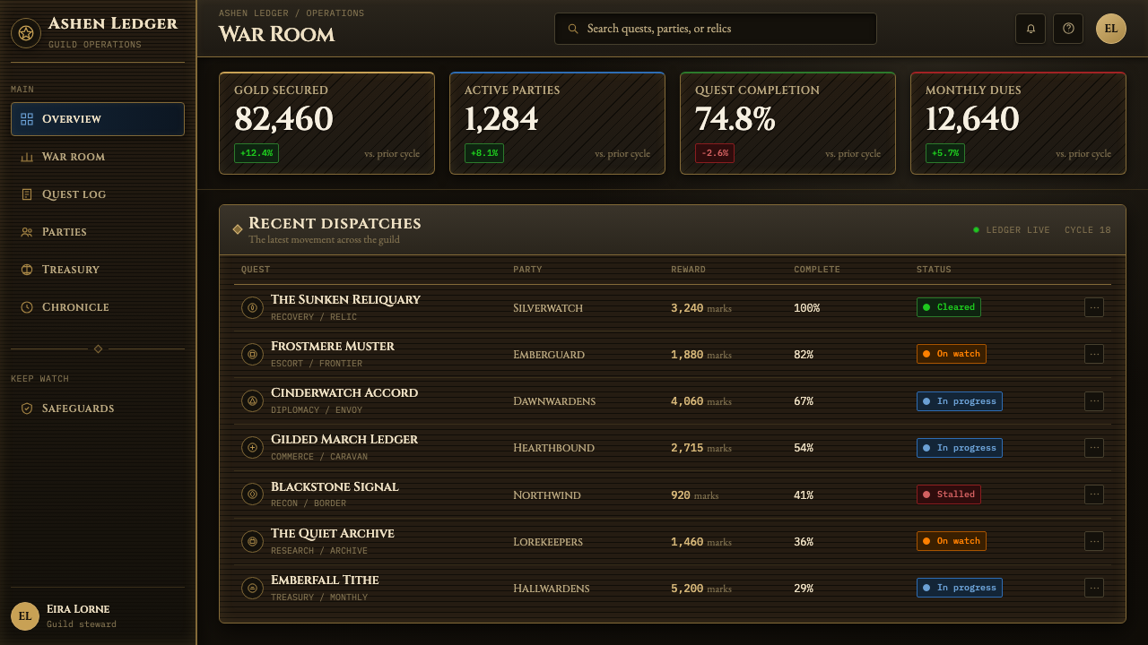
On the web, this language is strongest in game communities, lore archives, collection tools, character dashboards, and pricing or membership pages that need a strong fictional frame. Use dark surroundings to establish depth, then introduce parchment panels as islands of readable information. Navigation can behave like a row of mounted plaques; status states can borrow the logic of rarity-colored light; key actions can feel like stamped seals or inset metal controls.
For editorial and marketing work, the style supports feature stories, seasonal campaigns, event landing pages, and product pages that benefit from atmosphere before explanation. A long-form article can use a parchment reading surface surrounded by a darker frame, with faction-colored callouts separating related themes. Marketing sections work best when each feels like a page from the same grimoire: a consistent border vocabulary, recurring material texture, and only a few moments of bright heraldic emphasis.
The common mistake is copying the surface cues while losing the interface logic. Random gold trim, distressed textures, glowing text, and red-blue accents can quickly become visual noise when they are applied everywhere. The authentic lesson is structural: darkness creates contrast, framing creates artifacthood, factional color assigns meaning, and textured surfaces establish place. Choose one dominant material mood and reserve spectacle for important actions, rewards, or transitions.
World of Warcraft (2004) — FAQ
Is this simply a medieval parchment style?
No. Parchment is only one layer of the system. The defining combination is dark parchment with ornate cast-metal framing, riveted construction, gold filigree, faction heraldry, rarity-colored light, and Warcraft’s painterly exaggeration. A plain manuscript treatment may feel historical; this style needs the tension between archive material, forged hardware, and playable fantasy.
Why does the interface use so much framing and texture?
Because framing and texture turn software regions into world objects. A border can imply metalwork, a rivet can imply construction, and a stained paper field can imply age and history. Together they make the player feel that an interface is part of the setting rather than an external layer placed over it. The detail is functional at the level of fiction, even when it is ornamental at the level of surface.
Can this aesthetic work without faction imagery?
Yes, provided another meaningful heraldic system replaces it. The important principle is not copying Alliance or Horde symbols, but using a small set of recurring colors, emblems, and material cues to make hierarchy feel culturally grounded. A guild, class system, collection taxonomy, or fictional institution can provide an equivalent structure if its signals are used consistently.
Where does this style become difficult to use?
It becomes difficult when information density is high but the available visual space is limited, or when the product requires an intentionally neutral and contemporary tone. Dense texture, elaborate frames, and glow can compete with small text and repeated controls. In those cases, preserve the dark palette and selective heraldic accents, but reduce the ornamental layers so content remains the first thing users can read.
What separates a convincing version from generic fantasy decoration?
A convincing version makes every decorative decision reinforce an interaction or a world rule. Parchment supports reading, metal frames establish containment, rarity color marks significance, and heraldry communicates affiliation. Generic fantasy decoration adds the same cues indiscriminately. If removing an element leaves hierarchy, material logic, and atmosphere unchanged, that element is probably decoration without a role.
Related design styles
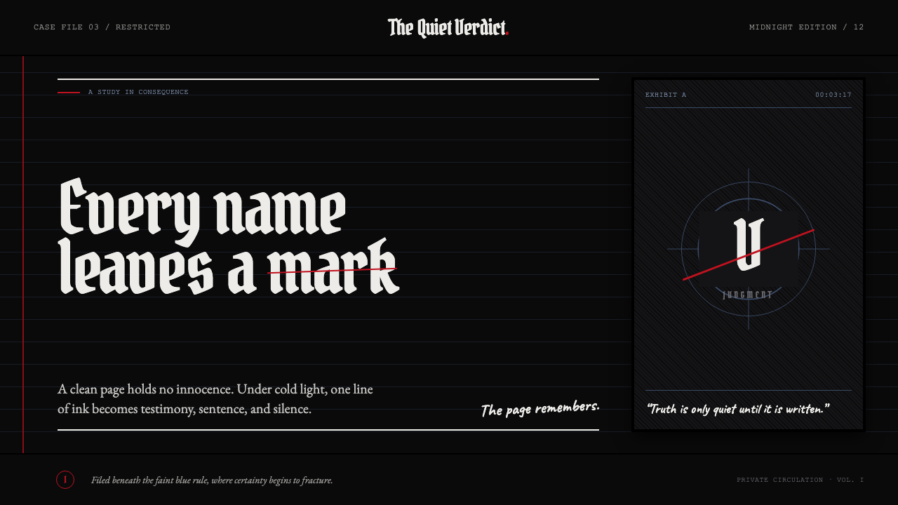 Death Note (2003)Silence becomes judgment. Bone-white blackletter and blue rules break under o…
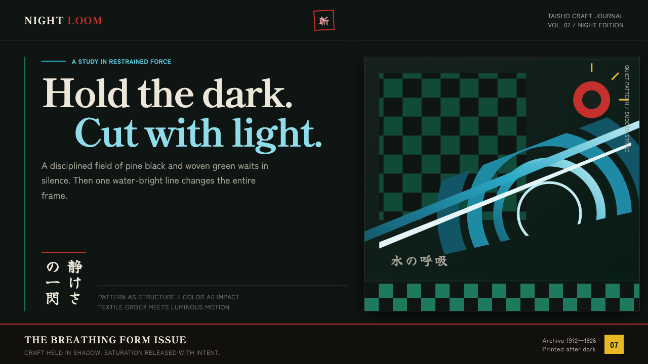 Demon Slayer (2019)Quiet craft, sudden force. Pine-black checks split beneath a water-teal strik…
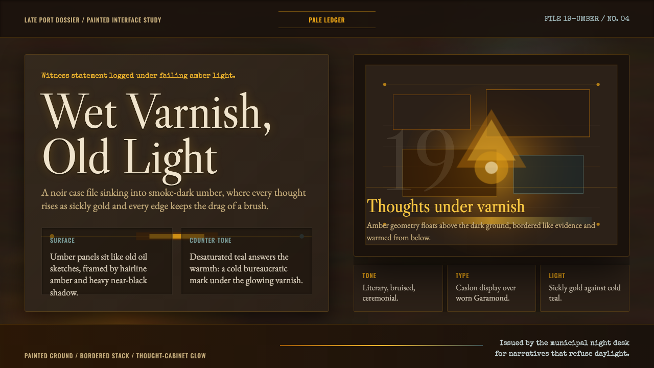 Disco ElysiumNoir rot glows from within. Amber Caslon type cuts through varnish-dark umber.
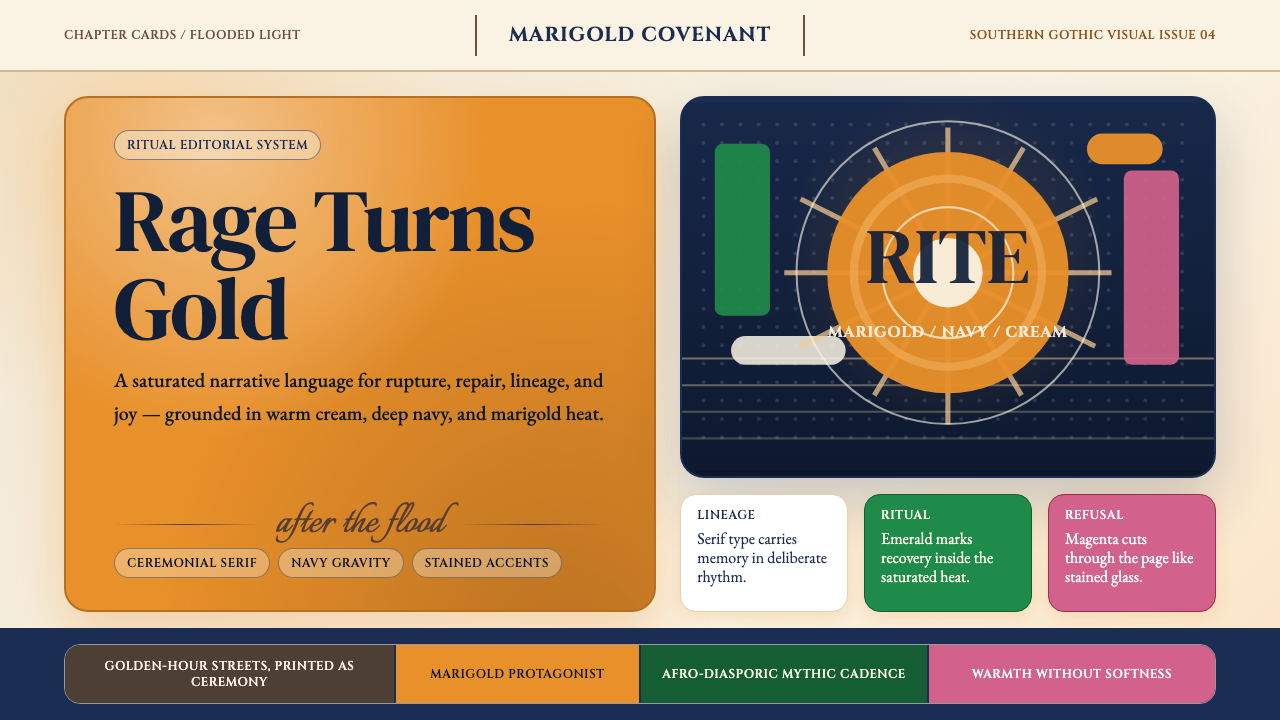 Beyoncé — LemonadeMythic heat refuses restraint. Marigold blocks, navy gravity, serif ceremony.
 Death Metal BlackletterUnreadable by design. Bone fraktur on black, cut by one blood-red geometric s…
 Gothabilly Horror RevivalHaunted swagger. Blood-red marquee type, coffin frames, and pulp halftone on…