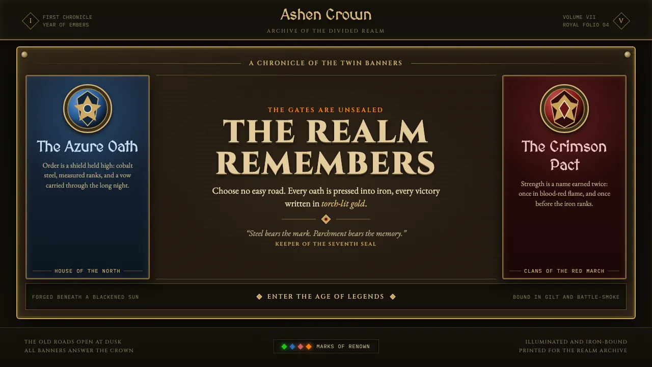
About World of Warcraft (2004)
World of Warcraft's launch interface is hand-forged fantasy made playable: every panel a slab of dark smoke-stained parchment bolted into ornate cast-metal frames, rivets at the corners, gold filigree crawling the borders like an illuminated grimoire. Two heraldic factions rule the palette — noble Alliance in cobalt-and-gold, savage Horde in blood-red-and-iron — rendered with painterly, slightly exaggerated weight so low-poly geometry reads as epic.
Nothing is flat or clean. Quest logs unfurl on aged vellum, action bars sit in riveted bronze, tooltips glow with rarity colors against near-black. The aesthetic insists you are not clicking a button but pressing a rune into enchanted iron — warm torch-lit parchment floating in shadow, crowned with faction sigils.
- Origin
- Irvine, California — Blizzard Entertainment
- Era
- 2004 (launch Nov 23); Burning Crusade / Wrath art direction 2004–2010
- Key figures
- Samwise Didier · Chris Metzen · Rob Pardo · Justin Thavirat
- Movements
- high-fantasy game art · Warcraft stylized realism · heraldic UI design · painterly texture-over-geometry
World of Warcraft (2004) design spec
Colors
Typography
The other 11 sections — buttons, cards, spacing, motion, techniques and more — open once you unlock. Download the DESIGN.md or send it to your AI in one click. Unlock once, yours forever.
Sign up nowStyles similar to World of Warcraft (2004)
Also inspired by film, games & music, with a close feel.
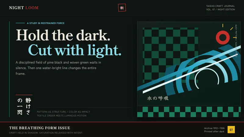 Demon Slayer (2019)Quiet craft, sudden force. Pine-black checks split beneath a water-teal strike.
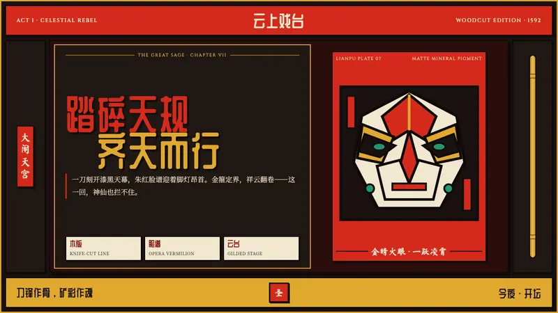 Journey to the West (Monkey King)A god roars off the block. Vermilion opera paint and gilt rules ignite a lacquer-black stage.
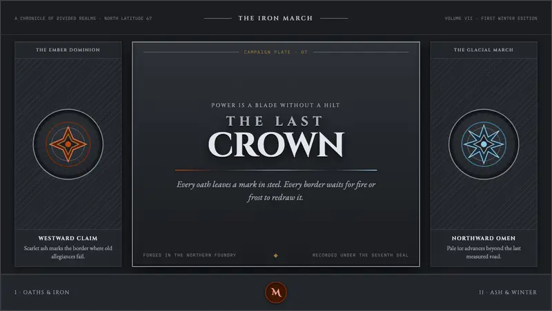 Game of Thrones (2011)Power is forged cold. Chiseled Roman capitals divide ember from glacial ice on gunmetal.
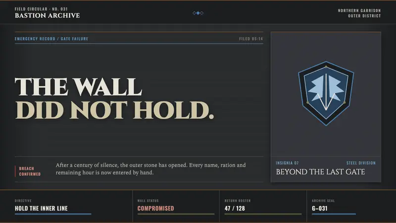 Attack on Titan (2013)Dread becomes duty. Stone-gray bands, engraved caps and one steel-blue crest form a war archive.