What is WipEout?
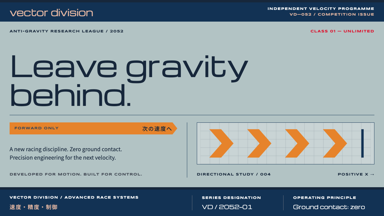
WipEout sold a fictional anti-gravity league the way a real electronics company sells hardware: pale steel-blue, a strict grid and an orange arrow pointing forward.
WipEout in brief
WipEout is the visual identity of a racing game released on the PlayStation in 1995, in which the sport itself is fictional: a futuristic anti-gravity racing league set in 2052. The distinctive thing is not the racing but the packaging. The Sheffield design studio The Designers Republic gave the game a corporate-style brand world, with pale steel-blue covers, navy bands of ruled lines, an orange katakana banner and a set of team identities that look like the logos of electronics firms.
As a style, WipEout combines two energies that usually do not meet: club culture and corporate precision. The pages are flat and printed-looking, as if they came from a manual or a product catalogue. Yet the typography is extended and futuristic, the language is faux-technical, and the Japanese lettering is used as a decorative signal of the future rather than for meaning. Everything is sold with the straight face of a real brand.
Color follows a clear code. Orange marks what moves forward. Red marks position and danger. Everything else stays in cool blues, greys and white, laid out on a strict modular grid. The result is a style that feels fast without ever looking messy, and that suits any product that wants a nightlife edge while still being orderly.

Where does WipEout come from?
WipEout reached the PlayStation in 1995, as one of the launch-era titles for Sony's new console, published by the Liverpool-based developer Psygnosis. The game belonged to a moment when video games were trying to shake off their image as children's toys and present themselves as part of adult youth culture, alongside electronic music, clubs and fashion. The designers of the packaging and branding were given a chance to treat the game like a lifestyle product, and the source material notes that the package and team identities were designed in 1994 and 1995.
The people involved reflect this blend. Nick Burcombe is listed among the key figures as a creative force on the game side. Ian Anderson, founder of The Designers Republic, led the graphic identity from Sheffield, a studio already known for turning corporate visual language into pop culture. Tim Wright, a composer associated with the game's electronic sound, belongs to the same world of rave and club music. The collaboration tied a sound, a look and a game together so tightly that the identity is still read as a single package decades later.
The Designers Republic had a distinctive method, often described as corporate-pop graphics. It borrowed the clean look of corporate communication, logos, specification tables, hazard icons, mock product codes, and pushed it into a faintly absurd, highly stylized register. For WipEout the studio invented teams that looked as though they had global branding departments, such as FEISAR and Qirex, each with its own logo, color and typographic habit. A viewer could almost believe these were real companies.
Three currents feed the style, according to the source material: 1990s UK rave and club culture, The Designers Republic's corporate-pop graphics, and the Swiss International Style. Swiss Style supplies the discipline, the grid, the sans-serif type, the logic of alignment. Rave culture supplies the attitude, the speed, and the playful cult of the future. The studio's corporate-pop approach is the bridge between them, converting rigorous modernism into something that could be pasted on a record sleeve or a games box and still look impeccable.
What defines the WipEout look?
Pale steel-blue ground
The ground color is a light, cool blue-grey, like painted metal or a technical drawing. It gives the layouts a clean, clinical feel and makes the accent colors pop. Large areas stay flat and unadorned, which is part of the printed, manual-like quality.
Navy rule bands
Dark navy bands and fine ruled lines divide the page into zones, much as a specification sheet does. They give structure and a sense of authority, and they create strong horizontal rhythm that suggests speed along a track.
Orange as forward motion
Orange is reserved for what moves forward: arrows, chevrons, key banners. Used sparingly against the blues, it directs the eye through the layout like a signpost. Red, by contrast, marks position and danger, so the two warm colors never mean the same thing.
Extended techno headings
Headings are set in Michroma, a wide, geometric typeface whose letters are stretched horizontally. It reads as engineered and futuristic at once. Wide letterforms also fill the grid generously, giving each title a stable, horizontal presence.
Unicase labels
Small labels use Syncopate, a unicase face in which capitals and lowercase share the same form. It makes captions, codes and team names look like product markings stamped onto a machine. Generous letter spacing keeps these tiny labels crisp.
Bilingual banners
Noto Sans JP sets Japanese katakana alongside English, as in the orange banner that crosses the packaging. The Japanese text works as a decorative signal of the future and the global, a convention of 1990s techno culture, and it is placed with the same discipline as the Latin type.
Strict modular grid
Every element locks to a modular grid. Logos, data tables, banners and blocks of text share the same units of width and height. The grid is the real discipline of the style and the thing that makes loud ideas look credible.

Who shaped WipEout?
Anderson founded The Designers Republic, the studio behind WipEout's graphic identity. The studio built its reputation on corporate-pop graphics, treating logos and product language as raw material for pop culture, and WipEout is one of its best-known projects.
Burcombe is listed among the key figures on the game side of the project, which was published by Psygnosis. He represents the push to make a racing game feel like part of club culture, with the visual identity treated as seriously as the gameplay.
Wright is a composer associated with the electronic music of the game. His work illustrates how sound and graphics were meant to feel like a single product: a club soundtrack matched to a branded, corporate-looking world.
How do you use WipEout today?
On slides, the WipEout style gives a technology deck a nightlife edge without losing order. A cover can use the pale steel-blue ground, a wide uppercase title in Michroma, a navy rule band across the top and a single orange arrow or banner. Content slides can keep the grid visible through consistent margins and rule lines, and each slide can carry a small unicase code in a corner, as if it were a catalogue sheet. It is a good fit for product launches, hardware and chip talks, esports and electronic music presentations.
On data slides, the discipline is the strength. Use a navy-banded table with unicase column labels, flat bars in blue, and one orange mark to flag the figure that moves forward. Use red only for rank, position or warning, so that the reader learns the code quickly. Avoid gradients or soft shadows; the style depends on flat, printed surfaces.
For web interfaces, WipEout suits dashboards, product pages for technology brands, event sites for music and gaming, and any interface that benefits from a strong sense of system. Navigation can look like a spec sheet: ruled bands, short uppercase labels, a clear orange state for the active item. Cards can be flat rectangles aligned to the grid, each with a small code or team-style emblem. Keep spacing consistent in whole multiples, because the grid is the thing users will notice if it breaks.
In editorial and marketing work, the style is excellent for brand-world storytelling: fictional or real products presented as part of a coherent corporate universe, complete with sub-brands, emblems and faux-technical captions. Posters and launch graphics can use a large wide-set title, a strip of Japanese lettering as texture and a single orange chevron to lead the eye. The tone is deadpan, serious about a playful idea.
The most common mistake is to treat it as generic futuristic neon. WipEout is not dark, glowy or cyber; it is pale, flat and printed. Another frequent error is using orange everywhere, which destroys its meaning as forward motion, or ignoring the grid, which removes the corporate precision that makes the rave attitude read as clever instead of chaotic. Finally, do not use the Japanese lettering as real copy unless it has been properly translated.

WipEout — FAQ
Who designed the WipEout look?
The graphic identity came from The Designers Republic, a design studio based in Sheffield and led by Ian Anderson, working with the game's publisher Psygnosis. The packaging and team identities were designed in 1994 and 1995 for the PlayStation release.
What does orange mean in this style?
Orange marks what moves forward: arrows, chevrons and key banners. Red is held back for position and danger. Keeping the colors tied to meanings is what stops the design from feeling decorative, and it helps users read the layout at a glance.
How is WipEout different from Swiss International Style?
Swiss Style is one of its sources, giving it the modular grid, clean sans-serif logic and strict alignment. WipEout adds club-culture attitude, wide futuristic typefaces, faux-corporate branding, Japanese lettering as decoration and a playful sense of humor. Swiss Style is the discipline; WipEout is the discipline wearing a rave outfit.
Can I use it on a light background only?
The reference look is pale steel-blue, flat and printed, and it works best that way. You can add dark navy bands and blocks for contrast, but turning the whole page dark moves it toward generic cyberpunk and loses the product-catalogue precision that defines the style.
Related design styles
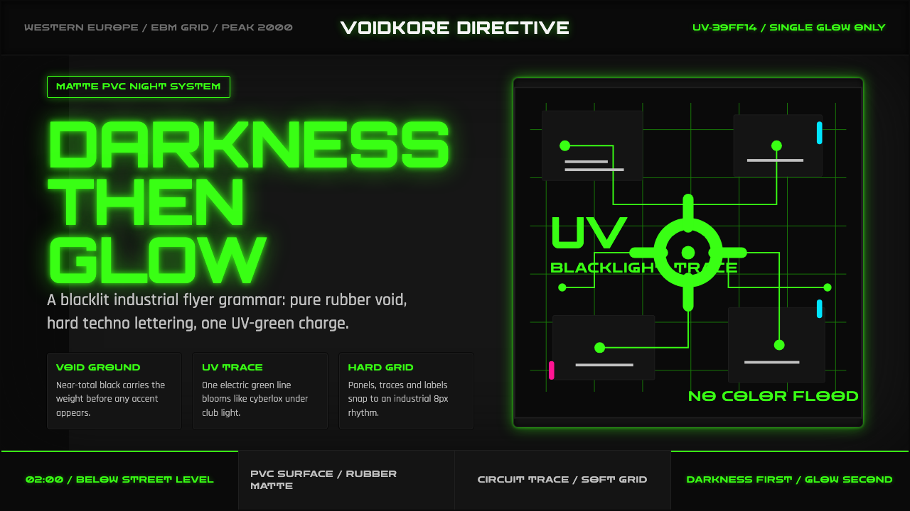 Cybergoth RaveDarkness rules. Pure black PVC is split by one UV-green circuit glow.
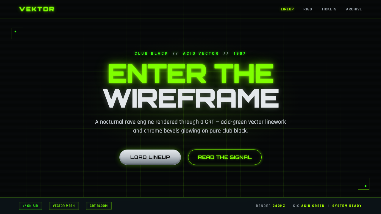 Playstation Rave Green 1997Enter the wireframe. Acid-green vector lines and chrome glow on club black, a…
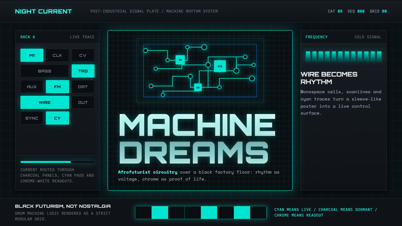 Detroit TechnoCold machines dream. Electric cyan circuits and chrome display type lock to a…
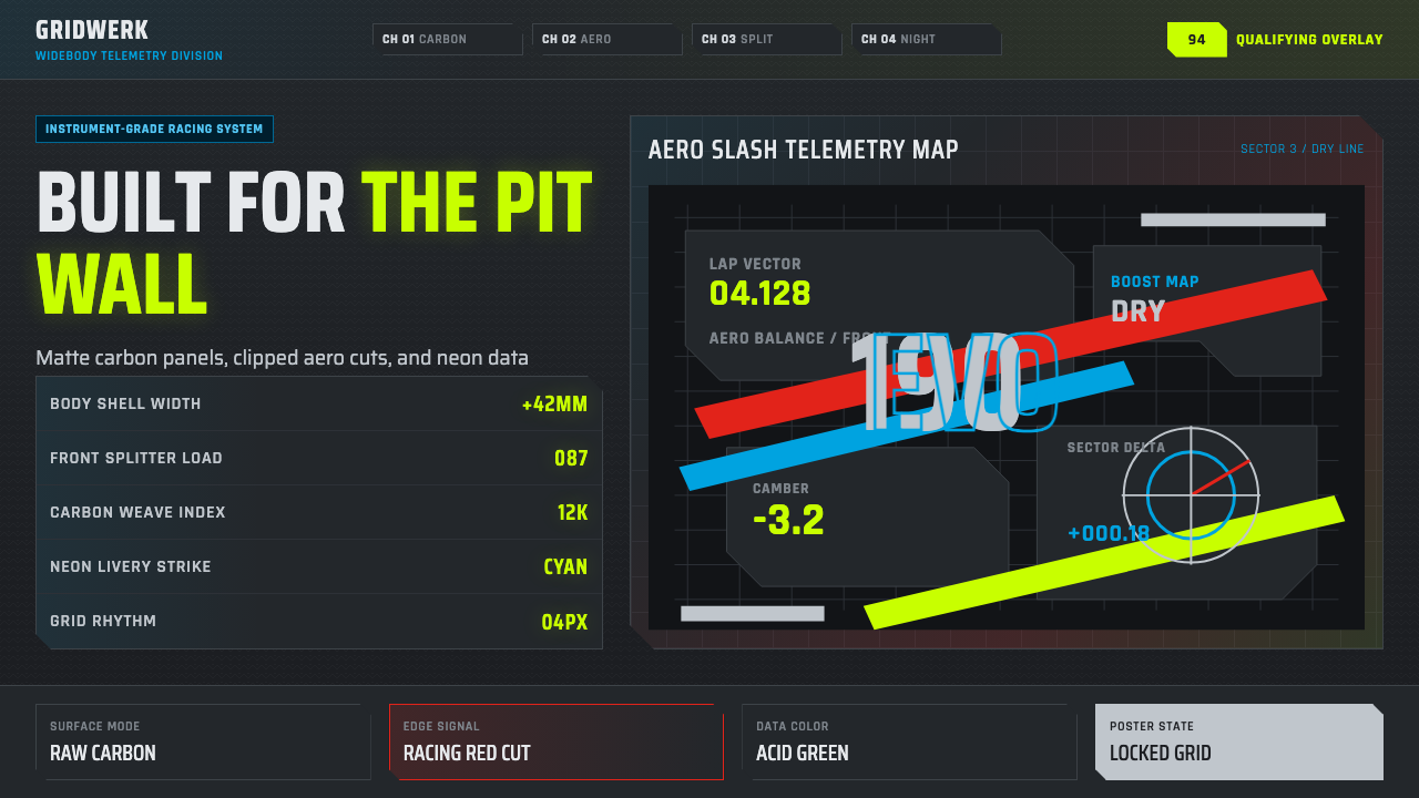 DTM Touring CarEngineered aggression. Carbon black grid, gunmetal type, cyan and acid teleme…
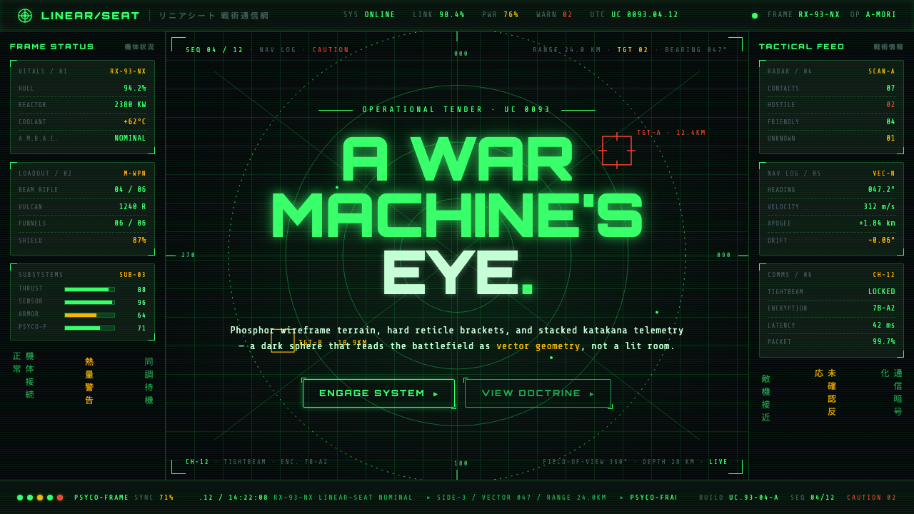 Gundam Universal Century UIA war machine's eye. Phosphor wireframe and katakana telemetry glow inside a…
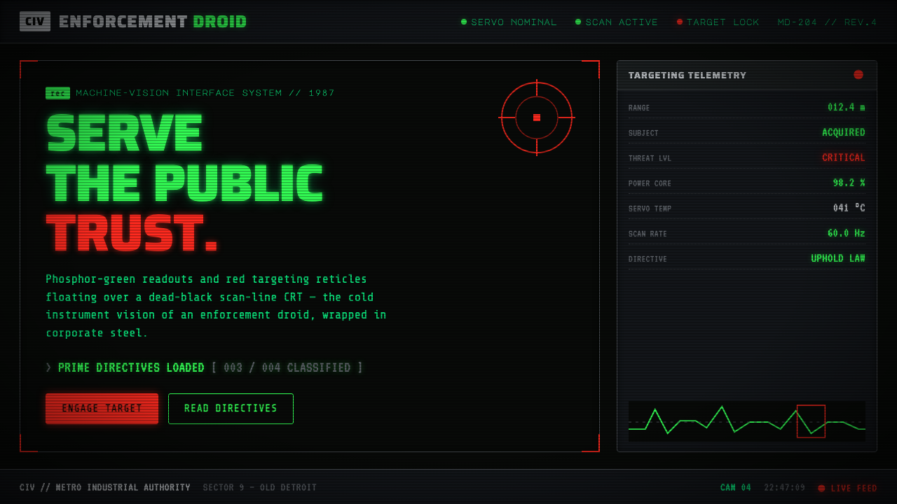 RoboCop (1987)Machine vision as interface. Phosphor-green readouts on dead-black CRT, red r…