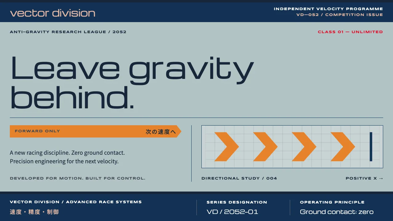
About WipEout
WipEout is the look of a fictional 2052 racing league sold as if it were a real consumer brand. The Designers Republic gave Psygnosis's PlayStation launch title pale steel-blue packaging, navy rule bands, an orange katakana banner and four team identities that read like corporate logos.
This system keeps that discipline: Michroma for extended techno headings, Syncopate for unicase labels, Noto Sans JP for bilingual banners, all locked to a strict modular grid. Orange marks what moves forward, red marks position and danger, and everything else stays flat, printed and precise.
- Origin
- Liverpool and Sheffield, England
- Era
- 1995 PlayStation release; PAL packaging and team identities designed 1994–1995
- Key figures
- Nick Burcombe · Ian Anderson · Tim Wright
- Movements
- 1990s UK rave and club culture · The Designers Republic corporate-pop graphics · Swiss International Style
WipEout design spec
Colors
Typography
The other 11 sections — buttons, cards, spacing, motion, techniques and more — open once you unlock. Download the DESIGN.md or send it to your AI in one click. Unlock once, yours forever.
Sign up nowStyles similar to WipEout
Also inspired by film, games & music, with a close feel.
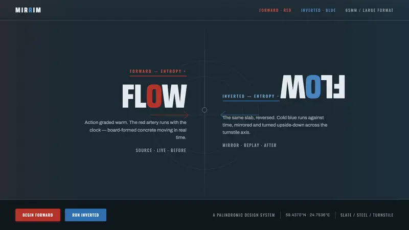 Tenet (2020 Inversion)Time runs both ways. Slate concrete split by a turnstile axis: red flows forward, blue inverts.
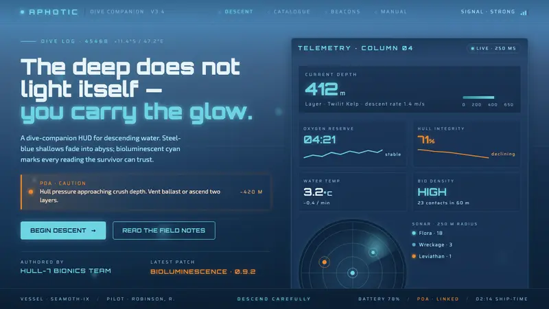 Subnautica DeepThe deep does not light itself. Steel-blue gradient into abyss, cyan glow, one PDA-orange spark.
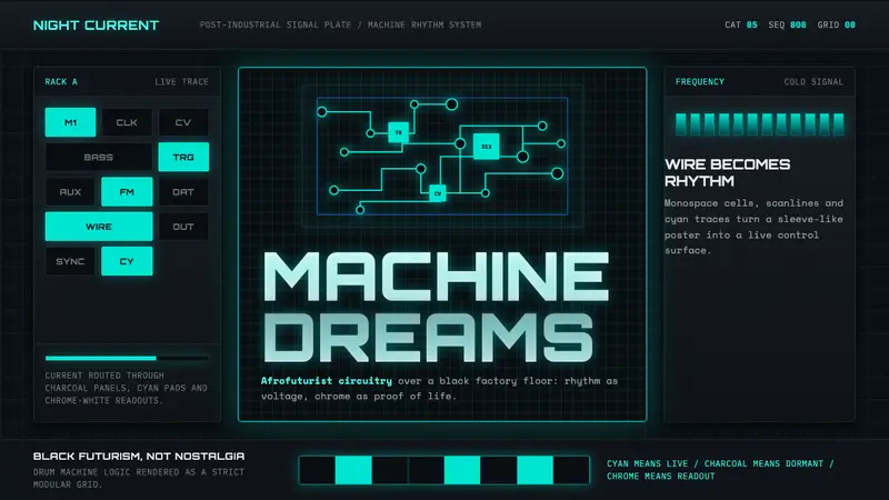 Detroit TechnoCold machines dream. Electric cyan circuits and chrome display type lock to a black grid.
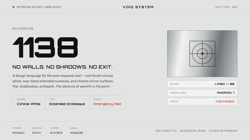 THX 1138Conformity as over-exposed void. Bluish-clinical white, black extended numerals, one emergency red.