What is Yule Solstice?
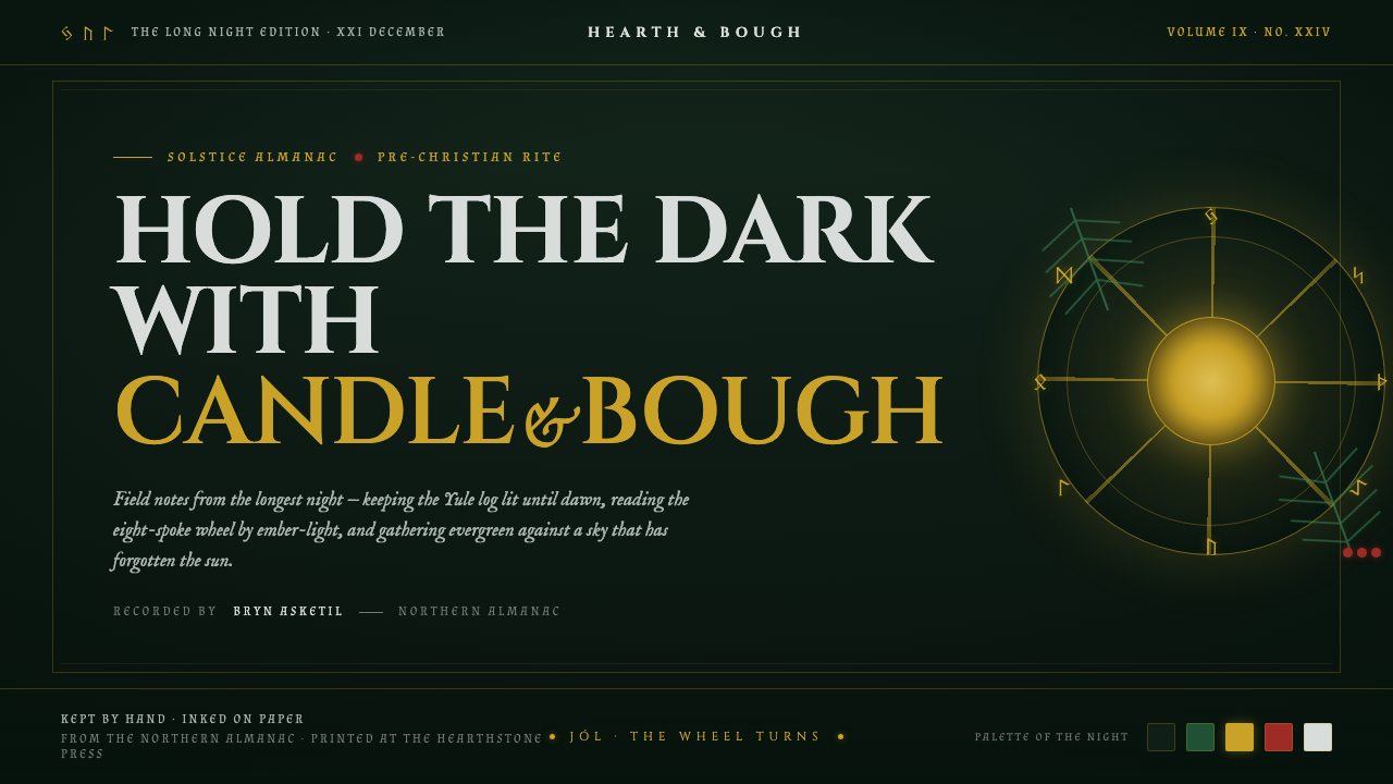
Yule Solstice holds the longest night in stillness — pine-dark ground, carved gold lettering, and a sun wheel waiting for the light to return.
Yule Solstice in brief
Yule Solstice is a dark design language distilled from Yule, the pre-Christian Norse Jól midwinter festival. It takes its emotional center from the winter solstice: a night of near-total darkness held at bay by candlelight and the slow, persistent burn of the Yule log. This is not a bright holiday aesthetic. Its atmosphere is solemn, watchful, and warm only in small, deliberate places.
The visual field begins with deep evergreen darkness: the green-black presence of pine and fir boughs against a winter night. Returning-sun gold brings the principal contrast, while holly-berry red and snow-silver appear as rare living accents. The palette behaves like a ritual arrangement rather than seasonal decoration. Darkness occupies most of the composition so that each lit element feels earned.
Typography and symbols carry much of the style’s identity. Carved, runic, and old-world serif letterforms suggest inscriptions, woodcut marks, and inherited ceremony rather than contemporary luxury branding. The eight-spoke solar wheel serves as a central sign of the returning sun. Together with restrained candlelike glow, it creates a digital environment that feels ancient in mood without becoming theatrical or crowded.
Where does Yule Solstice come from?
Yule Solstice begins with Jól, the pre-Christian Norse midwinter festival associated with the winter solstice and the longest night of the year. Its cultural setting lies across Scandinavia and the wider Germanic lands, where midwinter was understood through darkness, endurance, fire, and the anticipated return of the sun. The resulting design language does not attempt to reproduce a historical ritual scene. Instead, it draws from the elemental conditions named by that rite: night, evergreen life, ember warmth, and solar return.
The evergreen branch is essential to this origin. Pine and fir remain visibly alive when the landscape is otherwise dominated by winter darkness and snow. In the visual system, their deep green becomes more than a seasonal color: it is the ground of persistence. It gives the interface a living undertone beneath the blackness, preventing the dark theme from reading as empty, metallic, or merely gothic.
The Yule log provides the style’s model for light. Its meaning is not an explosion of illumination but a slow burn capable of holding darkness back. That distinction shapes the use of gold and glow: they should feel low, concentrated, and intimate, like warmth gathered close to a fire. Holly red and snow silver extend the same logic, appearing as signs of life and weather rather than as competing decorative colors.
The runic dimension comes through the Elder Futhark tradition and through the broader old-world character of Northern and Germanic midwinter symbolism. Folk-pagan revival practitioners and Wiccan Yule celebrants keep Yule visible as a living seasonal reference, but the design system remains focused on an austere shared vocabulary: evergreen boughs, the Yule log, carved marks, and the solar wheel. Its visual aim is reverence for the longest night, not a generalized fantasy of the past.
What defines the Yule Solstice look?
Evergreen Night
The dominant field is a pine and fir darkness that sits close to black without becoming neutral. It should feel dense, quiet, and botanical, like evergreen boughs disappearing into a winter night. Large areas of this ground are necessary: the darkness is not background filler but the condition that gives every other element its force.
Returning-Sun Gold
Gold is the principal source of light and should read as carved metal, leafed illumination, or a warm reflection caught in the dark. It belongs to titles, sacred marks, key dividers, and moments of arrival. Used too broadly, it becomes festive ornament; used selectively, it suggests the sun’s return without claiming that dawn has already come.
Carved Typography
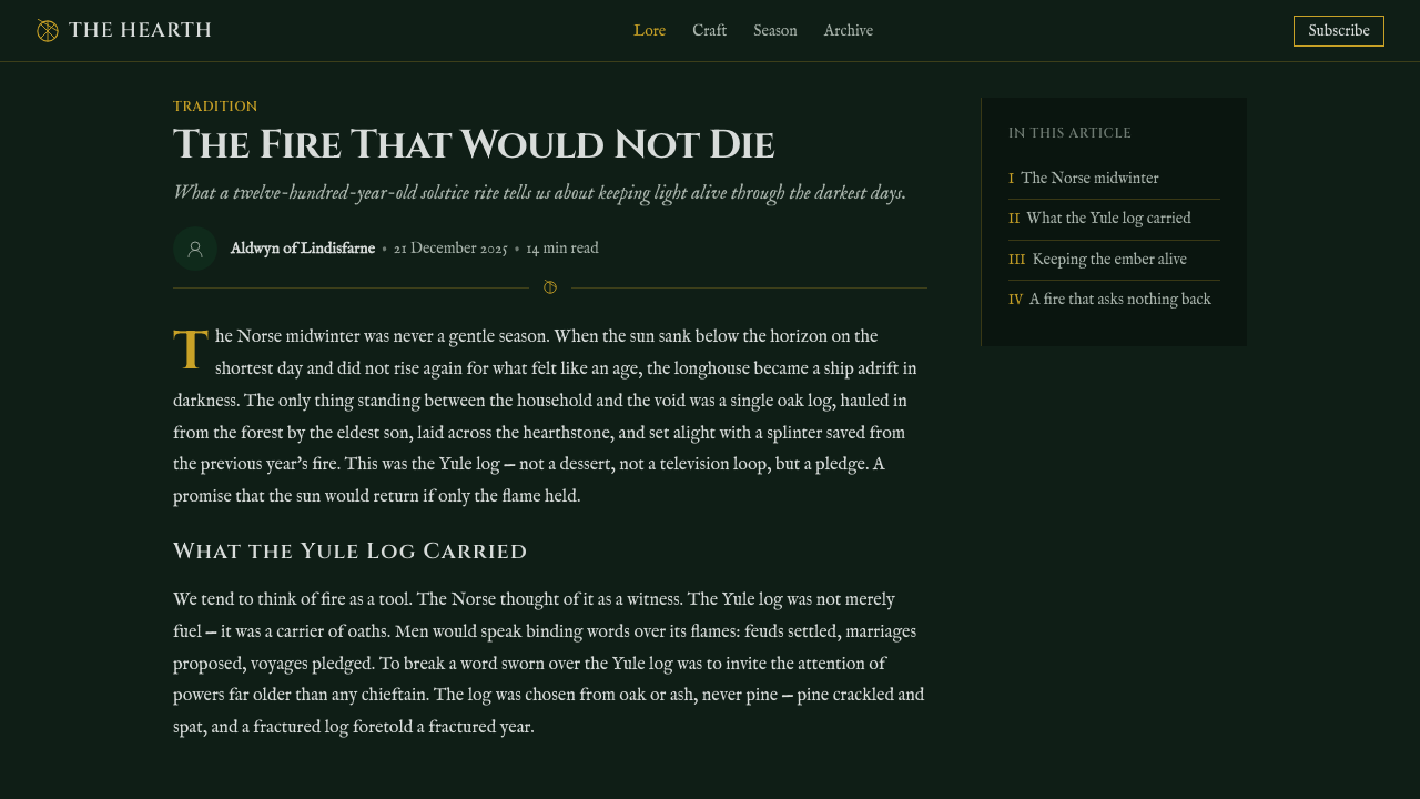
Cinzel-like old-world serif type and runic cues give language the authority of an inscription. Headings should feel cut, pressed, or engraved rather than airbrushed or casually set. The contrast with quieter supporting text is important: display type carries ceremony, while reading text preserves clarity and prevents the page from becoming a decorative artifact.
Solar Wheel
The eight-spoke solar wheel is the defining emblem. It represents a cyclical return rather than a burst of spectacle, so it works best as a centered seal, a quiet navigation marker, a medallion, or a structural anchor. Its geometry should remain clean and legible. Excessive detailing weakens the sign by turning it into ornament instead of a solar symbol.
Low Candle Glow
Light is warm and local, never ambient in the sense of flooding the whole scene. A glow should appear to gather around a meaningful element: a title, a wheel, a ceremonial action, or a point of focus. The darkness must remain visible around it. This preserves the Yule-log logic of a small flame actively holding the night back.
Ritual Restraint
The style depends on scarcity. Holly red and snow silver are accents, not equal partners to the evergreen ground and gold light. Decorative branches, runes, and seasonal symbols should be chosen with care and given room to stand alone. A quiet composition feels more faithful than a crowded one because the theme is vigil, endurance, and return.
Who shaped Yule Solstice?
The pre-Christian Norse and Germanic communities associated with Jól provide the primary cultural setting for Yule Solstice. The design system draws from their midwinter frame of reference: the solstice as a confrontation with darkness, evergreen life as a visible sign of continuity, and fire as a modest but meaningful answer to the season.
Folk-pagan revival practitioners help sustain Yule as a contemporary seasonal reference rather than a closed historical subject. Their relevance to the visual language lies in continuity: the symbols of evergreen boughs, fire, solar return, and carved tradition remain meaningful when treated with restraint and without collapsing into costume-like fantasy.
Wiccan Yule celebrants represent another living context in which the winter solstice remains marked through seasonal symbolism. Within Yule Solstice, that ongoing observance supports the emphasis on cycles rather than nostalgia. The sun wheel, candle glow, and dark evergreen field are used to evoke a recurring threshold between the longest night and returning light.
How do you use Yule Solstice today?
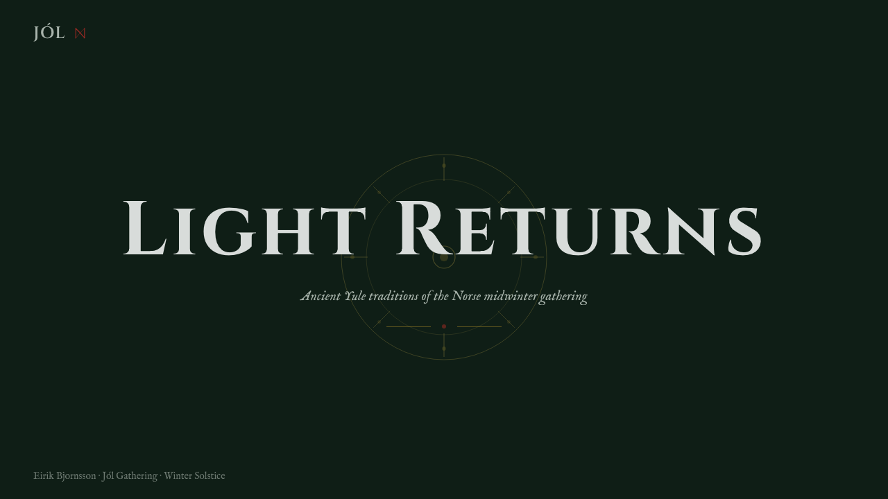
For presentation covers, use the style as a vigil rather than a celebration. Let the pine-dark ground occupy the frame, place a carved gold title with ample surrounding silence, and use a single solar wheel or restrained evergreen form as the compositional anchor. Content slides should become calmer and more editorial: maintain the dark field, separate sections through gold rules or quiet silver markers, and let old-world display type appear only where it can carry a clear chapter or idea.
Data slides work when they preserve the hierarchy of night and light. Charts should remain structurally plain and readable, with gold reserved for the important series or conclusion, silver for supporting information, and holly red for genuinely exceptional states. The solar-wheel geometry can guide radial or cyclical information, but it should not be forced onto every dataset. The mood should make analysis feel illuminated from darkness, not disguised as a seasonal poster.
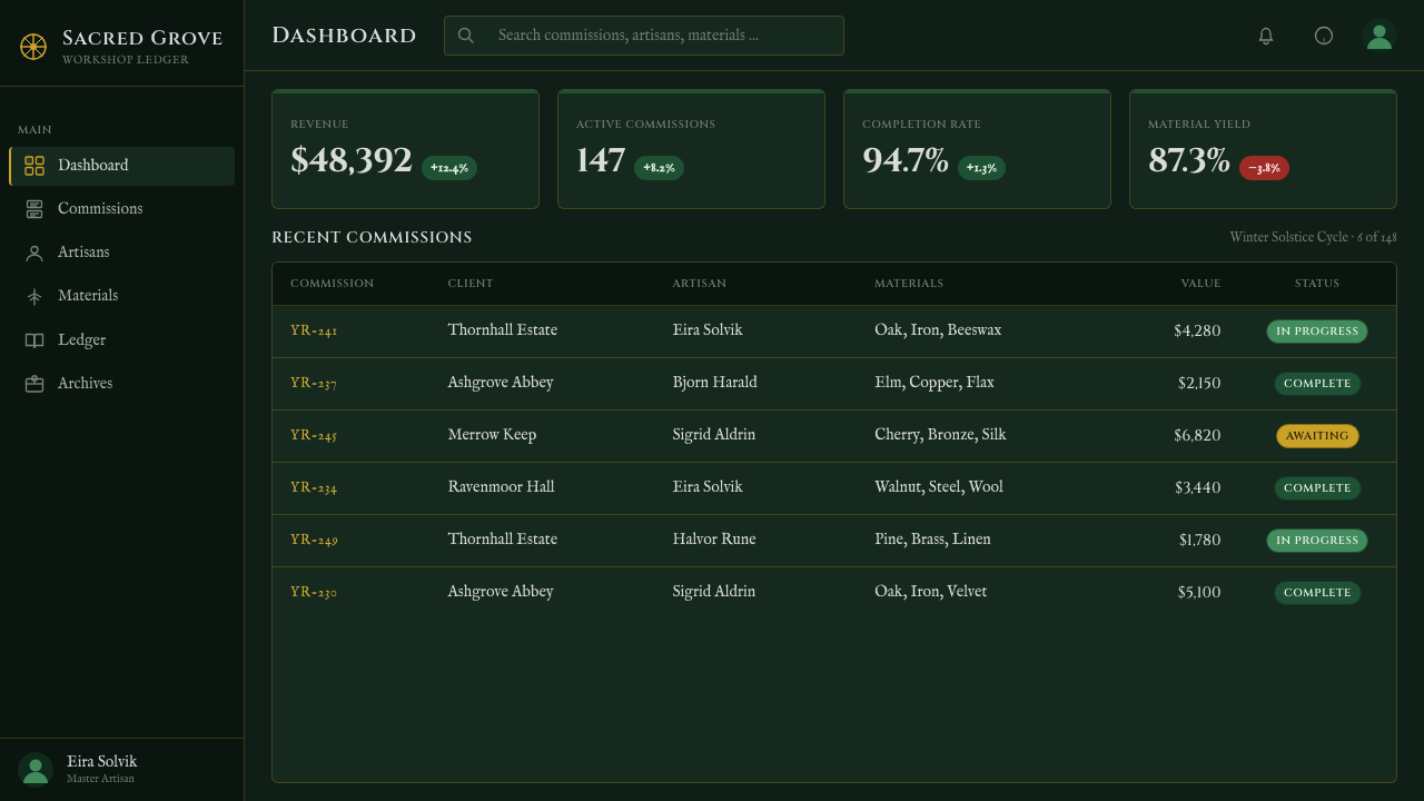
In web interfaces, Yule Solstice suits dashboards, seasonal journals, event pages, memberships, and pricing pages that benefit from gravity and ceremonial focus. Use the evergreen-dark canvas to create depth through absence, not through a pile of panels. Gold can identify primary actions, active states, and high-value information; subdued silver can hold secondary navigation and metadata. Cards, controls, and data regions should be crisp enough for everyday use, with the carved display voice reserved for headings and important thresholds.
For editorial and marketing work, the style is strongest when it frames a story of endurance, return, memory, or winter gathering. Long-form pages can alternate dense night sections with quieter snow-silver reading areas, using evergreen imagery or branch-like motifs sparingly. Marketing layouts should favor one memorable emblem, a small number of warm focal points, and language with genuine weight. The atmosphere is most convincing when it leaves room for readers to feel the darkness around the message.
A common mistake is turning Yule Solstice into generic Christmas decoration: scattering red, gold, greenery, candles, stars, and runes everywhere at once. That replaces vigil with excess. Another mistake is using ornate historical lettering for every line of copy, which harms readability and makes the interface feel like a prop. Keep the hierarchy firm: evergreen night first, carved gold second, rare living accents last. The style succeeds through controlled warmth, not seasonal abundance.
Yule Solstice — FAQ
Is Yule Solstice simply a Christmas style?
No. Its source is Yule, the pre-Christian Norse Jól midwinter festival, and its visual center is the winter solstice rather than holiday display. It can coexist with seasonal content, but its defining ideas are longest-night darkness, evergreen endurance, candle and Yule-log warmth, and the returning sun. A bright, crowded festive treatment misses its central mood.
Why is the background so dark?
The darkness is structural. Yule Solstice is built around a night that must be endured and held back, not erased. The near-black evergreen field gives gold, red, silver, and candlelike glow their meaning. If the ground becomes too light or too busy, the style loses the contrast between vast winter night and small sustaining sources of life.
How should the eight-spoke solar wheel be used?
Treat it as a primary emblem of solar return, not as repeating surface decoration. It works best at moments of orientation, completion, transition, or focus: a cover seal, a central marker, a ceremonial action, or a cyclical navigation idea. Keep it clear and spacious so its spokes remain a readable sign rather than a textured motif.
Can holly red and snow silver become the dominant colors?
Usually they should not. The defining relationship is evergreen night against returning-sun gold. Holly red is most effective as a sign of living intensity or exception, while snow silver supports reading, weathered contrast, and secondary structure. Giving either accent too much territory makes the system feel decorative and weakens the slow, low-light atmosphere.
Does the style require runes everywhere?
No. Runic and carved cues are part of the atmosphere, but they work through selectivity. A small number of inscription-like moments can establish the old-world voice; repeated symbols quickly become visual noise or fantasy styling. The stronger approach is to let typography, darkness, the solar wheel, and restrained warmth carry most of the identity.
Related design styles
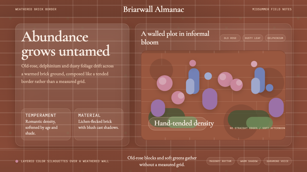 English Cottage GardenAbundance wins. Old-rose Garamond blooms over weathered brick and dusty leaf.
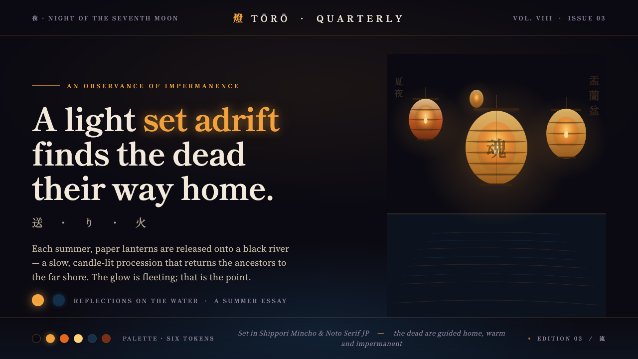 Obon Floating LanternsLight, set adrift. Amber washi lanterns on near-black water, each glow double…
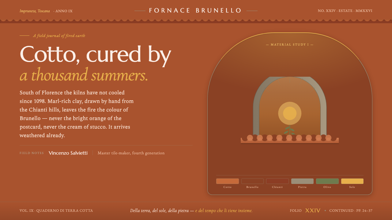 Tuscan TerracottaWeathered fired clay, never cream stucco. Brunello browns and sun ochre on hu…
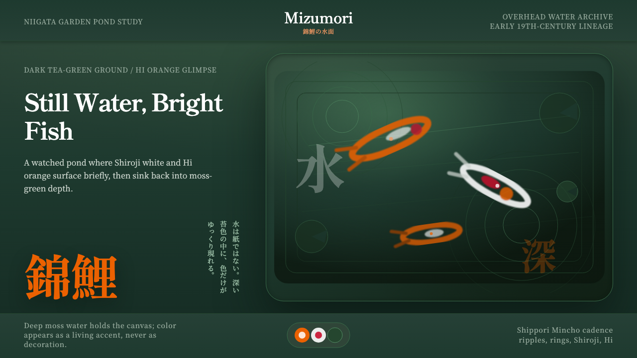 Koi PondQuiet water carries color. Moss depth, Mincho type, and orange koi flashes.
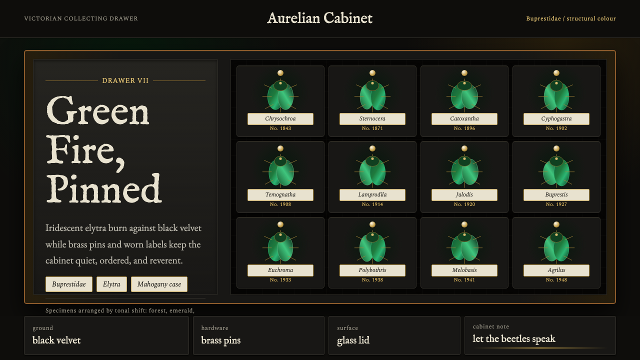 Beetle Specimen CabinetGreen burns in darkness. Emerald elytra grids glow under brass keylines and b…
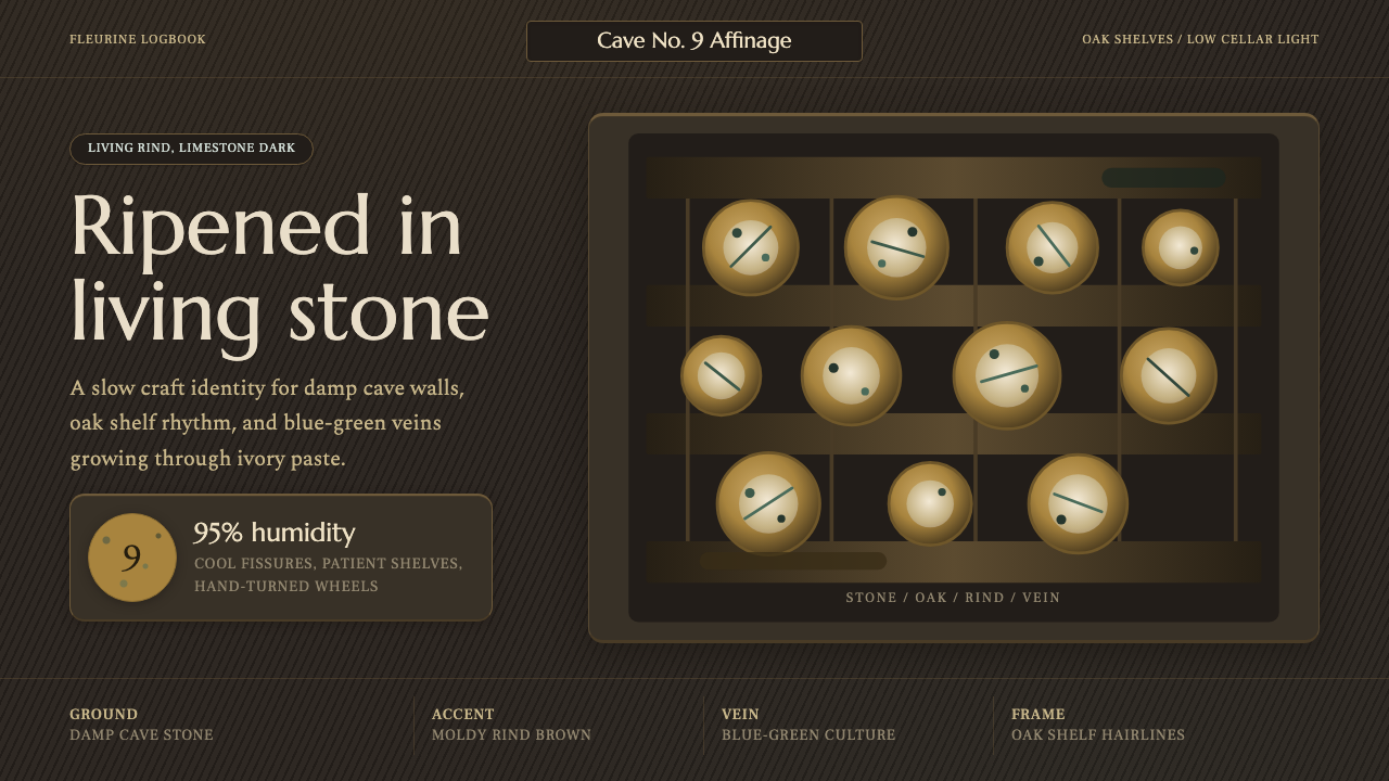 Cheese Affinage CavePatience reads as stone. Rind brown, mold green, and oak shelf grids glow in…