What is Tuscan Terracotta?
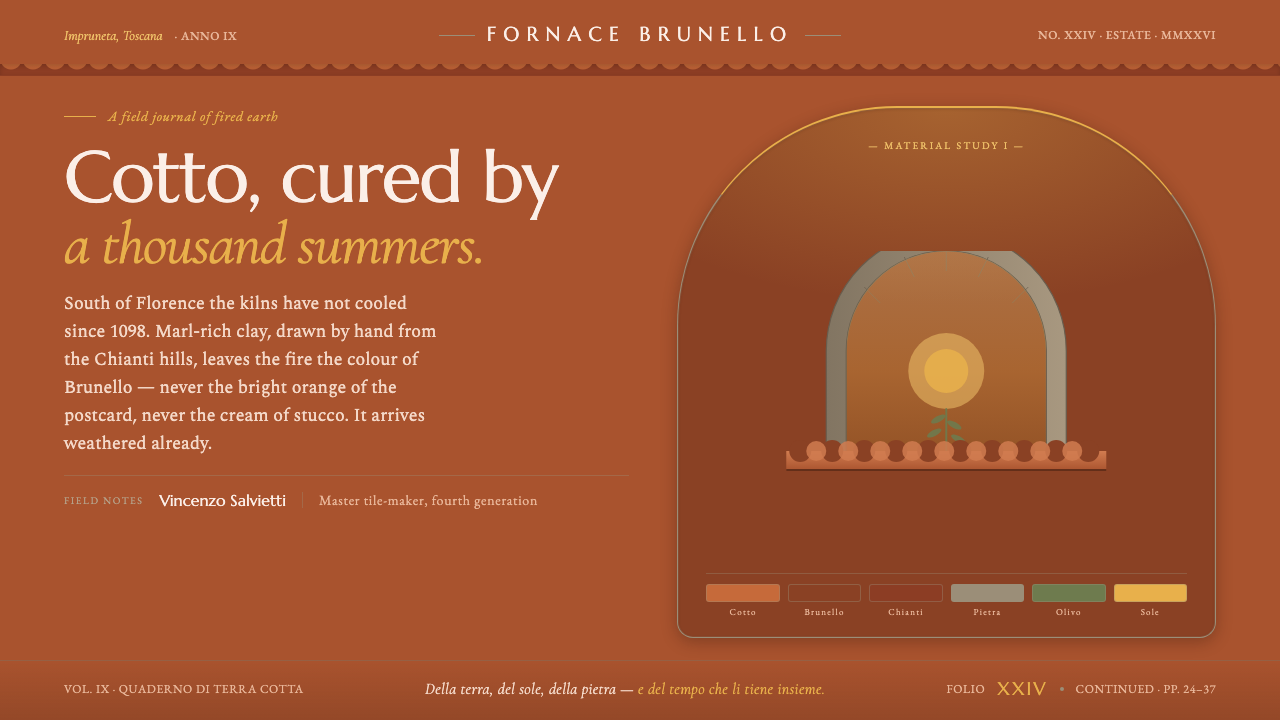
Tuscan Terracotta turns fired earth into a visual language of weathered clay, sun ochre, stone, and humanist Italian type.
Tuscan Terracotta in brief
Tuscan Terracotta is rooted in the fired earth of the Tuscan countryside: aged Impruneta cotto roof tiles, orange-brown clay darkened by weather and shadow, and rough pietra serena stone surrounding farmhouse walls. Its defining quality is material truth. It should read as genuine fired clay, never as pale plaster, creamy stucco, or a generic rustic orange.
The system gathers Brunello and Chianti browns, stone gray, olive-cypress green, and sun ochre into a warm but grounded palette. Saturated fired clay supplies the visual ground, while the cooler stone and vegetal tones keep the composition from becoming sugary or theatrical. Humanist Italian serifs carry the voice, giving headings and long-form text a cultivated, regional character.
Its ornament is architectural rather than pictorial. Overlapping tile courses create rhythm; arched openings create softness within a sturdy structure; rough stone coursing introduces irregularity and weight. The overall impression is sun-warmed, aged, and enduring: a design language shaped by material, climate, craft, and the accumulated marks of time.
Where does Tuscan Terracotta come from?
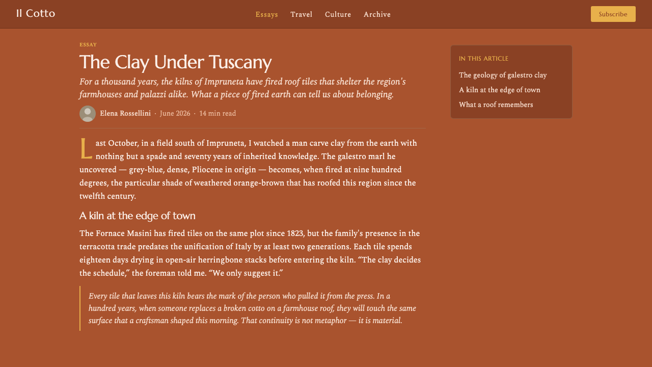
The source landscape is Tuscany in western Europe, especially Impruneta, the Chianti hills, and the Florentine countryside. Tuscan Terracotta does not begin with an abstract color swatch; it begins with a building tradition in which roof, wall, shadow, and stone are read together. The visual system preserves that relationship by treating clay as an architectural substance rather than a decorative accent.
Impruneta cotto has been fired in the hills south of Florence since 1098. That continuity gives the material its authority. The reference is not newly painted orange but weathered fired clay: surfaces that have been exposed to sun, age, and shadow until their color becomes deeper, more nuanced, and more rooted in the ground beneath them.
The architectural vocabulary belongs to Italian rural and vernacular building. Cotto roof tiles overlap in visible courses, pietra serena forms a cool counterweight to the clay, and arched openings interrupt solid walls with measured softness. Rough stone coursing adds a tactile irregularity that keeps the system from becoming overly polished. These elements are not interchangeable motifs; together they establish the rhythm of the countryside.
Typography extends the same regional continuity into language. Humanist Italian serifs connect the visual system to a humanist typographic tradition, balancing warmth with dignity and craft with readability. Tuscan Terracotta therefore distils two vernacular inheritances at once: the material intelligence of the Impruneta fornaci and the disciplined character of humanist Italian lettering.
What defines the Tuscan Terracotta look?
Fired-Clay Ground
The dominant ground is saturated fired clay: aged orange-brown, sun-warmed, and visibly deeper than postcard orange. It carries the atmosphere of cotto roof tiles after exposure to weather, with enough shadow in the color to feel substantial rather than bright or cosmetic.
Earth and Stone Contrast
Brunello and Chianti browns establish warmth, while stone gray introduces a cooler architectural counterpoint. Olive-cypress green and sun ochre extend the landscape without turning it into a botanical palette. The colors should feel inherited from walls, hills, tiles, and vegetation.
Humanist Italian Serifs
Typography is carried by humanist Italian serifs rather than neutral modern lettering. Their forms bring warmth, literary dignity, and a sense of practiced craft. Headings should feel cultivated and assured; body text should remain calm, legible, and suited to sustained reading.
Tile-Course Rhythm
The repeated course of roof tiles provides a structural rhythm: overlapping bands, measured repetition, and slight visual variation. This motif can organize sections, cards, or dividers without becoming literal illustration. Repetition should feel architectural and cumulative, not ornamental or busy.
Arches and Rough Coursing
Arched openings soften the system's weight, while rough stone coursing introduces irregular edges and tactile depth. Used together, they create a balance between shelter and openness, order and hand-built variation. The forms should appear sturdy, quiet, and shaped by construction.
Weathered Depth
Depth comes from age and shadow rather than glossy polish. Fired clay should feel darkened in recesses and softened at exposed edges; stone should read as rough and cool beside it. The visual effect is layered and grounded, with time implied through tonal variation instead of artificial spectacle.
Who shaped Tuscan Terracotta?
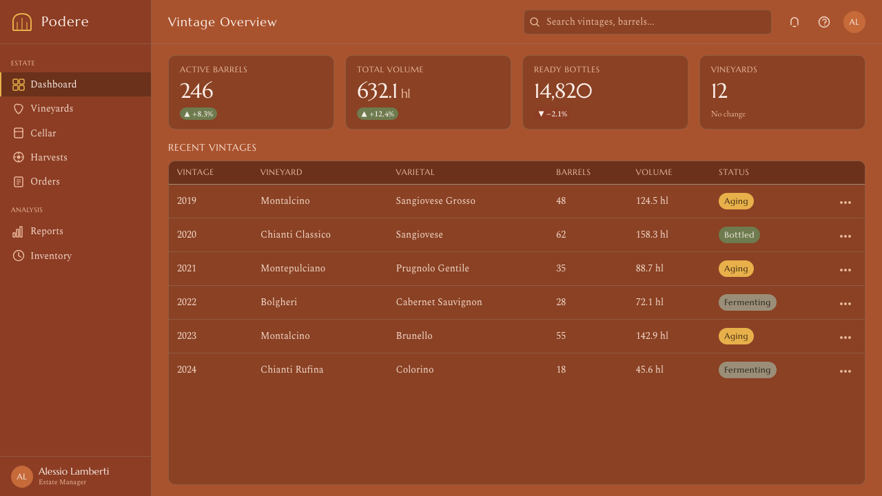
The Impruneta kilns are the material source at the heart of the style. Their long continuity, firing tradition, and association with the hills south of Florence give cotto its authority as genuine fired earth. In the design system, they represent process, place, and the accumulated character of weathered clay.
Tuscan master cotto makers embody the craft knowledge behind the roof tile: how fired earth acquires warmth, depth, and variation without losing its structural identity. Their contribution is reflected in the system's refusal of flat postcard orange and its preference for aged, shaded, materially credible clay.
Tuscan stonemasons provide the counter-language to fired clay through pietra serena and rough coursing. Their work gives the style its cool grounding, irregular texture, and architectural weight. Stone is not a background neutral; it is the element that makes the terracotta feel built, inhabited, and enduring.
How do you use Tuscan Terracotta today?
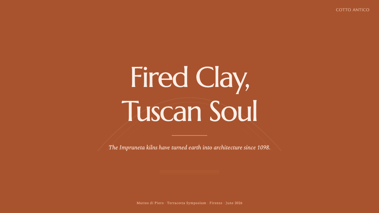
For presentation covers, use fired clay as the commanding field and let the title sit in a humanist Italian serif with generous breathing room. A quiet arch, a band of overlapping tile-like rhythm, or a stone-gray interruption can establish the Tuscan reference without turning the cover into a literal farmhouse illustration. The composition should feel sunlit and substantial rather than decorative.
Content slides benefit from a clear hierarchy built through serif scale, tonal contrast, and architectural grouping. Use stone gray or olive-cypress green to separate supporting information from the main clay-colored field. Data slides can treat bars, panels, and labels as courses of masonry or tile: repeated, aligned, and slightly varied, with sun ochre reserved for emphasis rather than scattered across every element.
For web interfaces, Tuscan Terracotta suits dashboards and pricing pages that want to feel trustworthy, crafted, and grounded. Use fired clay for primary actions or prominent panels, stone gray for structural surfaces, and olive-cypress green for secondary states or supporting categories. Keep navigation typographic and calm; use arches, borders, and course-like bands to organize space instead of relying on glossy cards or excessive ornament.
Editorial and marketing layouts can use the style's sense of place to make information feel tactile and memorable. Long-form pages should pair humanist serif text with broad clay-colored fields, cool stone sections, and restrained ochre signals. Campaign pages can alternate between saturated terracotta grounds and quieter stone-led passages, allowing the contrast between warmth and solidity to carry the narrative.
The common mistake is treating Tuscan Terracotta as a generic rustic theme or an excuse to fill every surface with orange. The style depends on variation: fired clay needs stone, shadow, and vegetal green; warmth needs restraint; architectural rhythm needs open space around it. Cream stucco, postcard brightness, random farmhouse icons, and decorative clutter weaken the material honesty that makes the system distinctive.
Tuscan Terracotta — FAQ
Is Tuscan Terracotta simply an orange color palette?
No. Its identity comes from fired earth understood as a material and architectural condition. The orange-brown clay is weathered, shaded, and balanced by stone gray, olive-cypress green, and sun ochre. Without those counterweights, the result becomes bright rustic orange rather than Tuscan cotto.
Why does the system reject cream stucco?
Cream stucco points toward a pale, smooth, plastered architecture, while the reference here is weathered fired clay laid against stone. The distinction is essential: Tuscan Terracotta should feel kiln-made, shaded, and substantial. A pale stucco ground removes the very material contrast on which the style depends.
Why are humanist Italian serifs important?
They connect the interface or page to the system's humanist Italian typographic tradition. Their presence adds cultivated warmth and literary dignity, while their readable forms support sustained text. A neutral modern sans serif could preserve clarity, but it would lose the regional and crafted voice that the style is meant to carry.
Does the style require literal tile and arch illustrations?
No. Tile courses, arches, and rough stone coursing are structural references, not mandatory pictures. They can appear through repeated bands, rounded openings, layered sections, and irregular boundaries. The goal is to evoke the rhythm and weight of Tuscan vernacular architecture while keeping the design useful and legible.
Related design styles
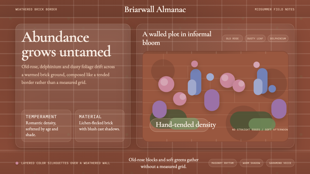 English Cottage GardenAbundance wins. Old-rose Garamond blooms over weathered brick and dusty leaf.
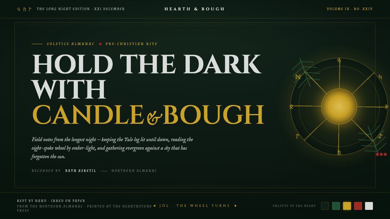 Yule SolsticeHolds the longest night. Pine-dark ground, carved Cinzel gold, an eight-spoke…
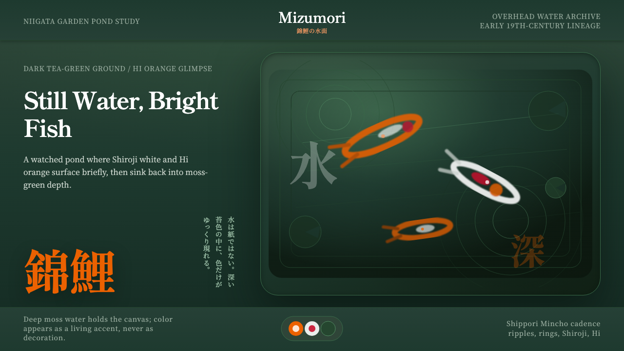 Koi PondQuiet water carries color. Moss depth, Mincho type, and orange koi flashes.
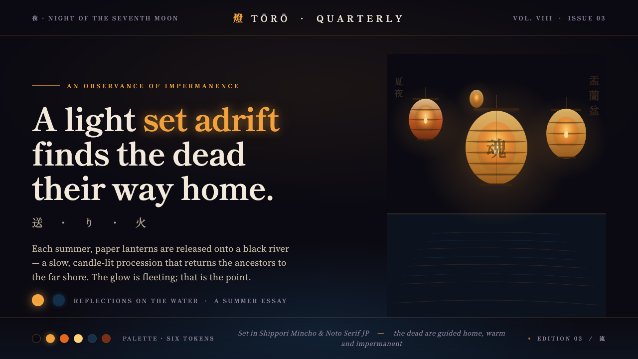 Obon Floating LanternsLight, set adrift. Amber washi lanterns on near-black water, each glow double…
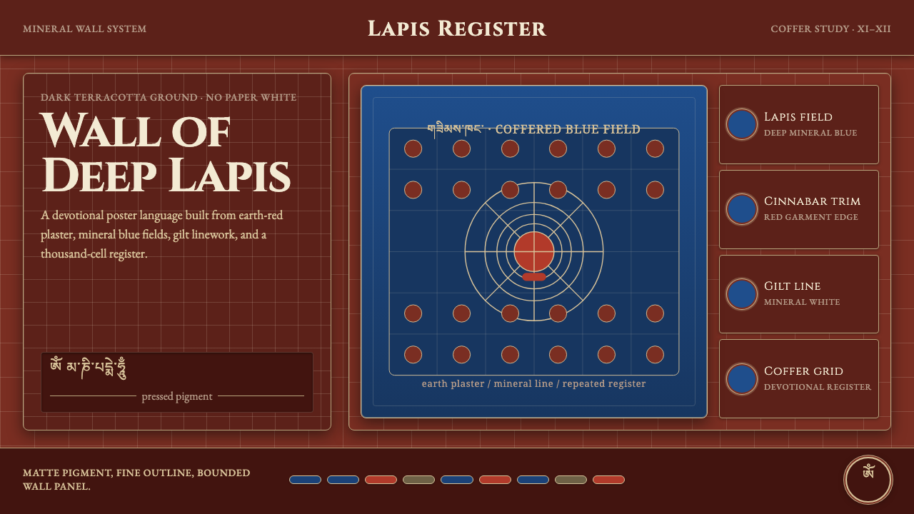 Alchi Monastery MuralDevotional depth. Lapis fields and coffered grids glow on terracotta plaster.
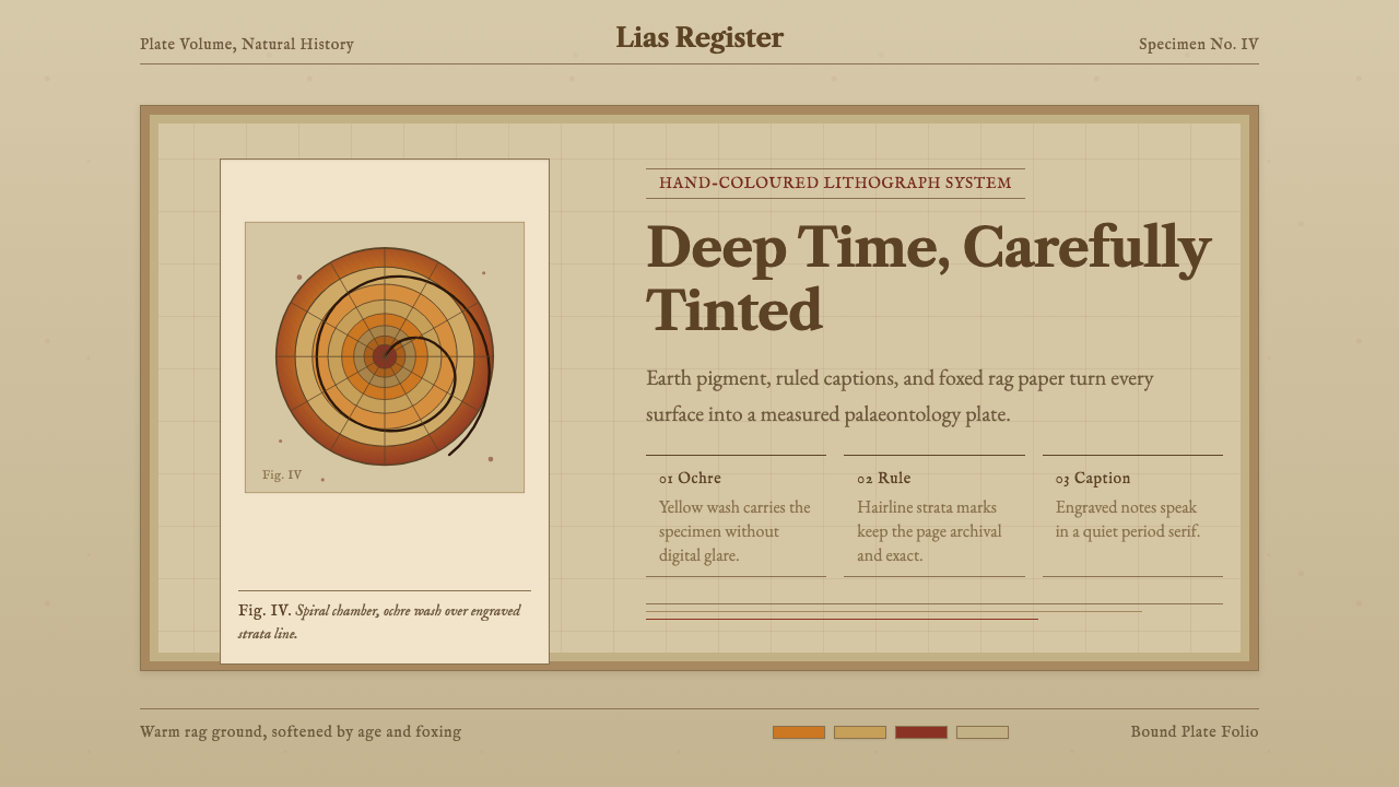 Ammonite Fossil PlateDeep time feels hand-tinted. Ochre spiral, foxed paper, and engraved captions…